Quantcast
Channel: Infragistics Community
Viewing all 2223 articles
Browse latest View live

What is C#?

$
0
0

What is C#?

C# is an object oriented programming language developed in 2000 by Anders Hejlsberg at Microsoft. Anders has an impeccable heritage in this area, having previously worked on both Turbo Pascal and Delphi. Since creating C#, Anders has moved onto the development of TypeScript, a Microsoft project to create an enhanced version of JavaScript.


The C# language was designed to be platform independent and borrows its syntax heavily from both Java and C++. Indeed one of Anders original design goals was to create a language to address what he saw as many of the flaws in these older languages.


In 2000 O'Reilly editor John Osborn conducted an interview with Anders, in which he discussed the inspirations behind C#:

“We tried to stay much closer to C++ in our design [for C#]. C# borrows most of its operators, keywords, and statements directly from C++. We have also kept a number of language features that Java dropped, like enums.”


C# was developed for use within Microsoft's .NET development framework, which comprises a large library of prebuilt code classes (for things like data access, data connectivity, and network communications) and a software environment called the ‘Common Language Runtime’ (CLR). The CLR is a ‘just in time’ compiler, meaning it converts C# code into suitable machine code as it runs.


The framework actually supports a wide range of languages, including C++ and even Visual Basic, but C# has seen particularly wide use. As you might expect .NET is primarily designed for the Windows platform, although an open source project called Mono provides a runtime and development framework for Linux and Mac operating systems. As a result of .NET, C# is seen as a particularly strong language with which to develop Windows desktop applications.


The ECMA, which approved version 2.0 of C# (the current version is 5.0) as a standard independent of Microsoft, have stated seven key design goals for the language. These include but are not limited to the following:

  • C# is intended to be simple, modern, general purpose, and object-oriented
  • C# should support strong type checking, array bounds checking, and automatic garbage collection
  • C# is not intended to compete with C or assembly language for size (of compiled programs) or performance.


Advantages of C#

As Anders has publicly stated, C# tries to build on much that is good about the C++ and Java languages. C++ has been around since 1983, and is considered by many to be a fairly complex language to master, especially for those starting out in programming. It lacks many of the memory management features of modern languages, like automatic garbage collection (something both Java and C# support) which can make writing very efficient code difficult. C# does feature automatic garbage collection, meaning developers have more time to focus on solving problems with their code rather than implementing good memory management techniques. C# is also strongly typed, meaning it is somewhat easier for developers to adhere to coding best practice, and to find and eliminate bugs.


The dominance of C# on the Windows platform has seen a large and very active community build up around it, and this in turn has helped to foster numerous help and support resources. A quick search of the web will surface a wealth of well implemented, freely available code libraries and samples.


Areas for Improvement

At launch many felt C# was simply a Microsoft version of Java, developed to avoid explicitly licensing a third party product, but over time the two languages have diverged, and C# has found its own feet. It has moved away from its original platform independence, and become a core tool of the .NET framework.


The ‘just in time’ nature of its compiler has lead some developers to question its performance, when compared to other languages. Whilst there is some truth to this (ECMA themselves have stated C# isn’t a performance rival to the likes of C or pure machine code) it is not something that affects 99.99% of well written code running on modern hardware. Indeed the wide variety of code libraries available as part of the .NET framework means that many familiar problems already have efficient and fully tested solutions available.


The Future of C#

In April 2014, at its BUILD developer conference, Microsoft formally announced it was releasing the .NET C# compiler ‘Roslyn’ as an open source product. This was a big step for Microsoft, who had previously developed the .NET framework as proprietary technology. Roslyn is part of a larger initiative called the ‘.NET Foundation’ which aims to open source much more of .NET over time. Whilst it is early days for these initiatives, they are a positive move towards greater cross platform support for .NET, and the wider use of C# on non Windows devices (like smartphones and tablets).


Infragistics offers a number of development tools that make it even easier to write high quality C# code and applications. Find out more here.


Indigo Studio from a Developer Perspective

$
0
0

Click here to learn more about Indigo Studio

As a developer with nearly two decades of working in the trenches. I was skeptical the first time someone mentioned the term User Experience (UX). At the time I didn’t fully grasp the science and engineering involved with creating not just a good experience but a great one.  Like most developers I thought about the user interface from my point of view. I open the toolbox in Visual Studio and started grabbing the controls that made sense for the problem at hand. Never really considering or taking the time to understand what would make the best experience.

Over the last few years, I had the pleasure of working with some of the best and brightest UX minds in the world. In our Infragistics D3 service group we have two distinct teams: Development and User Experience.  During our projects there is a lot of collaboration that happens between these teams. Both groups bring unique prospective to designing and building the best user experience for our customers. We use a variety of techniques and tools during this collaboration including sketches, wireframes, visual design mockup and design guides. The main deliverable we collaborate over are wireframes. A wireframe can be in the form of a simple sketch to a high fidelity PDF document with lots of annotations. Wireframes have an inherent drawback that they are static in nature and don’t always clearly define the user experience.

This is where prototype and tools like Infragistics Indigo Studio shine. Indigo Studio is more than just a simple prototyping tool it a Swiss Army knife that allows you to capture and bring to life the user experience. From a developer point of view, this saves me time not just during the initial collaboration with our UX team but ongoing throughout the entire application development lifecycle. Instead of having to maul over a print out or a PDF document. It’s possible to fire up Indigo Studio and interactively walkthrough a real working prototype. This is a powerful thing that allows us to capture the user experience in a very rich way. Now when our teams are collaborating it much easier to clearly see what the user experience will be. Instead of having to wait weeks or even months for us (developers) to build out the UI of the application. Project stake holders and end users can walk through the same rich interactive prototype and validate how the application will work. This can be a huge time saver and simplify the overall developer effort and cost in building the application.

As a developer it’s easy to get caught up in the bits and bytes involved with a working application an overlook the importance of the user experience. Tools like Infragistics Indigo Studio are invaluable weapons that a developer can add to his arsenal to help capture and bring to life not just a good but a great user experience.

Infragistics World Tour: Europe Here We Come!

$
0
0

Infragistics is taking the show on the road and across the pond - to Europe! We'll be in London September 29th, Paris October 3rd, and Munich on October 7th! You don't want to miss these workshops, where you'll learn how to incorporate design into your development for apps that look good and provide a great user experience.

[youtube] width="640" height="480" src="http://www.youtube.com/embed/EVijDODTyhY" [/youtube]

Want to register? Email DaveM@infragistics.com to be notified when registration opens up for these events - and we hope to see you there!

iOS - Objective-C - Downloading Data using NSURLSession

$
0
0
Previously, I talked about downloading data using NSURLConnection . That method works great, however, in iOS 7 Apple introduced a different way of downloading data, which also allows downloading while you're app is in the background. Just like we did with NSURLConnection, we first need to implement a protocol. This protocol is called: NSURLSessionDownloadDelegate and requires the following 4 selectors: -(void)URLSession:(NSURLSession *)session downloadTask:(NSURLSessionDownloadTask *)downloadTask...(read more)

Great UX & How to Build It - An Interview with Jared Potter of Sixth Ave. Studios

$
0
0

After his recent World Tour stop at Microsoft in Times Square, NYC, we had the opportunity to chat with Jared Potter of Sixth Ave. Studios about design, development, and the best – and worst – user experience he’s seen lately. Read on!

Thanks for taking the time to sit down with us today, Jared. Why don’t you start by telling us a little bit about yourself?

Sure, thanks. I’m now the principal designer for Sixth Ave. Studios, but before that I was the design integration lead for Microsoft's mobile team and led the effort on the Windows Phone from 2009 to 2012, where I used a lot of tools.  When I was in the design studio I talked tools with a lot of teams, and I was in charge of a V-team that would choose the tools that we designed with and developed with. So that’s my background: I love talking about and trying out different tools.

So given your design background, why would you say design is so important?

Design is important because it's inevitable. Design will happen whether you're intentional about it or not. If you ignore it, you're going to end up with an awful end result. But if you’re intentional about the final experience that you want to produce from the moment you start working on your software, you’ll create a good design and a great experience for your users. Outside of the feature set, design is the one thing that relates directly to the customers.

Then what would you consider the number one most important design rule?

I would say that design is order. Giving your designs the appearance of simplicity is a very important thing. Creating a design that feels cluttered or overcrowded is probably the easiest way you can go wrong, with complex software and lots of user requirements. When it comes to designing software, I strive for simplicity by using grids, aligning objects, typography, things like that to create the perception of order. Of course, there are lots of other important design rules that I live by, but I'll go with that one for now! [laughs]

Why do you think it's so hard to build an app that looks good and provides a great user experience?

I think it's because building an app is all about empathy: how empathetic can you actually be with your users? A lot of times people will get really passionate about their designs, to the point where it becomes their baby. The problem is that the client wants a pony, and you want to keep your little baby that you've been working on, and those are two contradictory things.

The biggest thing that you can do to reconcile that is to craft the design for the user. Focus on UX, do user research, get your designs in front of people – whatever you can do to flex your empathy muscle will help you create a great app. Because you're not the user! Even if that was the case before you started this software, once you're creating it, you're no longer the user.

So you're on this World Tour with Infragistics, showing people how to use Indigo Studio to start designing a great app. How do you think it's going?

I think it's going very well! We’ve had some great turnouts, and I’m looking forward to heading to Europe in the fall.  That’s the magic of Dave Mendlen [my co-presenter on the World Tour]. I've been to a lot of talks where they write a lot of code on stage and people will ask their technical questions, but they were going to ask that technical question regardless of what you’re presenting. But Dave does a really good job of engaging with the audience. They come to the show, see what we’re talking about, and keep the conversation going long after the show.

So there’s more of a personal touch with these shows.

Right. Everything from the emails before the show to the Q&A afterwards onsite, it’s a very personal experience.

And from a technical standpoint, I definitely think that the message is getting out there with these shows too. Indigo Studio is a great, time-saving prototyping tool that every developer should have in their toolkit, and at every show I’ve found that people get really excited about it because it resonates with the work they're currently doing.

Speaking of something you can get excited about, here’s a fun question for you: what's the best and worst user experiences you've seen lately?

Oh, wow… the best one? That’s hard. I can think of a million bad ones [laughs]. Coming from the Windows team, I was one of the originators on the team that created the Metro design language. Hands down, some of the worst user experience I've seen has been coming out from Microsoft on the Windows side of things.

There are a lot of things that just make no sense. They kind of get the rules around the design, but they don't get the heart of the inspiration behind it. They're like, "You can make a box? I can make a box. You made a tile that’s a red square? I can do that too!" Then you'll just get pages of these tiles or boxes and it just doesn’t look pretty and it doesn't fit into the experience. I think that stems from the fact that these developers use the Microsoft guidelines as their bible. They’re super strict about it, and some of the designs are just unusable when you get them to users.

When it comes to great UX, I actually just discovered this app called "Clear", and it’s fantastic. It's a list/task-tracking app, but the simplicity of it lies in the fact that everything is done with an intuitive gesture. To add an event you just drag down, to mark a task as done you swipe one way and to delete it you swipe it the other way –  where so many of the task apps out there are overly complicated, this is a little app that just does everything that you want it to do, very simply. That’s great user experience!

To learn more about Infragistics Ultimate or download your free trial, click here.

MVVM Best Practices

$
0
0

In this episode, recorded at TechEd in Houston, Robert Green is joined by Brian Lagunas of Infragistics, who shares with us best practices for building applications using MVVM. Brian starts off by reviewing what MVVM is and what it isn't. He then demonstrates several things you should not do and why you should not do them. In addition to the demos, Brian gives his advice on how he approaches some common scenarios.

For more information on Visual Studio Toolbox see http://channel9.msdn.com/Shows/Visual-Studio-Toolbox 

[youtube] width="560" height="315" src="http://www.youtube.com/embed/ysWK4e2Mtco" [/youtube]

Optimize the UX of your applications with the Ignite UI jQuery Radial Menu

$
0
0

Ignite UI Radial Menu Header imageThe 14.1 release of Ignite UI came with a brand new OneNote MX Inspired jQuery Radial Menu control. This control presents its items in a circular arrangement around a center button and thus allows the end-user to select any item faster because each item is equally positioned in relation to the center. If you have been following my blogs so far you may have read the ones about the  XAML Radial Menu and the WinForms Radial Menu. With the release of this Web UI widget now you can create office inspired apps on every platform.

Essentials

From User experience point of view the Radial Menu strikes 10 out of 10 points when it comes to easy navigation through the different items. With its circular structure every slice is equally distant from the center which means that you can reach/select every one of them for the same duration and considerably faster compared to using a normal menu. The supported item types for this control are various and has unlimited levels of hierarchy. Among those types you can find numerical values, color values as well as buttons  that perform action.

As I said this control is inspired by the OneNote MX menu which means that it is intended to be a tool for text editing but of course it is flexible so you can customize it and use it according to your needs. We are going to take a look at some of the basics to help you get started with this widget effortlessly. Let’s start by saying that by default the Radial Menu has 8 items – meaning that the inner area is separated in 8 equal slides and if you need less items the other space will remain blank. Of course that doesn’t mean that you are obligated to make 8 wedges, you just have to change the value of the minWedgeCount property to the number of items you need. This option comes in handy when you create a numericgauge item because it allows the gauge to spread along the whole inner area of the sub-item.

If you want to create a numeric item you have to add an item of numericitem type which will act as a button to the numeric gauge. Visually the slice will contain a custom image or header if any and an associated numeric value above them. The child item should be of numericgauge type which will allow to select a numeric value.

JS:

  1. $("#radialMenu").igRadialMenu({
  2.     width: "300px",
  3.     height: "300px",
  4.     minWedgeCount: 1,
  5.     items:
  6.     [
  7.         {
  8.             type: "numericitem",
  9.             header: "Font Size",
  10.             iconUri: "/Icons/Size.png",
  11.             value: "8",
  12.             items:
  13.             [
  14.                 {
  15.                     name: "gauge1",
  16.                     type: "numericgauge",
  17.                     ticks: "10,12,18,24,36",
  18.                     value: 12,
  19.                     smallIncrement: 2,
  20.                     valueChanged: function (evt, ui) {
  21.                         if (evt.newValue == 10) setFontSize(2);
  22.                         elseif (evt.newValue == 12) setFontSize(3);
  23.                         elseif (evt.newValue == 18) setFontSize(5);
  24.                         elseif (evt.newValue == 24) setFontSize(6);
  25.                         elseif (evt.newValue == 36) setFontSize(7);
  26.                     }
  27.                 }
  28.             ]
  29.         }
  30.     ]
  31. });

MVC:

  1. @(
  2.     Html.Infragistics().RadialMenu()
  3.         .ID("radialMenu")
  4.         .Width("300px")
  5.         .Height("300px")
  6.         .MinWedgeCount(1)
  7.         .Items(i =>
  8.             {
  9.                 i.NumericItem("numItems1")
  10.                     .Header("Size")
  11.                     .IconUri("/Icons/Size.png")
  12.                     .Value(8)
  13.                     .Items(subItem => subItem.NumericGauge("numGauge1")                    
  14.                     .WedgeSpan(5)
  15.                     .Ticks(newdouble[] {8,9,10,11,12,13,14,16,18,20,22,24,26,28,36,48})
  16.                     .Value(8));
  17.             })
  18.         .Render()
  19.     )

Image:

Ignite UI Radial Menu Numeric Items

Another specific item type is the coloritem. When you add this item to the menu it will display custom image and header if any and an associated color. The child items should be of colorwell type. This item is specialized item that displays associated color in the item area and the outer ring.  To create the whole palette of colors you need to add a hierarchy of  color well children. The snippet below demonstrates how to do that for the yellow color.

JS:

  1. type: "coloritem",
  2.             header: "Foreground",
  3.             iconUri: "/Icons/FColor.png",
  4.             items:
  5.             [
  6.                 {
  7.                     type: "colorwell",
  8.                     color: "#FFFF00",
  9.                     autoRotateChildren: false,
  10.                     items:
  11.                     [
  12.                         {
  13.                             type: "colorwell",
  14.                             color: "#ffffe5"
  15.                         },
  16.                         {
  17.                             type: "colorwell",
  18.                             color: "#ffffcc"
  19.                         },
  20.                         {
  21.                             type: "colorwell",
  22.                             color: "#ffffb9"
  23.                         },
  24.                         {
  25.                             type: "colorwell",
  26.                             color: "#ffff99"
  27.                         },
  28.                         {
  29.                             type: "colorwell",
  30.                             color: "#ffff7f"
  31.                         },
  32.                         {
  33.                             type: "colorwell",
  34.                             color: "#ffff66"
  35.                         },
  36.                         {
  37.                             type: "colorwell",
  38.                             color: "#ffff4c"
  39.                         },
  40.                         {
  41.                             type: "colorwell",
  42.                             color: "#ffff32"
  43.                         },
  44.                         {
  45.                             type: "colorwell",
  46.                             color: "#ffff19"
  47.                         }
  48.                     ]
  49.                 },{...}
  50.          ]

MVC:

  1. i.ColorItem("colorItem1")
  2.                 .Header("Color")
  3.                 .IconUri("/Icons/BColor.png")
  4.                 .Items(si =>
  5.                 {
  6.                     si.ColorWell().Color("#FFFF00").Items(colorItem =>
  7.                     {
  8.                         colorItem.ColorWell().Color("#FFD55F");
  9.                         colorItem.ColorWell().Color("#FFEB9C");
  10.                         colorItem.ColorWell().Color("#FFFF00");
  11.                         colorItem.ColorWell().Color("#AC4D25");
  12.                         colorItem.ColorWell().Color("#D16227");
  13.                         colorItem.ColorWell().Color("#EB7C23");
  14.                         colorItem.ColorWell().Color("#F6901E");
  15.                         colorItem.ColorWell().Color("#FFC000");
  16.                     });
  17.                 });

Image:

Ignite UI Radial Menu Color Items

You can see from the images that in the outer ring above some of the items there are arrows – this is an indicator that these items have sub-items and you can navigate to them through those arrows. All items ( regardless if they have child items or not) act as simple buttons you can assign actions to through the click handler . For the items with hierarchical structure, each time a child item is used, its name is set on the parent's recentItem property. You can use that property to perform the same functionality the child item had from the parent, essentially functioning the same way as a split button would.

JS:

  1. $("#radialMenu").igRadialMenu({
  2.     width: "300px",
  3.     height: "300px",
  4.     minWedgeCount: 1,
  5.     items:
  6.     [
  7.         {
  8.             name: "bold",
  9.             header: "Bold",
  10.             iconUri: "/Icons/Bold.png",
  11.             click: function () { toggleBold(); }
  12.         }
  13.     ]
  14. });

MVC:

  1. @(
  2.     Html.Infragistics().RadialMenu()
  3.         .ID("radialMenu")
  4.         .Width("300px")
  5.         .Height("300px")
  6.         .MinWedgeCount(1)
  7.         .Items(i =>
  8.             {
  9.                 i.Item("button1")
  10.                     .Header("Bold")
  11.                     .IconUri("/Icons/Bold.png")
  12.                     .ClientEvents(newDictionary<string, string>() { { "click", "function(evt, ui) { alert('Bold clicked'); }" } });
  13.             })
  14.         .Render()
  15.     )

Image:

Radial Menu Bold button

The following snippet is an example how to make  a parent item act like a split button.

  1.     type: "list",
  2.     header: "Font",
  3.     highlightBrush: "#004A7F",
  4.     outerRingButtonFill: "#4C4C4C",
  5.     outerRingButtonHotTrackFill: "#66CCFF",
  6.     autoRotateChildren: false,
  7.     iconUri: "/Icons/Font.png",
  8.     click: function (evt, ui) {
  9.         setFontFamily(evt.item.recentItemName);
  10.     },
  11.     items:
  12.     [
  13.         {
  14.             header: "Arial",
  15.             name: "Arial",
  16.             highlightBrush: "#004A7F",
  17.             click: function (evt, ui) { setFontFamily(evt.item.name); }
  18.         },
  19.         {
  20.             header: "Calibri",
  21.             name: "Calibri",
  22.             highlightBrush: "#004A7F",
  23.             click: function (evt, ui) { setFontFamily(evt.item.name); }
  24.         },
  25.         {
  26.             header: "Comic Sans",
  27.             name: "Comic Sans MS",
  28.             highlightBrush: "#004A7F",
  29.             click: function (evt, ui) { setFontFamily(evt.item.name); }
  30.         },
  31.         {
  32.             header: "Consolas",
  33.             name: "Consolas",
  34.             highlightBrush: "#004A7F",
  35.             click: function (evt, ui) { setFontFamily(evt.item.name); }
  36.         },
  37.         {
  38.             header: "Courier New",
  39.             name: "Courier New",
  40.             highlightBrush: "#004A7F",
  41.             click: function (evt, ui) { setFontFamily(evt.item.name); }
  42.         },
  43.         {
  44.             header: "Segoe",
  45.             name: "Segoe UI",
  46.             highlightBrush: "#004A7F",
  47.             click: function (evt, ui) { setFontFamily(evt.item.name); }
  48.         },
  49.         {
  50.             header: "Tahoma",
  51.             name: "Tahoma",
  52.             highlightBrush: "#004A7F",
  53.             click: function (evt, ui) { setFontFamily(evt.item.name); }
  54.         },
  55.         {
  56.             header: "Times",
  57.             name: "Times New Roman",
  58.             highlightBrush: "#004A7F",
  59.             click: function (evt, ui) { setFontFamily(evt.item.name); }
  60.         },
  61.         {
  62.             header: "Verdana",
  63.             name: "Verdana",
  64.             highlightBrush: "#004A7F",
  65.             click: function (evt, ui) { setFontFamily(evt.item.name); }
  66.         }
  67.     ]
  68. }

Let’s get creative

The radial menu can be separated in three main parts – outer ring, inner area and center button. All of these parts can be easily customized by changing their brush, highlights, border and etc..  Let’s go over the options that are related to these parts and see how to manipulate and change the appearance of the control.

We are going to stat from inside out. The center button! The center button is the first thing you see when you run the control. Thanks to it you can expand or collapse the Radial Menu as well as navigate through the hierarchical levels of the different options (it allows access to menu items on the previous level). It has three main states: closed, open and when you interact with it. Each of there states is connected with two options one for the border stroke and one responsible for the internal fill color.

Ignite UI Radial Menu Customized Center Button

Let’s continue with the inner area. The inner area displays the current level menu items.  Similar to the center button this part of the menu has states, which means that you can change the appearance of the inner area when it is in a undisturbed condition and then you interact with one of the items. The outer edge of this inner area is called a selection arc and in this arc you can see the currently hovered menu item highlights and its checked state.

Ignite UI Radial Menu Customized Inner Area

The outer part of the radial menu is the Outer Ring. If there are arrows above the items in this part of the menu this means that these items have sub-items and you can navigate to them. As you have probably guessed similar to the above mentioned parts of the control you can manipulate the outer ring on few levels. You can change the appearance of the main ring as well as the appearance of the buttons on it. The supported option for customizing this ring are various and detailed. You can even customize the arrow on the the buttons.

Ignite UI Radial Menu Customized Outer Ring

Summary

The main idea behind the radial menu is to be simple and easy to work with. It should present small number of items and distribute them in a circular arrangement which speeds up items selection. It is designed to look and behave like OneNote’s radial menu but it allows you to customize it and adopt it to your needs. This colorful, functional and handy widget can undoubtedly optimize the user experience of your applications.

Check out a live demo on jsFiddle or download the ASP.NET MVC sample.

You can follow us on Twitter @Infragistics and stay in touch on Facebook, Google+ and LinkedIn!

Microsoft In Touch Conference–Event Recap

$
0
0

The event was held on Wednesday and Thursday , May 14th and 15th  at Sofia Event Center, Sofia, Bulgaria. Microsoft In Touch is the biggest Microsoft's conference for developers in Bulgaria. This is two-day event, including many presentations and workshops related to the latest technologies from Microsoft.

Infragistics was a bar sponsor of Microsoft In Touch . Company had a booth, company presentation two other technical presentations  and provided award for the event raffle.


What is Microsoft In Touch


  • A two days event
  • 32 presentations in 2 tracks.
  • Around 450 attendees
  • Speakers from 7 countries:
  • The biggest event for Microsoft developers technologies in Bulgaria


Infargistics participation at Microsoft In Touch


  1. Infragistics Inc. was a sponsor
  2. There was 3 technical presentations from Infragistics Inc.:


Microsoft In Touch keynote:


Infragistics booth:


Infragistics crew


Damyan and Marina are talking about Indigo Studio


Angel Todorov is talking about “Debugging, Profiling and Optimizing Web Apps with IE11 – F12 Dev tools”


Bobbi and Mihail are preparing their presentation about “Node.js and Open Source Software Development on Microsoft Azure”


Bobbi and Mihail in action


You can take a look at the video recording from “Node.js and Open Source Software Development on Microsoft Azure” here :

[youtube] width="560" height="315" src="http://www.youtube.com/embed/GSQ_4vuyMDY" [/youtube]


If you want more information about the event feel free to contact the Event Admins at mmateev@infragistics.com

Follow this event on Twitter with hash tag  #MSinTouch.

You can learn more about Azure Bootcamp Bulgaria if you follow us on Twitter @mihailmateev  and @Infragistics and stay in touch on Facebook, Google+, LinkedIn and Infragistics Friends User Group !


Infragistics Windows Forms Release Notes – May 2014: 13.1, 13.2, 14.1 Service Releases

$
0
0

With every release comes a set of release notes that reflects the state of resolved bugs and new additions from the previous release. You’ll find these notes useful to help determine the resolution of existing issues from a past release and as a means of determining where to test your applications when upgrading from one version to the next.

Release notes are available in both PDF and Excel formats. The PDF summarizes the changes to this release along with a listing of each item. The Excel sheet includes each change item and makes it easy for you to sort, filter and otherwise manipulate the data to your liking.

In order to download release notes, use the following links:

WinForms 2014 Volume 1 Service Release (Build 14.1.20141.2035)

PDF - Infragistics WinForms 2014 Volume 1
Excel - Infragistics WinForms 2014 Volume 1

WinForms 2013 Volume 2 Service Release (Build 13.2.20132.2054)

PDF - Infragistics WinForms 2013 Volume 2
Excel - Infragistics WinForms 2013 Volume 2

WinForms 2013 Volume 1 Service Release (Build 13.1.20131.2124)

PDF - Infragistics WinForms 2013 Volume 1
Excel - Infragistics WinForms 2013 Volume 1

Intro to the Mobile Web Using HTML5 and jQuery Mobile - World IA Day 2014

$
0
0

Back in March, Infragistics D3 Services hosted its second annual World IA Day event at our Cranbury, NJ headquarters. This annual event, which took place in cities around the world, highlighted the roles of UX, interaction design, development and sales in information architecture and user experience design.

Todd Snyder, Principal Consultant with D3 presented an Intro to the Mobile Web Using HTML5 and jQuery Mobile. Check out his full presentation below:

[youtube] width="640" height="360" src="http://www.youtube.com/embed/BKUulAzXgwo" [/youtube]

For more videos like this one, be sure to subscribe to our YouTube channel!

iOS Quick Tip: Split a UIImage into Multiple Parts

$
0
0
Given a UIImage, in some cases you may want to have the image split. For example, say you wanted to create a Flipboard or Paper like interface, where you have a screen shot of a UIVIew, and you want to have the appearance of it folding. To do this you can use the CGImageCreateWithImageInRect method in objective-c. The code below is an example of how to use this method. In this scenario we're splitting the image in half, a left and right image. -(void)splitImage:(UIImage *)image { CGFloat imgWidth...(read more)

Google Input Tools: An Overview

$
0
0

An overview of Google Input Tools

Latest figures from around the web suggest that over two billion people now use the Internet, with nearly two thirds of these using it every single day. Usage spans the globe, with nearly fifty percent of users in Asia alone. In fact the majority of web users are now non-English speakers. This poses a number of interesting challenges and opportunities for language and how it is used online. Specifically how do users of non-English languages (which utilize non standard alphabets and scripts) communicate in their native tongue?

Google Input Tools are a set of applications and services that make it easy to use over ninety languages on the web - when writing email, on Android phones, and even in desktop apps. Consisting of onscreen keyboards and custom dictionaries, Google Input Tools allows the full expression of language to be communicated quickly and easily online. Once installed the various tools allow text to be entered in different languages, specifically those languages that don’t use the standard Western alphabet script. On traditional PCs the tools allow text to be entered using virtual onscreen keyboards. On Android devices, phones and tablets, the out of the box (digital) keyboards can be replaced altogether. Devices that support handwriting recognition can take advantage of this form of input.

Google Input Tools consist of the following components:

App for Android devices
Google Keyboard offers a number of advanced input features - like gesture typing, voice typing, and advanced layouts. The app also supports dictionaries for 26 languages and personalised suggestions, corrections and completions. The Android App Store also includes a number of alternative keyboards, made available by the Google Input Tools team, to support native composition in languages such as Hindu and Japanese. More information here

A Google Chrome extension
This extension allows users of the Chrome browser to switch language with the click of a mouse. Included is support for over 90 languages, 30 different scripts, and handwriting input for 40 languages. This is a very flexible option for those doing a lot of work on the web. More information here

Features in a range of Google Services
Google has baked its Input Tools into a number of its own core services. In Gmail, for example, users can turn on additional software keyboards in the settings section. Google Drive, and thus Google Docs, include similar options. Support even extends to sites like YouTube, with options for both video searches and content managers. More information here

A desktop app for Windows computers
As a desktop application this version of Input Tools doesn’t rely on an Internet connection for the bulk of its operation. Features include dictionary based word completion, single click web search for highlighted words (which does need an online access), and the ability to store personalised settings (such as specific word corrections). This version of Input Tools supports 22 different languages. More information here

Passing Data Between View Controllers (iOS Obj-C)

$
0
0

Introduction

When designing an app that makes use of multiple view controllers it may become necessary to pass data back and forth between the view controllers. This common occurance will be covered in this blog post by demonstrating passing data to the next view controller as well as passing data back to the previous view controller.

Passing Data Forward to a View Controller

Passing Data Forward to a View Controller

To pass data forward to the next view controller, expose properties on the next view controller. In this example, we'll expose a data property of type NSString. In your own project you can use whatever data type you wish, including custom objects.

@interface SecondViewController : UIViewController@property (nonatomic, retain) NSString *data;@end

The code to create an instance of this view controller along with passing of the data is as follows. This example passes the text contained in a label to the second view controller.

- (void)passDataForward
{SecondViewController *secondViewController = [[SecondViewController alloc] init];
    secondViewController.data = _label.text; // Set the exposed property
    [self.navigationController pushViewController:secondViewController animated:YES];
}

When your next view controller is loading it's then possible to use the assigned data. Our sample project sets the text of a label using the exposed data variable.

UILabel *label = [[UILabel alloc] initWithFrame:CGRectInset(top, 5, 5)];
label.autoresizingMask = UIViewAutoresizingFlexibleHeight|UIViewAutoresizingFlexibleWidth|UIViewAutoresizingFlexibleBottomMargin;
label.textAlignment = NSTextAlignmentCenter;
label.text = [NSString stringWithFormat:@"Your data: %@", _data]; // Make use of the exposed data property
[self.view addSubview:label];

Passing Data Back to the Previous View Controller

To pass data back to the previous view controller, you will need to create a delegate protocol the second view controller uses and exposes to the previous view controller. The sample delegate shown in this example forces implementation of the dataFromController: method by the adopter. The second view controller exposes the delegate protocol through the delegate property.

@protocol SecondViewControllerDelegate <NSObject>@required
- (void)dataFromController:(NSString *)data;@end@interface SecondViewController : UIViewController@property (nonatomic, retain) NSString *data;@property (nonatomic, weak) id<SecondViewControllerDelegate> delegate;@end

On the first view controller we need to adopt this delegate protocol.

@interface FirstViewController () <SecondViewControllerDelegate>
{UILabel *_label;UIButton *_button;
}@end

Now that the delegate protocol is adopted, we must implement the required methods. In this method, our sample sets the label text to the data passed in and disables the button.

- (void)dataFromController:(NSString *)data
{_label.text = data;_button.enabled = NO;
}

For this method and adoption of the delegate protocol to work, we must set the delegate property to self.

- (void)passDataForward
{SecondViewController *secondViewController = [[SecondViewController alloc] init];
    secondViewController.data = _label.text;
    secondViewController.delegate = self; // Set the second view controller's delegate to self
    [self.navigationController pushViewController:secondViewController animated:YES];
}

Download the Example Project

The Xcode project source code for this quick tip can be downloaded by clicking this link.

By Torrey Betts

Using different template engines with Ignite UI controls

$
0
0

header imageCreating an application is not only about making it functional it is about how the users will react to it. Did you know that when you create a mobile app for example a user decides in the first 10 seconds whether he likes it or not? So imagine how will you feel if the application is slow and you have to wait these seconds only for it to render? For us in Infragistics the User Experience is a top priority, that is why in the new 14.1 release we went through some major changes in order to optimize the UX of our users.

First we deprecated the rowTemplate option of the igGrid and thus we increased the templated igGrid rendering with more than 40%. And second we removed the dependence between the template and the syntaxes of the Infragistics Template Engine.  The second alteration was driven by our desire users to feel free to use any Template Engine they like. In this blog we are going to go through some of the most popular template engines and see how to use them with the Infragistics Ignite UI controls.

What’s New in 14.1 Template Engine

A major changes in the new 14.1 release is that the rowTemplate option has been deprecated. This is a breaking change from the previous versions’ functionality. The igGrid control now uses only the templates for individual columns. As before you can use templates only for some of them (will be rendered through the template engine) and  the other columns will render along with the grid render. This actually increases the render of the grid with more than 40% and thus with this alteration we did not only make the control faster but we also optimized the user experience when interacting with it.

Let’s see the grid in action. For the demo I’m going to use the Infragistics Template Engine. For some of the columns I‘m going to use different templates and the other I will leave unattached with template. Setting the template option separately to every column is very handy because it gives you the opportunity to manipulate them differently. You can check out the demo in jsFiddle to see it for yourself.

Condition Template:

  1. <scriptid="colTmpl"type="text/template">
  2.  
  3.     {{if${SoldLastMonth}<=${SoldThisMonth} }}         
  4.     <imgwidth='10'height='15'src='http://igniteui.com/images/samples/templating-engine/colTemplateWithConditionalCell/arrowUp.gif'/>
  5.     {{else}}
  6.     <imgwidth='10'height='15'src='http://igniteui.com/images/samples/templating-engine/colTemplateWithConditionalCell/arrowDown.gif'/>
  7.     {{/if}}
  8.  
  9. </script>

Grid Initialization:

  1. $("#grid1").igGrid({
  2.     primaryKey: "ProductID",
  3.     width: '700px',
  4.     height: '600px',
  5.     rowVirtualization: true,
  6.     virtualizationMode: "fixed",
  7.     avgRowHeight: "60",
  8.     autoGenerateColumns: false,
  9.     columns: [
  10.         { headerText: "Product ID", key: "ProductID", dataType: "number" },
  11.         { headerText: "Units in Stock", key: "UnitsInStock", dataType: "number", template: "Units in Stock: ${UnitsInStock}" },
  12.         { headerText: "Product Description", key: "ProductDescription", dataType: "string" },
  13.         { headerText: "Unit Price", key: "UnitPrice", dataType: "string", template: "Unit Price: ${UnitPrice}" },
  14.         { headerText: "Sold last month", key: "SoldLastMonth", dataType: "number", template: "Sold last month: ${SoldLastMonth}" },
  15.         { headerText: "Sold this month", key: "SoldThisMonth", dataType: "number", template: "Sold this month: ${SoldThisMonth}" + $("#colTmpl").html() }
  16.     ],
  17.     tabIndex: 1,
  18.     dataSource: namedData
  19. });

Another change is that the template is no longer tied to the Infragistics Template Engine syntax which gives you the opportunity to use any other template system and override the template. Further in the blog I am going to show you how to do that in details.

Fire up Ignite UI controls with different template engines

The increased use of JavaScript led to the development of many JS libraries to support the applications developed in this language. When it comes to client side data-binding method it is convenient to use one of those templating libraries. As you know Infragistics has a great Templating Engine and you can easily use it to create templates and use them with the Ignite UI controls. But in case that is not enough for you and you want to use another Framework that is not a problem anymore - you just have to override the template. We are going to look at some of the most popular template engines and see how to do that and fire up some of the Ignite UI controls with the different frameworks. By overriding the Ignite UI template function you can easily use different template engines. The main idea is that every control that has a template option goes through the template function. This function takes two arguments – template as string and the data object to be rendered (called automatically by the controls) and should return the final result as HTML string.

HandleBars.js and Mustache.js

Mustache for example is often considered as a base for the JavaScript templating. This template system is described as a “logic-less” system because it lacks any explicit control flow statements.  On top of it is build the HandleBars  template engine. This is one of the most popular templating library and it adds a lot of helpers to Mustache. The syntaxes of these two templates is similar - they both use double curly braces.

If you choose to use HandleBars.js to render a template you should first create the template  and then you can compile it by using the Handlebars.compile function. To get the HTML result of the evaluated template you have to execute the template with the data that you want to use.

  1. $.ig.tmpl = function (tmpl, data) {            
  2.     var template = Handlebars.compile(tmpl);
  3.     return template(data);
  4. };
  5.  
  6. $("#grid1").igGrid({
  7.         primaryKey: "ProductID",
  8.         width: '700px',
  9.         height: '600px',
  10.         rowVirtualization: true,
  11.         virtualizationMode: "fixed",
  12.         avgRowHeight: "60",
  13.         autoGenerateColumns: false,
  14.         columns: [
  15.                { headerText: "Product ID", key: "ProductID", dataType: "number", template: "PID: {{ProductID}}" },
  16.             { headerText: "Units in Stock", key: "UnitsInStock", dataType: "number", template: "In stock: {{UnitsInStock}}" },
  17.             { headerText: "Product Description", key: "ProductDescription", dataType: "string", template: "Desc: {{ProductDescription}}" },
  18.             { headerText: "DateAdded", key: "DateAdded", dataType: "date", hidden: true, template: "Date: {{DateAdded}}" },
  19.             { headerText: "Unit Price", key: "UnitPrice", dataType: "string", template: "unitprice: {{UnitPrice}}" }
  20.         ],               
  21.         tabIndex: 1,                
  22.         dataSource: namedData
  23.     });

The template for Mustache.js is the same as the one we use with HandleBars because they have similar syntax. The difference appears in the override function – you have to use the Mustache.render to compile the template.

  1. $.ig.tmpl = function (tmpl, data) {
  2.     var template = Mustache.render(tmpl, data);
  3.     return template;
  4. };


Ignite UI igGrid with Hadlebars.js template

On jsFiddle can check out a demo using the igGrid with HandleBars Template Engine .

Underscore.js

The Underscore is a JavaScript library that provides  functional helpers without extending any built-in objects.  As any template Underscore has its specific syntax so you can either use this syntax when you call the template or you can change the Underscore’s template settings to use different symbols. This can be accomplished by defining a regex to  match the expression that should be evaluated.

Using Underscore syntax:

  1. $.ig.tmpl = function (tmpl, data) {
  2.     var template = _.template(tmpl);          
  3.     return template(data);
  4. };
  5.  
  6.  
  7. $("#grid1").igGrid({
  8.         primaryKey: "ProductID",
  9.         width: '700px',
  10.         height: '600px',
  11.         rowVirtualization: true,
  12.         virtualizationMode: "fixed",
  13.         avgRowHeight: "60",
  14.         autoGenerateColumns: false,
  15.         columns: [
  16.                { headerText: "Product ID", key: "ProductID", dataType: "number", template: "PID: <%- ProductID %>" },
  17.             { headerText: "Units in Stock", key: "UnitsInStock", dataType: "number", template: "In stock: <%- UnitsInStock %>" },
  18.             { headerText: "Product Description", key: "ProductDescription", dataType: "string", template: "Desc: <%- ProductDescription %>" },
  19.             { headerText: "DateAdded", key: "DateAdded", dataType: "date", hidden: true, template: "Date: <%- DateAdded %>" },
  20.             { headerText: "Unit Price", key: "UnitPrice", dataType: "string", template: "unitprice: <%- UnitPrice %>" }
  21.         ],               
  22.         tabIndex: 1,                
  23.         dataSource: namedData
  24.     });
  25. });

Changed Underscore template setting to perform HandleBars.js style template:

  1.     $.ig.tmpl = function (tmpl, data) {
  2.  
  3.         _.templateSettings = {
  4.             interpolate: /\{\{(.+?)\}\}/g
  5.         };
  6.         var template = _.template(tmpl);          
  7.         return template(data);
  8.     };
  9.  
  10.  
  11.     $("#grid1").igGrid({
  12.             primaryKey: "ProductID",
  13.             width: '700px',
  14.             height: '600px',
  15.             rowVirtualization: true,
  16.             virtualizationMode: "fixed",
  17.             avgRowHeight: "60",
  18.             autoGenerateColumns: false,
  19.             columns: [
  20.                    { headerText: "Product ID", key: "ProductID", dataType: "number", template: "PID: {{ProductID}}" },
  21.                 { headerText: "Units in Stock", key: "UnitsInStock", dataType: "number", template: "In stock: {{UnitsInStock}}" },
  22.                 { headerText: "Product Description", key: "ProductDescription", dataType: "string", template: "Desc: {{ProductDescription}}" },
  23.                 { headerText: "DateAdded", key: "DateAdded", dataType: "date", hidden: true, template: "Date: {{DateAdded}}" },
  24.                 { headerText: "Unit Price", key: "UnitPrice", dataType: "string", template: "unitprice: {{UnitPrice}}" }
  25.             ],               
  26.             tabIndex: 1,                
  27.             dataSource: namedData
  28.         });

On jsFiddle you can see how to use igCombo with Underscore.

Ignite UI igCombo with Underscore.js

jsRender

I have already written a blog about the jsRender integration with the igGrid, but that was about the 13.2 release. Now after the deprecation of the rowTemplate let’s go back and see how to change the Heat map sample. It is actually pretty simple all you need to do is set different templates to the columns that you want to participate in the establishment of the heat map. You can check out a demo of the sample in jsFiddle.

  1. $("#grid").igGrid({
  2.     width: "600px",
  3.     height: "500px",
  4.     dataSource: busy,
  5.     columns: [
  6.         { headerText: "Id", key: "ID" },
  7.         { headerText: "Name", key: "Name" },
  8.         { headerText: "Mon", key: "Mon", template: "<td style='background: {{:~colorChange(Mon)}};'><b>{{>Mon}}%</b></td>" },
  9.         { headerText: "Tue", key: "Tue", template: "<td style='background: {{:~colorChange(Tue)}};'><b>{{>Tue}}%</b></td>" },
  10.         { headerText: "Wed", key: "Wed", template: "<td style='background: {{:~colorChange(Wed)}};'><b>{{>Wed}}%</b></td>" },
  11.         { headerText: "Thu", key: "Thu", template: "<td style='background: {{:~colorChange(Thu)}};'><b>{{>Thu}}%</b></td>" },
  12.         { headerText: "Fri", key: "Fri", template: "<td style='background: {{:~colorChange(Fri)}};'><b>{{>Fri}}%</b></td>" }
  13.     ],
  14.     templatingEngine: "jsrender"
  15. });

Ignite UI igGrid heat map with jsRender

By following the above shown examples you can use any template engine you like and override the template in a similar way.

Summary

Every web developer has his preferences when it comes to using a JS libraries to help you create stunning applications. And what is better than being able to use them along with Ignite UI controls.  With the latest release of our Web widgets we give you the opportunity to blend your favorite template engine with our controls by overriding the template function. Our desire was to make you feel comfortable and thus create your apps faster and easier.


You can follow us on Twitter @Infragistics and stay in touch on Facebook, Google+ and LinkedIn!

Simple Should Be Better, Not Boring - World IA Day 2014

$
0
0

On March 22, Infragistics Consulting Division, D3 Services, hosted its second annual World IA Day event at our Cranbury, NJ headquarters. This annual event, which took place in cities around the world, highlighted the roles of UX, interaction design, development and sales in information architecture and user experience design.

At the event, D3 UX Visual Designer Megan Ezeadi talked about the importance of good design in her presentation, "Simple Should Be Better, Not Boring". Check out her full presentation below:

[youtube] width="640" height="360" src="http://www.youtube.com/embed/TgGTFz5TKEw" [/youtube]

For more videos like this one, be sure to subscribe to our YouTube channel!


Feature Persistence in the Ignite UI jQuery Grid and Hierarchical Grid

$
0
0

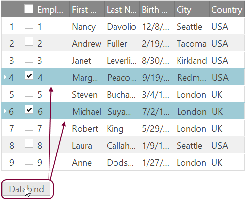
Feature Persistence header imageDo you know what persistence is? Well when it comes to programming persistence means to save the current state of the process. Without this capability, the state will exist as long as the process is alive. This is an important feature when it comes to manipulating data in a grid. Imagine the following scenarios: You are using remote paging and you do some selection when you need to check the next page for something and return to finish your work just to find it’s all gone. Or for example you sort and filter your data when you decide that you want to refresh it in order to see if any changes have been made and after rebinding your data your previous actions has vanished.  Unpleasant right? That is exactly why in the new 14.1 release of the Ignite UI Grid control we added a new persist feature to help our users interact with the data they load in the grid effortlessly and without loosing a minute to redo your work afterwards.
 

Feature Persistence 

The breaking change around the jQuery Grid and Hierarchical Grid is that they now maintain state between re-bindings. This persist option is supported with the Filtering, GroupBy, RowSelectors, Selection and Sorting features. By default all of these features’ persistence is true. This means that when you enable any of these features you will be using it in a persist mode. When the dataBind function is explicitly called the persistence will be applied for UI and data source view. But if you want to retain the previous behavior  of interactions being cleared after user re-binds the igGrid, you have to disable the persist option by setting it to false. When you use selection persistence enabled it is good to provide an explicit, unique primary key. The persistence of the above mentioned features is implemented for the igHierarchicalGrid as well. In our sample browser you can find a great example showing you feature persistence in action.

Selection

As I said when you enable the igGridSelection feature you are using it in a persist mode and if you want to use it in the previous default behavior you have to use the persist option and set it to false.  Being in a persist mode means that when you select a row or a cell it will remain selected after you interact with another features of the grid such as sorting, filtering or if you use the data binding function.  Persisting depends on the feature’s ability to unambiguously distinguish rows and columns from one another. As row indexes are not stable and therefore unusable for this purpose, igGridSelection will use either the user-defined primary key of the grid or will generate pseudo-unique identifiers for each row based on the corresponding record’s property values.

Selection Persistence igGrid

Sorting

Similar to the selection features when you enable the sorting feature you will be using it in a persistence mode. This means that after you call a data bind function the persistence is applied for the UI (CSS classes are applied) and the data source remains sorted.

Sorting Persistence igGrid

Filtering and GroupBy

With risk of repeating I will say that the filtering feature by default is in persistent mode – so when you call dataBind() the filter editors will not clear and the data source will remain filtered. Same goes for the group by feature– the grouped columns wont be cleared and the data source will remain sorted.

Filtering and GroupBy persistence igGrid

Limitations

When it comes to Unbound Columns there are some tricky things to watch for. Sorting, filtering and groupby for example do not persist their state when they are applied to unbound columns. Another issue is connected with igGridPaging. When you change page size with remote Paging  the remote Sorting and Filtering don’t persist.

If you are working with a hierarchical grid pay attention that remote filtering, sorting and group by are not persisted for child layouts without load-on demand.

Summary

Persistence between states is an important option when you are dealing with a grid. By default Sorting, Filtering, Selection and GroupBy features are in persistent mode which means that after you refresh your data, the UI and the data source view will remain the same.


You can see a live demo of feature persistence with remote Paging on jsFiddle or a sample with remote data but local Paging.

You can follow us on Twitter @Infragistics and stay in touch on Facebook, Google+ and LinkedIn!

OK-Cancel or Cancel-OK?

$
0
0

Here’s one of the epic questions in UX design: should the OK buttons be to the left of the Cancel button or should it be the other way round?

image of OK and Cancel buttons

Before I go into details, here’s the executive summary: there’s neither a significant difference in performance (task execution speed) nor in user preference.

It’s interesting that although it’s a source of constant discussions, it’s not something that would be published about in textbooks or on the web (if you know of something recent, please let me know!!!).

You can argue that consistency with platform conventions is the most important thing to consider. For desktops, that’s Microsoft/Windows vs. Apple/Mac. The former uses OK-Cancel, the latter Cancel-OK. If you’re designing a desktop product running on Windows, your button sequence should be the same that all other applications on that desktop feature.

On the web it’s not that easy. There, all bets are off because browser-based UIs can be accessed from multiple platforms. You can use web analytics to find out the most used platform for any particular web product, but whatever button sequence you choose, it will not be consistent with that some users know from their operating system. So then, the sequence should be whatever is better from a usability perspective. Here are pros for each sequence (see bottom of blog for the references):


Pro OK - Cancel:

  • Supports normal reading flow and sentence structure in the Western culture, where you say for example “Do you agree with me – Yes or no?”. So the positive option comes first, the negative second.
  • Given that in most cases OK is the primary action to complete a flow and therefore is used more frequently than Cancel as the secondary action, OK is faster to hit with the TAB key for keyboard users (assuming a reading direction that goes from left to right).


Pro Cancel - OK:

  • Improves the flow, because the dialog "ends" with its conclusion, assuming a reading direction that goes from left to right. The final UI element to interact with – the OK button – is at the right-most position.
  • As with Previous/Next, OK is the option moving you forward towards the completion of your flow, while Cancel moves you back. Therefore, OK should be in the same location as Next - on the right.
  • Less fixations. Users look at all options before choosing which action to take. Most users won’t blindly engage with the left button without also looking at the right button. So in the case of OK – Cancel you look at OK, then look at Cancel and then if you want to engage with OK, you look back to OK. That’s a total of three fixations in two directions. In the case of Cancel – OK you look at Cancel first and OK second. Since OK is what you want, you don’t need to look anywhere else but can just click/tab the OK button. This creates a total of two fixations in one direction.


So which way is better? Like with many UX design topics, there’s no right or wrong answer. It’s helpful though to know what speaks for each option. My personal preference is OK-Cancel. What’s yours? Any other reasons than those stated above?


Further readings:

http://www.nngroup.com/articles/okndashcancel-or-cancelndashok/

http://uxmovement.com/buttons/why-ok-buttons-in-dialog-boxes-work-best-on-the-right/

http://measuringuserexperience.com/SubmitCancel/

What’s New in IG Test Automation 2014.1

$
0
0

The primary focus for Infragistics Test Automation is to offer you peace of mind. Such that when you develop with our controls, your teams can seamlessly implement automated testing of the user interface (UI) to confidently produce higher-quality releases. IG Test Automation, currently supports our Windows Forms controls via HP’s Unified Functional Testing (UFT) and IBM’s Rational Functional Tester (RFT).  We also support our WPF controls via HP’s UFT.

As IG Test Automation’s purpose is to automate tests of the UI of applications using IG controls, this what’s new will start off with the new controls, it should be noted that CTP controls are typically not supported until full release. I will follow with changes in existing controls that had changes that would affect how the UI behaved, then I will list any improvements to IG Test Automation that is not dependant upon the controls, lastly I’ll list any bug fixes that were implemented this cycle.


New Infragistics Controls

IG Windows Form’s UltraPivotGrid

The UltraPivotGrid allows you to embed Microsoft Excel styled PivotTables directly into your application. Giving your end users access to sophisticated analytics and reporting functionality.


IG WPF’s XamRadialMenu

The radial menu is a circular menu that provides a fast navigation for users. This control was inspired by Microsoft’s OneNote MX 2013 radial menu. This kind of menu is useful and convenient for touch devices.

XamRadialMenu


IG Control’s with UI altering Improvements

IG Windows Form’s Editors

New to the IG Editor’s was right to left support. The following control’s now support right to left.

  • UltraCalculator
  • UltraCalculatorDropDown
  • UltraCheckEditor
  • UltraColorPicker
  • UltraComboEditor
  • UltraCurrencyEditor
  • UltraDateTimeEditor
  • UltraNumericEditor
  • UltraOptionSet
  • UltraTextEditor
  • UltraCombo
  • UltraDropDownButton

IG Windows Form’s UltraTab

New to the UltraTab was a New Tab button to emulate the behavior of most modern tab-based web browsers. When the user clicks the button a new tab is added to the control.

IG Window’s Form’s UltraToolbarsManager Ribbon

New the Ribbon is the ability to let the developer change the display behavior of the Ribbon’s Tab item area. When all the commands are grouped on a single tab, there is a lot of application space that is unnecessarily reserved to display a single tab item It allows the developer to hit the tab items (in red) or the entire tab area (in blue) to regain the space.

  UltraToolbars Manager, Tab Item Visibility

IG WPF’s XamDataGrid

While there were several improvement’s to the XamDataGrid, including adding a SelectedItems property, which returns the underlying data item’s that are selected, and row numbering, it was the changes to filtering that affected the UI. Specifically there were two new operands added to the filtering menu, In, and NotIn.  As well as allowing the developer to change how filtering affects the UI. By default it hides the filtered out rows, new this release is the ability to dim the filtered out rows.

IG WPF’s XamComboEditor

While there wasn’t really new changes to the UI for the XamComboEditor. There were several properties added to the control, SelectedValue and SelectedValues, that we felt should be offered as testable properties.

IG WPF’s XamRibbon

New to the XamRibbon this release was the an emulation of the Office 2013 style file menu.

Office 2013 styled XamRibbon

Also new is a new Tab Item toolbar area (in red).

XamRibbon, TabItem toolbar area

IG Test Automation improvements

Japanese Localization

Both versions of IG Test Automation for Window’s Forms, have a Japanese localized version.


New Bug Fixes in 2014.1


TA Product

Control

Description

Win Forms for HP

UltraCalendarCombo

Changing settings for "WinCalendarCombo" has no effect

Win Forms for HP

Settings Utility

WinCalendarCombo setting is duplicated in Settings Utility

Win Forms for HP

UltraToolbarsManager

InvalidCastException occurs when recording against custom RibbonGroup

Win Forms for HP

UltraToolbarsManager

Syntax error with CustomizeContextMenu method

Win Forms for IBM

UltraComboEditor

Cannot record on DropDown list off a ComboEditor when there is an item with no displaytext or datavalue among the ValueListItems list


Video: What's New in Test Automation?

$
0
0

Infragistics Ultimate 14.1 saw the addition of some awesome new controls in Windows Forms and WPF. With these updates, we’ve added corresponding support to our TestAutomation suites so you can start testing your applications immediately, and get to market faster. Take a look in our latest video:

[youtube] width="640" height="360" src="http://www.youtube.com/embed/BBMib4Byj8w" [/youtube]

In our Windows Forms control suite, we added the UltraPivotGrid, which allows you to embed Microsoft Excel-styled PivotTables directly into your application. In addition, we added some great improvements to our Tab controls and Toolbars Manager. And for those building applications for an international audience, we’ve implemented right to left support within our Editor control suites, and we’ve even added Japanese language support  to both of our Windows Forms TestAutomation suites: HP Unified Functional Testing and IBM Rational Functional Tester.

In our WPF control suite, we’ve added the Microsoft OneNote stylized XamRadialMenu- and we’ve made great improvements to our Microsoft inspired Ribbon control, our Combo editors, and our DataPresenters, like the XamDataGrid.

As always, our TestAutomation suites for HP Unified Functional Testing give you access to our integrated Intellisense; a rich set of methods and properties that are there to help you with your test case development. And with our TestAutomation suite for IBM’s Rational Functional Tester, you have our comprehensive data verification point system too.

As you can see there are a lot of new controls to test in 14.1; but with Infragistics Test Automation tools, you’ll be ready for anything.

For more videos just like this one, be sure to subscribe to our YouTube Channel!

ReportPlus v3.0 released, adds dashboard sharing, rebranding exports, improved Analysis Services support and more

$
0
0
ReportPlus Mobile Business Intelligence

After months of wait we are proud to announce that ReportPlus v3.0 is available for download in the app store.  Version 3.0 represents a major release for the team; it ships several new features as well as introduces enhancements to the overall user experience of the app.

With this release the app switches business model. ReportPlus going forward becomes a subscription based app, free to download, but requires a subscription to unlock all features.  Existing users, who purchased the app in previous versions, are granted a perpetual license to use all subscription features free of charge. In order to redeem this license you must register and tap on the Restore Purchases button.

The Lite version is removed from the app store. Existing users of the Lite version will continue to be able to use it but won’t receive any updates, and are encouraged to move to the new version.

Among the list of new features there’s the following:

App Store Core

  • Folders support in the initial dashboard selector view. You can now group local dashboards in folders, making finding and managing dashboards easier.
  • Enhanced Analysis Services editor & support. Data sets retrieved from Analysis Services get a completely revamped editor, including a treeview editor for navigating the hierarchies of dimensions and measures, plus named sets, folders and measure groups support.
  • UNDO/REDO. Both in the dashboard design canvas, as in the Widget Editor you have the ability to undo and redo any action, making the learning process smoother.
  • AutoSave. The dashboards being designed is constantly saved to avoid any data loss.
  • Hourly Aggregation. Time based aggregation now goes beyond Year, Month, Day, and allows you to group records by Hour.
  • Overlay of help tooltips. In any screen if you tap the help button an overlay of tooltips with descriptive texts is displayed. Some of them link help articles.
  • Cascading filters support for widget filters and global filters. Define related filters with dependencies, such as Country>State>City, so that when users select a Country, only valid values are displayed for State, and City filters.

App Store Subscription

  • In the cloud repository to share dashboards & folders. Sync your dashboards across devices and share them with other users in such a way that they keep shared dashboards in sync.
  • Export to PDF, Word and CSV document formats. ReportPlus v3.0 goes beyond powerpoint slides when it comes to exporting and sharing in office formats.
  • Rebranding company color & logo in exported documents. Export professional looking documents with your company logo and you company color.
  • Annotations support in emailed images & exported documents. Add notes and markers in exports to highlight the big picture.
  • DIY HTML Visualizations. Visualize data sets retrieved by ReportPlus with your own html + javascript code.

Enterprise

  • Navigation Between Dashboards. You can specify one dashboard to open another dashboard passing parameters, upon certain actions such as: widget maximize, or tapping a row, or chart column. This enables drill down navigation experiences across dashboards, where one dashboards offers a broad overview, and another a greater level of detail. For instance you can create a dashboard with a Company 360 Overview, and have a Human Resources widget, and when the user maximizes the HR widget navigate to the HR Dashboard.

I will be covering in more detail all these features in a series of future blog posts. We hope you enjoy the new version, and find value in the new features. If you have any questions or feedback don't hesitate to contact us.

Viewing all 2223 articles
Browse latest View live