We are super excited to finally release reusable design elements! We call them Screenparts, which quite literally means reusable parts of your screen.
After we released version 2, the Indigo Studio team has continued to enhance version 2 through updates. And this continues to be our model; consistently adding value to the product you purchased. If our perpetual licensing model was not clear before, it should be clearer now. All our users who purchased an Indigo Studio license for version 2 get a free upgrade to version 3! And that means you can update and use screenparts as of today.
Learn more about how screenparts are related to screens and storyboards
Five things you should know about Screenparts
In this post I will discuss some of the core capabilities offered with Screenparts. In other words, the new and shiny bits!
1. Easily Create New Screenparts
Screenparts are designed pretty much exactly like screens. Instead of screen, select Screenpart from the new menu. You can also right-click on the project tab and create one from the context menu. Once you have the Screenpart designer fired up, add UI elements to the design surface to design your Screenpart.
The approach described above implies that you know upfront what needs to be reusable (i.e., Screenpart). But we imagine the following workflow to be equally, if not more, common. You are in the thick of designing your screens . You finish one (e.g. Screen A) and proceed to create a new screen (e.g., Screen B) as a result of navigate to interaction. And right then you realize that there are UI elements that you customized on screen A, which you also need on Screen B. Of course you can copy and paste these elements, but that entails a maintenance burden during design iteration.

Instead of copying and pasting directly, select the UI elements you need, and Convert to Screenpart first. This automatically adds the selected elements to the Screenpart tab in your toolbox. At the same time this replaces the selected UI elements with a Screenpart instance. Copy paste this instance instead. With this approach, you can change the source Screenpart to update all its instances on different screens. Maintenance burden be gone!
Watch Video on Creating and Customizing Screenparts
2. You can customize Screenpart Instances
Any time you add a Screenpart to a screen, Indigo creates an instance of the source Screenpart. This approach provides you with complete creative control on how the Screenpart instance looks and behaves on a particular screen. Want to change the color, size or position of something? Simply double click to edit the instance and make changes you desire. You can just as easily reset it to match the source Screenpart.

3. Design Screenparts to behave like Interactive Widgets
You can package visuals and interactions to be reusable as screenparts. Indigo Studio achieves this with the help of screenpart states which are created on the source screenpart. Design Screenpart states exactly like you do for screens. When you run the prototype, users will be able to interact with the interactions contained inside screenpart. For example, simulating a creating a new account experience inside a sign in window.
Watch Video on Screenparts as Interactive Widgets

4. Organizing your Screenparts with Categories
Right-Clicking on screenparts in your screenpart tab reveals the context menu. Use the add/edit screenpart category option to create new categories or add screenparts to existing categories. You can also add a screenpart to multiple categories.
Watch video on Organizing Screenparts
5. Exporting/Sharing Screenpart Libraries
Once you have a nice little screenpart library created, you can use it on other projects you have. Select the screenparts you need in the project home, and export. Export as Indigo Files & Assets and point the export location to a different Indigo Studio Project. If you have any images inside your screenpart, we include them in the assets folder.
When you create and save Screenparts, we automatically create a new subfolder under your project folder called "Screenparts." This should make it easier for you to locate all the screenparts in your project. You can of course filter your project home/gallery view to show just screenparts.

You can also create a zip file to email this library to someone on your team. For now, each project will need its own screenpart library to work correctly. As in, it should be available inside the folder for the Indigo project you are working on.
Watch video on Exporting Screenparts
How to Get This update?
Here's how to update the version of Indigo Studio installed on your machine:
- If you have the option to automatically check for updates on startup checked, you should see a dialog box pop up when you launch Indigo. Simply click update, and Indigo Studio will do the rest. This is the easier approach.
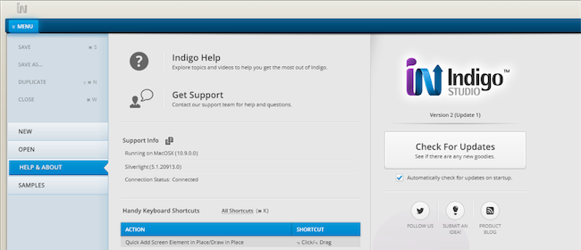
- If for some reason you chose not to automatically check for updates, go to MENU > HELP & ABOUT and use the "CHECK FOR UPDATES" option.
![Checking for Updates]()
Starting a New Trial for Version 3
If you have tried version 2 in the past, and used up your 30-day trial, you can still start a new trial for this major version for another 30 days! You can do this in the following two ways:
- If you have days remaining in your 30-day trial period for the current version (e.g., version 2, update 5), use the check for update option inside the app. You will be able to start a fresh trial for the next major version (e.g., Version 3)
- If you have used up the 30 day trial for the previous major version (e.g., Version 2), simply download and install Indigo Studio from our website (http://indigo.infragistics.com). This will also allow you to start a new trial.
If you already own an Indigo Studio License for a specific version, you can trial the latest version and then go back to my licensed version.
As explained in our perpetual license model, there is a good chance that version 3 is a free upgrade. We check this for you when you try to update from inside the app and will inform you accordingly.
If your license does not allow a free upgrade, you can still start a new trial for the latest version! When your 30-day period runs out, simply install the older version again. You can grab the installer for the version you own from my keys/downloads section on our website. You won't even have to re-enter your license key in most cases.
Please note: Screenparts are exclusive to Indigo Studio version 3 and above, so if you go back to an older version, screens that use Screenparts will not be compatible.
About Indigo Studio for Interaction Prototyping
Don't have Indigo Studio? Download a free 30-day trial which will let you try all of the prototyping goodness.
Looking to suggest improvements and new ideas for Indigo Studio?
If for some reason you are having trouble with Indigo Studio, check out our help topics, forums or contact support.
Follow us on Twitter @indigodesigned