AMAZING! That’s all I can say about this 14.1 release of Infragistics WPF and Silverlight controls. This is the most feature packed release we have had since I started working at Infragistics over 2 years ago. I am really excited about the new controls we are giving you early access to, the new features that will remove hundreds of lines of XAML from your views, the improved MVVM support, and the new themes and style updates that will make your application sing that beautiful song of awesomeness.
This year, we are focusing on three main areas, all designed to help you deliver the best, most modern applications to your customers faster than ever.
- Touch everywhere, Office inspired apps on every platform
- Deliver “Stunning” with awesome branding and styling
- Developer productivity across every device, and every platform
This isn’t just limited to our WPF and Silverlight controls. We are focused in these three areas across desktop, web, mobile native & mobile hybrid toolsets. Everything we are doing in each product is going to circle back to one of these areas, and of course some features overlap. I would like to also mention, that every single one of these new controls and features we are releasing in 14.1 were asked for by you. You told us what you wanted, and we delivered. This is your release!
Touch Everywhere, Office Inspired Apps on Every Platform
Normally I like to save the new CTP controls until the end of my posts, but I am so excited about our two newest controls, I just couldn’t wait. Wait a minute Brian… What the heck is a CTP? Well, I am glad you asked. A CTP (Community Technology Preview) is a classification that we give a control when it is in its’ early stage of development. We release these controls as a CTP in order to gather feedback from you, our customers, during the development of the control. This gives you the ability to get early access and tell us what you like and what you don’t like. You can even let us know what features the control should have. Feel free to submit your product ideas on our Product Ideas site, or email them directly to me.
xamDiagram – CTP
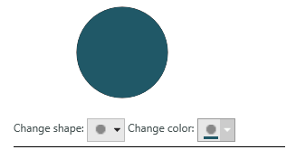
Go ahead and uninstall Microsoft Visio, because you won’t be needing it anymore. The new WPF xamDiagram will allow you to create your very own diagramming solution with all of the features that you would expect in a diagramming tool such as Visio. Even though this is being released as a CTP, don’t let that fool you! The xamDiagram CTP will ship with all the features you will need to start writing anything from simple flow charts and activity diagrams, to complex LinqToSQL relationship diagrams.

Initially, the xamDiagram will come with over 10 predefined diagram shapes such as Circle, Square, Rhombus, and Triangle just to name a few. We’ll be adding more in a future release. Making connections between shapes is as easy as dragging your mouse. Simply click the center of a shape and then, while holding down the mouse button, drag a connection to another shape. It’s that easy. Once a connection is made, you can change various properties of the connector. Choose from 28 different start and end cap types such as Arrow, Circle, Diamond, and more. Choose from 7 different line styles including dash, dot, dash-dot and more. Not happy with the size of the shape? No problem, we give you the ability to perform a proportional resize by dragging one of the shape’s many resize handles at runtime. You can even do an un-proportional resize by holding the keyboards “Shift” key while dragging a shape’s resize handle.
Don’t think you are limited to just the predefined shapes and connectors. Oh no! You can create any custom shape you can imagine. For example, maybe you want to create a LinqToSQL class diagram. No problem! Using custom styles and templates, you are not limited in what you can create. You can even customize the location of the connection ports for your custom shapes.

The xamDiagram’s canvas is easy to navigate with mouse wheel support for zooming in and out, as well panning while holding down the left mouse button. There is even an overview navigation pane built-in, which will give you more options for changing zoom levels and navigating the design surface. The xamDiagram is being built with MVVM and data binding as our top priority. We provide a number of commands that allows you to perform actions such as Copy, Paste, Cut, Delete, Edit, Undo, Redo, and SelectAll. Having said that, we haven’t released data binding the xamDiagram to a collection of objects yet. We want to make sure we do our due diligence, and get the data binding feature right the first time. I am relying heavily on the Infragistics XAML Insiders to help us determine the best approach for data binding support. If you have ideas on what data binding scenarios you would like to see us support. I would love to hear them too.
You know what may be the best part about the xamDiagram? Even with all these features, and the flexibility you have for customizations, it is still the highest performing WPF diagram control on the market. Even as a CTP! And it will get even better with time.
xamSpreadsheet – CTP
While you’re uninstalling Microsoft Visio, you might as well get rid of Microsoft Excel too. Well, maybe not quite yet, but soon. Since I started working at Infragistics, the most popular questions I received were on how to make the xamDataGrid behave, and act like, an Excel spreadsheet. You know who you are! Obviously, a data grid is not an Excel spreadsheet, and trying to get a data grid to act like one is like trying to get Darth Vader to leave the Dark Side. It’s just not going to happen. They are two very different controls with different purposes. So instead of trying to convince Darth Vader to change his ways, we decided to write a new Excel inspired xamSpreadsheet control. I can already tell that this will quite possibly be the most popular control we will ever write. The number of customers wanting early access to this control is overwhelming.

You want to know what’s really cool about this control? Do ya, do ya? The new xamSpreadsheet is built on top of our existing Excel Library. Now you can create, open, edit, and secure Excel documents without ever having Microsoft Excel installed on your machine. Mind blown! Your customers are going to love you.
As it sits, the xamSpreadsheet is in the very early stages of development, but has a ton of great features that you can start using now. You can freeze and split panes, zoom, merge cells, set a background image (yeah that’s a big deal), control the grid lines, and format cells. The options you have for formatting cells include alignment, font, indent, shrink to fit, text wrapping, fill colors, string formatting, and more. That might not seem like much, but when you are basically writing Excel wrapped in a control, that is actually a lot in such a short amount of time.
You can expect this control to get a lot of love during our 14.2 efforts, but for now, what you see is what you get. Normally, we wouldn’t be releasing this control so early in it’s development cycle, but I am really interested in your feedback. Actually, I am surprised they are letting me release the xamSpreadsheet so early. Hmmm… did I forget to ask for permission? Move along, nothing to see here!
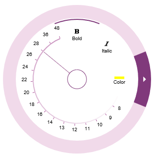
xamRadialMenu
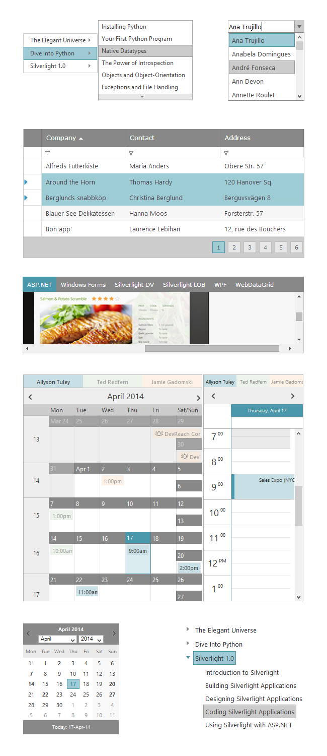
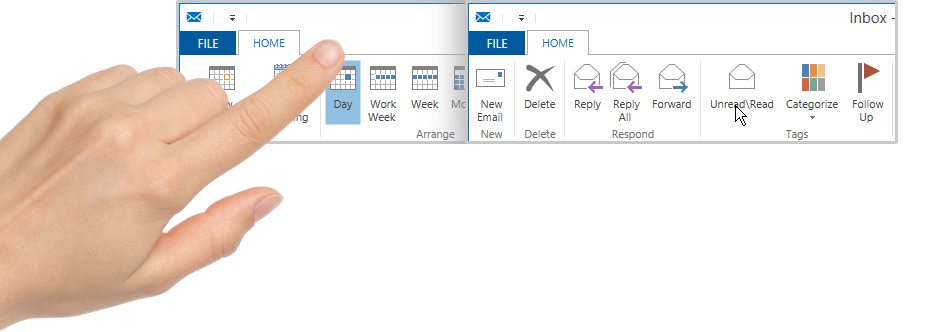
Our xamRadialMenu has finally shed its’ CTP classification and is being officially released as an RTM control in 14.1. The xamRadialMenu is available for both WPF and Silverlight platforms. Inspired by the Microsoft OneNote radial menu, the xamRadialMenu provides a circular menu that orients the commands around the user, rather than requiring the user to negotiate a nested hierarchy of drop downs. Most commonly used as a context menu, the xamRadialMenu allows you to drill down into related sub-menu items with the ability to navigate back to the main level menu item. Although the xamRadialMenu is optimized for touch, it works just as well for mouse and keyboard interactions.

It has configuration options for setting the number of wedges, rotation, size, and more. It has a number of built in tools such as a radio button, color well, numeric items and gauges, as well as a list tool. With support for recent items, tooltips, key tips, keyboard navigation, MVVM support, this control has everything you need to build your own touch based applications. While some people believe this is somewhat of a novelty control, I have actually seen very good implementations of this control. If done right, you can add a lot of touch friendly functionality to your applications.
Deliver Stunning with Awesome Branding & Styling
Besides releasing brand new Office inspired controls; we are also giving you a great new Office 2013 theme, and great new Office 2013 ribbon features to help give your applications a great modern and familiar feel. We are also sprucing up some of our own default styles for a number of our data visualization controls to give them an updated look and feel right out of the box.
Office 2013 Theme
We are delivering a brand new theme for WPF inspired by the new Microsoft Office 2013. Not only does this new Office 2013 theme apply to all Infragistics controls, but we are also shipping this theme for common Microsoft controls. You can now give your WPF applications a nice clean Office inspired look and feel. Here is just a small sample of how some of your WPF controls will look with this new Office 2013 Theme applied.

I am even thinking of giving away the Office 2013 Microsoft styles for free, just like I did for our other popular themes (IG, Metro Light, Metro Dark, and Office 2012 Blue). What do you think? Thank you, thank you. No need to applause! You can have a seat now.
xamRibbon and xamRibbonWindow
In conjunction with the new Office 2013 Theme shipping in 14.1, we have also added a number of new features to our xamRibbon and xamRibbonWindow to help you achieve that Office 2013 inspired look and feel in your WPF applications. The most noticeable new feature of the xamRibbon is the brand new Office 2013 Backstage. Unlike the previous version of the Office Backstage in which the ribbon tabs were always in view, when opened, the 2013 backstage will encompass the entire application window. So, how do you get this new Office 2013 backstage? No need to re-write any of your application’s XAML. Simply set your xamRibbon.Theme to the Office 2013 theme, and VOILA!
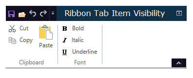
We also added a new TabItemAreaToolbar that allows you to add custom content to the right end of the xamRibbon’s tab area. Some common usages for this feature are to add user login information, or provide a help button to access application help documentation. Items that are no longer visible, maybe because of a window resize, will be added to an overflow popup, which can be opened by clicking the overflow button to give you access to the content. You can see these features in action in the below screenshot. Pretty sweet, huh?

Have you noticed the clean, modern look of the window yet? I bet you have, because you don’t get that with the default WPF Window. When using the xamRibbonWindow, simply set the xamRibbon.Theme property to the new Office 2013 theme, and the xamRibbonWindow will automatically update its window chrome to match the modern style of the Microsoft Office 2013 products. But Brian… What if I want all the windows in my application to have this beautiful, clean, and modern window chrome? Well… I’m glad you asked, because you can! And no, you will not be required to have a xamRibbon in each window. You can easily use the xamRibbonWindow as a standalone window without defining a xamRibbon. In this case, you would simply define the RibbonWindowContentHost object in the xamRibbonWindow, and set the RibbonWindowContentHost.Theme property to the Office 2013 Theme. But wait… there’s more! You can even change the accent color of the window chrome by using the RibbonWindowContentHost.ApplicationAccentColor attached property. As you can probably guess, this property would need to be attached to the actual RibbonWindowContentHost object.

New Default Style - xamDataChart, xamFunnelChart, and xamPieChart
We heard a lot of feedback regarding the default look and feel of some of the data visualization controls when dragging them from the Visual Studio toolbox onto the design surface, and we made sure to improve your experience. You no longer have to spend hours setting properties, modify a control template, or creating new styles altogether. We spent a lot of time creating a new default style to make the xamDataChart, xamFunnelChart, and xamPieChart kick you in the eyeballs with visual awesomeness. If you happen to prefer the older style to the new one, don’t worry, you can still apply the older style with a simply resource dictionary.
xamDataChart:

xamFunnelChart:

xamPieChart:

Developer Productivity across Every Device, Every Platform
Beside providing you with great new controls, and awesome new styles and themes that would put your applications on the cover of Vogue Magazine; we also want to make it easier for you to write those applications. We want to reduce the number of line of code that you have to write. We want to reduce the amount of time it takes to learn our controls. To achieve these goals, we have implemented a number of new features that eliminates up to 500 lines of XAML from your code. There are also a lot of new features that improve your ability to use our controls with the MVVM pattern. There is also a brand new template gallery that delivers entire applications out of the box.
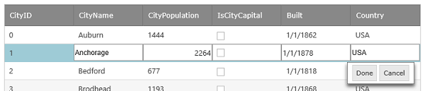
xamDataGrid
If you are one of the many customers that like to have record numbers in your grid, then you know the pain you had to go through to achieve simple record numbers in the xamDataGrid. You would literally need to add a custom RecordSelector ControlTemplate with up to 500 lines of XAML to get record numbers. Well, that is just not going to work! In this release you will be happy to know that you can now remove those 500 lines of XAML and turn on record numbering with a single property called FieldLayoutSettings.RecordSelectorNumberType. You have options for how the numbering will work, for example, will you use the DataItemIndex, the RecordIndex, or the VisibleIndex? You can even choose which number your record numbering begins at by setting the FieldLayoutSettings.RecordSelectorNumberStart property. What’s really nice about this feature is that these new properties are exposed off the FieldLayoutSettings so they can be set on the xamDataGrid directly, or on individual FieldLayouts through their Settings property.

What to change the styling? No problem! Just set the RecordSelectorNumberStyle property, and make it look exactly how you want.

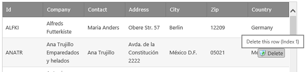
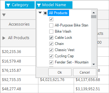
The xamDataGrid also got two new filtering operands in the form of “In” and “Not In”. You can now filter a column in the xamDataGrid using multiple values, separated by commas, to find records that contain values that fall “In” the filter values, or do are “Not In” the filter values.

Are you an MVVM (Model-View-ViewModel) developer? Do you use the xamDataGrid? Do you wish there was a property that would allow you to data bind a property in your ViewModel to the selected items in the xamDataGrid? Well, call me “Brian the Genie”, because I just made your wish come true! The xamDataGrid has received a new SelectedDataItems property for the sole purpose of supporting numerous MVVM scenarios, as well as other View related data binding scenarios. Not only will your ViewModel have access to the items being selected in the xamDataGrid by binding to the SelectedDataItems property, but you can also control which records in the xamDataGrid get selected from within your ViewModel. That’s right! The SelectedDataItems property is a Two-Way binding. Not only that, we have provided a SelectedDataItemsScope property which will allow you to control when the SelectedDataItems are populated. For example, you may only want to know the SelectedDataItems when the records are selected. In this case, you would set the SelectedDataItemsScope property to RecordsOnly. You could also set the SelectedDataItemsScope property to RecordsOrCells, or you can turn the feature completely off in order to increase performance.
xamRichTextEditor
The xamRichTextEditor is quickly becoming one of our more popular controls. Although it supported RTF, Plain Text, and Word document formats with its’ first release, it was still missing one critical format... HTML! That’s right, the xamRichTextEditor now supports importing, exporting, and even data binding to the ever popular HTML format. Don’t get this confused with writing HTML in the editor. This is taking the rich content you created in the editor and converting all the fonts, styles, images, lists, and other rich content into HTML markup which can be saved as an .htm document on disk, or as text in a database field.
For example:

As you can see, as I type content into the xamRichTextEditor, the output is rendered as HTML markup. If you’re an MVVM developer, don’t you worry. We have created an HTML document adapter that will let you data bind your HTML content to a property in your ViewModel. Now take that HTML and do what you want with it. No code-behind here!
xamComboEditor
This one was personal! In my early experience with the xamComboEditor, I determined that this control was not fit for an MVVM application. Most PMs (Product Managers) would never say that about their product. Well, if you can’t tell by now, I’m not like most PMs. I tell it like it is. I’m transparent to my customers, that’s you, and I am always looking for ways to improve my products. I even wrote a custom behavior so that you can actually use the control. Well, I am very excited to announce, that we have given the xamComboEditor so much MVVM love, that you would think that we were back in the 70’s. Every feature that was in my custom behavior, and more, is now part of the product!
First, we added a new IsSelectedMemberPath property. Now you can data bind those awesome CheckBoxes to a property of the underlying object. Oh yeah baby!

Next, we added the dearly missed, and much needed, SelectedValue and SelectedValuePath properties. Now, you no longer have to rely on dealing with object instances. Simply provide the SelectedValuePath to indicate which property of the underlying object you want to use for the identifying value. Then, you data bind a property in your ViewModel to the SelectedValue property to get the corresponding value for the selected item.

I know what you’re thinking… That’s great Brian, but how do I handle selecting multiple values? I mean, we are dealing with a bunch of check boxes here. So, I should be able to select many items at once. Does the SelectedValue handle this scenario? No it doesn’t. The SelectedValue property will only give you the last selected value, or the last value of the item that was checked. Don’t freak out! We have a solution for this. We have also added a new SelectedValues property. Notice the plural “s”? In multiple selection/CheckBox scenarios, you can use the SelectedValues property to get the collection of all selected values from within your ViewModel. Oh, and did I mention that both of these properties are a Two-Way binding? This means that not only can you get the selected values from within your ViewModel, but you can also control what items get selected in the xamComboEditor from within your ViewModel. Isn’t it beautiful?
The SelectionChangedEventArgs got a little love as well. Now you might be thinking, “why would you spend time on this?”. Well, if you ever used the SelectionChanged event in the past, you quickly realized that you had no way to know what was selected or unselected. What a pain! So we fixed it. You now have access to the newly added and removed items from within the SelectionChanged event. Ahhh… the little pleasures in life.

Were you one of the many customers that wanted a more powerful filtering mechanism? In the past, you could only filter the items based on the DisplayMemberPath. Well, this isn’t very useful, especially if you need to filter on multiple values. Maybe you use a 10-Key system, and use codes to lookup inventory items. You will be happy to hear that we have introduced a new, much more powerful, filtering mechanism to give you much more control over your filtering needs. You can filter on multiple properties, as well as add multiple filter conditions per property.

In this example, we are filtering a list for people that have a “First Name” that contains the search query we enter into the editable xamComboEditor, AND doesn’t end with the same query. We can easily modify this query to do an OR comparison between our two ComparisonConditions, or choose from over 35 operators. You can even add more ComboItemFilters to filter on other properties of your underlying objects. Now, this will be useful!
Lastly, we also gave you a little more control over the xamComboEditor’s drop down. You can now set the MaxDropDownHeight, MaxDropDownWidth, and MinDropDownWidth. The xamComboEditor also got a nice resize handle so your users can easily resize the drop down at runtime. Not only that, but we added a new DropDownButtonDisplayMode property that gives you control over when to show the drop down button. You have four options to choose from; Always, MouseOver, Focused, and Never. Pick what fits your needs.

Oh, and guess what?! Since the xamMultiColumnComboEditor derives from the xamComboEditor, all these features are available in the xamMultiColumnComboEditor too. How sweet is that?!
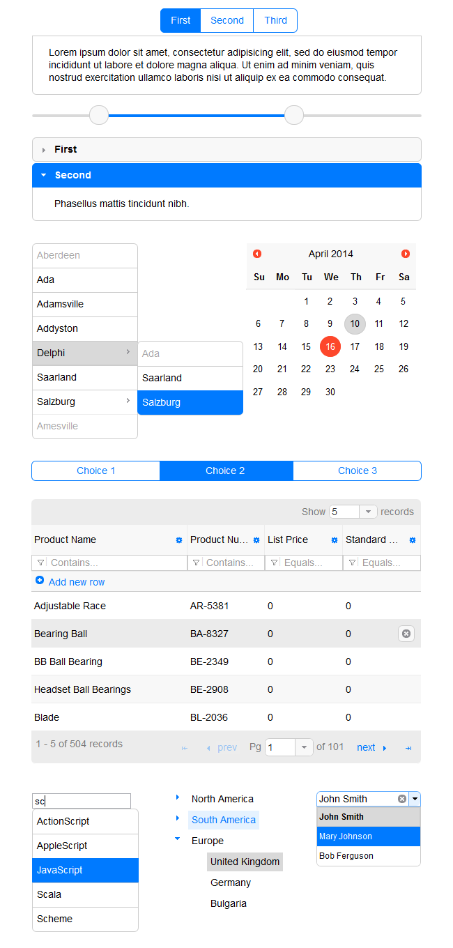
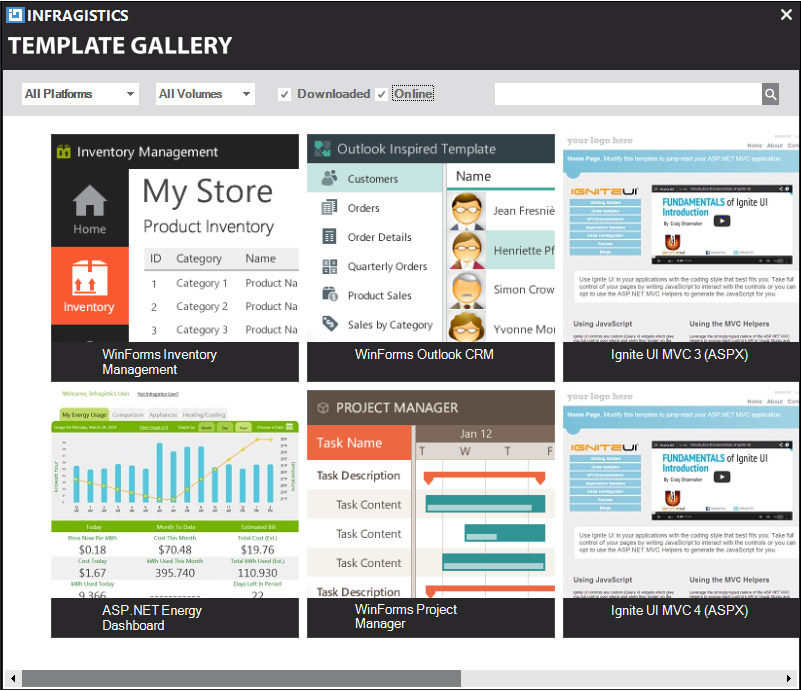
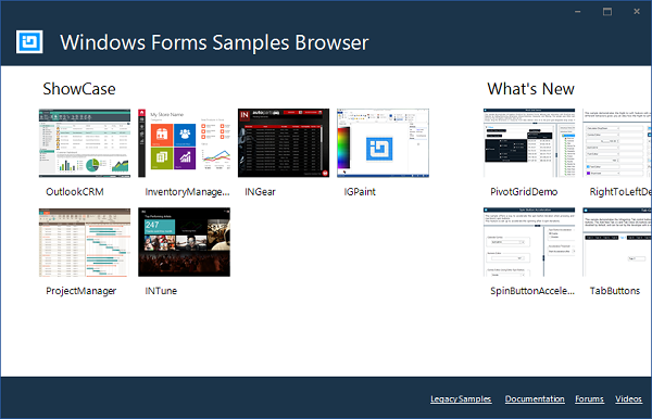
Infragistics Template Gallery
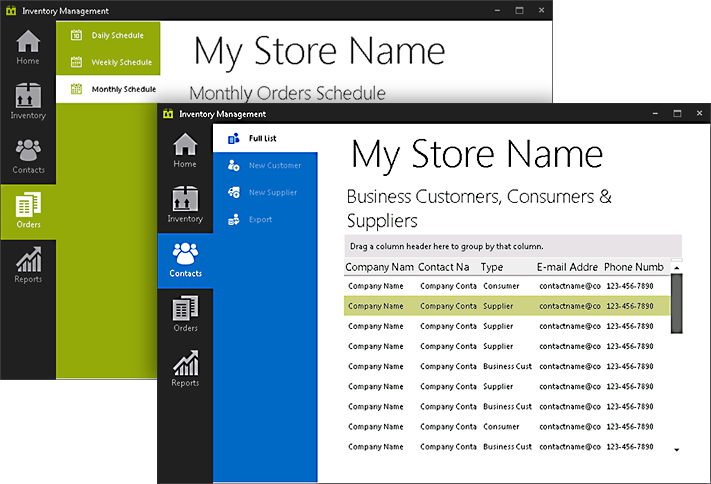
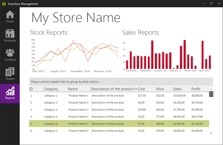
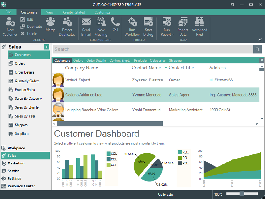
You can now find a new set of Infragistics templates in the File - New Project dialog of Visual Studio. These templates are designed to help you get started with a functional, well-designed, and fully-styled application. We have templates for all platforms that target all kinds of application scenarios such as dashboards, inventory management, project management, and Outlook inspired applications to name a few.

More templates will be added over time to address a wide range of application scenarios. If you have any suggestions for templates you’d like to see, be sure to let me know or submit them directly to the Product Ideas website.
Additional Features
Besides all of the major controls and features I described above, we have also added a number of smaller, yet still important, features to some other controls. Here are some of the other features that are worth highlighting in this post.
XamDataTree – ActiveDataItem
The xamDataTree got a property that everyone has been screaming for. I would like to introduce you to the new xamDataTree.ActiveDataItem property. You can now data bind a property in your ViewModel to the currently active item in the xamDataTree. It is amazing what a single property can do for you.

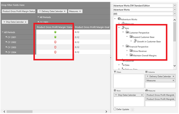
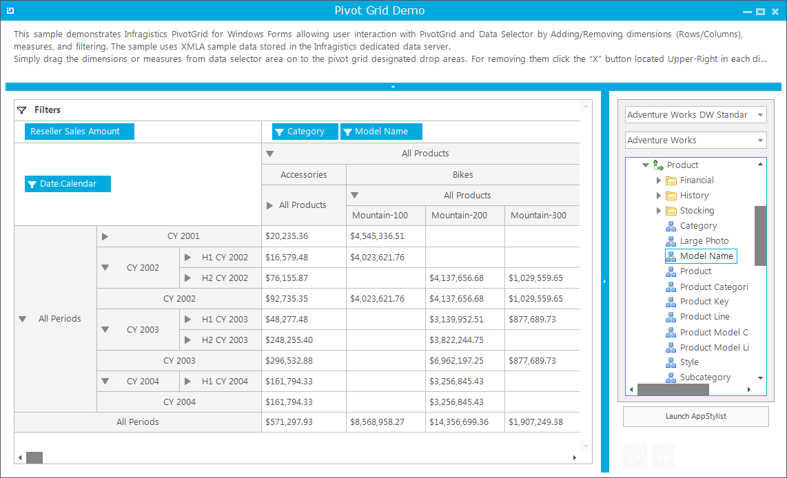
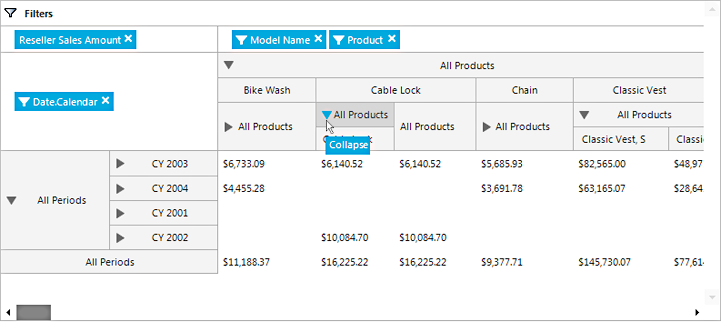
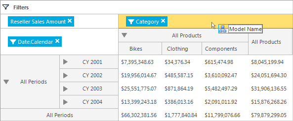
XamPivotGrid – KPI Support
The xamPivotGrid now gives you the ability to visualize and monitor your measured key performance indicators (KPI) directly from your online analytical processing (OLAP) cube. You can easily define your very own custom KPI images by using simple data templates using pure XAML. Go ahead, and feel free to visualize your product sales KPIs for each fiscal year.

IME Support
We didn’t forget about our global, non-English speaking, customers. We put a lot of effort into making sure that you can use our xamSyntaxEditor and xamRichTextEditor no matter what language you speak by adding IME support to both controls. Don’t think we just slapped this feature on. Heck no! Our IME support embeds active compositions directly into the text area, rather than the less desirable ‘overlay window’ approach that is often seen. This allows the user to watch the content being “re-flowed” as compositions are entered. Now, no matter what keyboard language you are using, our IME editor will display language specific options for you to use while editing content within the xamSyntaxEditor and the xamRichTextEditor.

Excel Library – Protect Workbooks
Lastly, due to popular demand, we have added the ability to protect an Excel workbook to our Excel Library. There have been a number of new properties and methods, and method overloads added to the Excel Library that give you full control over providing encrypt passwords and protecting workbooks. Requiring a password to open a workbook is as easy as calling the Workbook.SetOpenPassword(password) method and passing in your password. Want to write protect the workbook? No problem, simply call the Workbook.SetFileWriteProtectionPassword(password) method ad provide your password. Even if you created and protected the workbook in Microsoft Excel, our Excel Library will be able to open and unprotect that workbook if using a valid password.
Let’s Wrap this Baby Up!
Are you still with me? Wow, that was a lot to cover. Your eyeballs are probably exhausted from reading all that awesomeness! Besides all of the great controls and new features I mentioned in this post, we are delivering much more that I didn’t get a chance to talk about. We have tons of other smaller features, and bug fixes, and performance optimizations that we are part of our newest 14.1 release.
I hope you are as excited about this release as I am. As you have probably noticed, things are changing at Infragistics, and your voice is louder than ever. If you have ideas about new features we should bring to our controls, important issues we need to fix, or even brand new controls you’d like us to introduce, please let us know by posting them on our Product Ideas website. Follow and engage with us on Twitter via @infragistics. You can also follow and contact me directly on Twitter at @brianlagunas. Also make sure to connect with our various teams via our Community Forums where you can interact with Infragistics engineers and other customers.
If you are not using our WPF or Silverlight controls yet, remember that a free evaluation download is only a click away.
Lastly, when you do build something cool with our controls, please make sure to let us know.
![]()


