Quantcast
Channel: Infragistics Community
Viewing all 2223 articles
Browse latest View live

UXify 2016 Conference Follow-Up

$
0
0

Infragistics’ 4th annual user experience, UXify, took place this past Saturday, 9 April 2016 at our global headquarters in Cranbury, NJ. It was a fantastic event filled with presentations from thought leaders with unique perspectives on UX, design, and the process that underlies the creation of useful, beautiful experiences.

If you were able to join us, please accept my thanks. If the cold and rain (and in nearby Philadelphia, snow!) kept you home, I hope we’ll get to see you next year. You want to miss such an excellent opportunity to network, share knowledge and experience, and gain new insights in fields ranging from UX Architecture, UX Design, UI Development and more.

We will be publishing videos of almost all the talks in the coming weeks, so stay tuned to the Infragistics UX blog page to make sure you don’t miss them!

In the meantime, take a look at some photos from the event!

IMG_3104IMG_3105IMG_3106IMG_3107IMG_3108IMG_3109IMG_3110IMG_3111IMG_3112


Are mobile UIs as good as they can be?

$
0
0

How did you feel the last time you downloaded a poor-performing mobile app? What was your reaction; how long did you put up with it? Perhaps you found yourself getting lost, maybe you couldn’t find out how to go back or forward, maybe it just wasn’t clear how to navigate through the app itself. We’ll bet good money that you deleted it straight away – or left it sitting somewhere in the background of your phone never to be used again.

80% of apps only ever get opened once, and even the most forgiving users won’t continue to use a poorly designed app:

Source: Digital Trends

Digital Trends report that any issues – such as freezing, crashing, slow launches or simply not living up to expectations - will turn users off even the most useful apps. And, in a world where around 85% of apps are only ever opened once, tools need to be bug free as well as immediately engaging. No one said being a developer was going to be easy!

If these statistics are anything to go by, there are a lot of apps out there that are clearly letting themselves down with a poor UI. And because users are aware there is normally an alternative to your tool out there, you often have just a few select moments to impress with a sleek and smooth User Interface. First impressions really do matter with apps, so if you want to please clients and engage their customers, it’s valuable to spend a little more time learning about UI. Not every development team has a dedicated UI design expert, but with a bit of testing, a bit of observation and a bit of research, anyone can improve their UI skills.

In today’s post, we’ll be drawing on neuroscience (and the work of Dr. Susan Weinschenk) to better understand how the human brain interacts with mobile apps, and reveal some valuable insights into how you can make UI a lot better.

Sexy chocolate kills

The human brain has various levels on which it makes decisions, including the emotional brain and the ‘old brain’ – the most instinctive part of the organ. The old brain is responsible for a huge amount of our unconscious processing, and is interested in two things: survival and propagation – which can be roughly translated to ***, food and danger (hence ‘sexy chocolate kills’). It’s very easy to grab hold of an app user’s attention by appealing to the old brain or the emotional brain (which is particularly affected by pictures of people and by stories).

The lesson here? Grab your user’s attention from the word go with an engaging message which strikes an instinctive or emotional note. Tell a story, show a picture of happy, smiling people, highlight the risks of not using your app; or show how it’s going to make them healthier, happier and better looking.

People are lazy

And you are too! Most developers are just like everyone else; they want to do the bare minimum to get the job done. However, the bare minimum just isn’t enough with UI. People will give up on your app if it forces them to remember things or if they have to do lots of additional work to get something done. Think of some of the most wildly popular apps out there: you can order an Uber cab in just a few taps or find a date on Tinder in a couple of swipes.

The lesson here? Make your app as easy to use as possible. Get rid of any information that isn’t necessary, remove any steps which confuse matters, ask your users to do as little as possible to achieve as much as possible. Use visual cues and stick to usability best practices: give users control, flexibility, consistency, updates, recognition over recall and avoid errors (among others).

LOOK AT ME!

The human brain is programmed to pay attention to anything that is different or novel (and fills gaps when it comes to things which it has come to expect). Something that is different or striking will stand out and users are much more likely to come back to it.

The lesson here? Grab people’s attention by hooking all their senses (…well, as many as you can) from a mobile phone screen. Give them music, beeps, flashing colors, bold and distinctive fonts or unusual tones.

There must be a reason Facebook got so big…

Humans are the most social animal in the history of the planet. We depend on others, we look to learn from our peers and people we regard as influential. When we do things together it bonds us and releases positive chemical reactions in the brain. If we’re asked to do a favor, we’re also reciprocal and unconsciously expect something back. When we’re confused we seek information from others.

The lesson here? Accentuate the social side of your UI. If you’ve developed a game, introduce competition with friends or a leader board. If you’ve provided a restaurant recommendations tool, include reviews from other users. If you’re asking someone to fill in a form, promise to give them something back in return.

There’s a lot that developers can learn from psychology about how to create truly engaging apps. In a world where close to 90% of apps are only ever opened once, there’s a lot of space for improvement, so those who design the best apps can expect the biggest returns.

Build native and cross-platform applications that shine on any mobile device. Download Infragistics UI controls for iOS, Android or Xamarin.Forms today and start creating great mobile experiences!

What’s New in Infragistics WPF 16.1

$
0
0

Wow… is it 2016 already?  It seems just like yesterday I was talking about all the great stuff we did in the last 15.2 release of Infragistics WPF.  Now, it’s time to see all the goodies we have been working on over the last few months since.  Well to be honest, in 16.1, we really out did ourselves.  We added some of the most mind blowing, face melting, eye popping features that will make you want to slap your mama!  In order to prevent your heart from stopping, I’ll start slow and then work my way up to the coolest feature.

Gauge Needle Dragging

First up is a small, but very useful, feature for both the xamLinearGauge and xamRadialGauge controls.  The gauge controls have always been a popular, and simple way, to visualize certain types of data.  If you have used these controls, you know that they even have a nice little needle element that allows you to indicate a value on the scale.  This is really helpful.  The problem is that while they look great and those needles do their job of pointing out the value, your first instinct in interacting with the control is to use your mouse to click and drag the needle position.  You soon realize that YOU CAN’T!  Say what?  You’re kidding right?  I’m serious as a heart attack.  The needles did not have built-in functionality to be dragged and repositioned.  I mean, technically we had a sample in the WPF sample browser that you could copy and paste about 100 lines of code to do it manually, but that’s just crazy.

Thankfully, we has some customers report this to me and we got it fixed.  You can now set the brand new IsNeedleDraggingEnabled property to enable needle dragging by interactively dragging the needles using the mouse to indicate new values.  You can now rest easy knowing that you will no longer have the red mark on your forehead from your palm every time you want to add needle dragging to the WPF gauge controls.

gauge-nedle-dragging

XamTabControl Tab Dragging

Another reason you may have a red mark on your forehead from face palming, is the fact that our xamTabControl doesn’t support the ability to click and drag a TabItem with your mouse to reorder it.  I mean, come on… this is the year 2016 right?  This is standard tab control stuff we’re talking about here.  Why didn’t we have this feature earlier?  Good question!  Heck, even I didn’t even know this.  I just assumed it had it this whole time.  Once again, a customer reported this limitation to me, and we got it fixed!

As of 16.1, if you’re using the xamTabControl, you can now reorder tab items by clicking and dragging a tab item with your mouse to a new position. To enable this feature, simply set the TabDragMode property to the desired behavior.

The TabDragMode has three options:

  • None – dragging is disabled. (this is the default behavior)
  • Deferred – dragging is deferred until the tab is dropped. You’re shown a visual insertion indicator while you are dragging the tab.
  • Immediate – tabs are reordered while the tab is being dragged. Tabs are shifted to the left or right to indicate the new position of the tab being dragged.

tab-dragging

Right about now, your forehead should start feeling much better.


XamDataGrid Improvements

Ahhhhhh… the data grid!  Just about every developer that has ever written an app knows that the data grid is the heart of all line of business applications out there.  It is by far the most widely used control in our industry.  So it should be no surprise that every release of Infragistics WPF will include updates to our xamDataGrid to help make your life easier.  I had some great conversations over the last few months with customers to find your pain points in the xamDataGrid’s editing experience, the limitations you face laying out your fields (columns), and hearing the screams of anguish trying to load even more and more data into your applications.  You let me know where we could help, and that’s exactly what we did.

Auto Edit Mode

Since the first release of the xamDataGrid, its editing behavior has been pretty much remained unchanged.  Select a cell and press F2, or double click, in order to enter edit mode.  While this works, it is not always the most intuitive approach to editing.  A lot of apps require a much richer, some would say easier, editing experience that is closer to how Microsoft Excel works.  Right now, the editing experience is a little annoying.  What you want to do it select a cell, and start typing.  BAM, you’re editing!  No double clicking… no F-keys… no hassles!  Well keep your fingers off those “F’n” keys!  In 16.1, we have added a new property to the xamDataGrid FieldSetting object called IsAutoEditModeEnabled. When IsAutoEditModeEnabled is set to true, you can select a cell and just start typing.  BAM!!!  You’re in edit mode in a blink of an eye!  Editing, tabbing, committing changes all without having to click a mouse button.

xamdatagrid-auto-editing

Field Grouping

So we got our editing in check.  You’re cruising right along.  Now we need to address another issue you guys told me about.  Grouping your fields!  I got an email from a customer asking, “Brian, why can’t I group my fields so that I can make more sense of the data and show how it’s related to the other fields in the xamDataGrid?”.  I’m like, “What do you mean?  Show me!”.  So they did, and it made total sense.  Once I say what they wanted to achieve, I was like “let’s do this!”.

So we did!  In 16.1, we added the ability for you to create field groupings which allow you to group multiple fields together under a single common header. This allows your end user to quickly see which field falls under similar categories.  We actually had to change the way we defined FieldLayouts all together.  Now, don’t worry… we didn’t break you, but we did change the API to support this.  We added a brand new property called FieldItems which now accepts both Field objects (TextField, ComboBoxField, NumericField, etc.) as well as a new FieldGroup object.  If you are using the FieldLayout.Fields property, your app will still work, but going forward you should be using the new FieldItems property to add Fields and FieldGroups to.

image

So what can you do with these FieldGroups besides group your fields together?

  • Nesting - grouped fields can be nested within each other infinitely. Meaning that you can have a parent grouped field which contains other grouped fields.
  • Moving - grouped fields can be moved to a new position as a whole, or you can move individual fields within a group. (Note: by design we don’t support dragging a Field or FieldGroup outside of its parent group or into any other group.
  • Pinning - you can pin a grouped field so that its position does not change as you scroll the xamDataGrid. (Note: By design you can only fix Fields or FieldGroups that are at the root level, i.e. they don’t have a ParentGroup.)

Oh, and one more little feature that is pretty freaking cool.  When we completed this feature, the customer was like “Dang son… this is sick!  Do you know what would be even better?”, and I’m like “what’s that?”, and they said “if we could collapse the field group to hide all the child fields, but have an option to show only select fields”.  I though about it a little and said, “hell yeah, that would be awesome”.  So we did that too!

  • Collapsing – Field groups allow you to display an expansion indicator that will collapse a field group to show less detail. It essentially hides all the fields in the collapsed grouped field. This comes in handy when you have many grouped fields and need to de-clutter the view. You can also control which fields remain visible when collapsing a group.

xamdatagrid-fieldgroup-collapsing

Virtualized Data Source

While those features are cool and all, we have something even better up our sleeve.  I met with a customer one day, and they were having a hard time loading data from their OData service asynchronously, and having the xamDataGrid stay responsive, and continuously load data as they scrolled.  The problem was that they had literally millions of records being served up by this OData feed, but obviously they didn’t want this data loaded all at once in the xamDataGrid.  So we chatted about it for awhile and thought, “hey, why don’t we create a virtualized data source that will let you simply point it at an OData service, set how many records you want to bring down at a time, how many records you want to cache, and just bind that to the xamDataGrid.  Then, the xamDataGrid could do all the work for you and asynchronously load the data as you scroll it?”.  So that’s exactly what we did!

I am really excited to announce that in Infragistics WPF 16.1, we are shipping a brand new data source that will give the xamDataGrid (xamDataPresenter) the ability to asynchronously load data from an OData service. This means that data can now be loaded on a separate thread to keep the UI responsive. The data will appear in the grid as soon as it has been fully loaded regardless of scroll position.  The best part, is all you have to do is point it at an OData feed.  That’s it.  You’re done!  Now, for the initial release, we will only be shipping support for OData services. Simply point the data source to an OData service URI, set the entity set, request your fields, set your page size, and you’re off to the races. The virtual data source and xamDataGrid will do the rest.  I know you want more types of data sources, but we just didn’t have time.

xamdatagrig-virtualized-datasource

but wait…. there’s more!

The best part about this new virtual data source is that it is completely open source and available for download on GitHub.  

https://github.com/Infragistics/DataSource-Reference-Implementations  

Not only is the source code for the OData virtual data source available for download, but we also provide sample applications demonstrating how to use them in your applications. You can use this OSS project to submit improvements, and add support for other data sources and clients that you need, but we don’t currently support.  

Also, I would like to mention that while the default appearance of data that has not been loaded is a simple gray overlay bar, you can customize this and provide any overlay color you would like so that it aligns with your application theme and styles. You also have the ability to respond to the state of the data being loaded to show a custom loading indicator such as the xamBusyIndicator to give the end-user a visual indication that an asynchronous operation is being executed. Simply use the xamDataGrid.IsAsyncDataPending property to check the state of the data loading process.

A New 3D Surface Chart

While I know your brain is still trying to recover from the previous feature announcements and may still have a feeling of numbness, it’s time for sensory overload!  The brand new xamScatterSurface3D chart.  That’s right!  This was the number 1 most highly voted for idea on our Product Ideas website.  Not only was it the most highly voted idea, we had more customers email us about this than any other feature request.

This new xamScatterSurface3D chart is perfect for those scenarios where you need to visualize price volatility plots I the financial services industry, instrument measurement, and equipment testing, process simulation, modeling, and monitoring applications.  Basically anyone building specialized hardware for use in biotech, materials science, component testing would need such a surface plot to visualize multivariate data from testing/measurement.  I mean, this thing is sick!

image

Even though it’s a V1, this control has it all.

  • Surface Area Series Support – this is the single series type available in the control, which allows mapping of any x/y/z value set, such as terrain mapping, price volatility plots, etc.
  • Zooming – uses scaling to enlarge or shrink the surface chart
  • Touch support – the control uses standard touch gestures to initiate operations such as rotation and zooming.
  • Chart Surface Texture customization– allows more control over the material of the surface, from material used to color properties.
  • Tooltips – mouse tracking to show data, related to the currently hovered point.
  • Rotation – allows rotating the surface along all three axes – X, Y and Z.
  • Gridlines– horizontal and vertical gridlines along all sides of the Surface Cube for better usability and pointer tracking, when crosshairs are enabled.
  • Data Pint Markers – enable customizable data point markers for each point in the surface. Each marker is customizable to allow shape and template customization.
  • Crosshairs – allows matching of mouse position over the sides of the Surface Cube.
  • Color Palettes – offers a set of predefined color ranges, which can be modified and applied to the value ranges on the surface.
  • Axis labels – supports an array of features, related to the labels along the axes – step, formatting, customization, styling and templating.

You really have to download the WPF Sample Browser and play with this thing.  It’s an awesome 3D chart control.  Honestly, this is one of the few types of charts where 3D actually makes sense.  Most of the time, 3D charts are a novelty control that add no value to your data.  As you can see, that is not the case with the one.

Let’s Wrap this Baby Up!

I hope you are as excited as I am about these new controls and features.  As you can see, your feedback played a vital role in this 16.1 release of Infragistics WPF.  Every one of these features was because you let us know what you wanted and needed in order to be successful. Everything from fixing annoying things like needle and tab item dragging, to creating an entirely new 3D chart control.  Besides all the new features I mentioned in this post, we are delivering much more that I didn’t get a chance to talk about.  We have tons of other smaller features, and bug fixes that are part of our newest 16.1 release.  

If you have ideas about new features we should bring to our controls, important issues we need to fix, or even brand new controls you’d like us to introduce, please let us know by posting them on our Product Ideas website.  Follow and engage with us on Twitter via @infragistics. You can also follow and contact me directly on Twitter at @brianlagunas.  Also make sure to connect with our various teams via our Community Forums where you can interact with Infragistics engineers and other customers.  

If you are not using our WPF controls yet, remember that a free evaluation download is only a click away.

Lastly, when you do build something cool with our controls, please make sure to let us know.

What's New in Windows Forms 16.1!

$
0
0

With more than 100+ controls, Infragistics Windows Forms is the most mature, fully-featured Windows Forms Product on the market. With features that cover every aspect of enterprise software development including Microsoft Office Style user interfaces, high performance charting, and full modern experiences with touch & gestures. With this release, you will see our continued commitment and investment in Windows Forms, we recognize that it is by far the most widely used .NET platform for enterprise scale apps that target the desktop. Our goals and themes remain the same for the Ultimate toolset, and Windows Forms is a major part of this story:

  • Touch Everywhere, Office Inspired Apps on Every Platform
  • Deliver Outstanding Experiences with Awesome Branding and Styling
  • Developer Productivity Across Every Device, Every Platform

Overall, we had an emphasis on quality for 16.1, which means improving existing features, RTM'ing features that were previously CTP, and polishing your developer experience using the product.

I'll highlight each area of focus for 16.1.

UltraSpreadsheet - RTM


What was previewed as a CTP in 15.2, was perfected in 16.1 with the following additions.
  • Cell Formatting
    • Fonts –double underline and accounting
  • Page Layout
    • Worksheet Background
  • Shapes
  • Touch support
  • Touch Context Menus
  • Mouse and Touch Panning
  • Change Notifications
  • Description/Category Attributes
  • Dialogs => shown through igExcel Showcase sample
The UltraSpreadsheet control allows visualizing and editing of spreadsheet data, represented by the data model supported by the Infragistics Excel Engine. The following screenshot shows the UltraSpreadsheet control displaying some spreadsheet data:
Spreadsheet

DataVisualization


UltraPieChart

The UltraPieChart™ is a specialized control that renders a pie chart, consisting of a circular area divided into sections. Each section has arc length proportional to its underlying data value.
UltraPieChart

UltraDoughnutChart

The UltraDoughnutChart™ control is similar to the UltraPieChart™ –proportionally illustrating the occurrences of a variable or multiple variables in concentric rings. The following screenshot shows the UltraDoughnutChart control displaying some data:
UltraDoughnutChart

UltraRadialGauge

The UltraRadialGauge™ control is a data visualization tool capable of displaying a gauge containing a number of visual elements, such as a scale with tick marks and labels, a needle, and a number of ranges. Create a scale by supplying MinimumValue and MaximumValue values and point the needle to a value by setting the Value property. The gauge also supports ranges providing visual cues for the scale.
UltraRadialGauge

Barcode

Industries have created standards around barcode technology such as creating barcodes that provide capabilities unique to their industries. The vision for the Barcode™ control is to provide you with a control that is capable of rendering on screen barcode images that conform to the various widely adopted barcodes standards; this control abstracts much of the process and detail of barcode creation from you, allowing you to easily embed data in barcode format into your applications. The Barcode™ control provides support for the following barcode symbology:

UltraCode128BarCode

Code128Barcode

UltraQTCodeBarCode

QRCode Barcode

User Voice Requested Features


New features for the UltraGrid

Collapsible Column Groups

The UltraGridGroups collection supports ExpansionIndicators, allowing the user to hide all columns assigned to them. This improves the readability of your grid by allowing users to quickly prioritize information most relevant to them.

Column Header Collapse

ChildBand Rows Expand/Collapse indicators

The UltraGrid supports BandExpansionIndicators at the header of each child band, allowing for collapse/expand funcitonality on each child band. This improves ease of navigation between sibling bands with large data sets and reduces information clutter on the UI.

ChildBand Collapse

AutoEditMode

The AutoEditMode property is used to specify whether typing a displayable character will automatically enter edit mode on the active cell and process that character as though the cell had already been in edit mode. This allows the user to select or activate a cell (which is not in edit mode) and begin typing immediately to edit the contents of the cells, instead of having to explicitly enter edit mode via a separate keyboard action (like pressing F2).

Additional RTL support


UltraTabControl & UltraTabStrip Control

The Right-to-Left mode in the UltraTabControl & UltraTabStripControl applies to the tabs and their corresponding position at the top of the control.

Summary

I hope you are as excited as we are about these new controls and features. As usual, your feedback played a vital role in the 16.1 release. If you have ideas about new features we should bring to our controls, important issues we need to fix, or even brand new controls you’d like us to introduce, please let us know by posting them on our Product Ideas website. Follow and engage with us on Twitter via @infragistics. Also make sure to connect with our various teams via our Community Forums where you can interact with Infragistics engineers and other customers. And as usual, shoot me an email at jasonb@infragistics.com if you have any questions, comments or feedback.

Infragistics Android 16.1

$
0
0

It’s no secret that mobile development is all the rage right now.  Every conference, user group, pod cast, blog post, and chats by the water cooler involve some form of mobile topics.   In the beginning, HTML5 was the technology that got all the attention.  It was often talked about as if it were the tech that ruled them all.  While trying to target all device types with HTML5 sounded like an easy win, it has been proven that HTML5 is not the silver bullet everyone was hoping it would be.  Instead, native mobile development has been given an adrenalin boost as companies move away from their HTML5 mobile apps, and instead replace them with full blown native implementations to take full advantage of the device the apps are running on.  While Infragistics has always supported our web devs with our award winning web products, we recognize that HTML isn’t always the answer.  This is why Infragistics is committed to bringing you our industry leading UI controls from desktop and web, to native mobile for Android and iOS.  Now you can get the performance of the desktop and the reach of the web in the palm of your hands.

What exactly do you get with Infragistics Android 16.1?  Well, let’s take a look shall we…
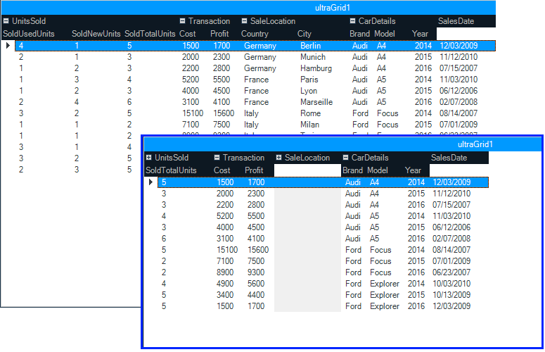
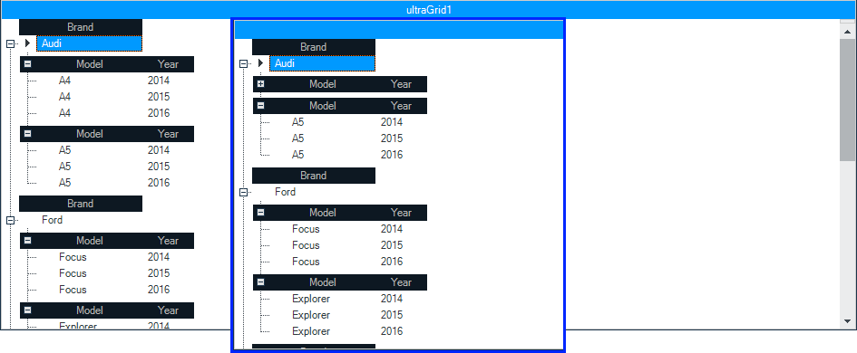
Data Grid

First up, is our brand new Android data grid written from the ground up to allow us to take advantage of everything that native mobile has to offer.  Even though this is a v1 release of our data grid, it has a ton of features that you can start taking advantage of right now.  Everything form the basics of column definitions, to sorting, filtering, responsiveness, and even async data loading.  This data grid has  some great features that will take your Android apps to the next level.

Columns

Every data grid has to have columns, and the Infragistics Android data grid is no different.  Create a grid with auto-generated columns or define the specific column types from our built-in columns: Text, Numeric, Image, DateTime, and Template.  All columns’ cells and headers can be configured by setting text properties like text color, font size, background color, alignment, and width just to name a few.  Of course, each column type has it’s own properties specific to its intended function, such as options for decimal places for the Numeric column, date/time formats for the DateTime column, and customizations for the Template column and many more.   I would like to mention that in this initial version of the data grid, all columns are read-only for now.  Editing is not supported just yet, but we’ll get it in there soon.

android data grid auto-generated columns

Sorting

The next no brainer is sorting.  You can’t have a grid and not have the ability to sort the data within that grid.  The Infragistics Android grid provides a powerful sorting API to give you full control of all your sorting needs.  You can provide single column sorts, or complex multi-column sorting.  You can provide a UI for your end-users, or choose to hard-code your sort.  You can choose a two-state sort or a three-state sort.  The choice is yours, and we give you everything you need to support your sorting requirements.  Besides you standard sorting of local data, you know… your data stored in memory on the device.  You can also sort data remotely on the server.  That’s right!  Put your server to work, not your app.  More on this later.

android data grid sorting

Filtering

Filtering is another one of those features that every grid just has to have.  Without filtering, a data grid is essentially use-less.  You have to have the ability to find the data you care about.  Otherwise, you might as well be looking through notes you wrote down on a napkin at lunch.  As with sorting, not only can you filter the data you have loaded in memory, but you can also filter your data on your server.  That’s right!  More work for the server to do, and less impact on your app performance and memory foot print.  All good things when creating an app for a mobile device.

android data grid filtering

Responsive

One of the most unique, and awesome features of the Infragistics Android data grid is it’s ability to respond to the size of the device.  This is known in the web world as being “responsive”.  Responsive Layouts allow you to react to scenarios in your application where horizontal screen real estate is significantly reduced, such as when a device is rotated from a horizontal to a vertical orientation.  In such cases retaining all of the columns in a visible state may impair both readability of data as well as reduce the aesthetics of your application (that means make it look like crap). Therefore, columns which display less critical information may be removed from view, while still displaying columns which contain the most relevant data.  This concept is popular among web developers and is their primary tool used for getting their HTML sites to play nice with mobile devices.

There are two general scenarios that the responsive grid layout is intended to be implemented with:

  • Purposely reducing the width of the current layout that contains the data grid control
  • Reduction of the width of the layout due to changes in orientation of the device as the result of its rotation, for example by rotating from a horizontal to a vertical position

The best part is, you have complete control of what columns show and when.  You can even combine this with the awesome built-in animation framework to create some really great and eye-catching visual experiences for your end-users.  Your imagination really is the limit to what you can do.

android data grid responsive layout

Virtual Data Source

I am personally really excited about this particular feature.  In Infragistics Android 16.1, we are shipping a brand new data source that will give the Android data grid the ability to asynchronously load data from an OData service. This means that data can now be loaded, sorted, and filtered on the server, and then loaded on a separate thread in your app to keep the UI responsive, without you having to do anything. The data will appear in the grid as soon as it has been fully loaded regardless of scroll position.  The best part, is all you have to do is point it at an OData feed.  That’s it.  You’re done!  Now, for the initial release, we will only be shipping support for OData services. Simply point the data source to an OData service URI, set the entity set, request your fields, set your page size, and you’re off to the races. The virtual data source and Android data grid will do the rest.  I know you want more types of data sources, but we just didn’t have time.

android-datagrid-virtual-datasource

but wait…. there’s more!

The best part about this new virtual data source is that it is completely open source and available for download on GitHub.  

https://github.com/Infragistics/DataSource-Reference-Implementations

Not only is the source code for the OData virtual data source available for download, but we also provide sample applications demonstrating how to use them in your applications. You can use this OSS project to submit improvements, and add support for other data sources and clients that you need, but we don’t currently support.   Heck, feel free to submit your PR so everyone can benefit from your newly created data source.

Data Chart

Next up is our Android Data Chart.  This control has been the power house of Infragistics for many years on other platforms.  Now, you can take advantage of the power and massive feature set provided by the Android data chart.  There are literally too many features to even fathom talking about all of them in this post.  So I will simply sum them up and you can go play with the data chart yourself.  Make sure you set aside a year or so to really dive in.  That’s just how many features we pack into this native mobile data chart.  The Android data chart comes with over 50 chart types including bar, column, line, area, spline, waterfall, point, OHLC, polar, radial, and many many more.  Besides a crazy number of supported chart types, there are an even larger number of features with each chart.  Crosshairs, legends, markers, panning, zooming, and much more.  Basically, the Infragistics Android data chart is the Chuck Norris of charts.  Nothing else needs to be said.

android data chart

Pie Chart

Who doesn’t like pie?  The main features of the Pie Chart include label configurations, like position and extent, label font properties, controlling pie radius, start angle, sweep direction, exploded slices and distance from center for exploded slices, selected slices, and legend. The ability to prevent the labels from colliding with each other or the slices.

android pie chart

Funnel Chart

A single series chart that displays data in a funnel shape with a variable number of sections each representing the data as different portions of 100% or to weight the height of the slices based on value. The Funnel Chart can be configured to be inverted, to use Bezier Curve for its shape or weighted slices.

android funnel chart

Gauges

Radial

The Radial Gauge contains a number of visual elements, such as a scale with tick marks and labels, a needle, and a number of ranges. The Radial Gauge has different label configurations, like color, extent, and interval. Radial Gauge has different range properties, like color, start and end value. The needle of the Radial Gauge can be configured by setting its color, needle and pivot shapes and outlines. The transitions between different sets of settings can be animated.

android radial gauge

Linear

The Linear Gauge is useful for showing a single measure on a linear range. It has different label configurations, like color, extent, interval, and position of the first and last labels. The needle of the Linear Gauge can be configured by setting its color, outline, shape, size. The transitions between different sets of settings can be animated.

android linear gauge

BulletGraph

The Bullet Graph displays a single primary measure and compares it to one or more other measures to create a concise data visualization. It supports a variety of configurations, e.g. orientation, scale, tick marks, ranges and colors along with animated transitions between different sets of settings.

android bullet graph

Barcode

If your app needs a barcode, well look no further.  Code 128 and QR codes are the most common barcodes for mobile apps.  So we figured these would be the first set of barcodes we deliver.  Don’t worry, we’ll have more in a future release, but these should get you going.

Code 128 Barcode

Code 128 Barcode can be used in inventory, shipping and distribution applications. The Code 128 Barcode has different configurations, like label’s color and font, background color, and stretch.

android code 128 barcode

QR Barcode

QR (Quick Response) Code Barcode can be used in commercial tracking, entertainment and transport ticketing, product marketing applications.

android QR barcode


What about iOS?

Right about now you are probably saying to yourself, “Wow Brian, your Android product melted my face off with awesomeness, but what about iOS?  I want to bring my Android app to iOS, but I need the exact same controls and features.  Do you ship the same controls on iOS?”  Well, I’m glad you asked!  One of our main goals in delivering high performing, feature rich, and drop-dead gorgeous native mobile controls to you is consistency.  Consistency in available controls.  Consistency in API’s.  Consistency in features.  Consistency in end-user experience.  Consistency in your satisfaction no matter what platform you are developing for.  We want to make sure that if you are using Infragistics Android, and then want to bring your app to iOS, you will have the exact same controls, features, and development experience across both platforms.  When we write a control for Android, we make sure to bring that control to iOS.  This is core to our mobile strategy.  We want to make sure that you are never limited when bringing your native mobile apps to all available platforms.  We even provide Xamarin bindings for all of our native Android and iOS controls so that you can write cross platform native mobile apps using C# and Xamarin.  You really have no excuse not to write awesome cross platform native mobile apps with Infragistics Android and iOS controls.

Let’s Wrap this Baby Up!

I hope you are as excited as I am about the Infragistics Android 16.1 release.  I know there is a lot in this post, and thanks for hanging in there with me.

If you have ideas about new features we should bring to our controls, important issues we need to fix, or even brand new controls you’d like us to introduce, please let us know by posting them on our Product Ideas website.  Follow and engage with us on Twitter via @infragistics. You can also follow and contact me directly on Twitter at @brianlagunas.  Also make sure to connect with our various teams via our Community Forums where you can interact with Infragistics engineers and other customers.  

If you are not using our Android controls yet, remember that a free evaluation download is only a click away.

Lastly, when you do build something cool with our controls, please make sure to let us know.

What's New in Ignite UI 16.1!

$
0
0

We are pleased to announce the release of Ignite UI 16.1! This release continues our investment in modern app development for HTML on mobile, tablet & desktop browsers. In 16.1, we’ve added support for Angular 2 Beta, Bootstrap 4, we’ve done a ton of work in Typescript enhancements across controls and we’ve invested in updates across the board in major controls. Let’s go through what’s new in 16.1!

Angular 2 Components

Arguably the biggest feature in 16.1 is support for Angular 2 components for Ignite UI controls. Like our Angular 1 directives, we’ve made our Angular 2 components available on Github for immediate availability. With the Angular 2 components come full TypeScript support. You can grab the Angular 2 components here and start using them today. Once Angular 2 comes out of beta, we’ll update Github to ensure everything works as expected. Keep in mind though Angular 2 is still beta, we fully support our components and will update them along the way as Angular 2 nears release. As with anything new as big as this, make sure to keep the feedback and commentary flowing back to us, we are committed to have the best Angular 2 components on the market.

igGrid

the grid continues to see investment. It is the most widely used control in the toolset, and your feature requests continue to drive the backlog. In 16.1, we’ve made improvements in key areas.

  • New column option - mapper - For columns with dataType="object" we now allow setting a mapper function, which can be used for complex data extraction from complex objects, whose return value will be used for all data operations executed on the specific column.
  • The ColumnFixing feature now works with grid width set in percentage.
  • Multi-Row Layout - enables you to create complex grid record layouts, that contain multiple rows with cells in them spanning multiple columns and rows. Such structure allows for greater rendering flexibility for grids with many columns that would otherwise require a horizontal scrollbar or when the data shown is better presented in a non-tabular fashion. Initializing the Multi-Row Layout is done entirely through the igGrid's column collection. Four new properties are added to the column definition that specify the position and size of the column - rowIndex, columnIndex, rowSpan and colSpan.

    • Checkbox Appearance - Checkbox column visual appearance have changed and it's square box is not going to be rendered when the grid is in display mode. What would be provided is only a plain checkmark. This change is due to refinement of the experience for the end-users, who naturally perceived that this was an interactive element, which they can click to toggle.

      • Paste from Excel sample - A new sample is added that demonstrates pasting Excel clipboard data into igGrid

      igTreeGrid

      When you have hierarchical data that needs column headers for each child level aligned with the parent columns. In 16.1, we improved the updating feature - the "Add new row" user interface is now enabled and along with it TreeGrid Updating supports adding new records not only directly to the root level, but also adding a child records to a specified level as through the UI, as well through the API. The "Add child row" button is available next to the "Delete row" button when a row is hovered with the mouse or swiped left or right when on

      The add new row UI is rendered inline next to its parent

      igTileManager

      splitterOptions now replaces the showSplitter option. Besides showing and hiding, additional functionalities are added. You can configure the splitter to be collapsible as well as attach to its collapsed/expanded events. SinceshowSplitter option will no longer be available

      igDataSource

      Related to the same feature on the grid column, a new field option –mapper - for field with dataType="object" we now allow setting a mapper function, which can be used for complex data extraction from complex objects, whose return value will be used for all data operations executed on the specific field

      TypeScript Support

      • Support for union types - widget members now support union types which greatly improves type checking. Union types introduced in TypeScript 1.4 allows for a variable or a member to have one of a set of several types. Previously members that were declared as type any now use union types to declare a more specific type.

      • Intellisense improvements - Intellisense is improved for options and methods to suggest all widget`s overloads.
      • Member descriptions - All members now have a description.

      Summary

      I hope you are as excited as we are about these new controls and features. As usual, your feedback played a vital role in the 16.1 release. If you have ideas about new features we should bring to our controls, important issues we need to fix, or even brand new controls you’d like us to introduce, please let us know by posting them on our Product Ideas website. Follow and engage with us on Twitter via @infragistics. Also make sure to connect with our various teams via our Community Forums where you can interact with Infragistics engineers and other customers. And as usual, shoot me an email at jasonb@infragistics.com if you have any questions, comments or feedback.

      Mobile Performance Testing - JSON vs XML

      $
      0
      0

      Introduction

      It doesn't matter if you're loading a configuration file, data set or even something obtained from a website to use as a data source, there is a performance tradeoff you'll encounter because of the processing time that occurs while parsing JSON or XML. This blog post covers how well loading and reading JSON & XML files using native APIs perform on iOS & Android.

      Test Files

      To test performance the SouthWind data set was used for JSON and XML. Both data sets are of roughly the same size, 1.3mb, and contain the same information. Source code used for the performance is provided below. The source for each project is quite generic and simply loads the data set file and reads all the employees into an array. All of the timing information is output through log statements.

      Android

      For XML loading and reading the DocumentBuilderFactoryDocumentBuilderDocument and NodeList classes were used. For JSON loading and reading the JSONObject and JSONArray classes were used. 

      Testing was done using a Kindle Fire HDX 7" tablet. The results on Android greatly varied on each run, but JSON was the faster choice by 300 milliseconds and even up to more than a second of processing time.

      Android

      iOS

      For XML loading and reading the NSXMLParser class was used. Because of how NSXMLParser is used it required created a separate class and adopting the NSXMLParserDelegate. For JSON loading and reading the NSJSONSerialization class was used for creating an NSDictionary from the JSON. 

      Testing was done using an iPad 3. The results on iOS were consistent throughout the run and provided JSON quite the edge over XML by more than a second for each of the runs.

      iOS

      Conclusion

      As you might of guessed JSON APIs are a lot faster at loading and reading compared to XML APIs. Picking which option to use requires you to look at the entire solution you're working toward. For example, a lot of companies make use of XLST transformations with their XML which can be very powerful. If you're app doesn't need a format with a lot of overhead for extra search functionality & transformation, then JSON is the way to go. The open source community has really done a great job extending what's possible with JSON.

      By Torrey Betts

      UltraWebGrid to WebDataGrid Migration

      $
      0
      0

      It has beet a while since the introduction of the new ASP.NET controls based on the Aikido framework. It brought the developers a product meeting latest standards in performance and modern browser support. This turned into a major challenge for applications that need to migrate from the Ultra ASP.NET controls to the new Aikido control. We did our best trying to help developers and make the migration process as seamless as possible – we posted content on our blog, we introduced some useful resources like the Cheat Sheet that provides a quick-access guidance to the new features that were introduced in both ASP.NET AJAX grids, styling guide and all of these along with an ongoing support for the old controls. However, there are still developers that are yet to upgrade their applications due to the challenges of modern web.

      It has always been our mission to delight our customers and еаse their work, while trying to achieve great functionalities with the help of our products. To do this, and to assist them through the upgrading process, we will expand our documentations and we will emphasize on the most popular for ASP.NET WebForms toolkit – WebDataGrid and the WebHierarchicalDataGrid.

      This article aims to show you how to achieve a smooth transition from the old UltraWebGrid to the new WebDataGrid/WebHierarchicalDataGrid based on our Aikido framework. I hope that all documents referenced below will help you save time and energy while using our ASP.NET grids and improve your daily work with the Infragistics toolset.

      Let’s continue with new topics below, which aim to explain in more details how a feature could be implemented along with code snippets and explanations.

      When migrating to the WebDataGrid/WebHierarchicalDataGrid, you may not find 1-1 equivalence for some functionalities you’ve been using in the UltraWebGrid. In all of these cases the functionality is available in the new grid, but is achieved in a slightly difference manner. After all the new grid follows entirely different approaches for styling, back-end and front-end implementations, ajax capabilities, loading of data and a lot more! Also take advantage of our forum community, online samples and blogs, after all “Those who dare seek, shall find what they are seeking for”.

      Enough with the sweet talks, let’s see how to migrate to the following features:

      Some of the commonly asked questions that we get are “Should I migrate to the new WebDataGrid?”, “If I start to use WDG, would it be supported under IE 11 or even Edge?”, “Is it easy to maintain and extend grids functionalities?”. And the answer to all of them is simply, yes!  

      Our grid is supported by all browsers out there, using of each feature is intuitive, easy and will help you to achieve almost anything.

      In conclusion, don’t be afraid to implement something new, or to start using entirely different approach in order to achieve what you want.


      Design, Usability and Testing the User Experience

      $
      0
      0

      Members of the Infragistics design community have been invited to speak at the 3rd annual Testing UY conference on April 26-27 in Montevideo, Uruguay. 

      UX Workshop Banner

      Martín Loskin, UX Architect, Claudia Badell, Senior Quality Engineer and Diego Rivero, Helena Muñoz, Joanna Arnaiz, Santiago Aguiar and Patricia Duarte, Indigo Studio Design & Development Team, will be conducting a 4 hour workshop, Testing the User Experience.

      The workshop will cover:

      • Usability and user experience: an introduction to the concepts.
      • Usability Heuristics: an overview of the different heuristics and a hands-on exercise.
      • User Testing: quantitative and qualitative usability testing techniques with a focus on task-oriented testing and analytics.

      Richardson Keynote Presentation Banner

      Kevin Richardson, Director of User Experience, will be delivering the closing keynote address, Design, Usability and Complex Systems.

      Kevin’s presentation will answer the following questions:

      • How does complex software need to evolve in order to become truly innovative?
      • Why will this “evolution” usher in a new era in product development?
      • How can the risk associated with existing software development processes, such as Waterfall and Agile, be significantly lowered by following a Design process?


      Testing UY is a software testing professionals conference, held annually in Montevideo, Uruguay. Testing UY consists of workshops and lectures dedicated to sharing software testing experience and knowledge, exploring the latest trends in software development and test automation, new technologies and best practices as well as improving software quality.

      Developer News - What's IN with the Infragistics Community? (4/4-4/17)

      $
      0
      0

      Here we are with another edition of Developer News! If you're just joining the series, Developer News is a curated content series by YOU, the Infragistics Community! Based on our social media profiles, we share the most popular and informative content a second time, twice weekly, so you don't miss out on the good stuff!

      Here are this round's picks:

      4. Coding Inspiration: For Anyone Who Has Been Turned Down by 18 Companies (HackerRank)

      3. 18 Web Development Conferences to Attendin 2016: Be There or Be Square! (Usersnap)

      2. Machines that Learn to Code and Take Your Job (Dev.To)

      1. 6 Essential Tips for Getting Started as a JavaScript Developer (DebugMe)

      Silverlight Release Notes – 16.1 Volume Release

      $
      0
      0

      Release notes reflect the state of resolved bugs and new additions from the previous release. You wll find these notes useful to help determine the resolution of existing issues from a past release and as a means of determining where to test your applications when upgrading from one version to the next.

      Release notes are available in both PDF and Excel formats. The PDF summarizes the changes to this release along with a listing of each item. The Excel sheet includes each change item and makes it easy for you to sort, filter and otherwise manipulate the data to your liking.

      Download the Release Notes

      WPF Release Notes – April: 16.1 Volume Release

      $
      0
      0

      Release notes reflect the state of resolved bugs and new additions from the previous release. You wll find these notes useful to help determine the resolution of existing issues from a past release and as a means of determining where to test your applications when upgrading from one version to the next.

      Release notes are available in both PDF and Excel formats. The PDF summarizes the changes to this release along with a listing of each item. The Excel sheet includes each change item and makes it easy for you to sort, filter and otherwise manipulate the data to your liking.

      Download the Release Notes

      Silverlight Release Notes – March: 15.1, 15.2 Service Releases

      $
      0
      0

      Release notes reflect the state of resolved bugs and new additions from the previous release. You will find these notes useful to help determine the resolution of existing issues from a past release and as a means of determining where to test your applications when upgrading from one version to the next.

      Release notes are available in both PDF and Excel formats. The PDF summarizes the changes to this release along with a listing of each item. The Excel sheet includes each change item and makes it easy for you to sort, filter and otherwise manipulate the data to your liking.

      In order to download release notes, use the following links:

      Silverlight 2015 Volume 1 Service Release

      Silverlight 2015 Volume 2 Service Release

      WPF Release Notes – March: 15.1, 15.2 Service Releases

      $
      0
      0

      Release notes reflect the state of resolved bugs and new additions from the previous release. You will find these notes useful to help determine the resolution of existing issues from a past release and as a means of determining where to test your applications when upgrading from one version to the next.

      Release notes are available in both PDF and Excel formats. The PDF summarizes the changes to this release along with a listing of each item. The Excel sheet includes each change item and makes it easy for you to sort, filter and otherwise manipulate the data to your liking.

      In order to download release notes, use the following links:

      WPF 2015 Volume 1 Service Release

      WPF 2015 Volume 2 Service Release

      Xamarin Forms Release Notes – March: 15.1, 15.2 Service Releases

      $
      0
      0

      Release notes reflect the state of resolved bugs and new additions from the previous release. You will find these notes useful to help determine the resolution of existing issues from a past release and as a means of determining where to test your applications when upgrading from one version to the next.

      Release notes are available in both PDF and Excel formats. The PDF summarizes the changes to this release along with a listing of each item. The Excel sheet includes each change item and makes it easy for you to sort, filter and otherwise manipulate the data to your liking.

      In order to download release notes, use the following links:

      Xamarin Forms 2015 Volume 1 Service Release

      Xamarin Forms 2015 Volume 2 Service Release


      Android Release Notes – March: 15.2 Service Release

      $
      0
      0

      Release notes reflect the state of resolved bugs and new additions from the previous release. You will find these notes useful to help determine the resolution of existing issues from a past release and as a means of determining where to test your applications when upgrading from one version to the next.

      Release notes are available in both PDF and Excel formats. The PDF summarizes the changes to this release along with a listing of each item. The Excel sheet includes each change item and makes it easy for you to sort, filter and otherwise manipulate the data to your liking.

      In order to download release notes, use the following links:

      Android 2015 Volume 2 Service Release

      Android Release Notes – April: 16.1 Volume Release

      $
      0
      0

      Release notes reflect the state of resolved bugs and new additions from the previous release. You wll find these notes useful to help determine the resolution of existing issues from a past release and as a means of determining where to test your applications when upgrading from one version to the next.

      Release notes are available in both PDF and Excel formats. The PDF summarizes the changes to this release along with a listing of each item. The Excel sheet includes each change item and makes it easy for you to sort, filter and otherwise manipulate the data to your liking.

      Download the Release Notes

      Xamarin Forms Release Notes – 16.1 Volume Release

      $
      0
      0

      Release notes reflect the state of resolved bugs and new additions from the previous release. You wll find these notes useful to help determine the resolution of existing issues from a past release and as a means of determining where to test your applications when upgrading from one version to the next.

      Release notes are available in both PDF and Excel formats. The PDF summarizes the changes to this release along with a listing of each item. The Excel sheet includes each change item and makes it easy for you to sort, filter and otherwise manipulate the data to your liking.

      Download the Release Notes

      Accelerate Your JavaScript & Mobile Dev Skills at XLR8 Conference 2016

      $
      0
      0

      Join us on May 14th at Sofia Event Center, Bulgaria, and hear the insights of some of the sharpest minds in the fields of JavaScript and Mobile Development!

      XLR8 2016 will bring you the latest trends and best practices in today’s hottest topics in software development – JavaScript – Angular 2, ReactJs, native & hybrid mobile development & design and our bonus track for you – handy Soft Skills which will help you become an even more successful developer.

      Here’s a sneak peek at some of our featured speakers and the exciting topics they'll cover at XLR8 2016:

      • Integrated Web Stack with Angular 2 (Minko Gechev, web hacker& Angular contributor)
      • Design for Constrained Productivity (Stefan Ivanov, Senior UX Architect, Infragistics)
      • Multi-threaded JS Applications in the Browser (Martin Chaov, Technical Lead, SBTech)
      • Evolution of JavaScript and Web– Past and Present Challenges (Konstantin Dinev, Platform Development Lead – Web Tools, Infragistics)
      • Neuro-linguistic Programming (NLP) Practices (Magdalena Nikolova, creator of NLP Training Center Bulgaria)
      • The WHYs and HOWs of User Research (Raya Dimitrova, UX Architect, Infragistics)
      • The Path of a Freelancer (Adrian Vladimirov, Tech Lead, Freelance)
      • Building Product Hunt for iOS (Radoslav Stankov, Web Developer, Product Hunt)
      • Keynote by Jason Beres, Vice President of Product Management, Community, and Evangelism at Infragistics
      • And much more.

      Hurry up and secure your spot today!

      Eventbrite - XLR8 Conference Bulgaria

      Event Links

      XLR8 Conference Official Website

      Facebook Event

      Follow @XLR8conference on Twitter

      Official event hashtag: #XLR8con

      #XLR8con is powered by Infragistics together with our friends and partners from MentorMate, SBTech, SuperHosting.BG and International House Sofia.

      When SharePlus met Dropbox, Google Drive and OneDrive for Business

      $
      0
      0

      A new experience

      Synesthesia is a particularly unique sensory condition: a neurological mismatch that results in two or more senses combining. Ingrid Carey lives with this rare but real condition. For her, the letter “N” is experienced as a sort of sienna brown, while the number “8” is orange. The pain from her shin splints throbs in hues of orange, yellow, purple and red.

      Meanwhile, for Sean Day, the taste of steak produces a rich blue color, while mango sherbet offers a wall of lime green with thin, wavy strips of cherry red. For others, listening to music may result in seeing colors.

      And speaking of new experiences, we recently released three new experiences in SharePlus. Given the rapid growth of cloud storage services in the last few years and the direction they are heading in the future, the logical step was to bring these different experiences to our mobile app. In 2016, we’re introducing cloud storage giants Dropbox, Google Drive & OneDrive for Business to SharePlus.

      A helping hand

      The addition of more cloud storage facilities to SharePlus brings a range of benefits for both individuals and teams. Above all, you and your colleagues will be able to collaborate and be productive in the way that’s most convenient to you.

      Despite the rapid growth the cloud has witnessed, the ‘big three’ cloud storage providers have led the way for some time. This means that although it’s unlikely for employees to all use the same provider, the likelihood is they’ll be using either Dropbox, Google Drive or OneDrive. This is useful, but since these environments don’t ‘talk to one another’, unifying them through SharePlus should iron out any friction resulting from individuals using different cloud providers.

      SharePlus users won’t have to go through the lengthy process of switching providers and moving all their content from one location to another. For those who are not yet affiliated with a specific cloud storage service, they’ll be able to choose the one that’s most suited to them. Someone who has a Gmail account may want to use Google Drive to store their files, whereas someone who is signed up to Office 365 will probably choose OneDrive for Business, for example.

      So what will the introduction of Dropbox, Google Drive and OneDrive for Business look like for SharePlus users?

      Brand new Documents Module

      Users are now able to access all of their files stored in different clouds from one centralized location by way of the Documents Module– regardless of which cloud the document is stored in. Created to facilitate the access to all your relevant documents; those marked as favorites, recently opened documents and those recommended by the server are all a finger press away.

      SharePlus’ Documents Module tab is divided into the following sections:

      1. Documents– displays the recent and recommended documents along with the documents you follow. (Recommended documents is a feature exclusive to SharePlus Enterprise.)
      2. Favorites– displays all documents you have listed as ‘Favorite’.
      3. Edited by me– a list of all documents that have recently been edited by the user.
      4. Local Files– an isolated and secure storage on your device. This storage is not synchronized with the server and can be used for storing personal files. These local files can be uploaded to the SharePoint server or can be shared via a Wi-Fi network.

      Content Sources

      Content Sources are displayed in the ‘Content’ section of the Documents Module, and give you access to all files within them. As we’ve mentioned, the new content sources added for 2016 are:

      • OneDrive for Business

      Office 365 or SharePoint personal cloud storage (this will be pre-configured if you are using SharePlus Enterprise and have Social features enabled).

      • Google Drive & Dropbox

       Cloud storage.

      • Network Drives

      Network file sharing over the network.

      It’s worth mentioning that OneDrive for Business has a few additional features thanks to its integration with Office 365.

      Along with the creation of documents and folders, users are able to add ReportPlus dashboards to create striking charts and data visualizations in SharePlus from SharePoint Lists and Excel files (If you have a SharePlus + ReportPlus bundle, you can connect to more than 20 other data sources).

      The power of the Cloud, on your mobile

      An underlying problem facing mobile devices is their storage capacity. With the cloud gradually becoming available for mobile devices, that problem is becoming a thing of the past. With a subscription to any of the cloud storage platforms that SharePlus now supports, users will have more space than they know what to do with. Which is, of course, a very nice problem to have.

      Centralize your productivity

      The integration of Dropbox, Google Drive and OneDrive for Business has massively expanded on the SharePlus experience, offering the biggest database ever for users to access their content. Try a free 30-day trial to see if SharePlus is right for you.

      Viewing all 2223 articles
      Browse latest View live