Quantcast
Channel: Infragistics Community
Viewing all 2223 articles
Browse latest View live

What I Learned After Using an SSH Honeypot for 7 Days

$
0
0

How Did This Idea Come About?

The idea of using a honeypot to learn about potential attackers came to me while chatting with a friend that had exposed his SSH port to log into while away from home. He had mentioned that Chinese IPs had been attempting to gain access. These attacks reminded me of when broadband internet was introduced and there was quite a few firewall software apps protecting internet users. In these apps, when specific incoming traffic took place a popup dialog would alert you to a possible attack. Today's internet is a lot more advanced with several new attack vectors and running an SSH honeypot would be a great opportunity to get up to speed about the attacks and attackers affecting the internet.

What Honeypot to Use?

Honeypots are classified into 3 different categories:

  • Low Interaction - simulates services and vulnerabilities for collecting information and malware but doesn't present a usable system for the attacker to interact with
  • Medium Interaction - imitates a production service in a very controlled environment that allows some interaction from an attacker
  • High Interaction - imitates a production service where attackers can have a free for all until the system is restored

When chosing a honeypot I wanted something where I could not only see the attackers IP but what they are doing to a system. I also didn't want to expose a full blown system to the world where it could be used to hack my internal network or potentially be used for external attack. Going with this premise I chose Kippo. Kippo is the most popular medium interaction SSH honeypot designed to log brute force attacks, and most importantly, the entire shell interaction performed by the attacker.

How Did the Week Progress?

Within the first hour of exposing SSH port 22, I had login attempts taking place from all over the world. The more time that had passed had me thinking about the popularity of Kippo and given the fact it hasn't been updated in a while, it's most likely detectable and lacking simulated features used by attackers. A quick web search confirmed all these suspicions, so I replaced Kippo with Cowrie. Cowrie is directly based off of Kippo with several important updates that include:

  • SFTP and SCP support for file upload
  • Support for SSH exec commands
  • Logging of direct-tcp connection attempts (SSH proxying)
  • Logging in JSON format for easy processing in log management solutions
  • Many more additional commands and most importantly, a fix for the previous Kippo detection

The switch went real smooth as Cowrie is basically a drop in replacement for Kippo and scripts like Kippo-Graph work with it. In addition to switching to Cowrie, I had updated the included fs.pickle file to not be the out-of-the box file system you get by default.

As the week progressed the honeypot continued to rack up login attempts, a few successful, but most were not successful. Because of this I had added a few of the more common username/password combinations to hopefully entice attackers to interact with the honeypot.

What Did the Statistics Look Like?

Over the course of a week there was a total of 1465 login attempts, which resulted in 1374 failed attempts and 91 successful attempts. Additionally, all these attempts are a combination of 113 unique IP addresses.

Top 10 Usernames

Top 10 Usernames

Top 10 Passwords

Top 10 Passwords

Top 10 Combinations

Top 10 Combinations

Top Connections Per Country

Top Connections Per Country

(KR = South Korea, US = United States, RU = Russia, TN = Tunsia, VN = Vietnam, UA = Ukraine, CN = China, FR = France)

What Information Have I Learned?

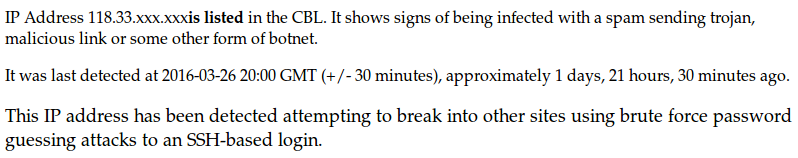
The major take away from this experience is that most of the login attempts appear to be automated through use of some tool or by way of botnet. Evidence of this comes from the fact that login attempt sessions use origin identifying passwords and repeating passwords tried day after day. Additionally, by doing a CBL lookup of for example the top connection in my honeypot returns the following text.

CBL Lookup Text

Attackers are also targeting exposed Raspberry Pi's and Ubiquiti routers as shown in the statistics. Both of these devices have factory default logins that are easily taken advantage of when not updated.

Unfortunately, in the 7 days that this honeypot ran there was not any notable interactions. Typically the most common types of attacks once an attacker gets inside SSH are botnet connections, irc bouncers or anything that allows an attacker remote control and interaction.

Reference Links

The reference links below are related to this blog post. If you're interested in more information about other honeypots available and setting one up, learn more at this link.

SSH Honeypots: KippoCowrie

Scripts: Kippo-GraphKippo-Scripts

By Torrey Betts


Using BeautifulSoup to Scrape Websites

$
0
0

Introduction

Beautiful Soup is a powerful Python library for extracting data from XML and HTML files. It helps format & organize the confusing XML/HTML structure to present it with an easily traversed Python object. With only a few lines of code you can easily extract information from most websites or files. This blog post will barely scratch the surface of what's possible with BeautifulSoup, be sure to visit the reference links at the bottom of this post to learn more.

Installing BeautifulSoup

If you're using a Debian based distribution of Linux, BeautifulSoup can be installed by executing the following command.

$ apt-get install python-bs4

If you're unable to use the Debian system package manager, you can install BeautifulSoup using easy_install or pip.

$ easy_install beautifulsoup4

$ pip install beautifulsoup4

If you can't install using any of the following methods it's possible to use the source tarball and install with setup.py.

$ python setup.py install

To learn more about installing or any possible errors that could occur, visit the BeautifulSoup site.

Your First Soup Object

The soup object is the most used object in the BeautifulSoup library as it will house the entire HTML/XML structure that you'll query information from. Creating this object requires 2 lines of code.

html = urlopen("http://www.infragistics.com")
soup = BeautifulSoup(html.read(), 'html.parser')

Taking this one step further, we'll use the soup object to print out the pages H1 tag.

from urllib import url open
from bs4 import BeautifulSoup

html = urlopen("http://www.infragistics.com")
soup = BeautifulSoup(html.read(), 'html.parser')
print soup.h1.get_text()

Outputs:

Experience Matters

Querying the Soup Object

BeautifulSoup has multiple ways to navigate or query the document structure.

  • find(tag, attributes, recursive, text, keywords)
  • findAll(tag, attributes, recursive, text, limit, keywords)
  • navigation using tags

find Method

This method looks through the document and retrieves the first single item that matches the provided filters. If the method can't find what you've search, None is returned. One example would be you want to search for the title of the page.

page_title = soup.find("title")

The page_title variable now contains the page title wrapped in it's title tag. Another example would be if you wanted to search the page for a specific tag id.

element_result = soup.find(id="theid")

The element_result variable now contains the HTML element that matched the query for id, "theid".

findAll Method

This method looks through the tag's descendants and retrieves all descendants that match the provided filters. If method can't find what you've searched for an empty list is returned. One example and simplest usage would be that you want to search for all hyperlinks on a page.

results = soup.findAll("a")

The variable results now contains a list of all hyperlinks found on the page. Another example might be you want to find all hyperlinks on a page, but they are using a specific class name.

results = soup.findAll("a", "highlighted")

The variable results now contains a list of all hyperlinks found on the page that reference the class name "highlighted". Searching for tags along with their id is very simliar and could be done in multiple ways, below I'll demonstrate 2 different ways.

results = soup.findAll("a", id="their")
results = soup.findAll(id="theid")

Navigation using Tags

To understand how navigation using tags would work, imagine that the HTML structure is mapped like a tree.

  • html
  • -> head
  • -> title
  • -> meta
  • -> link
  • -> script
  • body 
  • -> h1
  • -> div.content
  • and so on...

Using this reference along with a page's source if we wanted to print the page title, the code would look like this.

print soup.head.title

Outputs:

<title>Developer Controls and Design Tools - .Net Components & Controls</title> 

Scraping a Website

Using what was learned in previous section we're now going to apply that knowledge to scraping the definition from an Urban Dictionary page. The Python script looks for command line arguments that are comma separated to define. When scraping the definition from the page we use BeautifulSoup to search the page for a div tag that has the class name "meaning".

import sys, getopt
from urllib import url open
from bs4 import BeautifulSoup

def main(argv):
   words = []
   rootUrl = 'http://www.urbandictionary.com/define.php?term='
   usageText = sys.argv[0] + ' -w <word1>,<word2>,<word3>.....'

   try:
      if (len(argv) == 0):
         print usageText
         sys.exit(2)
      opts, args = getopt.getopt(argv, "w:v")
   except getopt.GetoptError:
      print usageText
      sys.exit(2)

   for opt, arg in opts:
      if opt == "-w":
         words = set(arg.split(","))

   for word in words:
      wordUrl = rootUrl + word
      html = urlopen(wordUrl)
      soup = BeautifulSoup(html.read(), 'html.parser')
      meaning = soup.findAll("div", "meaning")
      print word + " -- " + meaning[0].get_text().replace("\n", "")

if __name__ == "__main__":
   main(sys.argv[1:])

Outputs:

python urbandict.py -w programming
programming -- The art of turning caffeine into Error Messages.

References

The reference links below are related to this blog post. If you're interested in more information about using BeautifulSoup a great resource is the Web Scraping with Python book.

BeautifulSoup: Installing BeautifulSoupKinds of ObjectsfindfindAll

easy_install: Installing easy_install

pip: Installing pip

By Torrey Betts

Four considerations when building and deploying a responsive website

$
0
0


“90% of people move between devices to accomplish a goal, whether that’s on smartphones, PCs, tablets or TV”

That is according to the latest research from Google on the topic. This strongly suggests that the majority of web users are now consuming their digital media using mobile devices. This causes a massive problem for developers due to the vast amount of devices with varying screen resolutions. iPad, Kindle, iPhone and Blackberry… all of these devices need different approaches when crafting sites and those are only the market leaders.

The three most common ways that mobile users move between devices are:

  1. Repeating a search on another device
  2. Navigating directly to the destination site on the second device
  3. Sending themselves a link (email or Slack is great for this) to revisit at their convenience later

Imagine how hard it would be to create a version of your website for each of these devices, and that's without even considering the likelihood of screen sizes changing in the future. We need an approach which allows us to design for multiple devices, even if those devices haven’t been created yet.

We need responsive design!

Responsive design is an approach which helps us to provide our users with the optimum viewing experience regardless of the device they’re using. It’s a concept which lets the individual elements of a website - such as its text or images - to be adjusted in both size and layout by responding to the behavior of the user and the behavior of the device being used.

The other option is to build a dedicated mobile or tablet app. We will look at that approach in another post.

In essence, responsive design is not a single technology, but instead a set of practices which make your website more efficient for ease of use and maximum conversion. Using various techniques - such as fluid grids and some CSS media queries - a website can be made to respond automatically based on the visual preferences set the by the user's device.

In this post we will look at a number of considerations to be made when building and deploying a responsive website.

Understanding media queries

A media query can be used to allow you to target a specific set of CSS rules in your stylesheet for implementation on a particular device. This means that a media query can tell the elements on your site how to behave when they come across specific devices. Using these rules we can crop an image for display on a mobile device and have it oriented in landscape on a desktop without changing the HTML for the site. A good repository to see an all-inclusive list of media queries can be found here.

Fluid grids

Fluid grids help us to keep our web content responsive when we are using devices with dynamic screen sizes. These work by defining the maximum layout size for a design and then dividing the grid into a number of columns. The elements are then designed with proportional dimensions as opposed to pixel based ones, so that whenever the screen size is changed, the elements can adjust their dimensions in their parent container by the specific proportions of the device. Creating a fluid grid from scratch can be a time consuming task, but can be made simpler by using free CSS grid systems and generators.

Dealing with Images

Bitmap images (as opposed to vectors like the SVG format) are not fluid by default, and as such tend to have issues when scaled. This can cause an image to lose its visual appeal or even worse, its clarity and context. One way to tackle this is to size your images in relative units instead of pixel dimensions.

Relative units use percentages to help the image react to each device’s specifications. The most common way to use a relative unit is to set the ‘max-width’ property of the image to 100%. This simple CSS instruction will allow an image to display its own natural dimensions as long as there's enough real estate on the device’s screen. It will also cause an image to shrink in scale as its window narrows.

Touchscreen Considerations

It is important to consider that your site may be used on devices with a variety of inputs. Gone are the days when a mouse was the only viable input format for a website and with the influx of mobile devices, touchscreen inputs have become much more popular. The user experience can be improved on these devices by implementing small features such as performing “swiping” gestures to advance through a carousel of images or “pinching” to zoom into an infographic.

Act while you can!

Responsive design is all about the creation of websites that dynamically tweak themselves to ensure your users will receive the optimum User Experience (UX). Responsive websites eliminate the need to develop any other type of mobile website, thus making them a cost effective way to boost your website’s reach. Using fluid grids, media queries and flexibility, we can start to leverage ourselves to take advantage of the influx of mobile device users and potentially even generate higher revenues.

As the latest mobile technologies are introduced, the biggest businesses in the technology world are following suit. Even Google has recently recommended responsive web design and have announced they are checking if websites are mobile-friendly in their search results. This could negatively affect your website’s ranking if not implemented correctly, so why not start to make sure your website is mobile friendly today by using the helpful Infragistics Layout Manager tool!

Create modern Web apps for any scenario with your favorite frameworks. Download Ignite UI today and experience the power of Infragistics jQuery controls.

Top Resources for Build 2016

$
0
0

Weren’t able to make it to San Francisco for Microsoft’s Build 2016 conference? Don’t worry—Microsoft has made this year’s conference accessible to developers around the world!

First and foremost, it’s not too late to register for Microsoft’s Build mailing list. Once on the list, Microsoft will send you live updates and on-demand content directly.

Want to be able to watch the keynote speakers live? Microsoft even has you covered there. They will be live streaming keynote speakers starting at 8:30am PT. If you don’t have time to stream all speakers, check out Build’s full schedule to make sure you don’t miss out on your favorites.

If you’re unable to keep up via video, Reddit and Twitter are great resources to check in on the action. As usual, Reddit will host a live megathread throughout the event. In addition, plenty of Twitter accounts will be giving a live play-by-play of this year’s conference:

You can also keep up with the below hashtags:

On top of the standard social media outlets, plenty of blogs will be following the action. Ars TechnicaSoftpediaThe VergePC Advisor, and many others will be live blogging over the next few days.

Want to keep up with Infragistics at Build 2016? Follow Brian Lagunas (@brianlagunas), Ken Azuma (@kenazuma), Ambrose Little (@ambroselitte), and Jason Beres (@jasonberes) to see what we’re up to!

If you were lucky enough to make it out to Build this year, stop by booth 422 to say hi to Infragistics and check out the Ultimate experience! 

Infragistics Build 2016

Set-up Remote Unmoderated Usability Studies

$
0
0

When Indigo Studio’s product vision was first drafted, it was always intended to be a prototyping solution and not just prototyping tool. Our ultimate goal is to support the prototyping process for software based applications.

Rapid Prototyping Process = Design + Evaluation

We made Indigo Studio to rapidly design UI prototypes. Equally important to us is the ability to conduct usability studies with target users. It has been stated that theory without practice is empty, and practice without theory is blind. This is equally true for design(theory) and evaluation(practice).

While design reviews are one way to collect UX feedback, it's not a substitute for empirical feedback or findings based on usage. After all, we are expecting users to use the prototype and not just stare at it.

Today we are announcing the ability to set up remote and unmoderated usability studies for your Indigo Studio prototypes. Remote because your users can participate in the usability study from anywhere in the world, and unmoderated because users can participate whenever they want to without requiring a moderator to be present.

If you are new to usability studies, you should realize that a remote unmoderated study is no silver bullet. It’s simply one of many ways to evaluate designs. There are pros and cons, some of which are discussed in this article.

TL; DR

Reading not your thing? No problem. We recorded a quick video just for you.

[youtube] width="650" height="488" src="http://www.youtube.com/embed/athAhUx5Xyc" [/youtube]

Creating a New Usability Study

For creating a usability study for a prototype, you need to first share it on indigodesigned.com. I’m going to use a prototype that I have already shared, called Money app. Money app is a prototype that simulates a set of user stories related to managing daily expenses.

Select the create a new usability study option from the prototype details view to kick-off a brand new study.

Create new usability study

When you create a new study, it is automatically added to the “Usability Studies” area of indigodesigned.com. This way you can go there directly to review results for any studies in progress or to review older studies.

Defining Usability Tasks

A study has three main sections. The first section allows you to add some welcome page content, which is what your participants will see before starting the study. You can add any text material for your participants to read. The second and most important part is the section to define your usability study tasks. And finally, you can add some thank you page content that your participants will see when the study ends.

Adding Tasks

Adding content for the welcome page and thank you page is optional. However, you need at least one task defined to start the study.

Recording a Task Flow

The usability study can be conducted remotely and unmoderated. That means, any number of participants can take the study at the same time. So how you phrase your tasks, and the detail present in the prototype, may influence the outcome of the study.

To assist with this, as part of setting up a new task, we let you record the task steps/flow for completing that task. This way, you as a study moderator will know up front whether the prototype will indeed support the task, and does not lead participants to a dead end.

For my first task, I'm going to add the following:

  • Assume that you spent some money on a cup of coffee. Record this expense using the app.

Clicking on record a task flow launches the prototype and the recording interface. I will mark the UI state I am currently viewing as the start point. Of course, depending on the task, you can interact with the prototype and get the UI state you need before marking it as the start point.

Once you mark the start point, the service automatically records the steps leading to the finish point as you interact with the prototype. If you make a mistake, you can always undo the last step. Once you are done, save the task flow. And that’s it.

recording task flow

Using the same approach, I can define additional tasks for my study:

  • Change the budget you have defined for coffee from $45 to $65
  • Where will you look to find out how much you spent in the month of June this year?

Inviting Participants

To let participants take this study,  officially start this study, and use the invite option to get a direct link to the participate. You can share this link over email, IM or post it on a forum.

Invite Users

You can make changes to the study as long as you have no participants. Once participation begins, you cannot make changes. And when you have enough participants, you can close the study to prevent additional sessions.

How to Get Started

We have more articles planned about this awesome new capability. For instance, what the participants can expect to see when starting a study, and how to interpret the study results.

In the meantime, we have set up a top-secret site for you early birds called http://next.indigodesigned.com. It’s identical to the current site except this one has usability studies available today.

The idea is that you can conduct usability study with your existing shared prototypes. We look forward to any feedback you may have about what’s working, what’s not etc. When we publicly release this capability sometime in April, you will no longer need to be on next.indigodesigned.com to create studies. It will be merged.

All this just a start of something big. Big for your design practice, and big for the prototyping process.

Unlimited Studies, Unlimited Users. No Charge.

As long you have an active subscription for Indigo Studio, remote usability studies and all other features of indigodesigned.com are free!

Infragistics Windows Forms Release Notes – March 2016: 15.1, 15.2 Service Release

$
0
0

With every release comes a set of release notes that reflects the state of resolved bugs and new additions from the previous release. You’ll find these notes useful to help determine the resolution of existing issues from a past release and as a means of determining where to test your applications when upgrading from one version to the next.

Release notes are available in both PDF and Excel formats. The PDF summarizes the changes to this release along with a listing of each item. The Excel sheet includes each change item and makes it easy for you to sort, filter and otherwise manipulate the data to your liking.

Windows Forms 2015 Volume 1 Service Release (Build 15.1.20151.2230)

Windows Forms 2015 Volume 2 Service Release (Build 15.2.20152.2052)

How to get the latest service release?

Bind JSON to HTML table using the Ignite UI data source in three simple steps

$
0
0

IgniteUI DataSorce or igDataSource is a component of the Ignite UI framework. It binds various UI components to the data of the various forms like JSON, XML etc.

Step 1: Creating the Data

Let us say you have a JSON data as shown in the listing below:

var populationData = [
    { "CountryName":"China", "1995":1216, "2005":1297, "2015":1361, "2025":1394 },
    { "CountryName":"India", "1995":920, "2005":1090, "2015":1251, "2025":1396 },
    { "CountryName":"United States", "1995":266, "2005":295, "2015":322, "2025":351 },
    { "CountryName":"Indonesia", "1995":197, "2005":229, "2015":256, "2025":277 },
    { "CountryName":"Brazil", "1995":161, "2005":186, "2015":204, "2025":218 }
    ];

Data could be in the following form,

  • Plain JavaScript array
  • JSON object
  • XML

In real projects data will be pulled in the system from the remote services. Remote service could be WCF, REST or Web API.

Step 2: Create the render function

Let us say we have a requirement to render the data in a HTML table. We have created a HTML table as shown in the listing below:

<table id="t1"><thead><tr><th>Name<th><th>1995<th><th>2005<th><th>2015<th><th>2025<th><//tr><thead><tbody><tbody><//table>

Next to render the table we need to,

  • Create template using the jQuery template. In the template we are using the column name from the key of the JSON data.
  • Attach the template to HTML table
  • Create data view on the data source and attach to the HTML table

Render table function can be written as shown in the listing below:

var renderTable =function (success, error) {var template ="${CountryName}${1995}${2005}${2015}${2025}";if (success) {
            $("#t1 tbody").empty();
            $($.ig.tmpl(template, ds.dataView())).appendTo("#t1 tbody");
        } else {
            alert(error);
        }
    } 

Step 3: Create the igDataSource

In the last step we need to create the data source from the JSON data. In Ignite UI, igDataSource connects the data and the view. igDataSource can be created as shown the listing below:

var ds =new $.ig.DataSource({
        type:"json",
        dataSource: populationData,
        callback: renderTable
    });
    ds.dataBind();

We need to set the value for the datasource and the callback properties. Datasource property is set to the JOSN array and callback property is set to the renderTable function. In the renderTable function we are creating the template and rendering the table.

Running the application

On running the application, we will get JSON data rendered in the HTML table using the igDataSource. Rendered table should look as shown in the image below:

I hope you find this post useful. Thanks for reading.

Public Speaking 101

$
0
0

Gearing up to deliver a talk that lasts  Public Speaking

Who hasn’t been to a conference at least once in their lifetime? At the end of the day we usually reflect on the speakers and their performance. Some speakers did well, others not so and yet there are the few, who seem to have been way out of everyone’s league. Of course, we always return to this last group and discuss it the most. Inevitably someone makes the statement “They were born with the talent to speak well in front of an audience”. When I was born nearly thirty years ago I don’t remember myself talking the very next minute, despite the audience of family, unfamiliar to me until that very moment. Correct me if that is not true for 21st century babies, but barring some evolutionary leap in language development and motor skills, we are not likely to meet anyone born with the talent to speak well in front of an audience.

Having delivered a few talks myself, I started noticing trends and wanted to share them with you. I believe that if you build the right habits and create a plan to gear up for your talk, the likelihood that your performance will last in the memories of the audience will significantly increase. So, reflecting on the times when the audience was patiently listening to me… and the times when they counted the seconds to the end… and those one or two occasions when their eyeballs seemed to enlarge and almost pop just before the applause, I will share a few of my public speaking tips hoping that you will put them into action and deliver an outstanding presentation.

Bold beginning, bold end. I’ve seen people make a joke or put on a silly hat to break the ice. These affectations may work but make sure to pick an inoffensive joke and try not to make a fool of yourself. Being a joker is not a good first impression if you want to plant some serious ideas later on. At the end of your presentation, try leaving your audience with a question that will keep them thinking for a day or two.

Short sentences and simple words. Don’t prepare a script and try to learn it by heart. Having a few points on each slide to talk about, expressing them in simple language will put you on the right track. Preparing slides is a beast on its own and I will not cover it here, but make sure that you don’t read from the slides– the audience is there to hear you speak, not to watch you read. And it should go without saying, avoid turning your back toward the audience.

Tailor your talk. Pick images and examples that make most sense for the expected of audience. Missing the target might be bad, but being too general is even worse. Spend a little extra time to research what sort of people are likely to attend the event and who went on its last occasion.

Show actual stuff. People believe their eyes, and when you are telling a story your slides serve as a visual confirmation for your words. But if you really want to impact the audience, you will probably need to get your hands dirty and search your home, garage or ceiling for some unique objects that reinforce your ideas. I remember my talk on emotional design last year when I took out an apple peeler that looked like torture tool from the Inquisition. It served its purpose well and stressed my point about the different aspects that drive user desire when purchasing a product.

11426389_971562072878414_2205054990259075856_o

The author and his Inquisition-like apple peeler. Image attributed to: the UX Sofia 2015 team.

It doesn’t have to be something special. Something that anyone can find in their house is even better! What’s needed, however, is something that reinforces your ideas and arguments in a special way – a function of the object that people did not realize until this very moment.

These four tips are a good beginning, but I have many more observations to share, so expect a second part of this blog in the very near future. However, that does not mean you need to wait for it without taking action. If you have the opportunity, use these four tips now and let me know how it goes.


Is programming similar to composing music?

$
0
0

Over the last couple of decades, computer scientists with an interest in both musical composition and programming have managed to marry the two together. Artificial Intelligence can now compose music that is practically indistinguishable from that which is created by professional musicians.

It’s no secret that many professional developers have a real passion for music, and many musicians dabble in computer programming too. For example, Elvis Costello, the prolific British musician who’s been described as ‘the finest songwriter of his generation’ operated an IBM 360 in the 1970s before his musical career took off.

You can see why people might be drawn in by both concepts; There’s a lot that composing melodies and writing algorithms have in common. On the surface the two may seem quite disparate, but there is a creative side to developing, and a mechanical side to composing. So, just how similar is programming to composing music?

You’ve got the music in you

Let’s first take a look at the similarities between composition and programming.

 1.   They are both about following logical rules.

Composing music, just like programming, requires what the Ancient Greeks called the Trivium. You need:

  1. Grammar: a solid grasp of the fundamentals – be that musical notation and theory or knowledge of programming language rules
  2. Logic: you need to be able to create ‘logical arguments’. When writing music or code you need to follow logical rules to get the ‘moving parts’ to work together correctly.
  3. Rhetoric: as well as following grammar and logic, you need to be able to persuade listeners and users of new approaches to standard practice.

Without following the fundamentals of composition or development, things just don’t work. A haphazardly written program will be full of bugs, in the same sense an ill-formed chord structure will create dissonance.

 2.   They are about making something beautiful from small parts

To be a great pianist, you must first practice and perfect the basics: simple, repetitive scales and arpeggios. To be a great developer, you need to spend a lot of time ensuring even the simplest expressions are elegantly and correctly coded. Once you have the small pieces in place, you’re then able to build something greater, which is equally as important:

 3.   You need to be able to see the bigger picture

Just as a composer must consider all the different sections of the orchestra and how they will gel together, a developer needs to hold an abstract ‘bigger picture’ in their head as they start building their program’s architecture. Both disciplines are about building up towards something bigger and better.

 4.   Self-expression is key

Music and software development both require creativity and self-expression; both are about cultivating your own style and creating something new and inspiring.

 5.   You need to be technically engaged

Musicians and developers need to spend a long time thinking about how their creations will interact with other outputs, and in the hands of ‘end users’. A composer may add accent marks to instruct members of the orchestra the style in which to play. A guitarist may want to think about using external hardware (amps, effect pedals etc.) or how they want their song to be produced in the studio. Developers similarly need to bear in mind how others will use their end-products, on which kind of device and in what context.

 6.   They both include collaborative and individualistic aspects

Mozart might have spent a lot of time alone working out how his next composition would sound, yet his skillset also required working with others – namely the musicians he was conducting. Similarly, the most successful developers can’t be pure introverts; they need to collaborate with end users, managers, UX designers and so on.

I’m no musical dev

While there are a lot of things these disciplines hold in common, it’s worth hearing out the arguments against. Not every developer is set out to be the next Beethoven!

 1.   Is this kind of comparison just a way that we as developers puff up our egos?

As the author of the Coding Horror blog argues, comparisons that developers draw between their craft and painting, music or other art forms could be seen more as self-aggrandizement than a real comparison. Of course, we’d all like to think that the app we’re building is just as wonderful as the best of Gershwin, or that the website we just designed has the same lasting impact as Miles Davis’ Kind of Blue. But let’s be honest, it’s not quite the same thing, is it?

 2.   Programming is about solving a problem

When you’re asked to design an app, for example, it’s usually in order to solve a specific business or consumer problem. Developers excel at solving this kind of issue, yet can this really be compared to music? At its purest, composition should be about representing and inspiring pure feelings and emotion.

 3.   Programming has a very different purpose to music

When you develop any kind of tool, the final goal is for an end user to be able to do something specific with it. Say you’re building a business app – your creation should mean that the end user’s day to day tasks are facilitated. Music, by contrast, doesn’t really serve a specific ‘purpose’, beyond pure enjoyment.

Weighing the balance

The jury is still out on this one; while it’s clear that composition and development definitely hold certain factors in common, there are also a lot of areas where they diverge. What we do know is that both developers and musicians can enrich our lives and give us things we never knew we needed and which we now can’t live without.

Limited Time Offer: Get a Free Custom Mobile SharePoint Workspace in 30 Days or Less and Realize ROI

$
0
0

Your current SharePoint investment is already helping your organization collaborate and become more efficient. But do you realize SharePoint’s ROI when it comes to mobility?

With the latest release of SharePlus, the premier mobileSharePoint and collaboration solution, we’ve empowered enterprise teams to become even more efficient! With Custom Mobile Workspaces to give you a tailored experience, SharePlus enables teams to access content from multiple file sources on premise or in the Cloud from Sharepoint, OneDrive for Business, Dropbox, Google Drive and Network Drives.

Limited Time Offer: Realize ROI in 30 Days or Less

To help companies put themselves on the fast track to enable their modern workforce, Infragistics is offering businesses a free Custom Mobile Workspace that will have your team up and running in 30 days. Find out more about this offer.

What is a Custom Mobile Workspace? Custom Mobile Workspaces provide teams with a focused mobile SharePoint environment tailored to their needs or specific job roles. You can have everything you need from SharePoint, including data visualizations, in one mobile location with personalized and central access online or off.

SharePlus’ Custom Mobile Workspaces help you:

  • Stay connected and securely collaborate anywhere in the world.
  • Adapt SharePlus to your mobile workstyle.
  • Add rich data visualizations for over 20 data sources.
  • Keep content secure on the go with Enterprise security configurations.

Transform the Way You Work  

Take a look at some of our Mobile Workspace Solutions for a deeper dive:

Education

Faculty, students and alumni need to connect with each other and to the information and resources vital to the education process. Providing everyone with focused mobile workspaces available anywhere helps grow and engage a school’s community:

Figure 1 Sample Custom Mobile Workspace for Education

Executive

Leaders can make better informed decisions when they have a single secure portal on their mobile device to share and collaborate with access to all of their data:

Figure 2 Sample Custom Mobile Workspace for Executives

Field Service Operations

Perfection at a job site happens when a team has the full spectrum view of equipment maintenance records, access to related issues, and documentation, like in this example:

Figure 3 Sample Custom Mobile Workspace for Field Services

Professional Services

Service professionals need 24/7 secure access to project specific content on the go. By extending SharePoint to a custom workspace on their mobile devices, they can stay compliant and limit risk when managing projects and client engagements every day, remotely or onsite:

Figure 4 Sample Custom Mobile Workspace for Professional Services

Sales

From prospect-to-lead to a closed deal, mobile sales teams need access to valuable customer data and key resources on the go. Mobile access to SharePoint makes it possible for sales reps to win deals anywhere, anytime:

Figure 5 Sample Custom Mobile Workspace for Sales

Which is the most in-demand use case of your mobile workforce?

Whatever your needs might be, see them come to life with SharePlus. See if you qualify for a  Free Custom Mobile SharePoint Workspace by calling 1.800.231.8588 today or emailing us at 30DayROI@Infragistics.com - we look forward to hearing from you soon!

Create an IRC Bot using Python 2

$
0
0

What is IRC?

If you're unfamiliar with IRC (Internet Relay Chat) it is an application layer protocol used to facilitate chat with users all over the globe and has been around since the late 1980s and is still widely used to this day. There are several different IRC networks, so which one you chose to use comes down to your own personal preference.

Why Create an IRC Bot?

Simply put, IRC bots in general are simple and fun to create. They allow you to extend the functionality of a channel or even create fun interactive games for your channel. Basically, the sky is the limit in terms of possibilities for bot functionality, and when mixed with the ease of Python you can create a complex bot in very few lines of code.

How Do I Connect to the IRC Server?

The process for connecting to an IRC server is straight forward*.

  1. Connect to XXXX server on port XXXX (typically 6667)
  2. Send the USER command
  3. Send the NICK command
  4. Respond to any PING commands

* - It's important to note that some IRC servers differ in how you connect or the format of messages received, be sure to look up the reference information for the host you normally connect to.

Before connecting to the IRC server we'll setup the variables for server, botnick, the channel to join on connect and the boolean flags for sentUser and sentNick. The sentUser and sentNick boolean flags are used to determine whether or not those commands have been previously sent to the server during connection.

server = "ix.undernet.org"
channel = "#usa"
botnick = "uberbot" + str(random.randint(1, 10000))
sentUser = False
sentNick = False

Connect to XXXX server on port XXXX

To connect to a server a simple socket is created and then connected to by calling the connect method.

irc = socket.socket(socket.AF_INET, socket.SOCK_STREAM)
print "\nConnecting to:" + server
irc.connect((server, 6667))

Send the USER command

Next, register (and something authenticate) a user session with a short username and a human-readable realname. The command format looks like this.

USER (username) (hostname) (unused) (realname)

if sentUser == False:
   irc.send("USER " + botnick + " " + botnick + " " + botnick + " :This is a fun bot\n")
   sentUser = True
   continue

Send the NICK command

After the USER command, send the NICK command to specify your chat nickname. The command format looks like this.

NICK (nickname)

if sentUser and sentNick == False:
   irc.send("NICK "+ botnick + "\n")
   sentNick = True
   continue

Respond to any PING commands

IRC servers regularly send the PING command to connected clients to determine if they are still connected. To show you are connected each PING must be answered with a PONG and the supplied PING token. The PING command uses the following format.

PING (token)

if text.find("PING") != -1:
   irc.send("PONG " + text.split()[1] + "\n")

How Does My Bot Accept Commands?

To have your bot accept commands, you'll need to parse the input that comes from the buffer and then respond accordingly. Since IRC is text based the messages coming from the server are all easy to parse using regex or even a simple text find. The snippet below searches the message text from a channel or private message containing "!host". If found, the bot responds with the OS version information. 

if text.find(":!host") != -1:
irc.send("PRIVMSG " + channel + " :" + str(platform.platform()) + "\n")

Can I Just Have the Codez?

The source code below is the full listing of code used for this post.

import platform
import random
import socket
import sys

reload(sys)
sys.setdefaultencoding('utf8')

server = "ix.undernet.org"
channel = "#usa"
botnick = "uberbot" + str(random.randint(1, 10000))
sentUser = False
sentNick = False

irc = socket.socket(socket.AF_INET, socket.SOCK_STREAM)
print "\nConnecting to:" + server
irc.connect((server, 6667))

try:
   while 1:
      text = irc.recv(2048)
      if len(text) > 0:
         print text
      else:
         continue

      if text.find("PING") != -1:
         irc.send("PONG " + text.split()[1] + "\n")

      if sentUser == False:
         irc.send("USER " + botnick + " " + botnick + " " + botnick + " :This is a fun bot\n")
         sentUser = True
         continue

      if sentUser and sentNick == False:
         irc.send("NICK " + botnick + "\n")
         sentNick = True
         continue

      if text.find("255 " + botnick) != -1:
         irc.send("JOIN " + channel + "\n")

      if text.find(":!host") != -1:
         irc.send("PRIVMSG " + channel + " :" + str(platform.platform()) + "\n")

except KeyboardInterrupt:
   irc.send("QUIT :I have to go for now!\n")
   print "\n"
   sys.exit()

Where Can I Learn More?

The links below are great references for learning about IRC, IRC bots and the IRC protocol.

Data Visualization: What Is It and Why Does It Matter?

$
0
0

As the saying goes,“A picture is worth a thousand words”. But exactly how true might that statement be? There is an abundance of research out there regarding how we gather and retain knowledge most effectively, and the general consensus is that we remember pictures and images more readily than we remember words.

This makes a fair amount of sense when you consider that our brain is mainly an image processor, not a word processor. The part of our brain devoted to processing words is considerably smaller in comparison to the part that processes visual images. Words are abstract and altogether harder to retain, versus the more concrete manner of visuals; can you remember the last program you watched on TV? Probably. But trying to remember the last paragraph or sentence of the last thing you were reading (and no, this blog post doesn’t count!) is considerably more challenging.

[source]

While there are a select few that learn best when actively doing something, research shows that the majority of us are visual learners; we use images, pictures, colors and other visual stimuli to organize and learn information. The messages from visual content are transmitted to our brain much, much faster than text – 60,000 times faster, to be exact. Our eyes can register 36,000 visual messages per hour, and the brain can register images that last for just 13 milliseconds. The difference between the two is actually quite astounding. Given the above, in the average time it takes you to read this sentence you could have registered about 40 images… feeling unproductive? Fear not, in this post we’ll explore how you can use the visual power of the brain to express your data in striking and memorable ways.

2, 5 and 17 zeros

Today, we generate 2.5 quintillion bytes of data every day. The fact that we’re now dealing with numbers that we have to research to understand their value (it’s 2.5 Exabytes of data, for those wondering) should provide context that we’re dealing with a lot of data. With the power of the Cloud and mega-data centers, storing all this data isn’t yet an issue. Although as we continue to create more data than ever – and show no signs of ceasing to do so – the prospect of just how much is out there can be quite overwhelming.

Of course, the other way to interpret all this data is that there is now more content for us to understand and work with, and more ways we can express and showcase this data than ever before. Platforms like social media have created an intense desire (and opportunity) to share what we learn and experience with others, and this can be attributed to data visualization. With so much data available to business users, it’s important they have the appropriate tools to allow them to turn data into something they – and anyone they show it to – can visually understand.

Drive your data

In TechTarget’s essential guide to dashboard development and data visualization, the term itself is expressed as follows:

“an effort to help people understand the significance of data by placing it in a visual context… …used effectively, new data visualization tools and well-thought-out dashboard designs help streamline the visual presentation of large, complex sets of data for better decision making.”

Understanding the significance of data is, we think, the most telling part of this definition. Being able to effectively display your findings has always been a point of emphasis in business – whether it’s showing your data to colleagues, presenting it to your team or your boss. Engaging and relating to your audience is much harder if you’re simply speaking your message and pointing at words on a screen. A lack of engagement and interest is going to result in no one remembering your presentation in a week’s time, even if that presentation’s content held some insightful and important messages. Data visualizations, on the other hand, can help to convey messages with considerable weight and leave a real impact on your audience. In the modern working world, the ability to package relevant and meaningful information in a unified manner is invaluable and is why data visualization tools have skyrocketed in popularity over the past few years.

Data visualizations for the enterprise

ReportPlus, from Infragistics, is a dedicated data visualization app that lets users access all their data in a single space – whether it’s On-Premises, in local files, in Cloud storage software from Dropbox and Google Drive or in cloud apps like Salesforce. Dashboard and report access is  available on mobile devices (Android & iOS) and will soon be available on desktop. Real-time dashboards allow teams to make data-driven decisions with no gaps in information and users can share dashboards securely through email, the Cloud or as a presentation in PowerPoint.

ReportPlus really plays into our definition of ‘understanding the significance of data’. Rather than a tool that breaks existing decision making workflows, or requires a dedicated expert or team to setup and master, ReportPlus really can provide ‘Insights in an instant’. From adhoc roundtable discussions, to board presentations, or decision making in the field – ReportPlus pulls out the significance of data right there in the palm of the user’s hand when they need it most.

Once data has been connected, compelling visualizations can be dragged and dropped into place quickly and easily – and then shared. Imagine a typical boardroom scenario:

A presentation of a business case is going well, but a ReportPlus visualization on the big screen really sells the idea. The deal is sealed when you point the board to the hosted version of the data, allowing them to connect to the dashboard right there on the devices in their pockets.

At Infragistics, we understand that the enterprise is a prime destination for data visualizations to take control; ReportPlus offers support for data sources such as Oracle, Analysis Services, SQL Salesforce and Microsoft Dynamics CRM. Combining the power of the enterprise with the flexibility of mobile apps, ReportPlus lets you create and share striking visualizations wherever you may be.

Create Tappable Content Within the IGLabel (Obj-C)

$
0
0

What is the IGLabel?

What is the IGLabel?

The IGLabel is an iOS control for creating rich text labels. It works similarly to the generic UILabel and applies styles to text in a similar fashion that is done when using attributed strings. It is also based on Core Text to boost performance and functionality over the generic UILabel.

What is Tappable Content?

Tappable content is series of characters, words or sentences that allow interaction by tapping them. The IGLabel allows this interaction by setting an attribute over a matching regular expression or specific text location. When tappable content is tapped using the IGLabel, the labelTap:tapText:tapValue IGLabelDelegate method is called. This method provides the label tapped, the text receiving the tap and the value applied to the text through the styling attribute.

How Do I Create Tappable Content?

The first step in creating tappable content is to set the text property on an instance of the IGLabel.

_label.text = @"The IGLabel contains tappable content.";

Next create an NSDictionary containing the tap attribute. Any NSObject can be used for the tap attribute.

NSDictionary *attributes = @{IGTextStyleTapAttributeName : @"Imaginary Value"};

Finally, add the attributes dictionary to the IGLabel.

[_label addAttributes:attributes forRegEx:@"tappable\\scontent" error:nil];

Once the attribute has been added to the IGLabel, the text "tappable content" can be tapped.

[custom] width="400" height="600" src="https://appetize.io/embed/5z44ep6xc5jnvv5anzjbb6v34g" [/custom]

Where Can I Learn More?

The reference links below provide more information about the IGLabel and the styling aspects it supports.

By Torrey Betts

Using the IGOverlayView to Display a Toast Message (ObjC)

$
0
0

What is the IGOverlayView?

The IGOverlayView is a powerful and extremely flexible control for displaying any type of view that will overlay another view, with or without animation, when shown or dismissed. A total of 12 overlay animations are included, with 2 of these animation types allowing for custom animations limited by your imagination.

What is a Toast Message?

A toast message is an brief auto-expiring information dialog. Typically used in mobile devices to show visual feedback when turning the volume up/down or application actions such as notifying the user a file has saved.

What is a Toast Message?

How Do I Create a Toast Message Using the IGOverlayView?

The first step in creating a toast notification is to initialize the IGOverlayView. The IGOverlayView will provide the transparent dark appearance over a view and animate the toast message to and from the screen.

_overlay = [[IGOverlayView alloc] init];
_overlay.backgroundColor = [UIColor colorWithWhite:0.3 alpha:0.5];

Next, initialize a UILabel with a fixed size and a white background to serve as the toast message. The center property is also set to place the toast message directly in the center of the view. After configuring the UILabel is added as a subview of the IGOverlayView.

_toastLabel = [[UILabel alloc] initWithFrame:CGRectMake(0, 0, 200, 100)];
_toastLabel.backgroundColor = [UIColor whiteColor];
_toastLabel.textAlignment = NSTextAlignmentCenter;
_toastLabel.numberOfLines = 0;
_toastLabel.layer.masksToBounds = YES;
_toastLabel.layer.cornerRadius = 8;
_toastLabel.center = CGPointMake(self.view.center.x, self.view.center.y);
[_overlay addSubview:_toastLabel];

How Do I Display the Toast Message?

To display the toast message we need to set the message text and the duration of the message.

int duration = 2;
NSString *message = @"This is a toast message.";
_toastLabel.text = message;

Next the IGOverlayView is animated into view and using the Dispatch API the IGOverlayView will automatically dismiss itself.

[_overlay showInView:self.view withAnimation:IGOverlayAnimationFade];
dispatch_after(dispatch_time(DISPATCH_TIME_NOW, duration * NSEC_PER_SEC), dispatch_get_main_queue(),
^{
        [_overlay dismiss:IGOverlayAnimationFade];
});

[custom] width="400" height="600" src="https://appetize.io/embed/j8gfcuv5uj7razd3ufg83pnpcw" [/custom]

Where Can I Learn More?

The reference links below provide more information about the IGOverlayView.

By Torrey Betts

Access OneDrive for Business through SharePlus

$
0
0

If you’re a SharePoint user, then OneDrive for Business is the cloud storage service for you. It's not to be confused with OneDrive, its sister cloud service. While OneDrive, formerly known as SkyDrive, offers cloud storage, OneDrive for Business offers a perfect and secure collaboration experience, is integrated with both SharePoint and Office 365, and is also accessible within SharePlus. In addition, you now get 1 TB of space in OneDrive for Business if you have an active Office 365 Pro license. Why should you consider accessing OneDrive for Business from within SharePlus?

Just like SharePoint content, you can access OneDrive for Business files offline in SharePlus – both in iOS and Android!

Because of its integration with SharePoint, SharePlus allows you to keep your OneDrive for Business files both online and offline. You can now continue working with your OneDrive content even when you don’t have connectivity, similarly to the way you work offline with SharePoint portals!

The multiple-document previewer in SharePlus iOS lets you work fast and organized

Ever felt the need to review multiple documents to find the one you're looking for? On a mobile device, that's close to impossible. Well, look no further! With SharePlus, you can tap the required documents and see a clean, responsive, in-app preview of several documents at once.

But that’s not all....

For our Enterprise users, that's not all. If you have the SharePlus Social feature enabled, you won't even need to configure OneDrive for Business! Upon going to the Documents tab, you will find your personal OneDrive for Business already configured.

Try this out starting today

Get your Free 30-Day SharePlus Enterprise Demo here!

If you have any questions, would like to give feedback, or schedule a demo, please do not hesitate to contact us. We look forward to hearing from you!


Developer News - What's IN with the Infragistics Community? (3/21-4/3)

The Value of Bringing Self-service Data Visualization & Data Discovery to Your Organization

$
0
0

Microsoft’s internal help desk supports more than 105,000 clients – employees, vendors and contractors – across 5 international call centers. In an attempt to reduce call volumes, the Redmond tech giant deployed a number of self-service tools, including an online support website that offered chat capabilities and access to knowledge-based articles. As a result, calls were reduced by almost 16% at a savings rate of roughly $30 per call.

As the above example shows, there are substantial savings to be found using self-service tools to help users solve their own problems. And yet it’s not merely cost and efficiency savings that come as a by-product of self-service methods. In the realm of data, self-service software and tools offer users a lot of free reign, which is ideal for a line of work that requires imagination and creativity to be fully effective. Data discovery and data visualization are two areas that have seen self-service tools more recently enter the market.

In this post, we’ll explore the benefits that can be found in bringing these self-service tools into your company. To start with, though, let’s look at both data discovery and data visualizations to understand the impact they can have on a company.

Data Visualization

As we mentioned in a previous post (Data visualization: What is it? Why does it matter?), a picture is worth a thousand words. We are visual learners above anything else; interpreting, understanding and relating more strongly to visual stimuli than plain text. Data visualizations take this concept to new heights – providing an array of tools and techniques for users to create visual representations from their gathered data. When done right, the results can be extremely effective.

With the right data discovery and visualization tools, users are able to uncover interesting and unique patterns and relationships from the underlying data, and create striking visualizations to express those patterns through powerful, memorable visuals. But what makes these tools ‘self-service’? Well, as the name suggests, self-service Business Intelligence (BI) allows you to access all these features by yourself, giving you more flexibility and potential for customizations. Gartner predicts that by 2017, most business users and analysts in organizations will have access to self-service tools to prepare for data analysis. We say, why wait until 2017?

Data Discovery

Data discovery involves the process of interacting with your data through different data visualizations and finding business insights. More specifically, however, data discovery breaks down complex data collections into information that users can more readily understand and manage. This means it can turn what would otherwise be incomprehensible quantities of raw data into recognizable groups, sets and relationships. For data analysts, this is one of the first (and most important) steps towards finding meaningful answers in their data. By discovering and observing interesting relationships between data, users are also far more likely to get the imagination or inspiration they need to create the next data visualization.

You can do it now

“Going beyond the obvious impact to the data/information/analysis/insight/action paradigm that has dominated our sales analysis work for decades, I was struck by the potential for how [self-service analytics] will change how we work.”

Tad Travis, Research Director, Gartner.

Gartner aren’t the only experts that are acknowledging the potential of self-service analytics. A Forrester report noted the top enterprise business intelligence vendors are prioritizing investments in self-service, desktop and Cloud products that appeal to business users.

Control and effect

Being in control of a situation can give you an added feeling of confidence and motivation. Giving users the ability to access and control levels of information will get them more familiar with the tool over a shorter period of time, as users interact with the tool on a closer, more frequent level. To refer back to Gartner:

“The ability to rapidly associate disparate data sets without building a multidimensional data model will be quite liberating…they will grasp insights much faster because they are no longer constrained by physical analysis limitations, like dimensionality, aggregations and joins.”

In a lot of companies, technical teams – such as Business Intelligence and IT departments – will have to concentrate on creating the majority of reports themselves and satisfying end user report requests. With self-service tools, however, users are able to make decisions based on their own queries and analysis, which frees up the organization’s technical teams to focus on other IT initiatives and improve overall company efficiency.

Accessible to all

Self-service Business Intelligence allows users to generate their own reports and dashboards, regardless of their technical know-how. To accommodate for this, BI tools must be intuitive and user-friendly in their design, as complex and sophisticated user interfaces (UI) are likely to steer away potential users. Self-service data visualization and discovery tools must provide simple and easy access of users’ customized information without the need for extensive training.

ReportPlus, from Infragistics, takes the self-service aspect of data discovery and data visualizations a step further. With a dedicated mobile app, users can create stunning visual designs on-the-go on their smartphone or tablet. With next to no help from IT, users can combine multiple data sources, access dashboards and reports and connect to on-premises, local and Cloud-based data.

Soon the power of ReportPlus will also be available to desktop users, as we get ready to launch the brand new Windows version.

Desk bound enterprise users will be able to access the same powerful visual tools they are used to on their mobile, via the desktop. Best of all the desktop version comes with all of the enterprise grade benefits of the mobile versions – connect multiple data sources, built in security, the ability to customize and brand reports - and of course visualizations can be shared right across an organization no matter how or on what device they were created.

We are currently putting the finishing touches to ReportPlus for Desktop. Sign up online to be the first to be notified when it’s available.

Meet with Infragistics in Bellevue, WA – April 20

$
0
0

Infragistics,the worldwide leader in providing tools and solutions to accelerate design, development, insights, and collaboration for any organization, will be out visiting Bellevue, Washington later this month. While we’re there, we’d love to invite developers, designers, and marketers in or looking to get into the technology industry to a free happy hour at Tavern Hall on April 20th.

Please consider this your official invite:

  • Who: Infragistics
  • What: Recruiting Event
  • When: Wednesday, April 20th, 4-6 PM
  • Where:Tavern Hall 505 Bellevue Sq., Bellevue, WA 98004

Do you have a passion for:

  • User Experience and Design when it comes to building the latest enterprise and consumer applications?
  • Building software with the latest web and mobile technologies such as Angular2 and HTML5?
  • Designing and executing highly integrated go-to-market campaigns?
  • Defining product roadmaps, being a product/technology champion (evangelist), building technical content?
  • Managing relationships with Fortune 1000 enterprises (sales or technology consulting)?

If so, then Infragistics would love to speak with you. We will be setting up shop at the bar in Tavern Hall in Bellevue, WA on April 20th from 4-6 PM.  Stop by, and have a drink on us.  Let’s informally chat about what you are looking for in your next gig and explore one of the many openings we have across the globe.  

Jason Beres, SVP of Developer Tools (Product Management) and Adam Jaffe, VP of Marketing Communications will be in the Puget Sound area, and they are looking to speak with developers, designers, strategic marketers, product managers, technology sales experts, and enterprise consulting specialists. 

Our team is growing rapidly with offices in NJ (HQ), NY, Bulgaria, UK, India, Uruguay, and Japan, and we are also open to remote/flexible working arrangements. Feel free to simply stop by, or if you would like to reach out in advance, send an email introducing yourself: ajaffe@infragistics.com  & jasonb@infragistics.com.

Hope to speak with you soon!


Top Developer Meetups: Chicago, IL

$
0
0

Next up in the Developer Meetups series is Chicago, Illinois!

With great opportunities like Girl Develop It and Geekfest, whether you're living in or visiting the windy city, don't miss out on these great groups!

Share With The Code Below!

<a http://www.infragistics.com/community/cfs- filesystemfile.ashx/__key/CommunityServer.Blogs.Components.WeblogFiles/d-coding/6866.Top- Developer_5F00_Chicago_5F00_19112015.jpg"/> </a><br /><br /><br />Top Developer Meetups: Chicago, IL <a href="http://www.infragistics.com/products/jquery">Infragistics HTML5 Controls</a>

Webinar Recap: Objects and Inheritance in JavaScript

$
0
0

On March 31st we hosted a webinar titled “Understanding Objects and Inheritance in JavaScript” for the India region, and we’d like to share the presentation and recorded webinar with you now!

In the webinar, we covered everything you need to know to about objects and inheritance in JavaScript, including:

  • Objects literals 
  • The Function constructor 
  • The Value of prototype of function 
  • Inheritance in object literal 
  • Inheritance in the function constructor

You can view the recording of the entire presentation here:

[youtube] width="560" height="315" src="http://www.youtube.com/embed/PMGizuJCQY8" [/youtube]

You can also view the presentation slides here

Once again, thank you so much for your interest in our webinars – and we look forward to seeing you at a future webinar!

Viewing all 2223 articles
Browse latest View live