Quantcast
Channel: Infragistics Community
Viewing all 2223 articles
Browse latest View live

Create Custom Dashboards with Infragistics

$
0
0

[youtube] width="560" height="315" src="http://www.youtube.com/embed/fli5N6KPSU4" [/youtube]

Data visualization is just that: data in a visual way. But if you need to find real insight from your information, trust the team at Infragistics to help you build amazing dashboards that move your business forward. Our designers, developers, and UX experts don’t just help you solve problems – they create innovative solutions for every aspect of your work. Make new discoveries and change the way you see your data – all with the Services Team at Infragistics.


Office Mobile Apps: What’s New?

$
0
0

It’s not uncommon to see a company gradually change its direction. Whether this is achieved through a business plan, marketing campaigns or a new product range, it’s not inconceivable for a firm to steer away from its previously charted course. Within the IT industry, the most vibrant example would be Apple, who navigated away from their roots as a hardware company and moved towards elegant, well designed consumer electronics under the guidance of Steve Jobs and Jonathan Ives.

We could now reasonably argue that Microsoft has begun a similar transition, stepping away from its Desktop and Server roots to a more cross-platform, mobile-centric future. In one of his first press conferences Satya Nadella mentioned that the direction he envisaged for Microsoft’s future was one that prioritised Mobile and Cloud. There are several products where the first shoots of these changes are visible, and this is particularly true with the Office Suite. Historically, the Suite has been locked into Windows and desktop platforms. This is now no longer the case as Microsoft have evolved the applications to a cross platform, cross device offering.  A simple glance at the Mobile Office Page confirms this. In this blog post we’re going to explore some of the more recent changes.

iPhone and iPad Freemium Apps are released

Until last November, the only form of Office Mobile App was single utility that permitted you to connect to One Drive to view documents. Furthermore, an active subscription to Office 365 was needed if you wanted to anything that extended beyond viewing your files. That all changed when Microsoft released free to use iOS versions of Office heavyweights, Excel, Word and PowerPoint. Optimised versions for both iPad and iPhone have also been announced.

There is a caveat to this extra flexibility though. You’ll only get basic functionality with these applications, with additional features (such as advanced formatting and viewing options) requiring you to take out an Office 365 subscription. In taking such a path, Microsoft is subscribing to a “Freemium” model that has been utilised by firms such as Amazon, Rackspace, Heroku and various video game companies. 

Currently these individual apps are available only to iOS devices, but Android tablet equivalents are in testing with Android handsets due to follow soon after.

Updates to Core Apps / Office Mobile Updates

So, with all that said, what do these changes actually mean? First, breaking the core applications into their own standalone products does provide more creative utility. The fact that Microsoft has chosen to optimize per device means that you’ll have a comfortable experience on any iOS device. iPhone Office Web Apps recreate the Office Ribbon in such a fashion that it’ll be usable with just one hand. It also has a separate reflow option that’ll allow you to resize documents, making them easier to read in this medium.

While these are the headline changes, some smaller configurations have been made to Office Mobile (for all platforms). This is the unified application that links to OneDrive and affords viewing rights. The nature of the changes is to provide more flexibility in accessing and sharing content.  The first change is that you are now able to generate and email links to OneDrive stored documents; previously this was only achievable via the desktop interface.

Dropbox Integration

The second change to the Office Web App is the addition of Dropbox as a content source for the Office Mobile App. Interestingly enough, this was announced only a few days before the iOS Standalone apps. On face value, this allows a mobile user to access and edit their Dropbox stored files as well as being able to distribute them. On its own, this extra collaborative functionality is pretty useful, but when we consider that Microsoft recently added Dropbox support (see below) to some select Yammer clients, it does make you think about where else Dropbox integration may arise and if it will extend to additional Microsoft authored apps.

Wider areas such as mobile device management

With the avalanche of new and planned functionality for Office Mobile Applications, it’s prudent to consider the possibility of data loss, especially with more and more employees bringing their personal devices into the workplace. 

In reaction to this, Microsoft has starting developing solutions known as Mobile Device Management.  Due to be released in the first quarter of 2015; these features will provide sufficient utility to manage access to Office 365 data across a variety of devices. Some of the pending features include:

  • Applying Mobile Device Settings: Caters for device level pins and applies jailbreak protection on devices.
  • Selective Office 365 data wipe: Allows a company to remove all Office 365 data whilst leaving personal apps, data and photos untouched.
  • Applying security policies: You can set security policies to connected devices to ensure that Office 365 data is only connected to phones and tablets that are managed by the company.

Necessity - the mother of invention

In closing, it’s clear that the notion of “Office on the Move” is going to be the future direction for Microsoft Office. In a world where people can book tickets, read books and produce and interact with content “on the go”, Office really had to change direction or risk losing out. If this sounds somewhat cynical, we can give an appreciative nod to how Microsoft is choosing to do this.

Rather than seeking to retain a huge, upfront investment to upgrade the entire suite, they’ve chosen to embrace the Freemium model instead. Adobe successfully showed what a large and successful software company can achieve by moving their Creative Cloud onto a monthly subscription option, and this is a model Microsoft look likely to replicate.

Getting Started with the jQuery Marketing Dashboard

$
0
0

[youtube] width="420" height="315" src="http://www.youtube.com/embed/nrCooCbsKb4" [/youtube]

In one of our newest tutorial videos, we're going to introduce you to the Infragistics jQuery marketing dashboard, which makes use of our date picker, our chart control, our map, our donut control, and the bullet graph controls.

What we'd like to do in this video is show you how to get the application running and familiarize you with the controls and the data found here within the dashboard. After you download the code and open up the zip file you'll have a solution and also the folder that's associated with that solution. What we'll do is open that up in Visual Studio. Once it's loaded, the first thing that you'll want to do is enable NuGet Package Restore. That way, all of the project references that are not on your machine for this application are brought down off the web.

Now with the references available you can build the solution. Now that the build has succeeded we can launch the application. As you run your application you'll be presented with a screen that looks something a lot like this. Now the idea behind the dashboard is that if you were to take all the different data points that you might want to track on a specific website and bring it all together in a single place, this is one way that you might want to build a dashboard for this.

Quickly just looking around you can see that we're tracking sessions and conversions, how much money we're spending on getting those conversions, and down to the individual conversion cost. The bar chart tells us a little bit about the sessions in relation to the conversions that we have in a given time period. Then the map will tell us about where that traffic is coming from geographically.

The campaign health section tells us some information about the different conversions that are happening on the site and where they're coming from, either pay per click, email, banners, or third party. Now I want to show you something that you'll see the first time you encounter this dashboard, and that's the welcome screen.

Now a few things that you need to keep in mind is that all the data presented within this application is randomly generated. That's done on purpose because as you download and run this application you'll notice all you had to do is run the solution. Didn't have to set up any databases and you didn't have to change any configuration files. By randomly generating the data it makes it very easy for you to get going with this application.

The other thing that I'd like to point out is the nature of the bar chart. We're using the logarithmic scale on the “y” axis of the chart. Let's look at the chart itself. As you look within here you can see that the green area tracks conversions and the yellow area tracks sessions. Notice how the scale grows. It starts at 10, very low number at the bottom, goes all the way up to 100,000 at the top. While the conversions are relatively low number compared to the visits for this time period, they're plotted together within the chart so that you can easily see how those data points are changing within the context of time and seeing it all together within a single chart.

We can change this view and take a look at the sessions by medium. Here they come in as organic, paid, direct, referral, and email. Behind the scenes this is using the same chart. We're just changing the visualization of the data in order to achieve the different effect. As we come down to the map we're able to take the data based off the date range, and when we press play it will plot that data on the map against the given time period.

Taking a look at the bullet graphs you have an opportunity to see quite a bit of information available all in one spot. You'll notice that for pay per click the value for this range is over 2,800 conversions that were based off of pay per click. That happens to be 74% of the target that was set for this time period. Here within this one control you can easily visualize the value and its target. If you want to see the percentage overall of the pay per click out of the whole you can see that for the current date range, which is the outer donut, and the previous date range which is the inner donut, 37% of all conversions are made up by pay per click conversions.

Now you'll notice as I click that button the chart animates, and that's one of the default behaviors of these controls, is as we change the data you notice that the values are animating across the bullet graphs and the charts. That's a quick orientation into the marketing dashboard. I do hope you'll join us for other videos that dive into the code and teach you a little bit about the details of working with some of our controls in depth.

Building a Better Web: The Future of Web Development

$
0
0

In this 3 part series, we’ve covered mobile, design, and development trends that matter. In this, our final post, we’ll take a look at the future of web development

Back when the web was little more than dancing hamsters1 few would have predicted the ability to stream high definition video, or develop desktop grade applications powered by the cloud. Truly the web has come an incredibly long way.

We have seen how mobile Internet access has become dominated by apps, with users eschewing the traditional browser for grids of icons across their screens. We have seen how these icons are becoming ever more numerous as apps get simpler in function - a reaction against the bloat of yesteryear.

We have looked at a number of graphic design trends - the love of flat design and its very welcome embracing of typography. We have seen how video is moving into the world of look and feel, having dominated as a content type for so long, and how 3D effects like parallax scrolling are actually much more desirable than the ‘virtually reality’ web many predicted we would now all be using.

Finally we have looked at the pure development world, the continued rise of the JavaScript framework and the maturing state of the CSS language.

So what is next? Predictions are notoriously easy to make and difficult to get right. Sticking to our categories here are three trends we hope to see a lot more of in the next few years:

1. Mobile and the move to apps

We think mobile apps will continue to simplify, but will join together in a much more cohesive manner (maybe using Facebook's ‘App links’ concept2). Right now even mobile staples like Google Maps doesn’t really understand how to interact with other content and apps on a phone. In the future apps will talk to each other intelligently, and in a way form a ‘sub’ operating system on top of Android or iOS - think of your camera app taking photos, Dropbox storing and syncing them automatically, and Facebook posting them to your friends.

What does this mean for developers? APIs will rule, and closed apps without hooks to the wider world will suffer.

2. Graphic and UX design

Mobile devices will soon outgrow their physical dimensions, with capabilities vastly outweighing the space a small screen can offer. Even laptops and tablets will seem clunky as the definition of mobile changes yet again with the advent of wearable devices. Very soon UX design will need to consider how it overlays the real world via technology like Google Glass or integrates into everyday tools like the wristwatch.

3. Development languages, frameworks and tools

Right now the cloud is all-powerful, with even the latest Xbox console offloading3 computing power remotely. The industry has long cycled between fat and thin clients, and we think the next few years will see client devices come into fashion again. They will continue to grow in power, and processing (and storage) will return locally.

The cloud isn’t going anywhere, but computers were once so large and complex they could only be owned and operated by specialists. So too the cloud will morph, and private and personal clouds will come into play. The fat client will return.

This means traditional development skills are going to be as important as ever, and JavaScript (or some variant of it like TypeScript4) might just become the most important language any developer will ever learn.

REFERENCES

  1. http://en.wikipedia.org/wiki/Hampster_Dance
  2. http://venturebeat.com/2014/04/30/facebook-launches-app-links-enabling-developers-to-link-mobile-apps-together/
  3. http://news.xbox.com/2013/10/xbox-one-cloud
  4. http://www.typescriptlang.org/

SPTechCon 2015 and Infragistics! (And a Discount!)

$
0
0

The Infragistics team is thrilled to announce that we'll be sponsoring SPTechCon 2015 in Austin, TX!

Come out to Austin and visit us at Booth #203 at SPTechCon from February 8-11 at the Renaissance Austin Hotel. Network with colleagues and learn from the best SharePoint experts, including dozens of SharePoint MVPs and Certified SharePoint Professionals. For more information – or to register – visit http://www.sptechcon.com/. Also, be sure to use the discount code, "infragistics" for $200 off your conference registration fee!

At SPTechCon Infragistics will be featuring our Enterprise Mobile solutions, SharePlus and ReportPlus, designed to help you mobilize your workforce with ease. If you'd like to schedule some individual time with one of our solutions consultants who will be on site, or you're interested in becoming a partner, please reach out to dmonasch[at]infragistics.com in advance.

Looking forward to seeing you there!

Infragistics Windows Forms SR Notes – January 2015: 14.1, 14.2

$
0
0

With every release comes a set of release notes that reflects the state of resolved bugs and new additions from the previous release. You’ll find these notes useful to help determine the resolution of existing issues from a past release and as a means of determining where to test your applications when upgrading from one version to the next.

Release notes are available in both PDF and Excel formats. The PDF summarizes the changes to this release along with a listing of each item. The Excel sheet includes each change item and makes it easy for you to sort, filter and otherwise manipulate the data to your liking.

In order to download release notes, use the following links:

WinForms 2014 Volume 2 Service Release (Build 14.2.20142.2059)

PDF - Infragistics WinForms 2014 Volume 2
Excel - Infragistics WinForms 2014 Volume 2

WinForms 2014 Volume 1 Service Release (Build 14.1.20141.2124)

PDF - Infragistics WinForms 2014 Volume 1
Excel - Infragistics WinForms 2014 Volume 1

Should I Choose a Pie Chart or a Bar Chart?

$
0
0

Imagine you want a chart that shows how some whole is divided up among its constituent parts. Popular convention may tell you to think in terms of a pie chart. As an example, here’s a bare-bones pie chart with only three categories, showing some fictitious data about sales of jars of spices.

It’s clear from the chart that only a quarter of the sales are of cumin. You can also probably tell that more jars of saffron were sold than ginger. But you might struggle to tell whether the difference between saffron sales and ginger sales is greater or less than the difference between ginger sales and cumin sales. We are much better at spotting straight lines and right angles than we are at accurately estimating acute and obtuse angles (see, for example, the introduction here).

How might things look with bars?


The ordering with this display is completely obvious, but it should also be fairly clear that sales of ginger are actually closer to sales of cumin than of saffron. What’s not clear is that cumin represents 25% of sales.

While pie charts do naturally give us a sense of part-to-whole, we’re not very good at the perceptual tasks required to decode most of the data encoded within them. Specifically, research (eg Cleveland and McGill) has shown that we are more adept at perceiving lengths and positions along aligned scales – typical visual tasks when reading a bar chart – than we are at judging angles and areas as we do when studying a pie chart.

Of course charts should have proper labels, so we can add those. The relative differences are now obvious from the pie chart because we can read the labels. But that’s using verbal rather than visual reasoning. We can read numbers from a table too, but the table has the advantage of alignment. And a simple sentence stating the values – eg “43% of jars sold were saffron, 32% were ginger, and 25% were cumin.” – takes up much less space.


If we sold nine different spices instead of three we probably wouldn’t want to just list the proportions in a sentence. But with a pie chart and nine sectors things become cluttered, as illustrated by extending our fictitious data. By contrast, the conventional bar chart scales well.


It’s not just clutter that undermines the pie chart. If we rely on the labels rather than estimating the (largely acute) angles then those numbers we wish to compare must be stored in working memory. This is limited to only a few verbal “chunks” of information, placing restrictions on chart comprehension. It’s the same problem one encounters when trying to make sense of a table of numbers and a primary reason why a well-designed chart is often more useful.

One sector (cumin) in the three-spice chart could clearly be seen to represent 25%. In the nine-spice pie chart it’s obvious that the sum of saffron and ginger sales amount to 50% of the total. Similarly, the sum of ginger, cumin and turmeric can also be seen to amount to 50% of all sales. (As noted earlier, we are good at spotting 90 and 180 degree angles.) By deduction or visual inspection we must also have sales of saffron equalling sales of turmeric and cumin combined and sales of ginger equalling the sales of the remaining five spices combined. None of this is particularly obvious from the bar chart.

This is in-line with some research by Spence and Lewandowsky that suggests we are better at judging summed combinations of sectors in pie charts than of bars in bar charts. Taking that research at face value leads to an obvious question to ask oneself – is the purpose of your chart to allow the intended user to compare arbitrary combinations of components with other arbitrary combinations of components? If so, a pie chart may be a reasonable choice (especially if the data gives rise to summed shares of 25% or 50%).

Finally, a popular alternative to the pie chart is the doughnut chart, where the center of the pie has been removed and (frequently) replaced with some text. Do that with the spices data set and the nice, clear 90 and 180 degree angles are gone. I’m not aware of any perceptual advantage of this practice.


Further reading

Stephen Few discusses the perceptual problems with pie charts in more detail, covering some of the issues discussed here. Ian Spence provides an interesting history of the pie chart and defends its use.

Infragistics insights - tech news roundup

$
0
0

We’re used to an undercurrent of competition in the struggle over tech world dominance, but this week things flared up following Google’s publication of a security flaw in Windows. Microsoft hit back, saying they were on the brink of releasing a patch to cover for the fault and criticised Google for exposing paying customers to security risks. For their part, Google reiterated that they had highlighted the flaw months earlier and were simply applying the rules of Project Zero, which gives tech companies ninety days to resolve faults in their programming.

Whether Google has a right to police other companies and if they were in the wrong to post details of the flaw online will be the focus of much discussion. Let us know what you think in the comments section below.

For those of us working in the development industry, it’s been an interesting week with some significant new releases. We’ve been paying particular attention to Microsoft’s new.NET framework patch, as well as jQuery releases and HTML updates.

.NET Framework 4.5.2

Microsoft recently announced that .NET Framework 4.5.2 would be made available. In the run up to its release, there was some concern about the patch and whether it would be of any value.

Throughout 2014 many of Microsoft’s patches and upgrades contained bugs or simply didn't work, so concern about whether this recent release would be any better was understandable. The Corporation has come under criticism for their patches over the last few years with the blame being placed on layoffs at Microsoft and a conspiracy to push customers onto the cloud. Whatever the cause of these issues, this latest update seems to have received a cautious welcome with only minor hiccups reported during its deployment.

So what does the new patch do? By and large, the update will improve functionality with .NET 4.+ and patch up a number of bugs. Supported on Windows 8 and 8.1, Windows 7 SP1, Vista SP2 (among others), it should make debugging easier and offers better tracing capabilities. Visual Studio developers will like the fact that it includes an update for ASP.NET; these new APIs are intended to improve on PreSendRequestHeaders and PreSendRequestContent events.

For those working on high resolution screens, you’ll be pleased to hear that Glyphs and Icons will be more easily visible. These screenshots on Microsoft's blog show how warning signs and drop down arrows are now a lot easier to see (equaling far less eye-strain!).

.NET Framework 4.5.2 is ‘in-place’, meaning it will be compatible with earlier versions of .NET Framework 4.+. You therefore won’t have to rebuild or restructure your codes. That said, it will include changes that can block functioning of certain applications, so make sure you’re up to date about how and when this will be the case.

It’s also worth noting that Microsoft will be ending support for .NET 4.5.1 and earlier versions of .NET 4. from January 2016. Looking forward, bear in mind that Microsoft see .NET 4.6+ as the future, so it’ll be worth investigating, because at some point upgrading will become inevitable.

jQuery recent releases

We all received an early Christmas present with the release of jQuery 1.11.2 and 2.1.3 in December. This is a Safari fail-safe edition and will be very welcome to developers who’ve been waiting a long time for jQuery updates. The update included a number of improvements, several bug fixes and aimed to smooth down cross-browser development.

However, the major fix was a workaround for a serious query Selector bug in Safari 8.0 and 7.1. jQuery explained that they received very little guidance from Apple when it came to fixing the bug, but that their patch should make up for the issues anyway. You can get 1.11.2 here and 2.1.3  here.

What’s new in HTML?

Last week was also a busy day for HTML - Mozilla announced the release of version 35.0 of Firefox which includes a raft of improvements, new tools and bug fixes. Focusing specifically on HTML this means:

  • Added support for the CSS Font loading API
  • Resource Timing API implemented
  • CSS filters enabled by default
  • Changed JavaScript ‘let’ semantics to match the ES6 specifications

Looking forward

With all these new developments it’s exciting to see how they’ll be adopted by the developer community, what achievements they’ll have and what problems they might throw up. We’re looking forward to following developments with these new offerings and will be tracking how they settle in.

Over the coming months we’ll be publishing a weekly round-up of tech news related to our work here at Infragistics. Let us know what you think about this week’s developments in the comments section below and tell us what you want to hear more about going forward.


How to Create Effective Dashboards – More Q&A

$
0
0

We had a great turnout for the webinar on Dashboard design, thank you for joining! There were so many great questions and comments about User Experience and Design that we could not cover them all during Q&A. Because of this, I’ll address some more here in this blog.


screenshot of dashboard


How to cope with a lot of data and concepts to visualise but can't fit in one screen?

The first consideration should be: what information is critical and needs to be on the dashboard and what information can we leave off? Oftentimes we tend to put too much on a dashboard and because of that we run into issues with screen real estate.

After that, you can make use of tactics like these (and they’re covered in the webinar):

(a) Use visualization types that are optimized for small screen real estate, for example sparklines and bullet graphs

(b) Use graceful degradation of details where you remove non-essential details and focus on the core information you want to show

(c) Use the same real estate to provide alternative views on the same information, for example upon a swipe replace a chart with the underlying data table (see screenshot above)

And then, you can also provide the option to drill into more details, for example by viewing a chart in full-screen mode or providing an extra “Details” tab. The prerequisite of doing this is that the parent dashboard itself already provides sufficient overview and insights so that drilling into more details is truly optional. 


What program are you using for the swiping capability?

This is our reporting tool ReportPlus, available for iOS and Android.


What level of user is your software designed for (as a creator of dashboards)? e.g. User/Super User/Specifically trained to use it or basically what do I need to know before attempting my first venture into dashboards?

We try to address all levels of users for ReportPlus. You don’t need to get trained on it. Even if you don’t know this type of tools, you should be able to use it. For example, even though a casual report creator may not know the concept of data connections and all the options that come with it, s/he can still pull data from an Excel document and turn that into meaningful information.


What's your opinion on customizable dashboards, in which all users can pick and choose components to have, versus a static board of information provided by management?

Personalization in and of itself is a good thing. It also helps with adoption of a dashboard, because people can make it their own. But then, if everybody is looking at their own information selectively, it defeats one of the main purposes of dashboards which is sharing the same information that is mapped to the same goals and strategies. Therefore, if I created a dashboard for managers that portrays information relevant to all of them, I would not allow them to change WHAT the dashboard shows but only HOW things are shown. For example, they should not be able to rip out one chart that shows year-to-date revenue (or whatever is tracked in this company), but they can change the color theme and the layout of the dashboard.


In regards to the worst practice of "Exceeding boundaries of single screen" I'm currently working on creating a Dashboard for my team to consume and currently have two distinct categories I'd like to show. General Usage and Debugging visualizations. What is the best way to approach showing these two categories without invoking tabs?

You should evaluate the cost/benefit for (a)having both on one screen for fast overview yet without as many details vs. (b) separating them on two screens/tabs so you’ll never see both categories in parallel but for each one you can display more details. How important is it for your team to see both together? How many details are enough to show to them? To me, this is the primary question. If parallelism is really not that important, then finding a design solution may include tabs, vertical scrolling or separate browser windows (if the users have dual monitors, they would get parallelism back that way!).


What is your experience using Maps (GIS Info) related to a chart ?  Is this a good practice ?

Sure, that’s a standard part of a dashboard. The trick there is not to go overboard and for example embed Google Maps without any constraints so that users can pan way outside the pre-determined geographic regions that you want to report on. Also, the level of details on the map should not be too high because that would distract from the information you want to show. Refer to this video that shows how we went about building a dashboard. This dashboard has a map in it. You’ll see it’s a pretty simple map – not meant to allow you to find out the shortest way from your house to the next restaurant, but only to put relevant data into a geographic context.


Traffic Lights (with different shapes)  are an excellent way to expose data; you should recommend them like sparklines.

Yes, the traffic light metaphor is good, because it’s universally understood. Of course, the limitation is that you can only code 3 gradations with it. I like that you mentioned the need for different shapes! That’s a good practice to accommodate for color blindness issues where people may not be able to differentiate red from green on the traffic light. So by encoding your values additionally with shapes (or symbols, sizes, etc.) you don’t rely on color alone.


How to optimize the use of colors?

Makes sure that…

… the colors portray the right meaning (red is bad, green is good, etc.)

… you don’t use too many colors. Beyond around 7 to 8 hues, it’s hard to tell them apart

… the colors are different enough in hue/saturation/brightness so that you can tell them apart even when they’re shown close to each other

… you have enough contrast not only between your chart colors, but also between chart colors and the background color of the canvas/the dashboard

… the sum of your dashboard items look like one harmonious dashboard

… you test your design with users!

See also the answer to the previous question.


How do you decide which data to display in the dashboard? How do you do your user research?

That’s a great question that is hard to answer shortly. The executive summary would be like this: don’t design in isolation without ever leaving your desk. Engage with stakeholders and users. Rather than asking them about how you should design a dashboard, learn from them how they work, what is important to them, what information needs they have, what success data/metrics their company has agreed upon. Refer to this video that shows how we went about building a dashboard. It tells the whole story about how we researched the need for a marketing dashboard.


What is your opinion on animating dashboards? Do they enhance the usability or cause distractions?

If animation is offered as an option, I think it’s great because it makes the dashboard more engaging and may reveal more insights. I would not animate things per default, that would just make things too busy and distracting. For a really strong example about the power of animated data, refer to this sample we built.


Here’s the link to the dashboard design video again. See you next time!

How to Customize Ignite UI Doughnut Chart Control

$
0
0

The igDoughnutChart displays data similar to a pie chart and can display multiple sets of data around a common center. With the Ignite UI Doughnut chart you can easily display multiple rings at the same time, and are capable of binding the same or different collections. Usually, this chart is used to show categorical statistics expressed in percentages. It exposes various options, allowing you to customize its appearance and the way your data is visualized. It allows for proportionally illustrating the occurrences of a variable. The inner radius of the control is configurable, and the Doughnut Chart’s series provides a built-in support for selecting and exploding its slices.


This blog will cover several main settings used to configure and customize the igDoughnutChart components:

  • Configure Basic Settings
  • Configure Legend
  • Bind to JSON
  • Labels and Tooltips
  • Styling and Theming


Before you start:

To add igDoughnutChart to your web application, you need the required JavaScript and CSS files referenced on the HTML page.


<link href="css/themes/infragistics/infragistics.theme.css" rel="stylesheet" /><link href="css/structure/infragistics.css" rel="stylesheet" /><script src="js/modernizr.min.js"></script><script src="js/jquery.min.js"></script><script src="js/jquery-ui.min.js"></script><!-- Ignite UI Required Combined JavaScript Files --><script src="js/infragistics.core.js"></script><script src="js/infragistics.dv.js"></script>

If you don’t want to host source scripts and prefer to use a CDN you need to add these resources:


<script src="http://igniteui.com/js/modernizr.min.js"></script><script src="http://code.jquery.com/jquery-1.9.1.min.js"></script><script src="http://code.jquery.com/ui/1.10.3/jquery-ui.min.js"></script><script src="http://cdn-na.infragistics.com/igniteui/latest/js/infragistics.core.js"></script><script src="http://cdn-na.infragistics.com/igniteui/latest/js/infragistics.dv.js"></script><link href="http://cdn-na.infragistics.com/igniteui/latest/css/themes/infragistics/infragistics.theme.css" rel="stylesheet"></link><link href="http://cdn-na.infragistics.com/igniteui/latest/css/structure/infragistics.css" rel="stylesheet"></link>


Adding Ignite UI Doughnut Chart to HTML page:

To do this, you'll need to add a div element in the body of your HTML page, which is used to create the Doughnut Chart:


<div style="text-align: center; width: 100%; font:16px Arial, Helvetica, sans-serif;">1990 Population</div><div style="text-align: center; width: 100%; margin: 10px 0; font:12px Arial, Helvetica, sans-serif;">Top 5 largest countries by population (in millions)</div><!-- Target element for the igDoughnutChart --><div id="chart"></div>


Next you need to instantiate the igDoughnutChart control.


$("#chart").igDoughnutChart({
    width: "100%",
    height: "550px",
    series:
    [{
        name: "Pop1990",
        labelMemberPath: "CountryName",
        valueMemberPath: "Pop1990",
        dataSource: data,
        labelsPosition: "bestFit",
        formatLabel: function (context) {
            return context.itemLabel + " (" + context.item.Pop1990 + ")";
        }
    }]
});


The picture below demonstrates generated Doughnut Chart:

If you need to add the Ignite UI Doughnut Chart control to your ASP.NET MVP project with ASPX views, you'll need to follow these steps:

1. Import the Infragistics.Web.Mvc namespace


2. Add references to the combined files for all data visualization controls

<link href="<%=Url.Content("~/Scripts/css/structure/modules/infragistics.ui.chart.css")%>" rel="stylesheet"></link><link href="<%=Url.Content("~/Scripts/css/themes/infragistics/infragistics.theme.css")%>" rel="stylesheet"></link><script src="<%=Url.Content("~/Scripts/jquery.min.js")%>" type="text/javascript"></script><script src="<%=Url.Content("~/Scripts/jquery-ui.min.js")%>" type="text/javascript"></script><script src="<%=Url.Content("~/Scripts/js/infragistics.core.js")%>" type="text/javascript"></script><script src="<%=Url.Content("~/Scripts/js/infragistics.dv.js")%>" type="text/javascript"></script>


3. Instantiate the igDoughnutChart control in the ASPX view

<body><%= Html.Infragistics().DoughnutChart()
                    .Width("300px")
                    .Height("300px")
                    .Series(s =>
                    {
                        s.Ring("flatSeries", Model.AsQueryable())
                            .ValueMemberPath(o => o.Index);
                        })
                     .Render()%></body>


Configure Basic Settings

To configure your basic settings, your options can be divided in two groups: options for the whole doughnut and options for the series. The first group contains options that control the behavior of all of the slices, while the second group allows you to choose the slices color, labels, style and etc.

Doughnut options:

There are two basic options that corresponds to the slices actions. The allowSliceExplosion option makes the slices pop out of their places when a user clicks on them, and the allowSliceSelection option makes the slices selectable – that means when a user clicks on a particular slice it can change its style or trigger a client event. Both of those options are of Boolean type. You also need to initialize the sliceClick event if you want the mentioned properties to work.


sliceClick: function (e, ui) {
    ui.slice.isSelected = !ui.slice.isSelected;
    ui.slice.isExploded = !ui.slice.isExploded;
}


$("#chart").igDoughnutChart({
    width: "70%",
    height: "550px",
	allowSliceExplosion: true,
    allowSliceSelection: true,
    series:
    [{
        name: "Pop1990",
        labelMemberPath: "CountryName",
        valueMemberPath: "Pop1990",
        dataSource: data,
        labelsPosition: "bestFit",
        formatLabel: function (context) {
            return context.itemLabel + " (" + context.item.Pop1990 + ")";
        }
    }]
});

Since this is a doughnut chart. it has a “blank circle” for a center, but actually you can control the radius of that circle with the innerExtent option and make it as big or as small as you want - or get rid of it.

innerExtent: 20


Series options:

There are plenty of options by which you can manipulate the series. We are going to look at some of them, but you can find the whole list in the API documentation.  You can have as many slices for you chart as you need, but remember that it's useful to make each slice a different color to be able to distinguish their sizes easily. For that purpose you can use the brushes property. This defines the palette from which automatically assigned slice brushes are selected. The value provided should be an array of CSS color strings.

brushes: ["#B284BE", "#5D8AA8", "#C9FFE5", "#7CB9E8", "#F19CBB", "#FAEBD7"]


Configure Legend

You need to supply a dom element to use for the legend. This element defines the position of the legend.

// You need to supply a dom element to use for the legend (preferably a div element)
// Initialize
$("#chart").igDoughnutChart({
   series: 
      [{
          legend: $("selectorForLegendElement"),
          valueMemberPath: "Pop1990",
          name: "Pop1990",
          dataSource: data
      }]
});
// Get
var series = $("#chart").igDoughnutChart("option", "series");
series[0].legend;
// Set
$("#chart").igDoughnutChart("option", "series", [{ name: "Pop1990", legend: $("selectorForLegendElement") }]);

Bind to JSON

JSON, or JavaScript Object Notation, is an open standard format that uses human-readable text to transmit data objects consisting of attribute–value pairs. It is used primarily to transmit data between a server and web applications. One of the main cases is how to bind series to JSON arrays.

Let’s have a JSON array like this one shown below:

var data = [
	{ "CountryName": "China", "Pop1990": 1141 },
	{ "CountryName": "India", "Pop1990": 849 },
	{ "CountryName": "United States", "Pop1990": 250 },
	{ "CountryName": "Indonesia", "Pop1990": 178 },
	{ "CountryName": "Brazil", "Pop1990": 150 }
];

The dataSource option of the series is used to provide bindings:


$("#chart").igDoughnutChart({
	width: "100%",
	height: "550px",
	series:
	[{
		name: "Pop1990",
		labelMemberPath: "CountryName",
		valueMemberPath: "Pop1990",
		dataSource: data,
		labelsPosition: "bestFit",
		formatLabel: function (context) {
			return context.itemLabel + " (" + context.item.Pop1990 + ")";
		}
	}]
});

Labels and Tooltips

Labels and Tooltips in the igDoughnutChart series can be maintained via four properties:

  1. series.showTooltip
  2. series.tooltipTemplate
  3. series.labelMemberPath
  4. series.labelsPosition


The snippet below shows Ignite UI Donut Chart with two series where these properties are set from code:


$("#chart").igDoughnutChart({
	width: "100%",
	height: "550px",
	innerExtent: 20,
	series:
		[
			{
				name: "Budget",
				labelMemberPath: "Label",
				valueMemberPath: "Budget",
				dataSource: data,
				labelsPosition: "center",
				showTooltip: true,
				tooltipTemplate: "budgetTooltipTemplate"
			},
			{
				name: "DepartmentSize",
				labelMemberPath: "Label",
				valueMemberPath: "DepartmentSize",
				dataSource: data,
				labelsPosition: "outsideEnd",
				showTooltip: true,
				tooltipTemplate: "<div class='ui-chart-tooltip'><div class='bold'>${item.Label}</div><div>Department Size: <label class='bold'>${item.DepartmentSize}</label></div></div>"
			}
		]
});

Styling and Theming:

Your styling and theming customization gets or sets the style used when a slice is selected: selectedStyle option


// Initialize
$("#chart").igDoughnutChart({
    selectedStyle : { fill: "red", stroke: "blue", strokeThickness: 3, opacity: 1 }
});
// Get
var selectedStyle = $("#chart").igDoughnutChart("option", "selectedStyle");
// Set
$("#chart").igDoughnutChart("option", "selectedStyle", { 
fill: "red", stroke: "blue", strokeThickness: 3, opacity: 1 
});


The Ignite UI Doughnut Chart is not affected by Theming - it has no styling elements that could be set via themes.

An igDoughnutChart Example – all settings together

Now that we've gone through our options, let’s put everything into one example:

The sample below includes most of basic settings, selection and selection styling, series binding etc.


$(function () {

        var data = [
                        { "savings": 210, "Budget": 600, "Label": "George" },
                        { "savings": 100, "Budget": 400, "Label": "Sam" },
                        { "savings": 250, "Budget": 550, "Label": "John" },
                        { "savings": 29, "Budget": 300, "Label": "Mike" },
                        { "savings": 130, "Budget": 650, "Label": "David" },
                        { "savings": 54, "Budget": 200, "Label": "Sally" }
        ];

        var array = new Array();
        $("#chart").igDoughnutChart({
            width: "450px",
            height: "450px",
            innerExtent: 10,
            allowSliceExplosion: true,
            allowSliceSelection: true,
            sliceClick: function (e, ui) {
                ui.slice.isSelected = !ui.slice.isSelected;
                ui.slice.isExploded = !ui.slice.isExploded;
                array.push(ui.slice);
                $("#selectedItem").empty();
                for (var i = 0; i < array.length; i++) {
                    if (array[i].isSelected) {
                        $("#selectedItem").append("<p id=" + array[i].item.Label + ">" + array[i].item.Label + " recieves " + array[i].item.Budget + "$ and manage to saves " + array[i].item.savings + "$.</p>");
                    }
                    if (!(array[i].isSelected)){
                        $("#" + array[i].item.Label).remove();
                    }
                }
            },
            series:
                [
                    {
                        name: "Budget",
                        labelMemberPath: "Label",
                        valueMemberPath: "Budget",
                        dataSource: data,
                        labelsPosition: "bestFit",
                        brushes: ["#B284BE", "#5D8AA8", "#C9FFE5", "#7CB9E8", "#F19CBB", "#FAEBD7"],
                        legend: { element: "legend1" },
                        selectedStyle: { fill: "lightpink", stroke: "black" },
                        showTooltip: true,
                        tooltipTemplate: "budgetTooltipTemplate"
                    },
                    {
                        name: "savings",
                        labelMemberPath: "Label",
                        valueMemberPath: "savings",
                        dataSource: data,
                        labelsPosition: "bestFit",
                        brushes: ["#7FFFD4", "#FF91AF", "#BCD4E6", "#FAE7B5", "#A2A2D0", "#FBEC5D"],
                        selectedStyle: { fill: "#FF6A6F", stroke: "black" },
                        showTooltip: true,
                        tooltipTemplate: "savings Template",
                        legend: { element: "legend2" }
                    }
                ]

        });

    });


The Infragistics jQuery Doughnut Chart supports a lot of other features which can help you customize it according to your needs. You can find a detailed information about the control and its features and how to configure its separate parts in the API documentation as we as the online help documentation.

To play around with the Doughnut Chart on your own, be sure to get Infragistics Ultimate and see the chart in action in our latest sample application by clicking the banner below!

AngularJS vs. Backbone.js vs Ember.js

$
0
0

There are more than 100 JavaScript frameworks available out there and the quantity of results on Google can be overwhelming. When developing a modern, sharp-looking website, including JavaScript at some point is essential. Advanced JavaScript programming can be very challenging however, especially when the application needs to behave the same way on different browsers. By picking the right JavaScript helper library, development time can be easier and less time-consuming.

One of the most popular JavaScript helper libraries is JQuery: a set of JavaScript functionalities that will ease the job of the developer. In this post we’ll take a closer look at three more advanced and popular frameworks: AngularJS, Backbone.js and Ember.js.

AngularJS

AngularJS is a JavaScript framework on an open-source platform maintained by Google. Based on the MVC (Model-View-Controller) architecture, it aims at making both development and testing efficient and easy. AngularJS extends traditional HTML code so that dynamic content can be easily served with help of two way binding.  Angular is an independent framework which means it doesn’t depend on any other JavaScript library - not even JQuery.

Backbone.js

Backbone.js is a lightweight MVC framework. After appearing in 2010, it quickly grew popular as a lean alternative to heavy, full-featured MVC frameworks such as ExtJS. This resulted in many services adopting it, including Pinterest, Flixster and AirBNB among others. It gives structure to web applications by providing models with key-value binding, custom events, collections with a rich API of enumerable functions and views. It can connect your existing API over a RESTful JSON interface. Backbone has a hard coded dependency on Underscore.js.

Backbone represents data as models which can be created, validated, destroyed, and saved to the server. Views are used to display the model’s state and can be triggered when a property has changed. The Views can then respond accordingly or re-render with the new information. Backbone is an attempt to lay down a minimal set of data-structuring (models and collections) and user interface (views and URLs) primitives that are generally useful when building web applications with JavaScript.

Ember.js

Ember's roots go way back to 2007. Starting its life as the SproutCore MVC framework, originally developed by SproutIt and later by Apple. It was formed in 2011 by Yehuda Katz, a core contributor to the popular jQuery and Ruby on Rails projects. Notable Ember users include Yahoo!, Groupon, and ZenDesk.

Ember allows developers to create scalable single-page applications. It offers a rich object model, declarative two-way data-binding, computed properties, automatically-updating templates powered by Handlebars.js and a router for managing application state.

Comparison

Community

An important factor when choosing a framework is the size of the community and the rate of activity on it. Angular.js has a larger, faster growing and more active community than the other frameworks mentioned here. It also has more highly starred projects on GitHub and more questions on StackOverflow compared to Backbone.js and Ember.js combined.

Framework size

Page load times are crucial for a successful web application. Users need access to information quickly. There are two factors which impact on loading times: the size of the framework and the time it takes to bootstrap it.

Comparing the minified version of each framework, Angular (1.2 - 105Kb) has the largest footprint followed by Ember.js (1.9.1 - 97Kb) and Backbone.js (1.1.2 - 6,5Kb). However, Angular does not have any dependencies while Backbone needs at least Underscore.js (5,2Kb). Ember.js and Backbone.js also benefit from using JQuery (82Kb). If our comparison includes these dependencies, Angular.js actually has the smallest footprint.

Templates

Angular and Ember include a template engine. Backbone, on the other hand, leaves it up to developers to use the template engine of their choice and Underscore templates are common here.

Flexibility

There are many JavaScript plugins out there that do specialised things, and usually they do them far better than the chosen framework. It is, of course, important that these frameworks can be integrated into the framework. Backbone.js is the most flexible framework because it has less conventions, so consequently developers have to make a lot of decisions when using it. Ember.js and Angular.js are flexible to some degree, but a few buy-ins are essential.

Learning curve

With Angular.js a developer can quickly start building an impressive web application, like using two-way binding, without having to learn much. It looks easy at first sight but after getting the basics, a steep learning curve follows. When using Angular.js, the developer must learn some very specific jargon. Ember.js has a comparative learning curve to Angular.js.

Backbone.js is easier to learn but leaves developers to make important decisions by themselves. Alongside Backbone.js the developer must learn the basics of other libraries like Underscore.js.

An informed decision

Choosing the right framework is an important decision when building a web application. Angular.js is the fastest growing and most active framework for the moment. It has a large community and Google’s backing. It’s definitely here to stay and works well for small and large projects. Backbone.js is the minimalist framework, small and easy to learn. Ember uses the MVC structure that many developers already know. All frameworks mentioned in this post help developers in creating flexible, powerful and mobile applications.

Developer News - What's IN with the Infragistics Community? (1/19-1/25)

$
0
0

ASP.NET, jQuery, and Javascript, this past week's Developer News is all over the map! No matter what platform you code in, we've got something cool and new for you to check out... OR check out our most popular article and figure out what programming language you want to focus on perfecting in 2015!

4. Anti Forgery Tokens with AngularJS and ASP.NET Web API (Frez)

3. Important Tips Every jQuery Developer Should Know (DotNetCurry) 

2. Backbone vs Knockout - A Basic Guide on Understanding JavaScript Frameworks (Web Designer Pad)

1. 15 Programming Languages You Need to Know in 2015 (Mashable)

Content Delivery Networks and why you should use them

$
0
0

Over the last ten years or so we’ve seen a considerable growth in the use of Content Delivery Networks (CDNs) making fast access to pages possible for even small websites. By redistributing content to data centers closer to users around the world, download times and bandwidth are reduced, cutting downtime and providing a more streamlined user experience.

Although there are some free CDNs, in most cases you’ll be paying for access to a provider for use of their service. There’s a host of CDN providers out there, so knowing which one is for you, what questions to consider when looking to buy and whether you even need to use one are big considerations.

There are a number of reasons why you might want to use a CDN to redistribute your content. When you ask them to deliver your content, CDN providers then host it on different servers around the world, reducing access times to your pages for end users. For you, this means the costs associated with maintaining servers are reduced, and for end users, access to your web pages and content is much smoother and latency reduced.

CDNs are designed to account for the distance of end users from the server. By caching content in servers geographically closer to them, customers can view a ‘copy’ of your web page, which means the pressure on the main server is reduced. Algorithms calculate where the closest ‘node’ in the network is to the user and take costs and time to download into account before assigning a page to the user.

This is all very well, but you might want to think about whether your website would actually benefit from using a CDN. A general rule is that pages receiving over one million hits per day should think about using one - otherwise they may not be cost efficient. You also need to think about geography; if the vast majority of visitors to your pages are local, you don’t really need to worry about improving access for users the other side of the planet. Further, despite their uses, CDNs aren’t magic bullets for speeding up your page - you also need to think about user optimisation and other methods for improving load times.

For those in the Microsoft universe, their Azure platform is the first point of call for developers thinking about CDNs, so we’ll be paying special attention to it with this post.

What can CDN do for me?

We’ve already looked at why CDN is able to improve accessibility to your content by reducing latency, page load times and bandwidth. Speedy access to your pages is undoubtedly the main reasons you would think about investing in a CDN, but there are a number of other benefits which make them attractive.


  • Most scripts and frameworks are supported by CDNs
  • The majority of time spent downloading a web page is used in downloading elements - CDNs redistribute sources so end users can carry out multiple downloads at the same time
  • If your website has a lot of images and video, CDNs will speed up page viewing time
  • They improve page load times from mobile devices and tablets
  • CDNs can reduce the threat of attacks because they spread risk - hackers would have to infiltrate numerous servers in datacentres around the globe
  • Because your content is redistributed widely, availability of content is almost 100% guaranteed, even in the case of a massive power outage

Cote d’Azure

For those of us working in the Microsoft universe, the Azure CDN is pretty compelling. Launched in 2010, Azure is a cloud computing platform with a truly global reach. Microsoft are the first multinational cloud provider with a datacentre in mainland China, for example, and they have servers in locations around the planet, and serious plans for expansion.

This global reach makes them a major player in the CDN market and allows 24/7 tech support and guaranteed availability, an appealing offer for websites with an international outlook.

The Azure CDN can take advantage of the largest virtual machine in the cloud, a hybrid approach to cloud computing and a unified service provision. What this means for you is a joined-up approach for your business with both Infrastructure as a Service and Platform as a Service combined. As a result, your websites and media should always be accessible for customers.

Microsoft want to be as universal as possible. Azure allows developers to build solutions in almost any language and lets them develop for any browser, client or device while providing Windows and Linux support. It’s becoming the standard for services to be available in the cloud, and with Azure, Microsoft are really taking this to the next level, with practically all aspects of content delivery now done almost exclusively through this platform. Check out how it lines up with other cloud operators here.

Choosing the right CDN

Making use of a CDN can really help with speedy access to your website and deal with moments where you have big spikes in traffic. Deciding which provider is good for you depends on your business needs and target market, so knowing the right questions to ask when looking for a CDN is essential - see this article for some important considerations.

For developers working in the Microsoft universe, the Azure CDN will leap out as the most obvious solution. Not only is it the most straightforward choice being compatible with the Microsoft stack, it’s also hugely powerful.

Developer Humor: Conversion Confusion

$
0
0

In 2014 I was able to regale you all with amusing developer-related humor... well..... that column is back with a vengence for 2015! Here's the first edition for your viewing pleasure, Conversion Confusion!

Conversion Confusion by Infragistics WinForms Controls

Share With The Code Below!

<a href="http://www.infragistics.com/products/windows-forms"><img src="http://www.infragistics.com/community/cfs-filesystemfile.ashx/__key/CommunityServer.Blogs.Components.WeblogFiles/d-coding/6087.Tech-toon-_2D00_-2015-_2D00_-med-res-02.jpg" height="825" width="636"> </a>
<br>
Conversion Confusion by Infragistics <a href="http://www.infragistics.com/products/windows-forms">WinForms Controls</a>

Customizing the Infragistics Map for jQuery Dashboards

$
0
0

[youtube] width="560" height="315" src="http://www.youtube.com/embed/jXQxdgyNX1I" [/youtube]

In the latest video about our marketing dashboard sample application, we're going to take you behind the scenes of how we've customized the map specifically for the dashboard.

Often our map is used with OpenStreetMaps or Bing Maps to provide rich interaction for geographical data, but for our purposes we have some specific needs of how we want the look and feel of the map to reflect the theme of the application.

On top of that for this use case we're simply plotting data over a static map, so here we've disabled zooming and panning and we just want to provide an overview of where the map is coming from.

The map you see here is our map control used with a custom shape and database files. The data points are plotted on the map at a one second interval. All right, now let's dig into the code so you can see how we've put it together.

As you begin working with the solution for the marketing dashboard, you'll encounter a JavaScript file called renderingService.js. This service is a JavaScript module that's responsible for rendering not only controls, but other elements into the dashboard.

You'll see that there's a function specific for the map. The control is instantiated by calling IG Map and passing in a number of options. We begin by setting the width and the height and then saying that we don't want the map to zoom.

The reason for this is because we're providing a custom shape file and it does a really good job of tracing the outline of the world's continents, but it's not a high resolution file. By not providing a high resolution file, this is another benefit to us because it keeps the shape file down and file size and so it makes the sight responsive.

We set the data source to the array of data that's relevant to the map and then set the window rectangle. These are the dimensions of the map itself inside the container. The height and the width are the container for the map, but the window rectangle basically sets the initial zoom level. We're turning off cross-hair visibility and then setting background content equal to null.

This step is important because normally this is where you would set up OpenStreetMaps or Bing Maps. Again, since we're providing a custom visualization, we'll set that background content equal to null.

Now there's two series for the map. The first series is a geographic shape series. We're giving it the name of World. The shape data source is being set to that shape file that I was referring to previously.

Now along with shape information you also have to provide the map with data to know how to plot the individual data points that you provide in subsequent series, so here this database file has all the information that the control needs in order to plot data relative to the shape that it draws within the map.

Then set the colors for brush and outline to give it the look and feel that we want. That basically takes care of the background of the map. The next series is the series that we use in order to plot data on the map. The type here is geographicProportionalSymbol. This series allows us to provide values for latitude and longitude, so the map knows where to plot the data.

We're going to set the marker type to circle and then give it some color. Now we'd like to provide a custom tool tip for the map and so we'll use the tool tip template here in order to show the country and the number of sessions associated with that country.

The value of this item is calculated by using radius member path and that will come in on the data object under the scaled sessions property. As it animates we'll set the transition duration to 1,000.

That's the setup for the map. Now we'll move over to the view model in order to show you how we're interacting with it. Now if you recall from how the dashboard works, we have the map in a progress bar underneath the map that animates once you press the button, so what we need to do now is implement the code that runs once you click that play button.

This is the handler for the button that you click in order to start plotting data on the map. This function will toggle between pausing the animation and playing the animation. The first thing that it does is looks to see if there's an existing interval. If this button's been clicked and the interval has a value, then that means that we have to stop the animation.

If that's true it will go to clear the interval, change the text on the map button to say play and remove the selected class. Once it's done with that it can return up to the collar. If we need to turn that animation on then we can go down and create the interval and then implement the logic to update the data rendered on the map.

Here we're tracking the current index of the data point that we're plotting on the map. We need to make sure that it fits within the bounds. If it goes out of bounds then we'll set it back to zero.

Then we'll take that value and set it as the value for the progress bar so that the progress bar below the map continues to be updated and then we update the map data by sending in the current data items per location data. That happens every one second.

Once that interval setup then we set the map text, it will pause and then add the selected class. Before we finish up, let's take a look at the function for update map data.

Here what we're doing is taking the current map data and setting that aside into the map variable and then simply updating each one of the individual data member points inside the loop. That way the data that's bound to the map is updated by the data that we pass into the function. Then by calling IG Maps notify set item method it knows to update the data that's rendered on the map and now we have the freshest data available on the screen.

And that’s it! If you haven't had an opportunity to download and work with the code yourself, make sure to download Ultimate and get the code via the banner below. Enjoy!


Mobility in the Enterprise: Supporting Device Diversity (Infographic)

$
0
0

Regardless of what business you're in, someone in your company is constantly on the go. Whether it's your on-site support representatives, your traveling sales force, or nurses rushing from patient to patient, making sure that your colleagues have access to what they need, when they need it, is essential to keeping your business thriving. Being able to access what you need easily is made even more seamless by supporting a diverse array of devices, and that's just good for business.

Support Device Diversity by Infragistics Enterprise Mobility

Share With The Code Below!


Conversion Confusion by Infragistics Enterprise Mobility

Top Hacker News: Week of January 26, 2015

$
0
0

The world has been waiting for a way to unboil eggs for generations. Well, not really. But we now know how to do it, thanks to an international team of brilliant chemists. And before you weep over the wasted research dollars, you should know that the newly discovered technology should have some more useful applications, such as possibly making many cancer treatments significantly more affordable.

Read about this breakthrough, plus a cool story about a blind coder, plus how you can break into professional longsword fighting, in this summary of top Hacker News threads:

  • The world of a blind programmer.Florian Beljers wants you to know that coding is possible even for the blind, and in this fascinating blog post, he explains exactly how it works. As a bonus, he also explains what his dreams are like. We also think that his request that app developers keep accessibility issues in mind as they work is extremely important. Click the link to read more about the challenges he faces every day while coding blind, and how he solves them.

  • Is coding the new literacy?Chris Granger adds his voice into the ongoing discussion about the importance of coding and the movement to get everyone to learn basic coding. He argues that modeling, not coding, is what we need to be teaching. But, on the other hand, he also begins his argument by quoting Google’s definition of literacy, freshman comp style. At the least, the post is a good starting point for a better conversation on the topic.

  • We Can Now Unboil Eggs.UC Irvine and Australian researchers have figured out how to pull apart tangled proteins and allow them to refold – in other words, to turn gummy proteins back into clear proteins. And don’t worry: this discovery wasn’t made just so we could take back our foolish plans to make deviled eggs this afternoon. The process will be used by the biotech industry to improve everything from cancer treatments to food production.

  • Learn way too much about hexagonal grids.Waaay too much. But Red Blob Games explains everything extremely clearly and deliberately, starting with the very basics: a hexagon has six sides, in case you missed it. From there, things start to get crazy. Read it not only to learn about hexagonal grids, but also to learn how to clearly explain a complex topic in a detailed but comprehensible way.

How to deal with multiple data on the data chart (how to create dashboards)

$
0
0

Ignite UI is the Infragistics jQuery & HTML5 based framework. With Ignite UI, developers can create next generation, browser based, touch-enabled tablet, mobile & desktop experiences. In this article we will look at how we create dashboards applications using this data visualization components framework. The samples will be mainly focused on Ignite UI Data Chart (igDataChart) and different options to use different data source ( big amount of data,  public OData sources ) and how to arrange these charts in your layout. .

In the near future cloud systems will have an increasing impact on our lives. Developers will focus more on building applications in the cloud.

Let's start with how we can create WEB application with charts and and different data sources:


This article  will cover several main points related to how to create web dashboards using Ignite UI Data Chart (igDataChart) component:

  • Prerequisites
  • Composite charts
  • Create composite layouts
  • Using Ignite UI Data Chart with high volume of data
  • Using Infragistics jQuery chart with live OData services
  • Composite dashboards with different controls ( igDataChart, igGrid, igMap )
  • Demo ( different Ignite UI Charts )


  • Prerequisites:


To add igDataChart to your web application, you need the required JavaScript and CSS files referenced on the HTML page.

The links below show the required resources:

<script src="http://igniteui.com/js/modernizr.min.js"></script><script src="http://code.jquery.com/jquery-1.9.1.min.js"></script><script src="http://code.jquery.com/ui/1.10.3/jquery-ui.min.js"></script><script src="http://cdn-na.infragistics.com/igniteui/latest/js/infragistics.core.js"></script><script src="http://cdn-na.infragistics.com/igniteui/latest/js/infragistics.dv.js"></script><link href="http://cdn-na.infragistics.com/igniteui/latest/css/themes/infragistics/infragistics.theme.css" rel="stylesheet"></link><link href="http://cdn-na.infragistics.com/igniteui/latest/css/structure/infragistics.css" rel="stylesheet"></link><link href="http://cdn-na.infragistics.com/igniteui/latest/css/structure/modules/infragistics.ui.chart.css" rel="stylesheet"></link>
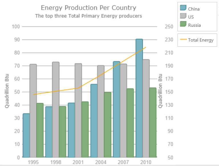
 

Composite charts:

Composite charts plot at least two data series that either use different axis ranges or are visualized by two different types of graphs. That means that, for example, one function spans between 1 and 100, and the other between 5 and 500, or even has a logarithmic scale, or one function is depicted by columns and the other by line.


$("#chart").igDataChart({
	dataSource: everyThreeYears,
	width: "450px",
	height: "450px",
	title: "Energy Production Per Country",
	subtitle: "The top three Total Primary Energy producers",
	horizontalZoomable: true,
	verticalZoomable: true,
	axes: [{
		type: "categoryX",
		name: "xAxis",
		label: "Year",
		strokeThickness: 5,
		title: "Year"
	}, {
		type: "numericY",
		name: "prodPower",
		minimumValue: 0,
		maximumValue: 100,
		strokeThickness: 5,
		title: "Quadrillion Btu"
	}, {
		type: "numericY",
		name: "totalPower",
		minimumValue: 50,
		maximumValue: 250,
		labelLocation: "outsideRight",
		title: "Quadrillion Btu",
	}],
	series: [{
		type: "column",
		isHighlightingEnabled: true,
		isTransitionInEnabled: true,
		name: "China",
		title: "China",
		xAxis: "xAxis",
		yAxis: "prodPower",
		valueMemberPath: "China",
		showTooltip: true,
		tooltipTemplate: "tooltipChina",
		legend: { element: "legend" }
	}, {
		type: "column",
		isHighlightingEnabled: true,
		isTransitionInEnabled: true,
		name: "UnitedStates",
		title: "US",
		xAxis: "xAxis",
		yAxis: "prodPower",
		valueMemberPath: "UnitedStates",
		showTooltip: true,
		tooltipTemplate: "tooltipUS",
		legend: { element: "legend" }
	}, {
		type: "column",
		isHighlightingEnabled: true,
		isTransitionInEnabled: true,
		name: "Russia",
		title: "Russia",
		xAxis: "xAxis",
		yAxis: "prodPower",
		valueMemberPath: "Russia",
		showTooltip: true,
		tooltipTemplate: "tooltipRussia",
		legend: { element: "legend" }
	}, {
		type: "line",
		isHighlightingEnabled: true,
		isTransitionInEnabled: true,
		name: "Total",
		title: "Total Energy",
		xAxis: "xAxis",
		yAxis: "totalPower",
		valueMemberPath: "Total",
		brush: "Orange",
		showTooltip: true,
		tooltipTemplate: "tooltipTotal",
		legend: { element: "legend2" }
	}],
	leftMargin: 5,
	topMargin: 15
});


You can see the final chart, based on the code above:


    Create composite layouts

      One of the most important when you are going to create dashboards is how to arrange your components in the page layout.

      The last two sections of this article demonstrate several layouts.


      Ignite UI Data Chart by default uses div element:


      <div class="chartComponent"><div id="chart"></div></div>

      It is also possible to use different div from your DOM for other igDataChart elements like legend:

      <div class="chartComponent"><div id="chart"></div></div><div id="legends"><div id="legend"></div><div id="legend2"></div></div>

      Using Ignite UI Data Chart with  high volume of data

      igDataChart works properly with big amount elements in the series.


      You can find more information in the Ignute UI website


      The image below demonstrates line series with high volume data:


      Using Infragistics jQuery chart with live OData services

      You can bind to the OData services, that returns data in json format , but often you need to maintain this data before to bind it to the igDataChart.

      The code below demonstrates how to manage Northwind data from www.odata.orgwebsite.

      Infragistics jQuery Chart expects a collection for its series. In this case collection is under the value option:

       var horthwndAPI = "http://services.odata.org/V4/Northwind/Northwind.svc/Products";
      
      $.getJSON(horthwndAPI, function (json) {
      
      	// Set the variables from the results array
      	var datavalues = json.value;
      	
      	$("#chart").igDataChart({
      		width: "100%",
      		height: "220px",
      		dataSource: datavalues,
      		//dataSource: "http://services.odata.org/V4/Northwind/Northwind.svc/Products",
      		axes: [{ name: "xAxis", type: "categoryX", label: "OrderID", labelVisibility: "visible" },
      				{ name: "yAxis", type: "numericY", labelVisibility: "visible" }],
      		series: [
      			{
      				name: "series",
      				title: "Product",
      				type: "line",
      				xAxis: "xAxis",
      				yAxis: "yAxis",
      				valueMemberPath: "UnitPrice", trendLineThickness: 6, thickness: 4,
      				trendLineBrush: "cyan",
      				transitionDuration: 1500,
      				trendLineType: "exponentialAverage"
      			}],
      		horizontalZoomable: true,
      		verticalZoomable: true,
      		windowResponse: "immediate",
      		overviewPlusDetailPaneVisibility: "visible"
      	});	
      
      });


      Composite dashboards with different controls (igDataChart, igGrid, igMap)


      Often you need to arrange different components in your dashboard and to let them to interact:
      for example if you select a record from the igGrid, to update your data for igDataChart and igMap,


      First you need to consider how to arrange components in the page layout:


      <div style="display: block; height: 500px;"><div><label for="color1">Highlight Color:</label><input id="color1" name="color1" type="text" value="#333399" style="width:200px; height:40px" /></div><div style="float: left; width:60%;  height: 500px; margin-right: 1%;"><table id="grid"></table><div id="chart"></div></div><div id="mapRoot" style="float: right; top: -500px; height: 500px; width: 39%;"><div id="map" ></div></div></div>

      Then you need to implement interaction between components:

      The Ignite UI Data Chart datasource is updated based of the selected record in igGrid:


      $("#chart").igDataChart({
      	width: "100%",
      	height: "220px",
      	dataSource: "/Home2/Orders",
      	axes: [{ name: "xAxis", type: "categoryX", label: "OrderID", labelVisibility: "visible" },
      			{ name: "yAxis", type: "numericY", labelVisibility: "visible"}],
      	series: [
      		{ name: "series",
      			title: "Order Freight Series",
      			type: "line",
      			xAxis: "xAxis",
      			yAxis: "yAxis",
      			valueMemberPath: "Freight", trendLineThickness: 6, thickness: 4,
      			trendLineBrush: "cyan",
      			transitionDuration: 1500,
      			trendLineType: "exponentialAverage"
      		}],
      	horizontalZoomable: true,
      	verticalZoomable: true,
      	windowResponse: "immediate",
      	overviewPlusDetailPaneVisibility: "visible"
      });
      
       $("#chart").igDataChart({
      	 dataSource: "/Home2/Orders?userID=" + args.row.element[0].cells[0].textContent
       });


      The full JavaScript source is available below:


      $("#map").igMap({
      	width: "100%",
      	panModifier: "control",
      	horizontalZoomable: true,
      	verticalZoomable: true,
      	windowResponse: "immediate",
      	overviewPlusDetailPaneVisibility: "visible",
      	windowRect: 
      	  {
      		  left: 0,
      		  top: 0,
      		  width: 0.5,
      		  height: 0.5
      	  },
      	seriesMouseLeftButtonUp: function (ui, args) {
      		var tets = args;
      	}
      });
      
      $("#chart").igDataChart({
      	width: "100%",
      	height: "220px",
      	dataSource: "/Home2/Orders",
      	axes: [{ name: "xAxis", type: "categoryX", label: "OrderID", labelVisibility: "visible" },
      			{ name: "yAxis", type: "numericY", labelVisibility: "visible"}],
      	series: [
      		{ name: "series",
      			title: "Order Freight Series",
      			type: "line",
      			xAxis: "xAxis",
      			yAxis: "yAxis",
      			valueMemberPath: "Freight", trendLineThickness: 6, thickness: 4,
      			trendLineBrush: "cyan",
      			transitionDuration: 1500,
      			trendLineType: "exponentialAverage"
      		}],
      	horizontalZoomable: true,
      	verticalZoomable: true,
      	windowResponse: "immediate",
      	overviewPlusDetailPaneVisibility: "visible"
      });
      
      $('#grid').igGrid({
      	virtualization: false, height: 280, width: "100%",
      	dataSource: "/Home2/Customers",
      	autoGenerateColumns: false,
      	columns: [
      		{ headerText: "Customer ID", key: "CustomerID", width: "120px", dataType: "string" },
      		{ headerText: "Country", key: "Country", width: "150px", dataType: "string" },
      		{ headerText: "City", key: "City", dataType: "string" },
      		{ headerText: "Contact", key: "ContactName", dataType: "string" },
      		{headerText: "Phone", key: "Phone", dataType: "string" }
      	],
      	features: [
      
      	 {
      		 name: 'Selection',
      		 mode: 'row',
      		 multipleSelection: false,
      		 rowSelectionChanged: function (ui, args) {
      			 $("#chart").igDataChart({
      				 dataSource: "/Home2/Orders?userID=" + args.row.element[0].cells[0].textContent
      			 });
      
      			 selected = args.row.element[0].cells[0].textContent; //keep track of selected user
      			 var countryUrl = "/Home2/CountryByName?countryName=" + args.row.element[0].cells[1].textContent;
      
      			$.getJSON(countryUrl,
      			   function (json, text) {
      				   $.each(json, function (index, value) {
      					   var country = value;
      					   var extend = country["Extend"];                                   
      
      					   var shapeData = country["ShapeData"];
      
      					   selectedColor = $('#color1')[0].value;
      
      					   var zoom = $("#map").igMap("getZoomFromGeographic", extend);
      					   $("#map").igMap("option", "windowRect", zoom);
      					   $("#map").igMap("option", "series", [{
      						   name: "series1",
      						   type: "geographicShape",
      						   markerType: "none",
      						   dataSource: shapeData,
      						   shapeMemberPath: "Points",
      						   shapeStyle: {
      							   fill: selectedColor,
      							   stroke: "black",
      							   thickness: 8.0
      						   }
      
      					   }]
      					 );
      					 
      					   var center = country["Center"];
      					   var name, lat, lon, centerData;
      
      					   name = country["CountryName"];
      
      					   lat = parseFloat(center.y);
      					   lon = parseFloat(center.x);
      
      					   centerData = [{ Name: name, Latitude: lat, Longitude: lon }];
      
      					   $("#map").igMap("option", "series", [{
      						   name: "Countries", 
      						   type: "geographicSymbol",
      						   longitudeMemberPath: "Longitude",
      						   latitudeMemberPath: "Latitude",
      
      						   /*
      						  The provided object should have properties called render and optionally measure.
      						  These are functions which will be called that will be called to handle the user specified custom rendering.
      						  */
      						   markerTemplate: {
      							   render: function (renderInfo) {
      								   var ctx = renderInfo.context; //2d canvas context
      								   var x = renderInfo.xPosition;
      								   var y = renderInfo.yPosition;
      
      								   if (renderInfo.isHitTestRender) {
      									   //  This is called for tooltip hit test only
      									   //  Rough marker rectangle size calculation
      									   ctx.fillStyle = "yellow";
      									   ctx.fillRect(x, y, renderInfo.availableWidth, renderInfo.availableHeight);
      								   } else {
      									   //actual marker drawing is here:
      									   var markerData = renderInfo.data;
      									   var name = markerData.item()["Name"];
      									   //set font or measure will be for the default one
      									   ctx.font = '10pt Segoe UI';
      									   var textWidth = ctx.measureText(name).width;
      
      									   //Move the path point to the desired coordinates:
      									   ctx.moveTo(x, y);
      									   //Draw lines:
      									   ctx.beginPath();
      									   ctx.lineTo(x - (textWidth / 2) - 5, y + 5);
      									   ctx.lineTo(x - (textWidth / 2) - 5, y + 40); // 35width rect.
      									   ctx.lineTo(x + (textWidth / 2) + 5, y + 40); // full textWidth line plus 5 margin
      									   ctx.lineTo(x + (textWidth / 2) + 5, y + 5); // 35 up
      									   ctx.lineTo(x, y);
      									   //finish the shape
      									   ctx.closePath();
      									   ctx.fillStyle = "rgba(78,183,226,0.7)";
      									   ctx.fill();
      									   ctx.lineWidth = 0.5;
      									   ctx.strokeStyle = "#185170";
      									   ctx.stroke();
      									   //add a point at the start
      									   ctx.beginPath();
      									   ctx.fillStyle = "black";
      									   ctx.arc(x, y, 1.5, 0, 2 * Math.PI, true);
      									   ctx.fill();
      
      									   //  Draw text
      									   ctx.textBaseline = "top";
      									   ctx.fillStyle = "black";
      									   ctx.textAlign = 'center';
      									   ctx.fillText(selected, x, y + 8);
      									   ctx.fillText(name, x, y + 20);
      								   }
      							   }
      						   },
      
      						   dataSource: centerData
      					   }]
      					); //MM2
      
      				   });
      			 });
      
      		 }
      	 }
      	,
      
      	{
      		name: 'Sorting',
      		type: "remote"
      	},
      	{
      		name: 'Paging',
      		type: "local",
      		pageSize: 10,
      		//pageSizeDropDownLocation: "inpager",
      		pageCountLimit : 1
      	}]
      	,
      	rendered: function (ui, args) {
      		//set up on-load selection 
      		$('#grid').igGridSelection("selectRow", 0);
      		//another way to get cell value independant of event parameters
      		var id = $('#grid').igGrid("getCellValue", 0, "CustomerID");
      		$("#chart").igDataChart({
      			dataSource: "/Home2/Orders?userID=" + id
      		});
      
      
      	}
      });


      The final result is like the on the picture below:


      If can see the live demo, hosted in Microsoft Azure here:


        Demo (different Ignite UI Charts)


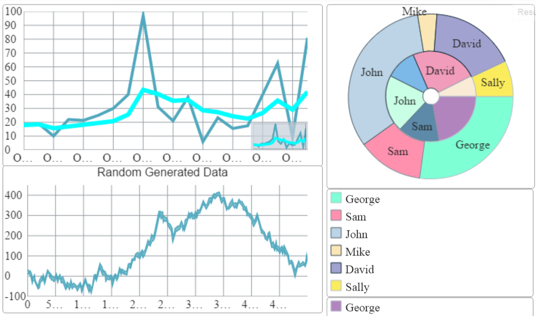
          Ignite UI dashboard demo includes several igDataChart instances and one igDoughnutChart widget.


          The Doughnut Chart , mentioned in my previous post: “How to Customize Ignite UI Doughnut Chart Control” is also added in the right side of the layout:


          Ignite UI Doughnut Chart supports ( in the same way like igDataChart ) multiple data sources that can be set to each series.

          The snippet demonstrates how you can set data:


          series:
          	[
          		{
          			name: "Budget",
          			labelMemberPath: "Label",
          			valueMemberPath: "Budget",
          			dataSource: data2,
          			labelsPosition: "bestFit",
          			brushes: ["#B284BE", "#5D8AA8", "#C9FFE5", "#7CB9E8", "#F19CBB", "#FAEBD7"],
          			legend: { element: "legend1" },
          			selectedStyle: { fill: "lightpink", stroke: "black" },
          			showTooltip: true,
          			tooltipTemplate: "budgetTooltipTemplate"
          		}
          	]


          You can see the whole code for igDoughnutChart chart below:


          $(function () {
          
                  var data = [
                                  { "savings": 210, "Budget": 600, "Label": "George" },
                                  { "savings": 100, "Budget": 400, "Label": "Sam" },
                                  { "savings": 250, "Budget": 550, "Label": "John" },
                                  { "savings": 29, "Budget": 300, "Label": "Mike" },
                                  { "savings": 130, "Budget": 650, "Label": "David" },
                                  { "savings": 54, "Budget": 200, "Label": "Sally" }
                  ];
          
                  var array = new Array();
                  $("#chart").igDoughnutChart({
                      width: "450px",
                      height: "450px",
                      innerExtent: 10,
                      allowSliceExplosion: true,
                      allowSliceSelection: true,
                      sliceClick: function (e, ui) {
                          ui.slice.isSelected = !ui.slice.isSelected;
                          ui.slice.isExploded = !ui.slice.isExploded;
                          array.push(ui.slice);
                          $("#selectedItem").empty();
                          for (var i = 0; i < array.length; i++) {
                              if (array[i].isSelected) {
                                  $("#selectedItem").append("<p id=" + array[i].item.Label + ">" + array[i].item.Label + " recieves " + array[i].item.Budget + "$ and manage to saves " + array[i].item.savings + "$.</p>");
                              }
                              if (!(array[i].isSelected)){
                                  $("#" + array[i].item.Label).remove();
                              }
                          }
                      },
                      series:
                          [
                              {
                                  name: "Budget",
                                  labelMemberPath: "Label",
                                  valueMemberPath: "Budget",
                                  dataSource: data,
                                  labelsPosition: "bestFit",
                                  brushes: ["#B284BE", "#5D8AA8", "#C9FFE5", "#7CB9E8", "#F19CBB", "#FAEBD7"],
                                  legend: { element: "legend1" },
                                  selectedStyle: { fill: "lightpink", stroke: "black" },
                                  showTooltip: true,
                                  tooltipTemplate: "budgetTooltipTemplate"
                              },
                              {
                                  name: "savings",
                                  labelMemberPath: "Label",
                                  valueMemberPath: "savings",
                                  dataSource: data,
                                  labelsPosition: "bestFit",
                                  brushes: ["#7FFFD4", "#FF91AF", "#BCD4E6", "#FAE7B5", "#A2A2D0", "#FBEC5D"],
                                  selectedStyle: { fill: "#FF6A6F", stroke: "black" },
                                  showTooltip: true,
                                  tooltipTemplate: "savings Template",
                                  legend: { element: "legend2" }
                              }
                          ]
          
                  });
          
              });


          It looks in this way:


          You can see the whole JavaScript source code below:


          $(function () {
          	vara currData, currDataSource, doGeneration, startTime = null;
          			var sliderValue = 50000;
          
          			function doGeneration() {
          				var num = sliderValue, data = [], curr = 10;
          
          				for (var i = 0; i < num; i++) {
          					if (Math.random() > .5) {
          						curr += Math.random() * 2.0;
          					} else {
          						curr -= Math.random() * 2.0;
          					}
          					var val1 = Math.round(curr * 1000.0) / 1000.0;
          					data[i] = { Label: i.toString(), Value: val1 };
          				}
          				return data;
          			}
          
          
          	currData  = doGeneration();
          		
          	var data2 = [
          							{ "savings": 210, "Budget": 600, "Label": "George" },
          							{ "savings": 100, "Budget": 400, "Label": "Sam" },
          							{ "savings": 250, "Budget": 550, "Label": "John" },
          							{ "savings": 29, "Budget": 300, "Label": "Mike" },
          							{ "savings": 130, "Budget": 650, "Label": "David" },
          							{ "savings": 54, "Budget": 200, "Label": "Sally" }
          			];
          		var array = new Array();
          
          	var array = new Array();
          	$("#doughnutChart").igDoughnutChart({
          		width: "100%",
          		height: "250px",
          		innerExtent: 10,
          		allowSliceExplosion: true,
          		allowSliceSelection: true,
          		sliceClick: function (e, ui) {
          			ui.slice.isSelected = !ui.slice.isSelected;
          			ui.slice.isExploded = !ui.slice.isExploded;
          			array.push(ui.slice);
          			$("#selectedItem").empty();
          			for (var i = 0; i < array.length; i++) {
          				if (array[i].isSelected) {
          					$("#selectedItem").append("<p id=" + array[i].item.Label + ">" + array[i].item.Label + " recieves " + array[i].item.Budget + "$ and manage to saves " + array[i].item.savings + "$.</p>");
          				}
          				if (!(array[i].isSelected)){
          					$("#" + array[i].item.Label).remove();
          				}
          			}
          		},
          		series:
          			[
          				{
          					name: "Budget",
          					labelMemberPath: "Label",
          					valueMemberPath: "Budget",
          					dataSource: data2,
          					labelsPosition: "bestFit",
          					brushes: ["#B284BE", "#5D8AA8", "#C9FFE5", "#7CB9E8", "#F19CBB", "#FAEBD7"],
          					legend: { element: "legend1" },
          					selectedStyle: { fill: "lightpink", stroke: "black" },
          					showTooltip: true,
          					tooltipTemplate: "budgetTooltipTemplate"
          				},
          				{
          					name: "savings",
          					labelMemberPath: "Label",
          					valueMemberPath: "savings",
          					dataSource: data2,
          					labelsPosition: "bestFit",
          					brushes: ["#7FFFD4", "#FF91AF", "#BCD4E6", "#FAE7B5", "#A2A2D0", "#FBEC5D"],
          					selectedStyle: { fill: "#FF6A6F", stroke: "black" },
          					showTooltip: true,
          					tooltipTemplate: "savings Template",
          					legend: { element: "legend2" }
          				}
          			]
          
          	});  
          		
          
          	$("#datachart").igDataChart({
          					width: "100%",
          					height: "200px",
          					title: "Random Generated Data",
          					dataSource: currData,
          					axes: [{
          						name: "xAxis",
          						type: "categoryX",
          						label: "Label"
          					}, {
          						name: "yAxis",
          						type: "numericY"
          					}],
          					series: [{
          						name: "series1",
          						title: "Test Series",
          						type: "line",
          						xAxis: "xAxis",
          						yAxis: "yAxis",
          						valueMemberPath: "Value",
          						showTooltip: true,
          						isTransitionInEnabled: true,
          						isHighlightingEnabled: true,
          						tooltipTemplate: "tooltipTemplate"
          					}],
          					horizontalZoomable: true,
          					verticalZoomable: true,
          					windowResponse: "immediate"
          				});
          	 var horthwndAPI = "http://services.odata.org/V4/Northwind/Northwind.svc/Products";
          
          	$.getJSON(horthwndAPI, function (json) {
          
          		// Set the variables from the results array
          		var datavalues = json.value;
          		
          		$("#chart").igDataChart({
          			width: "100%",
          			height: "220px",
          			dataSource: datavalues,
          			//dataSource: "http://services.odata.org/V4/Northwind/Northwind.svc/Products",
          			axes: [{ name: "xAxis", type: "categoryX", label: "OrderID", labelVisibility: "visible" },
          					{ name: "yAxis", type: "numericY", labelVisibility: "visible" }],
          			series: [
          				{
          					name: "series",
          					title: "Product",
          					type: "line",
          					xAxis: "xAxis",
          					yAxis: "yAxis",
          					valueMemberPath: "UnitPrice", trendLineThickness: 6, thickness: 4,
          					trendLineBrush: "cyan",
          					transitionDuration: 1500,
          					trendLineType: "exponentialAverage"
          				}],
          			horizontalZoomable: true,
          			verticalZoomable: true,
          			windowResponse: "immediate",
          			overviewPlusDetailPaneVisibility: "visible"
          		});	
          
          	});
              
          });


          The dashboard looks like this one below:


          The whole dashboard example you can find in JSFIDDLE here:


          The Infragistics jQuery Data Visualization controls offer  a wide range of options to create almost any dashboard that you need. In this post we use Ignite UI Data Chart and Doughnut Chart, but you can see sample how to use any of data visualization components on the Ignite UI website.  You can find a detailed information about the control and its features and how to configure its separate parts in the API documentation as we as the online help documentation.

          To play around with the Ignite UI dashboards on your own, be sure to get Infragistics Ultimate and see the chart in action in our latest sample application by clicking the banner below!

          A beginner's guide to submitting an App to the App Store

          $
          0
          0

          Since Apple successfully unleashed their trailblazing App Store in 2008, other technology firms have taken similar measures with their own software. The App Store allows an iOS owner to customize their device in whatever direction takes their fancy, due to the incredible range of apps available to users. Today, we’re going to be taking a look at how to push apps through the approval process. This is not necessarily straightforward and can be somewhat complicated.

          Developing the application

          To get started, you’ll need to get a subscription to the Apple iOS Developer program, priced at $99 per year, and an actual iOS device. This is preferable to using the iOS emulator as some bugs are likely to show up only when running on iOS devices. There are several things to do before you’re ready to submit your work:


          1. Request Certificates for your app: Certificates are used to identify you and your app. You’ll need two (1 x development, 1 x distribution). These are generated in an application known as Xcode, the iOS development IDE.
          2. Configure device for development and add the device to the member centre: Once the certificates have been generated, you’ll then plug your device into your computer. While this typically triggers an iTunes back-up / new device prompt, this isn’t desired. Instead, you’ll want to go to the XCode Organiser window (SHIFT+CMD+2) to register your device for development. 
          3. Create a provisioning profile: This step involves logging into the iOS Provisioning Portal to create a provisioning profile for your application. 
          4. Make sure your app is set to use that Xcode provisioning profile: You need to ensure your Xcode project bundle ID directly corresponds to the bundle ID that you specified when you created your App ID.
          5. Deploy app to the device: If all has gone well, you’ll see the name of your device in the list of deployable targets.

          The creation of a distribution provisioning profile

          The creation of a distribution provisioning profile allows multiple development certificates to be granted, which in turns allows multiple developers to create a build. With the iOS distribution provisioning profile, you’re only permitted one distribution certificate which will be the sole signing identity used to code sign your app at the archive generation phase. The archive is the name for the overall package that you end up submitting to the App Store.

          The distribution profile is generated by logging into iOS Developer Provisioning Portal and navigating to the Distribution Provisioning Profiles section. Choose App Store as the certificate type, then your App ID from the drop down list. Click Continue to move on. On the next screen, select the available distribution certificate and proceed to generate it, download it and installing it to your provisioning profile.

          Building an archive of your App using this profile

          This stage involves the creation of an archive within Xcode, which we’re going to submit for certification. This is where you’re going to have to check several things, namely that both the App Review Guidelines have been adhered to and that you’ve not made any common mistakes, as seen here.

          Once you’re confident your work meets all guidelines, you can proceed. On the root node of the project navigate to the project settings and look for the Build Settings Tab. In here, look for Code Signing → iOS Distribution. Change the deployment to iOS Device and then navigate to Product Menu Item look for the Archive option. This results in the creation of an archive.

          The creation of an App listing in iTunes Connect

          Now we move onto a brand new facility, which is the Apple iTunes Connect. This is another facility that you’re granted access to via the Apple iOS Developer, which lets you view various reports on your app. There are several options here, so for ease of use, navigate to Manage Your Apps → Add New App.

          Select the bundle ID that matches the app you want to submit and give it a name. You can (and should) fill out additional information here, such as App Version Information, relevant metadata, Contact info, EULA and Art Assets and so on. Once all this has been entered, click the save button and you’ll see that the status change of your app has now altered to “Waiting for Upload.”

          Submission of your application for final certification through Xcode

          Finally, head back to Xcode and open the organizer via SHIFT+CMD+2, and then navigate to the Archives tab to find your earlier archive. Click on the Distribute button, follow through the validation and use your developer credentials to log into iTunes Connect. Assuming all is well, your archive will now be uploaded for certification and you’ll see that the status label has changed to “Waiting for Review.”

          For those submitting apps for the first time, this can take up to a week. You’ll eventually receive an email from the review team when the status changes. If the app fails the review process you’ll typically be informed why.

          A multistep process

          As we’ve seen, the certification process can be tricky, both from having to have an iOS device, to managing various profiles and logging into websites whilst using Xcode. Not only is the submission process a multistep process, developers need to be aware of the Apple Review Guidelines.

          The App Review Guideline Document itself is a “living document” that can be modified at any time. They essentially use it to prevent concerns with explicit material, violence, legal issues, and user experience. Apple review teams tend to check each App against these guidelines before approving it for sale and inclusion on the App Store.

          It’s not necessarily the most straightforward process, but Apple’s desire to ensure quality is understandable and by following these basic steps you’ll be uploading Apps in no time at all.

          You are never NOT ‘doing’ User Experience

          $
          0
          0

          Whether you’re a developer, designer, project manager, or exec, if you have any part of any project that your customer will see or consume, you are creating something they will experience. Your customers – your users – can’t NOT ‘experience’ your site/app/product. You are ‘doing’ User Experience. If at NO point during the execution of that project did you even consider those people, chances are you created a crappy experience. Congrats.

          bad user experience

          Being a User Experience professional, it would be easy for me to say ‘leave UX up to us’.  But, it’s simply not that easy. Every single person involved should have an understanding of the user and their motivations. We all need to understand the scenarios our users go through so we can prioritize and determine what’s important to concentrate on in order for us to provide a good user experience for them.

          For instance, if users don’t know exactly what they’re looking for on your site, they may need a filtered browse system that can narrow down choices. If your database doesn’t have the proper metadata or structure, there’s not much a good UI design can do to improve that. 

          If they know what they’re looking for and search, is your search engine fast enough? If they navigate, are your pages structured to load quickly?

          If you know your users are likely to be on mobile devices, is your site or product responsive? Have you had the conversation about native v. hybrid?

          If you know that your  users need to perform certain tasks in the course of their day to get their jobs done, do you know if your backend systems talk to each other to pass that information across? CAN the user do all the tasks in a seamless manner?

          Do you know all of your customer touch points? Are you sending the same messaging to them on your site, in your product, and through direct communications via sales and marketing? If not, you could be confusing and confounding them.

          None of these examples necessarily involve UI/UX as we think of it, but they ALL impact the experience the user has. I’m sure there are plenty more I could cite because I’ve run into these and plenty more in the course of my career. The point is, that even if you don’t directly touch the design or the UI, you are impacting the experience the user has. If you know your users’ needs, motivations, and scenarios in which they use your site or product, you’ll think through your choices in the back end as well as on the UI and chances are you’ll create a GOOD user experience. Congrats!

          Viewing all 2223 articles
          Browse latest View live


          Latest Images