Quantcast
Channel: Infragistics Community
Viewing all 2223 articles
Browse latest View live

How to create a Microsoft Azure-based MVC application

$
0
0

“Cloud” has been a buzz word for a while now. But what does it mean for you as a developer? For starters, you won’t have to write very different code for the cloud than what you’re already writing for in-premise applications.

Let’s assume that you are already familiar with MVC applications. If that’s true, in this post we’ll focus on demonstrating how building for the cloud is not very much different than any other development. We’ll follow a step by step approach and create an end to end MVC application that is hosted completely in the cloud (both data and application).

Here’s how we’ll get it done:

  • Setting up the database in the SQL Azure
  • Creating the MVC application
  • Building the application using MVC and the Entity framework
  • Publishing the application to Azure web site

Setting up the database in the SQL Azure  

First, we will set up the database in the cloud. We are going to use SQL Azure as the cloud platform, and let’s go ahead and create a School database. To create this in Azure, you have to:

  • Login to Microsoft Azure portal
  • From the side tab, select SQL DATABASES options
  • In the bottom, click on the NEW button

From here, you’ll get the option to create a new database. To create one, you need to provide the following information:

  • Name of the database. Here we’re going to work with the Microsoft-provided School database, so make sure that you give “School” as the name of the database.
  • Choose the Azure subscription in which database will be created.
  • You can choose either an existing server or create a new database server. To create a new database server, you’ll have to provide information like region, login name and password.


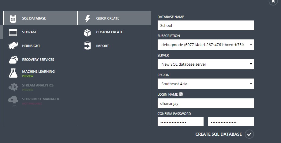
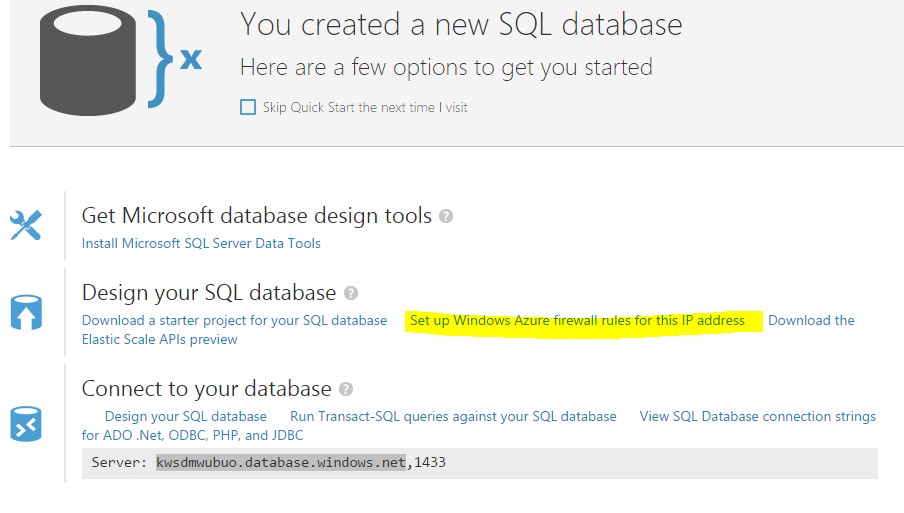
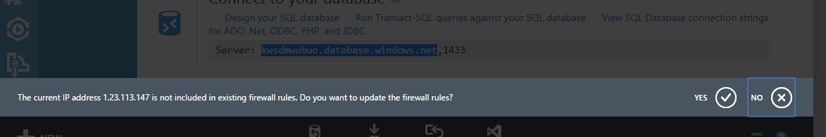
Once you click on the CREATE SQL DATABASE option, the School database and a new database server will get created. After successful database creation, you need to configure firewall rules for the database server such that you can connect the local development machine to the SQL Azure database server. To configure the firewall rules, click on Set up Windows Azure firewall rules for this IP address.

Here you’ll be prompted with the information that the current IP address is not added in the existing firewall rules. Click on Yes to add that current IP address to the existing firewall rules of the database server.

Next we will connect the newly created cloud database from the SQL Server management studio so that we can run scripts to create tables with the data. To do that, you’ll need to launch SSMS and provide the following information:

  • The name of the SQL Azure database server. You can find database server name in the portal.
  • Choose authentication as SQL Server authentication
  • User name and password

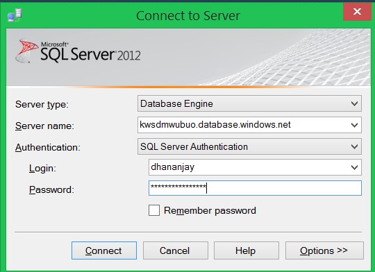
After successful connection to the SQL Azure database server, you will able to view the connection in the SSMS as shown below:

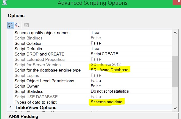
We are going to use the Microsoft-provided School database to create the tables and data. We already have the school database created from provided script in the local database server, so next we will have to create the script which can run on the SQL Azure database server. To create this, right click on the database and then select Tasks and then Generate Scripts.  In the generate script window, select Script entire database and all database objects.

On the next screen, click on the Advanced option.

In Advanced window, change the following values:

Types of data to script: Schema and data

Script for database engine type:  SQL Azure database

Select the option to save to new query window and click on Next. You will find that the generated script is created and opened in the new query window inside the SSMS.  Select the SQL Azure database connection and run the script.  You will find that tables along with the data has been created in the School database residing on the SQL Azure database server.

We have created the School database which is in the cloud. In the next section, we will use the cloud database to create a MVC application.

Creating the MVC application

In this section we will create and set up the MVC application to be published in the Azure Web Site. You can do so by choosing MVC template.

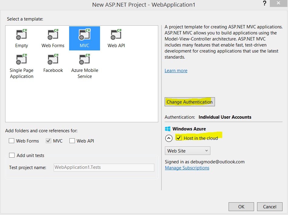
We don’t want any authentication for this application. To configure this click on the Change Authentication option, and in the dialog box select No Authentication as shown below:

We want to host the application in the cloud. To be precise, the application will be hosted in the Azure Web Site. To configure that, select the Host in the cloud check box, and from the drop down, choose Web Site.

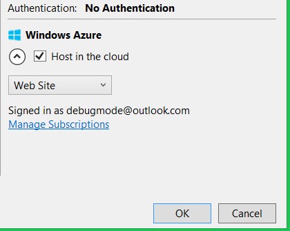
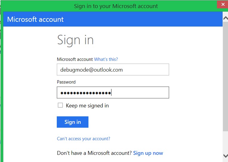
Next you will be asked to authenticate your account.  Authenticate yourself by providing the user name and the password.

On the next screen you need to configure:

  • A site name. This name will be used as URL to access the application when hosted in the azure server.
  • Region: the Azure server region in which the application will be hosted.
  • A database server. In this example we’ll select the same database server in which the School database resides.
  • A password to connect to the database server.

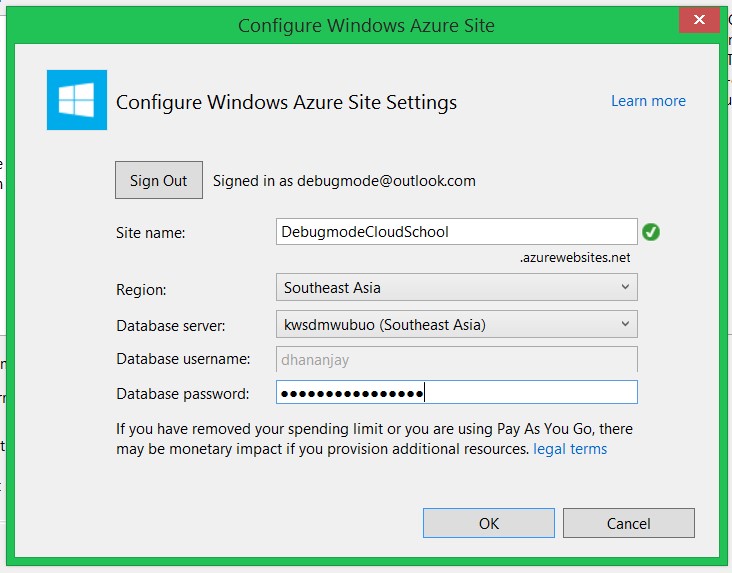
After successful authentication with the Azure service and the database server, you will see a message in Visual Studio that the application is ready.

Building the application

As of now we have set up the database and created the MVC application to be hosted in the Azure web site. Now let’s go ahead and build the application.

Adding the data model

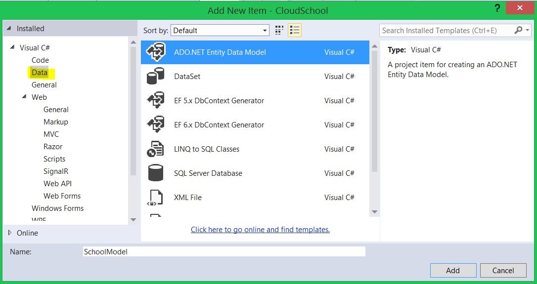
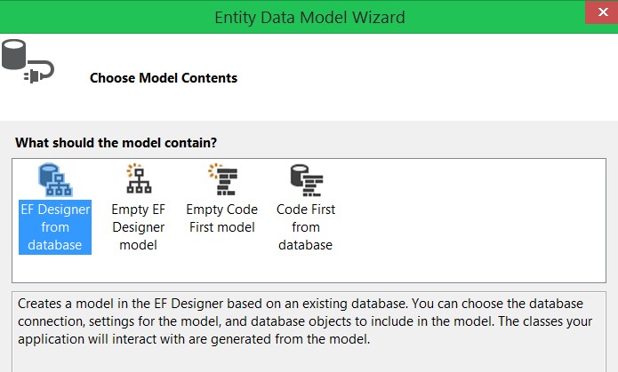
We will start with creating the data model using the School database hosted in the SQL Azure. We will use ADO.NET Entity Data Model to create the model. To create the model in the MVC project, create a folder named Infrastructure. Right click on the infrastructure folder, and select Add New Item. In the Add New Item dialog box, select ADO.NET Entity Data Model from the Data tab and name it SchoolModel.

On the next screen, select the EF designer from database option.

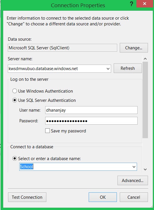
Click on New Connection, and in the new connection dialog box, provide the following information:

  • SQL Azure data base server name. We created this server in the previous section
  • Select SQL Server Authentication option
  • Provide the SQL Azure database server user name and the password
  • Select the School database from the drop down

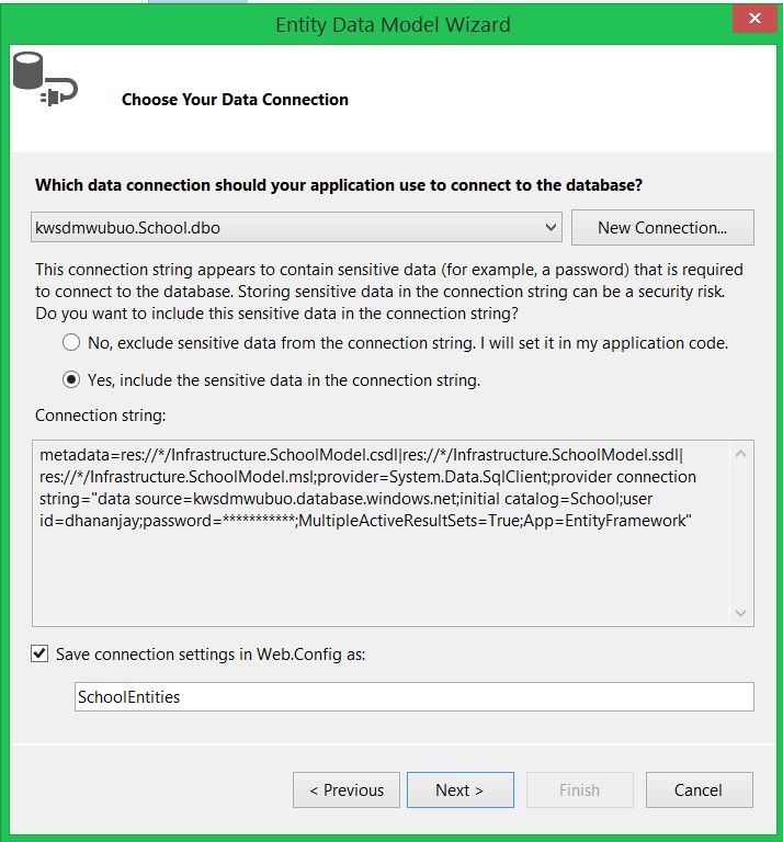
In the next dialog box, select the Yes option, include the sensitive data in the Connection string, and leave the default name for the connection string.

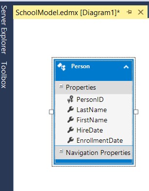
We are going to work with the Person table. So click on the Person check box and leave the other checkboxes to default.

By clicking on Finish, the data model will be created as shown below:

We have successfully created and added a data model in the MVC application. Keep in mind that SchoolModel is now connected to the cloud database in the SQL Azure.

Adding Controller with read and write operation

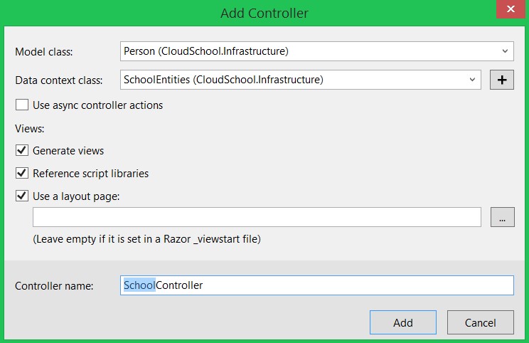
Next we’ll add a controller with views, using the Entity framework. We will use MVC scaffolding to create views to perform CRUD operations on the Person table. To add a controller, right click on the Controller folder and select MVC 5 Controller with views, using Entity Framework option as shown below:

In the next dialog box, we need to choose the model and the context class. Here we will choose Person as the model class and SchoolEntities as the DataContext class. To create the views corrosponding to the database operation, make sure that the other check boxes are checked.

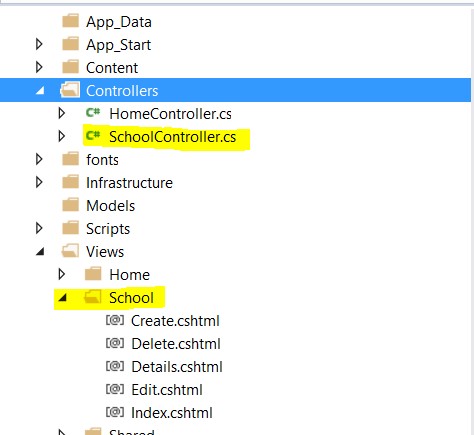
With this step, we have created the controller and views for the CRUD operations on the person table. In the solution explorer, you should have the following files:

At this point, if you go ahead and run the application, you will get data from the person table which resides in the SQL Azure is listed. You can also create new data, edit and delete data.

Making your application more immersive

In this example, we don’t need Home, About and Contact View. Also, let’s say we want a list of people on the base URL of the application.

Let us start by removing the Home controller and deleting the Home subfolder in the View folder and in the layout.cshtml file comment the div with the class navbar-header. Once the home controller and view is deleted, next open RouteConfig.cs from App_Start folder and change the default controller to School in the route as shown below:

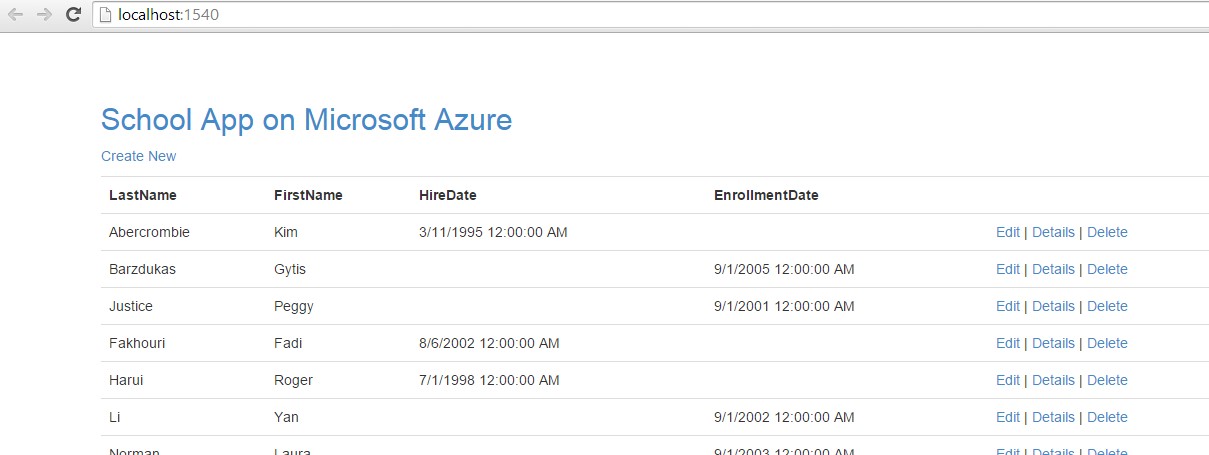
We are now done with creating the application. Press F5 to run and test the application locally. You should able to see the application running as shown below:

Publishing the application

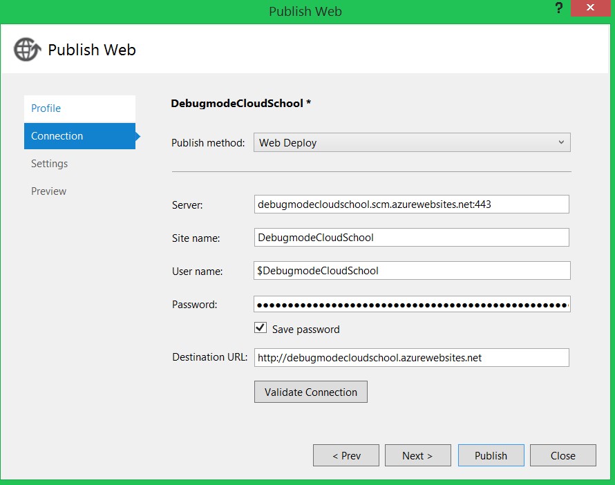
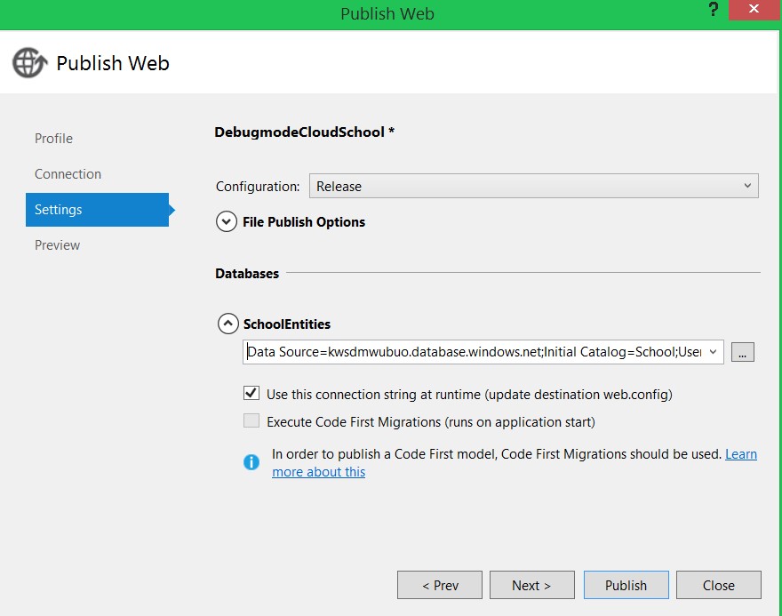
To publish the app, right click on the project and click on publish. In the connection dialog box, validate the values and click on next.

In the settings dialog box, for the database, select the SchoolEntities connection string and click on next.

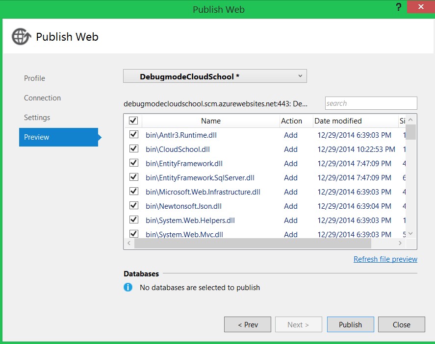
Finally, click on publish to publish the application in the Azure web site.

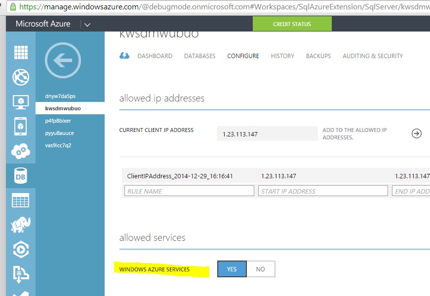
If you run into any errors, you can open the management portal and for the database server verify that Windows Azure Services option is set to yes or not in the Allowed Services. It should be set to Yes as shown below:

Conclusion

Now you should be able to perform CRUD operation from MVC application hosted in Azure web site and accessing the database hosted in SQL Azure. In this post we learned about:

  • Creating database in the SQL Azure
  • Migrating data from local database server to the SQL Azure database server
  • Using data from cloud in a MVC application using the entity framework
  • Host MVC application in the Azure web site
  • Publish the application to Azure web site.

Hopefully you found this article is useful – thanks for reading and happy coding!


Developer News - What's IN with the Infragistics Community? (12/22-1/4)

$
0
0

Annnndddd we're back in action after the New Year! I hope that everyone is having a great start to their 2015. :)

Dec 29-Jan 4

5. The Top UX Trends of 2014 (UX Magazine)

4. 25 Best Steve Jobs Quotes (The Motley Fool)

3. Why Computers Haven't Replaced Programmers (CodeProject)

2. Steve Jobs Meeting Techniques (Business Insider)

1. The Best User Interfaces of 2014 (FastCompany)

Dec 22-Dec 28

5. The Best 8 Languages to Choose for Learning Programming in a Month (Forbes)

4. Making a Class Schedule Using a Genetic Algorithm (CodeProject)

3. Why Steve Jobs Went "Thermonuclear" Over Android (Tim Bajarin)

2. The Programming Skills Will Earn You the Most Money (Quartz)

1. What's New in C# 6.0? Null Conditional Operators (CodeProject)

Five Tips for Surviving Crunch Time

$
0
0

The clock is ticking. Your project’s deadline is fast approaching, and completing it on time is nearly impossible. Perhaps extra work was thrown at you at the last minute, or perhaps things took an unexpected turn. Either way, the pressure is on the development team to deliver the goods. You’re in a crunch.

There are many software development methodologies promising to avoid time crunches if done properly. Yet, most of us have been there at some point in time. If you’re in a crunch, here are a few tips to help you return to your normal work life as quickly as possible.

Tip #1: Don’t Add Manpower

Published in 1975, the central theme of the Mythical Man Month is that “adding manpower to a late software project makes it later.” Forty years later, this is still a common mistake. It is likely due to the intuitive notion that adding more people decreases workload by a relative amount, which makes sense if you’re digging a trench.

Building software requires creativity. Even without an official “architect” title, programming requires design, and working on a team requires cognizance of others’ designs. Adding more team members effectively slows down a project as current team members must bring new programmers up to speed.

Exception: When a serious impediment is contributing to a crunch, adding a team member with the appropriate experience may help as long as the new developer is limited to that particular problem during the crunch.

Tip #2: Focus on the Deliverable

Crunch time is not the time to lay the groundwork for future functionality. It is tempting to create the underlying architecture to support both a current and planned feature, but only code what is required to end the crunch.

If necessary, throw a NotImplementedException (e.g. unused interface methods). It may not feel done, but it is for this release.

Exception: If laying the groundwork is the path of least resistance, do it. Your goal is to end the crunch, not to jump through hoops to follow these tips.

Tip #3: No Gold Plating

I know requirements are never perfect. They’re often missing little things like hot keys, tab order, or an appropriate icon. Perhaps they shouldn’t go into such minute details. In my experience, those details cause trouble (a user experience guide would be more appropriate).

If features are not part of the requirements or guidelines, don’t spend time on them. We all want users to have the best experience possible with our products, but every one of those features takes time to build, test, document, and may even require additional end-user training.

If you feel the feature is important despite its exclusion, or you suspect it’s an undocumented expectation, add a change request so it can be properly triaged or scheduled.

Exception: It is not gold plating to leave a system or browser feature in place.

Tip #4: Reject Change Requests

Features should not be added during crunch time, including those as minor as a modification to label text. Even a change that should take five minutes can unexpectedly snowball into a massive amount of work. Instead, schedule the change for a future cycle.

Exception: The change request accompanies a time extension ending the crunch.

Tip #5: You Got This

It’s no accident the project seemed to be moving quickly only to become a grind. The Pareto Principle implies that the last 20% of the project takes 80% of the effort. With few exceptions, I’ve found this to be a good rule to follow.

If completion is simply not possible, the project manager will need to delay or cancel some features. The upside of the Pareto Principle is that your team already implemented the majority of the release’s features.

Exception: It is impossible to reach 100% perfection in all but the most trivial systems. Don’t agree to write a completely bug-free system.

Conclusion

Despite claims to the contrary, developers are human. We need food, sleep, and exercise to function efficiently, and prolonged periods of long work hours can negatively affect our psyche. Due to diminishing returns, crunch time is only effective for short durations.

I hope these tips help when you do find yourself in crunch mode. Please share your own tips and story. And remember: code healthy!

Image Credits

Images used in this article are licensed under Creative Commons and may slightly differ from the original.

Alexander Torrenegra
package! By Beck Gusler
Henry VIII’s Armor by lizzybeans11
Stop by Jeffrey
Say It With Confidence by Pete

A Frank Lloyd Wright Approach to Digital Design

$
0
0

Frank Lloyd Wright was a pioneer, an Avant-Garde architect who broke free of the design traditions of his era. His ideals are still used in architecture today, and his buildings have stood the test of time, remaining relevant in today’s digital age. As designers, we’re frequently asked to create digital experiences (especially in software) that will have a life expectancy of five to ten years. This is an eternity in “digital” time. It makes me wonder how can we create experiences that remain relevant in today’s rapidly evolving world

Applying Wright’s principles can help us overcome this challenge. Wright passionately abandoned the fashionable and frivolous Victorian design traditions of his time. According to his philosophy, every design decision and detail should serve a greater purpose. Additionally, his views on materials, open layouts, form, function, and environment can inspire us to rethink the way we approach our digital design work and even push the medium into new and exciting territories.

Read the full article at Smashing Magazine to find out how these principles may be applied to digital design.

Theming and Customizing of Ignite UI jQuery Map Control

$
0
0


Ignite UI Map Control (igMap) is very easy to use widget providing  strong mapping functionalities

The underlying rendering engine of the Ignite UI Map (igMap) is the same as the Data Chart, so in addition to a wide variety of tile sources, you can also bind & render thousands to millions of data points on the map.  Bing, CloudMade, OpenStreet, ESRI Shape Files and custom tiles are supported.

This blog is focused mainly about how to style igMap, how to change the visualization  of some  the most popular Map series ( Geographic Symbol, Geographic Shape, Geographic Contour series), how to customize the symbol marker templates, tooltips and more useful examples.

Map series’ colors are controlled by options and depend on the particular series type used. For example, the Geographic Symbol and Geographic Shape series support markers, while the rest of the map series have other visual representation like polylines and contour lines or employ colored regions which depend on map data. That is the reason to have different code for different series. It is not possible for one article to cover everything and mentioned practices cover some of the most often seen cases.

Theming:

Infragistics offers the following themes you can include:

  • Infragistics Theme
  • Infragistics 2012 Theme
  • Metro Theme
  • iOS Theme
  • Bootstrap Themes:
    • Default
    • Superhero
    • Yeti
    • Flatly

Before to start:

To support styles and themes for any of Infragistics components don’t forget to add required resources to support Infragistics Ignite UI Map.

Include the Infragistics theme fileand  structure file in the code. 


The following code snippet includes the Infragistics theme and structure files in your file:

In HTML:


<link href="{IG Resources root}/css/themes/infragistics/infragistics.theme.css" 
     rel="stylesheet" type="text/css" /><link href="{IG Resources root}/css/structure/infragistics.css" 
     rel="stylesheet" type="text/css" />


The example demonstrates usage of infragistics theme , but the same approach can be used for all available themes.

In ASPX:


<%@ Import Namespace="Infragistics.Web.Mvc" %><!DOCTYPE html><html><head id="Head1" runat="server"><link href="<%= Url.Content("{IG Resources root}/css/themes/infragistics/infragistics.theme.css ") %>” 
     rel="stylesheet" type="text/css" /><link href="{IG Resources root}/css/structure/infragistics.css" 
     rel="stylesheet" type="text/css" />


The whole list of required resources to use igMap is available below:


<script src="http://igniteui.com/js/modernizr.min.js"></script><script src="http://code.jquery.com/jquery-1.9.1.min.js"></script><script src="http://code.jquery.com/ui/1.10.3/jquery-ui.min.js"></script><script src="http://cdn-na.infragistics.com/igniteui/latest/js/infragistics.core.js"></script><script src="http://cdn-na.infragistics.com/igniteui/latest/js/infragistics.dv.js"></script><script src="http://igniteui.com/js/map-helper.js"></script><link href="http://cdn-na.infragistics.com/igniteui/latest/css/themes/infragistics/infragistics.theme.css" rel="stylesheet"></link><link href="http://cdn-na.infragistics.com/igniteui/latest/css/structure/infragistics.css" rel="stylesheet"></link>


For loading the resources with the Loader, use the following code to include the igLoader script in the page:

If you are using Infragistics loader you need to set cssPath and scriptPath options, which is relative to the page that instantiates the loader.

<script type="text/javascript">
    $.ig.loader({
        scriptPath: "/Scripts/ig/",
        cssPath: "/Content/ig/",
        resources: "igMap"
    });</script>

If you need to use predefined themes you need to add also the specified theme:

<script type="text/javascript">
    $.ig.loader({
        scriptPath: "/Scripts/ig/",
        cssPath: "/Content/ig/",
        resources: "igMap",
	theme: "metro"
    });</script>

Ignite UI Map has no many styling points, so if you add series without specific styling these series will take default styling – not a styling related to the specified theme.

For example if you have Geographic Shape series or Geographic Symbol Series you will have default styling for these elements:

Geographic Shape series default styling

Geographic Symbol series default styling:


There are some elements affected from theming:


Overview Plus Detail panel   , getting the currently displayed area on the map, is one of the elements where theming effect is available:

$("#map").igMap({
	width: "100%",
	verticalZoomable: true,
	horizontalZoomable: true,
	overviewPlusDetailPaneVisibility: "visible",
	series: [{
		//add series definitions
	}],
	//add additional properties
});

Overview detail panel s affected from predefined themes


Overview Panel:

Infragistics theme:


Metro theme:


No styling:


Styling Ignite UI Map elements:

Map styling options reference summary

The igMap control is predominantly a graphic-content control and has properties and styling options to manage all visual aspects of the control.

With individual options you can define:

  • Map series outline and fill color
  • Marker outline and fill color for a particular series
  • Palette of colors for a geographic scatter area or contour line series
  • Custom functions to calculate style for individual shapes in geographic shapes series
  • The background content provider and, optionally, the imagery set to be used from the provider
  • The background color to be displayed until all map tiles are loaded from the provider


When set, the map properties have precedence over style classes in CSS files. These properties provide for programmatically changing the look of maps at run-time

More information about the igMap styling details could be found here:

Styling Geographic Shape series:

Providing Custom Logic for the Shape Style

There are many applications for geographic shapes maps with custom colors for individual shapes. These can be political maps showing different map regions, demographic maps showing population or population density, or financial maps showing different key performance indicators for different regions.

The igMap control allows, for the Geographic Shapes Series, a function to be specified which applies custom logic to select proper fill and outline color for individual shapes. It is called before each shape is drawn on the map and is passed the data bound to the shape.

Color selection logic.

The custom color selection logic in the example works based on a palette of colors and a range of values. It calculates interval of values based on the range size and the number of available colors in the palette. After that, whenever the logic is invoked with a concrete value for a map shape, it calculates to which interval the value belongs and returns the corresponding color from the palette.

The following code defines a variable colorPicker and assigns it with a ColorPickerByIndex object initialized with 100 000 and 500 000 000 as minimum and maximum values.


function ColorPickerByIndex(min, max) {
    //  Initialize internal state
    var brushes = ["#d9c616", "#d96f17", "#d1150c"];
    var interval = (max - min) / (brushes.length - 1);
    //  Returns a color from the brushes array depending on the input value
    this.getColorByIndex = function (val) {
        var index = Math.round(val / interval);
        if (index < 0) {
            index = 0;
        } else if (index > (brushes.length - 1)) {
            index = brushes.length - 1;
        }
        return brushes[index];
    };
}


The following code in JavaScript defines a shapeStyleSelector and assigns a color selection object to it. The selectStyle member of the color selection object points to an anonymous function which receives an argument called shape with all data bound to the shape. The anonymous function gets the POP_COUNTRY field from the data and invokes the colorPicker object’s getColorByIndex() method with the country population to get the proper fill color for the shape.


var colorPicker = new ColorPickerByIndex(100000, 500000000);

$("#map").igMap({
	width: "700px",
	height: "500px",
	windowRect: { left: 0.1, top: 0.1, height: 0.7, width: 0.7 },
	overviewPlusDetailPaneVisibility: "visible",
	overviewPlusDetailPaneBackgroundImageUri: "http://igniteui.com/images/samples/maps/world.png",
	series: [{
		type: "geographicShape",
		name: "worldCountries",
		markerType: "none",
		shapeMemberPath: "points",
		shapeDataSource: 'http://igniteui.com/data-files/shapes/world_countries_reg.shp',
		databaseSource: 'http://igniteui.com/data-files/shapes/world_countries_reg.dbf',
		opacity: 0.8,
		outlineThickness: 1,
		shapeStyleSelector: {
			selectStyle: function (s, o) {
				var pop = s.fields.item("POP2005");
				var popInt = parseInt(pop);
				var colString = colorPicker.getColorByIndex(popInt);
				return {
					fill: colString,
					stroke: "gray"
				};
			}
		}
	}],

});


The styled map will be like this one shown below:

Alternative methods:

alternative functions for generating color based on a data value:

Linear relation between the value and the color:


var getColorValue = function (val) {
	var ratio = val / 1338299500.0;
	var col = 255.0 * ratio;
	var colString = "rgba(0,50," + Math.round(col) + ",0.45)";
	return colString;
};


$("#map").igMap("option", "series", [{
		name: "series1",
		type: "geographicShape",
		markerType: "none",
		shapeMemberPath: "points",
		shapeDataSource: 'http://igniteui.com/data-files/shapes/world_countries_reg.shp',
		databaseSource: 'http://igniteui.com/data-files/shapes/world_countries_reg.dbf',
		shapeStyleSelector: {
		selectStyle: function (s, o) {
			var pop = s.fields.item("POP2005");
			var popInt = parseInt(pop);
			var colString = getColorValue(popInt); 
			return {
				fill: colString,
				stroke: "gray"
			};
		}

	}]                               
);


Logarithmic relation between the value and the color:


var getLogColorValue = function (val) {
	var ratio = Math.log(val) / Math.log(1338299500.0);
	var col = 255.0 * ratio;
	var colString = "rgba(0,50," + Math.round(col) + ",0.45)";
	return colString;
};


Styling Geographic Contour series

The fill scale palette is a set of colors from which the control chooses when plotting contour lines. The contour line delineates regions on the map where the values associated to the triangles differ between two ranges. The data member is designated by the valueMemberPath option. The whole range of values in the file is divided by the number of colors in the palette provided and an index of ranges is calculated for each color. A color is selected depending on which range the value belongs to. An optional minimumValue and maximumValue options can narrow the range of values for triangles which are colored.

A fillscale snippet:


fillScale: {
	type: "value",
	brushes: ["#3300CC", "#4775FF", "#0099CC", "#00CC99","#33CC00", "#99CC00", "#CC9900", "#FFC20A", "#CC3300"]
}


The snippet below demonstrates how to bind pre-triangulated files (.ITF) to the igMap control and configure a geographic contour line series.


$("#map").igMap({
	width: "700px",
	height: "500px",
	overviewPlusDetailPaneVisibility: "visible",
	overviewPlusDetailPaneBackgroundImageUri: "http://igniteui.com/images/samples/maps/world.png",
	series: [{
		type: "geographicContourLine",
		name: "precipitation",
		fillScale: {
			type: "value",
			brushes: ["#3300CC", "#4775FF", "#0099CC", "#00CC99","#33CC00", "#99CC00", "#CC9900", "#FFC20A", "#CC3300"]
		},
		triangleVertexMemberPath1: "v1",
		triangleVertexMemberPath2: "v2",
		triangleVertexMemberPath3: "v3",
		longitudeMemberPath: "pointX",
		latitudeMemberPath: "pointY",
		valueMemberPath: "value",
		triangulationDataSource: "http://igniteui.com/data-files/shapes/nws_precip_2011091820.itf",

	}]
});


The picture below shows how the map looks with the fill scale from the snippet above.


Create custom markers for Geographic Symbol series

The geographic symbol series of the igMap plots the markers for the geographic points specified by the data in your application.

With the help of the custom marker feature you can draw your own markers to convey information to the user in a different way.

The markerTemplate option gets or sets the MarkerTemplate for the current series object. The provided object should have properties called render and optionally measure.


$("#map").igMap({
	width: "700px",
	height: "500px",
	overviewPlusDetailPaneVisibility: "visible",
	overviewPlusDetailPaneBackgroundImageUri: "http://igniteui.com/images/samples/maps/world.png",
	windowRect: { left: 0.4, top: 0.2, height: 0.6, width: 0.6 },
	backgroundContent: {
		type: "openStreet"
	},
	series: [
		{
			type: "geographicSymbol",
			name: "igOffices",
			dataSource: igOffices,
			latitudeMemberPath: "Latitude",
			longitudeMemberPath: "Longitude",
			showTooltip: true,
			tooltipTemplate: "customTooltip",
			markerCollisionAvoidance: "fade",
			//  Defines marker template rendering function
			markerTemplate: {
				measure: function (measureInfo) {
					measureInfo.width = 10;
					measureInfo.height = 10;
				},
				render: function (renderInfo) {
					createMarker(renderInfo);
				}
			}
		}
	],

});


Function createMarker is responsible for the marker visualization:


function createMarker(renderInfo) {
	var ctx = renderInfo.context;
	var x = renderInfo.xPosition;
	var y = renderInfo.yPosition;
	var size = 10;
	var heightHalf = size / 2.0;
	var widthHalf = size / 2.0;

	if (renderInfo.isHitTestRender) {
		//  This is called for tooltip hit test only
		//  Rough marker rectangle size calculation
		ctx.fillStyle = renderInfo.data.actualItemBrush().fill();
		ctx.fillRect(x - widthHalf, y - heightHalf, size, size);
	} else {
		var data = renderInfo.data;
		var name = data.item()["Name"];
		var type = data.item()["ID"];
		//  Draw text
		ctx.textBaseline = "top";
		ctx.font = '8pt Verdana';
		ctx.fillStyle = "black";
		ctx.textBaseline = "middle";
		wrapText(ctx, name, x + 3, y + 6, 80, 12);

		//  Draw marker
		ctx.beginPath();
		ctx.arc(x, y, 4, 0, 2 * Math.PI, false);
		if (type == "Marketing")
			ctx.fillStyle = "#2372D1";
		else if (type == "Support")
			ctx.fillStyle = "#4d4949";
		else if (type == "Development Lab")
			ctx.fillStyle = "#d13521";
		else
			ctx.fillStyle = "#36a815";

		ctx.fill();
		ctx.lineWidth = 1;
		ctx.strokeStyle = "black";
		ctx.stroke();
	}
}


The sample below demonstrates final result using sample database and marker template, described above:


Setting custom color to Ignite UI  Map series:

The sample is focused on Geographic Shape series. Often seen case is to highlight one or set of specified polygons, adding it in a new series.

The image below demonstrates a dashboard with a highlighted selection on the map

A series color need to ne specified:

For this case a colorPicker component is used:


//Cerate a color picker
 $('#color1').colorPicker();

selectedColor = $('#color1')[0].value;

 $('#color1').change(function () {
		{electedColor = $('#color1')[0].value;
  //more code
 });


$("#map").igMap("option", "series", [{
	name: "series1",
	type: "geographicShape",
	markerType: "none",
	dataSource: shapeData,
	shapeMemberPath: "Points",
	shapeStyle: {
		fill: selectedColor,
		stroke: "black",
		thickness: 8.0
	}
}]                               

);


Map tooltips

The snippet below demonstrates a tooltip template that displays city and country name, and geographic coordinates is assigned to the series and displayed when the mouse pointer hovers over the city marker on the map.


$(function () {
	$("#map").igMap({
		width: "700px",
		height: "500px",
		windowRect: { left: 0.1, top: 0.1, height: 0.7, width: 0.7 },
		backgroundContent: {
			type: "openStreet"
		},
		series: [{
			type: "geographicSymbol",
			name: "worldCities",
			dataSource: data,
			latitudeMemberPath: "Latitude",
			longitudeMemberPath: "Longitude",
			markerType: "automatic",
			showTooltip: true,
			tooltipTemplate: "customTooltip"
		}],
	});
});


<script id="customTooltip" type="text/x-jquery-tmpl"><table id="customTable" ><tr><th colspan="2">${item.Name}, ${item.Country}</th></tr><tr><td>Latitude:</td><td>${item.Latitude}</td></tr><tr><td>Longitude:</td><td>${item.Longitude}</td></tr></table></script>


The samples above shows how you can set styling for different igMap series and important map elements like markers and tooltips. This post is a brief overview of the main Ignite UI Map styling cases.

Click on this image to get a fully support trial version of Infragistics Ignite UI controls:

http://www.igniteui.com/

Follow news from Infragistics for more information about new Infragistics products.

As always, you can follow us on Twitter @Infragistics and stay in touch on Facebook, Google+ and  LinkedIn!

Developer News - What's IN with the Infragistics Community? (1/5-1/11)

What is .NET Core and why does it matter?

$
0
0

Microsoft began working on the .NET framework in the late 1990s and the software development tool has undergone enormous changes since then. What originally made the framework so attractive was that it contained a class library that gives developers the freedom to write applications in any language (VB, C#, C++ etc.). Programs written in .NET are executed in a software environment called the Common Language runtime (CLR), an application virtual machine that provides security, memory management and exception handling.

.NET has received broad support from programmers and developers who cite its consistent programming model, direct support for security, less complex development efforts and debugging. It also makes application deployment and maintenance straightforward and simplifies assembly on computers with the framework installed. Thanks to this joined up approach, .NET became popular across the board.

The IT industry is undergoing constant change, so Microsoft have made some big alterations to the .NET Framework and specifically have rolled out .NET Core (which is also partially available to the open source community). In this post we’re going to look into this particular development in further depth.

What is .Net Core?

One of the main limitations of the .NET Framework was that it failed to share code across platforms. Now, however, .NET Core will provide developers with a library which can be deployed over various platforms and which also allows developers to import just the parts of the Framework they need for their projects.

The .Net Core Runtime has been released to the open-source community who will collaborate with the .NET team to improve and extend the platform. Licensed under the MIT open source license, the code now provides developers with a fully supported, open source, cross platform .Net stack for creating server and cloud applications. This will not only include compilers and the CLR, but also the core .NET base class libraries and the higher level .NET Web, Data and API Frameworks.

.NET Core is a small optimized runtime that is the basis of ASP.NET Core 5. At present, it only runs on Windows but will soon be extended to support Linux and Mac.

A core with two major Components

The structure of .NET Core is comprised of two major components which add to and extend the capabilities of the .NET Framework as follows:

1. Runtime:

  • Built on the same codebase as the .Net Framework CLR.
  • Includes the same GC and JIT (RyuJIT)
  • Does not include features like Application Domains or Code Access Security.
  • The runtime is delivered on NuGet (Microsoft.CoreCLR package)

2. Base class libraries:

  • Are the same code as the .Net Framework class libraries but do not contain dependencies so have a smaller footprint.
  • Available on NuGet (System.* package)

Benefits and differences

What’s really special about .NET Core is that it’s shipped by NuGet, meaning you can ship a private version of the .Net Core Framework for your specific application. In this way, other application versions can't change your application’s behavior, which is very cool.

.NET Core is not only available on the Windows platform but will soon be accessible on Mac and Linux. What this means for developers is that they can now build web and cloud based applications that can run on any system, which is another neat feature.

Further, the open-source applications Microsoft have made available can be built using the free Visual Studio Community edition. This isn’t just a rehash of the former "Express" edition, but a full blown development environment. Basically you get Visual Studio Pro, which is really neat.

Finally, the development environment and ASP.NET 5 (based on .NET Core) will support gulp, grunt bower and npm for front end developers. Developers will now have the scaffolding for a wide range of builds readily available. All in all, a very nice development.

Links to more information

We want to make your job easier, so check out some of the following links so you can get started with .NET Core:

So, what’s next?

We reckon you’ll want to dive right into .NET Core and start playing with it. So, to start with, why not download the Visual Studio 2015 preview and the .Net 2015 preview and start building next generation applications yourself? Here are just some of the things you can do:

  • More productivity tools like breakpoint configurations
  • Cloud aware IDE: build for using Azure and Visual Studio Online.
  • Ready for cross platform mobile development
  • Including C# and Xamarin support
  • Including HTML and JavaScript and Apache Cordova support is now build-in.
  • Includes a Visual studio Emulator for android.

The Visual Studio 2013 Update 4 included dozens of improvements and a few new features for the developer. The 2015 update looks set to take this to a whole other level - and we can’t wait to get started!

Building a Better Web: A Brief History of Web Development

$
0
0

In this 3 part series, we’ll cover mobile, design, and development trends that matter – and in this post, we take a brief look at the history of web development.

A full history of web development would take a paper of this length on its own to document, and even then only a summary of the technical innovations would be possible - such has been the exponential growth of the World Wide Web since its inception. The United Nations (UN) backed International Telecommunications Union (ITU) published a report in 20121 which listed the number of Internet users per 100 people of the population. It rose from 2 per 100 in 1997 to 33 per 100 in 2011. That figure rises to 67 per 100 if we consider just the developed world.

Such has been the rate of progress of web development that the very nature of World Wide Web has now been totally transformed. Tim Berners Lee, generally considered to be the founding father of the web2, foresaw a vast network of interlinked hypertext documents. These hypertext documents were to be written in a language called HTML (HyperText Markup Language). An early standard proposed3 a basic set of tags, including support for images with , but HTML was very much designed as a text focused specification. It offered very little in the way of formatting, and even less control over how content was positioned on the page.

As Internet and World Wide Web usage increased, the makeup of the audience using it changed dramatically. It went from being almost exclusively academic in nature, to including non-technical consumers. This in turn changed the demand for content and the type of websites that became popular. Suddenly formatting, design, and rich media were more important than structure and the intellectual rigor of content.

In order to deliver this new web, and to support what was quickly becoming the publishing and computing phenomenon that we know today, new development techniques and technologies were needed.

Historic milestones in web development

Let's start our overall review of the key trends that are currently affecting modern web development with a look at the historic milestones that enabled us to get to where we are today:

The Mosaic browser

Mosaic wasn’t the first browser, but it was the one that popularized the Internet for many. Released in 1993, it supported bookmarks and inline image. Before Mosaic images had to be downloaded and viewed separately from page content. Mosaic was, at the time, the most user friendly browser available by some degree. It allowed non technical users to understand the web for the first time.

Cookies

Support for cookies, tiny files that can store a web users preferences, were first supported by what was then the Mosaic Netscape browser in 1994. Whilst they have over the years gained a bad reputation for tracking user activity online, they have actually played a huge role in adding a layer of programmatic sophistication to the web. Such has been their impact we are only now implementing improved web storage methods to replace their use.

CSS

CSS, as we know it today, came along in 1994. It was proposed by the Opera browser CTO Hakon Wium Lie. Somewhat of a web pioneer, Hakon has since played key roles in the adoption of both downloadable fonts and the HTML tag. Whilst the separation of presentation and content that CCS facilitates is something we now take for granted, those who remember the mess HTML tables made of the web will forever be grateful for the day the W3C approved ‘CSS Level 1’4.

PHP

It is hard to imagine a World Wide Web without PHP, yet before 1996 that is exactly what we had. Quickly adopted upon its release as an core web language (it runs on a server, can be embedded in HTML and supports SQL databases) the language is now used on over 80% of all  websites.

AJAX

It isn’t often that Microsoft is attributed with changing the web for the better, but with AJAX that is exactly what they did. Their implementation of a technique called XMLHTTP in the Outlook web application paved the way for what we now call AJAX. This technique allows web browsers to fetch new data without refreshing the page, giving web apps the ability to act much more like their desktop counterparts.


REFERENCES

  1. “Internet Users per 100 inhabitants 2001-2011” - http://www.itu.int/
  2. http://webfoundation.org/about/sir-tim-berners-lee/
  3. http://www.w3.org/MarkUp/draft-ietf-iiir-html-01.txt
  4. http://www.w3.org/TR/REC-CSS1/

Entity Framework Context Abstraction

$
0
0

Depending on a project’s size, scope, and requirements, you may have opted to use an ORM such as Entity Framework without further abstraction or encapsulation. Larger enterprise applications may need complicated layering and services, but the development overhead should be justified.

Instead of lecturing on when to use more abstractions on top of the data access and object-relational abstractions provided by the ORMs, I want to address a common problem: the abstraction becoming necessary on an existing project.

This article primarily addresses Entity Framework, but much of it is applicable to other ORMs. My approach is to avoid a rewrite and minimize code impact.

Repositories Everywhere

Some people won’t even admit to using an EF context in an ASP.NET MVC controller, an MVVM view model, or a presenter. Mention it in a forum or conference discussion and you’re likely to be shamed for not using a particular silver-bullet pattern: Repository.

It is a fine pattern, and you’re already using it. However, you’re not using that person’s preferred interface (e.g. IRepository). Some versions will cause massive amounts of rewriting. Welcome to “refactoring” sprints 1, 2, and 3!

Avoid this outcome by considering what the Repository pattern represents.

“A Repository mediates between the domain and data mapping layers, acting like an in-memory domain object collection” – P of EAA Catalog

The caller of the repository is only aware of some kind of collection and should be unconcerned about the repository’s data storage. Entity Framework handles data mapping, and the repository should have some way to accept query criteria as the amount of data is likely nondeterministic.

 DbSet is a Repository.

The problem isn’t the lack of a repository; it’s the concrete coupling. Change your context class’ DbSet properties to IDbSet instead. If you have any compile-time errors, make sure you include a using clause for System.Data.Entity. The concrete class derives from DbQuery, but most of its extra methods are also available as extension methods to IDbSet. Bringing them into scope will do the trick.

Context Interface

The MSDN documentation describes DbContext as a repository. This is accurate, but an application-specific context is more like a repository bag.

 1 public class AppContext : DbContext 2 { 3     public IDbSet<Department> Departments {get;set; } 4     public IDbSet<Employee> Employees {get;set; } 5     public IDbSet<Person> People {get;set; } 6 }

Derived classes define properties for the various entity types it handles, and callers use those properties: context.Employees is more convenient and readable than context.Set(). This is good, but DbContext is much more than a repository bag. Part of this abstraction requires determining and defining only the necessary pieces.

The initial interface can be extract completely from the concrete class. However, DbContext also represents the Unit of Work pattern, so the context is also responsible for saving and discarding changes. Saving data uses an explicit method call, and if it is never made, changes are discarded using the disposable pattern.

 1 public interface IAppContext : IDisposable 2 { 3     IDbSet<Department> Departments {get;set; } 4     IDbSet<Employee> Employees {get;set; } 5     IDbSet<Person> People {get;set; } 6     int SaveChanges(); 7     Task<int> SaveChangesAsync(); 8 } 9 10 public class AppContext : DbContext, IAppContext11 {12     public IDbSet<Department> Departments {get;set; }13     public IDbSet<Employee> Employees {get;set; }14     public IDbSet<Person> People {get;set; }15 }

Replacing explicit declarations of AppContext with IAppContext will expose DbContext dependencies. Add the missing pieces to the interface for a clean build and a record of the dependencies.

What’s Next

This first bit of interface extraction was fun, but it also provides flexibility for solutions using a variety of object-oriented design patterns. I will cover the most important task in my upcoming article: removing the concrete context dependencies.

Getting started with JavaScript Unit Testing using QUnit

$
0
0

It’s usually good practice to have automated unit tests while developing your code. In unit testing, we test the smallest unit of the code for a particular behaviour. The Unit test helps us to find bugs in the code early in the development cycle. Essentially, a unit test is the piece of code which verifies the behaviour of a particular unit of the code in the development phase. Unit tests can be run by the test runner multiple times to verify the behaviour of a particular unit of code for different sets of input. Nowadays, most application developers adhere to Agile and TDD approach.

In the test driven development approach, you first write a unit test, and when it fails, you then write an application code to pass the test. In JavaScript, unit testing is not much different than other programming languages. To do unit testing or TDD in JavaScript, you need a testing framework. There are many popular JavaScript testing frameworks available, including:

  • Mocha
  • Jasmine
  • QUnit
  • JSUnit

In this post, we will focus on QUnit, a unit testing framework provided by the jQuery team. It provides a rich set of test assertions, highly informative test suite UI, support of synchronous and asynchronous call back, support of test module, and more. In this post, we’ll cover the following:

  • Writing the first unit test
  • Understating the test suite UI
  • A look into the assertions
  • Grouping the tests


Writing the first test

Let’s start with setting up the QUnit for the JavaScript unit testing. You need to add a reference to the two QUnit files on the HTML page. Either you can have files locally in the project or you can use the reference of the jQuery CDN. I am going to use the CDN option as shown below:

1 <head>2 <title>Test Pagetitle>
3
<link rel="stylesheet" href="//code.jquery.com/qunit/qunit-1.16.0.css">
4
<script src="//code.jquery.com/qunit/qunit-1.16.0.js">script>
5
head>

Next you need two div in the body of the HTML page, and one must have the id qunit.

1 <body>2 <div id="qunit">div>
3
<div id="qunit-fixture">div>
4
body>

We have added reference of qunit.js and qunit.css to set up the test environment. Qunit.js is the test runner and testing framework, and qunit.css provides style to the test suite page.

Now let’s go ahead and write a basic test. I am writing the tests in the separate test.js file and added reference of the file in the HTML page. A basic hello test is written as shown below:

 1 QUnit.test("hello test",function(assert) { 2     assert.ok(1=="1","Passed!"); 3 });

QUnit.test takes two input parameters. The first parameter is the name of the test, and the second parameter is a function. The function contains the test code, and it can contain any number of assertions.

In the above test, I have included a simple ok assertion.  The ok assertion will assert true, if the argument evaluates to true. It also takes the string input parameter to display the test result message.  When we go ahead and run the test, we should get the output as shown below:

In the test suite, QUnit is giving the message that one out of one tests has passed. Now let’s change the test to make it fail and examine how QUnit gives information about the failed test. I have modified the test as shown below:

 1 QUnit.test("hello test",function(assert) { 2     assert.ok(1=="2","Passed!"); 3 });

Once again, when I run the test, QUnit will give information about failed test in the test suite as shown below:

For the failed test, QUnit is giving us following information:

  • Expected result
  • Actual result
  • Difference
  • Source of failed test

Using this information we can easily find the source and reason of the failed test.

Understanding the Test Suite UI

In the test suite, QUnit will display the tests results. The header of the test suite displays the test page title, and below the header you will either find a green or red bar. The green bar indicates all the tests have passed, while the red bar indicates that at least one test has failed. Below the bar there are three check boxes:

  • Hide passed tests
  • Check for globals
  • No try-catch

You can hide all the passed tests from the test suite by checking the first box. This is very useful when you have a lot of tests and you want to find few failed tests in the set.

When you check the Check for globals checkbox, you instruct QUnit to make a list of all the windows object property before and after the test execution. QUnit will check for the differences, and if it encounters any, the test will fail.

By checking the No try-catch checkbox, you can instruct QUnit to throw a native exception when the test throws the exception. In this option, QUnit will make sure that when the test runner dies due to an exception in the tests, it throws a native exception in the browser, which can be useful in the debugging.

Below the check box header, a blue bar displays information about the navigator.userAgent. Below the blue bar there is a test summary, which gives us information about the total time taken to run all the tests. It also gives information about the number of failed assertions and passed assertions.

Below the test summary are the test results, which are displayed in number form with the test name next to the number. Next to the test name in the braces number of passed assertion, the number of failed assertion and total number of assertions are displayed. In the right corner you will find the time taken by the particular test.  In the test result for each failed assertion expected result, actual result, difference and the source of failed test is displayed.

Assertions

QUnit provides us different kinds of assertions. Assertions are the most important component of unit testing. In a test, we assert the expected result with the actual result, and the testing framework compares these two results to produce the results. QUnit provides us around 13 assertions, including:

  • ok()
  • equal()
  • deepEqual()
  • async()
  • expect()
  • notDeepEqual()
  • notEqual()
  • notPropEqual()
  • notStrictEqual()
  • propEqual()
  • push()
  • throws()
  • strictEqual()

In the next section we will take a look at two of these and focus on assertions in further articles. The simplest of the assertions is ok(). It takes two arguments:  the first is the expression to be evaluated and the optional second argument is the test result message.

If the expression passed because the first argument evaluates to true, the assert passes or else it fails.  Some of the ok assertion is show below:

 1 QUnit.test("Test 1",function(assert) { 2      assert.ok(1=="1","1is ok with1: OK"); 3     assert.ok(true,"true is ok : OK"); 4     assert.ok(false,"false is not ok : fails"); 5     assert.ok(NaN,"NaN is not ok : fails"); 6     assert.ok(null,"null is not ok : fails"); 7     assert.ok(undefined,"undefined is not ok : fails"); 8 });

In the test suite you can see that for NaN, undefined and null etc. ok assertion fails.

Let us take a look at the equal assertion. The equal assertion uses the == operator to compare the actual and expected arguments. In takes two required and one optional arguments. The first argument is the actual value, the second is the expected value, and the optional third argument is the test result message.

Some of the equal assertion is shown below. Here I am passing two arguments to test whether they are equal or not:

 1 QUnit.test("Test 1",function(assert) { 2      assert.equal(1,1,"1is equal to1: PASS"); 3     assert.equal(null,null,"null is equal to null : PASS"); 4     assert.equal(0,false,"0is equal to false : PASS"); 5     assert.equal(0,"zero","0is not equal to zero : FAILS"); 6     assert.equal("","","Empty is equal to Empty : PASS"); 7 });

In the test suite you can see the behavior of the equal assertion.

Grouping the tests

Tests can be logically grouped together using the QUnit.module().  A particular test group can run on their own.  It’s a good idea to group tests together to avoid any side effects. Using the QUnit.module, tests can be grouped as shown below:

 1 QUnit.module("Test Group 1"); 2 QUnit.test("Test 1 TG1",function(assert) { 3     assert.equal(1,1,"1is equal to1: PASS"); 4 }); 5 QUnit.test("Test 2 TG1",function(assert) { 6     assert.ok(true,"this test will return true : PASS"); 7 }); 8  9 QUnit.module("Test Group 2");10 QUnit.test("Test 1 TG2",function(assert) {11     assert.equal(null,null,"null is equal to null : PASS");12 });13 QUnit.test("Test 2 TG2",function(assert) {14     assert.ok(false,"this test will return true : FAIL");15 });

In the test suite UI, you can view the test results as grouped in the test group.

You can also filter to view the test results of a particular test group by selecting a test group from the drop down below the red/green bar.

Conclusion

In this post we started with JavaScript unit testing with QUnit. We learned to write our first unit test, discussed the test suite UI, explored the different kinds of assertions, and reviewed test grouping. Stay tuned for future articles where we’ll discuss other unit testing and QUnit topics in detail.

Exploring the jQuery controls in our new marketing dashboard

$
0
0

This month, Infragistics walks you through the creation of a Marketing Analytics Dashboard built using our jQuery tools, and you’re going to be pretty impressed with the results. Let’s start by taking a look at exactly how this app was built.

For this particular application, we used Infragistics jQuery map, data chart, bullet graph, data picker and doughnut chart controls.

First, we’ll look at how we used the logarithmic scale in the data chart, which allows us to show values of different amounts together in one graph. For instance, look how the visits and conversions take up roughly the same amount of space in the stacked bar:


Now look at the Y axis. See how it goes from 100 to 1,000 and then from 1,000 to 100,000? The value for visits is much larger than conversions, but using the log scale we can show them together with contextual meaning.

Next, the bullet graphs we used in this app are a nice touch, because they showcase a lot of information in just one control. Here you see the target, and the value together.

The map and date pickers are being used based on their most common use cases, but when combined with our UX and Visual Designers’ input, the results are visually stunning.

And if you don't mind my saying, the doughnut chart is a pretty cool way to represent some data in a different way.

Overall, these controls all add up to create something pretty spectacular!

So now that you’ve seen the behind-the-scenes details, be sure to grab your free trial of our controls, check out our making of the app video, and get the code for yourself so you can start creating a dashboard of your own. Happy coding!

Great UX gives customers something they didn’t know they needed

$
0
0

Some of the best user experiences come when something delightful and unexpected happens that help users or customers with a problem they didn’t even know they had. The art of creating a need that never existed before lies in not just understanding the problem at hand, but also understanding the people that have the problem.

Here's an example: The other day, my sister messaged me: "Is there anyone you are feeling particularly resentful toward? Because you need to see http://shipyourenemiesglitter.com/"

Well, this is just perfect. Despite my repeated attempts to be a better person I could still think of a few choice people who NEED glitter. BADLY. Unfortunately, the site was down most of the day yesterday as potential customers flooded it. According to thedailydot.com, the day after it went viral the creator of the site regretted his success despite hitting the proverbial jackpot. He created a need for something that people didn’t know they needed: a LOT of people have enemies; a LOT of people hate glitter (A LOT). In this case, it backfired on him because he wasn’t prepared to actually fulfill the need. He has since shut down the ordering system and is now looking for a buyer.  I’d bet a lot of companies would love to have this kind of problem.

o-SEND-ENEMIES-GLITTER-570

image courtesy of shipyourenemiesglitter.com

So why don’t more companies succeed at this? One theory I have is that many companies just take a list of customer requests and add it to ‘the backlog’ to prioritize. Then they wonder why they’re not more successful - they ‘listen to their customers’. 

The problem is this: not a lot of customers know exactly what they need.  Did you know you needed to ship glitter to your enemies? I didn’t. Had you asked me how I’d enact revenge, I dare say glitter would not have been my first choice. But once it was presented to me as a solution, the glitter was necessary.

The trick in creating a great user experience is to really understand what your customers need. But to do that, you need to understand who they are and what problems they are having - that includes problems they may or may not even realize they are having. You need to turn those customer "wants" back into problems for which you can then provide a solution.

A colleague of mine used to say "if the customer comes to us with a solution, we have a problem". This goes along with one of my favorite quotes (attributed to Henry Ford): "If I’d asked my customers what they wanted, they would have asked for a faster horse." This applies whether you’re creating a product, an app, a website, or anything customer-facing. It is simply how you give your customers a great user experience. Don’t just take it on its face when customers or users tell you what they want.

Give their enemies glitter. 

The Habits of Front-End and Back-End Developers

$
0
0

They’re the odd couples of development – the yin and yang, East and West, salt and pepper, fire and water.

Front-end and back-end developers differ significantly in their skills, preferences and personalities. It’s no wonder; they approach development from opposite sides of the equation.

Yet front-enders and back-enders need to collaborate to develop amazing apps, so let’s take a brief look at both to understand them better.

Let’s start with perspectives. The front-end developer creates what the user sees and touches, from design to typography to colors. The back-end developer works behind the scenes to build the infrastructure that makes a website operate and remain dynamic. Think of the front-end and back-end developers as car designers: one designs a car’s exterior and interior, while the other develops the body and what’s under the hood.

The front-ender is client-side, and more focused on what’s in the browser. Typical front-end job titles may include Web, UI or UX designer. The back-ender is server-side, dealing with databases, security and content management. They tend to be programmers or Web developers. 

In addition, their respective languages and tools differ. The front-end developer lives in a world of HTML5, CSS, JavaScript, JQuery and Bootstrap, while the back-ender’s forte is PHP, .Net, Ruby, Python and MySQL.

To use some tongue-in-cheek stereotypes, at a social gathering, the front-ender likely would be the life of the party – personable, creative, energetic, and extremely interested in his appearance. Frequently checking his iPhone 6, he might sport a witty T-shirt. On the other side of the room, the back-end habitué would chat quietly with a few people on the periphery. Feet on the ground, logical, and comfortable with complexity and detail, she would be playing Osmos HD on her Android and might wear a free T-shirt she picked up at the last Code Mash.

Recognize yourself? Even if you’re a full-stack developer, you probably lean in one direction – you might even see a bit of yourself in both types! No matter what side of the fence you fall on, the key to peaceful cohabitation is mutual understanding. Respect where your “opposite” is coming from so you can pool your strengths for the best end-product you can build. Your shared customers - and your company! - will appreciate the results. And who knows - you may learn something useful in the process!

Are you a front-end or back-end developer? How have you learned to work with your counterparts? Please share any amusing or informative stories in the comments below.


Theming and Customization jQuery Date Picker Control

$
0
0


The igDatePicker allows you to have an input field with a dropdown calendar and a specified date format display. The igDatePicker control supports localization by recognizing different regional options exposed from the browser and also supports validation.

The igDatePicker control extends the functionality of the igDateEditor control and requires the jQuery UI Datepicker script to be included in the page (jquery.ui.datepicker.js).

The Ignite UI  DatePicker control depends on jquery.datepicker an thus also requires its localization files to be referenced on the page. The Infragistics Date Picker reuses the drop-down calendar from jquery.datepicker as it doesn’t implement its own drop-down.


  • Prerequisites


You need to add these resources to use Ignite UI Date Picker with styling


You can create an instance of igDatePicker using the code below:


$(function () {

            $("#datePicker").igDatePicker();

});


IgDatePicker-Pic01


The igDatePicker control exposes a rich client-side API, which may be configured the work with any server technology. While the IgniteUI controls are server-agnostic, the editor control does feature wrappers specific for the Microsoft ASP.NET MVC Framework to configure the control with the .NET language of your choice.

The Date Picker control may be extensively styled giving you an opportunity to provide a completely different look and feel for the control as opposed to the default style. Styling options include using your own styles as well as styles from jQuery UI’s ThemeRoller.


This blog is focused mainly about how to style igDatePicker , how to change the visualization  of some  the most popular Date Picker parts  and more useful examples.


As it was mentioned above, the igDatePicker control is a jQuery-based widget that extends the igDateEditor control and it exposes a number of options for styling. To customize style of the numeric editor you must use theme option to apply custom CSS rules to the control. Ignte UI DatePicker control reuses the drop-down calendar from jquery.datepicker and you should use style options available for jquery.datepicker.


  • Theming


Infragistics offers the following themes you can include:

  • Infragistics Theme
  • Infragistics 2012 Theme
  • Metro Theme
  • iOS Theme
  • Bootstrap Themes:
    • Default
    • Superhero
    • Yeti
    • Flatly


The Ignite UI DatePickers offers full theming support. That means almost all its elements could be restyled using theming.


More info around theming for Ignite UI  is described in this post.

The following code snippet includes the Infragistics theme and structure files in your file:

In HTML:


For loading the resources with the Loader, use the following code to include the igLoader script in the page:

If you are using Infragistics loader you need to set cssPath and scriptPath options, which is relative to the page that instantiates the loader.


// 


If you need to use predefined themes you need to add also the specified theme:


// 


The styled Date Picker is shown below:


IgDatePicker-Pic02


Changing theme is not supported when base element is INPUT or TEXTAREA and renderInContainer or button are not enabled.


//Initialize
$(".selector").igDateEditor({
    theme : "redmond"
});
//Get
var theme = $(".selector").igDateEditor("option", "theme");
//Set
$(".selector").igDateEditor("option", "theme", "redmond");


  • Changing the Theme Programmatically


The code below is an example how to set a custom theme named, customTheme, when the mouse hovers over the control.


You can use the approach  shown below to change the theme during initialization:


$('#datepicker').igDatePicker({
     width: 160,
     regional: 'en-US', 
        theme: 'customTheme'
});


The result is shown below:

IgDatePicker-Pic03


If the control is already created in the DOM, then you can change the theme at any time using the approach shown:


//use this approach
//when the control is already created in the DOM
$('#datepicker').igDatePicker('option', 'theme', 'customTheme');


  • Using ThemeRoller


The igDatePicker control can also be fully styled using the jQuery UI ThemeRoller. The next snippet demonstrates how to change the theme of a control from a Theme Switcher dropdown.


Set picker theme with jQuery UI ThemeRoller via HTML


In JavaScript - Initialize igDatePicker:


$('#datepicker').igDatePicker({
    width: 160,
    regional: 'en-US'
});
$('#themeRoller').themeswitcher();


Click on this image to get a fully supported trial version of Infragistics Ignite UI controls:

http://www.igniteui.com/

How to Customize Ignite UI Bullet Graph Control

$
0
0

The Ignite UI Bullet Graph (igBulletGraph) control is an Ignite UI component which allows for visualizing data in the form of a bullet graph. Linear by design, it provides a simple and concise view of a primary measure or measures compared against a scale and, optionally, some other measure. This control is similar to the Linear Gauge but apart from the current value it also shows a target value which can serve as a point to reach or a measurement . It is usually used to compare two values one represented by a horizontal bar and another represented by a vertical line. You can display the chart separately or you can insert it in a Grid and thus create a graphical table for even better UX.


This blog will cover several main settings, used to configure and customize igBulletGraph components:

  • Configure Basic Settings
  • Scale Labeling Settings
  • Tick Marks Settings
  • How to change igBulletGraph Orientation
  • Configuring the jQuery Bullet Graph Background


Before to start:

To be possible to add igBulletGraph to your web application, you need the required JavaScript and CSS files referenced on the HTML page.


<!DOCTYPE html><html><head><!-- Ignite UI Required Combined CSS Files --><link href="../../igniteui/css/themes/infragistics/infragistics.theme.css" rel="stylesheet" /><link href="../../igniteui/css/structure/infragistics.css" rel="stylesheet"/><script type="text/javascript" src="../../js/jquery.min.js"></script><script type="text/javascript" src="../../js/jquery-ui.js"></script><!-- Bullet Graph Required JavaScript Files --><script src="../../igniteui/js/modules/infragistics.util.js" type="text/javascript"></script><script src="../../igniteui/js/modules/infragistics.dv.simple.core.js" type="text/javascript"></script><script src="../../igniteui/js/modules/infragistics.gauge_bulletgraph.js" type="text/javascript"></script><script src="../../igniteui/js/modules/infragistics.ui.bulletgraph.js" type="text/javascript"></script></head><body><!-- your implementation here --></body></html>


To add a Bullet Graph to your page you need to  create an element within the HTML body on which to instantiate the igBulletGraph control.


<body><!-- Target element for the igBulletGraph --><div id="bulletGraph"></div></body>


Next you need to instantiate the igBulletGraph control.


<script type="text/jscript">
     $(function () {                        
               $("#bulletGraph").igBulletGraph({
         });
         });</script>


  • Configure Basic Settings


When instantiating the igBulletGraph, configure the width and height options.
In HTML:

$("#bulletGraph").igBulletGraph({
     width: "320px",
     height: "80px"
 });


Configure the scale: You need to set its minimumValue and maximumValue properties. For example, the scale will start at 5 and end at 55.

$("#bulletGraph").igBulletGraph({
     width: "300px",
     height: "70px",
     minimumValue: "5",
     maximumValue: "55"
 });


Add a performance bar: The primary measure of the igBulletGraph is visualized by its performance bar. Its value is managed by the value property setting.

$("#bulletGraph").igBulletGraph({…
     value:"35"
 });


Configure the comparative marker: To position the comparative measure marker on the scale is managed by the value of the targetValue property.

$("#bulletGraph").igBulletGraph({…
     targetValue:"43"
 });


Add comparative ranges: Comparative ranges are managed by ranges property within which several individual ranges can be defined, each of which having its own starting and ending values (startValue and endValue) and color (brush).


$("#bulletGraph").igBulletGraph({…
     ranges: [{
         name: 'range1',
         startValue: 0,
         endValue: 15,
         brush: '#DCDCDC'
     },
     {
         name: 'range2',
         startValue: 15,
         endValue: 30,
         brush: '#A9A9A9'
     },
     {
         name: 'range3',
         startValue: 30,
         endValue: 55,
         brush: '#808080'
     }
     ]
 });


The final result looks like the bullet graph at the picture below:


  • Scale Labeling Settings


You can control the labeling settings as

formatLabel:

formatLabel: function (evt, ui) {
	ui.label = "$" + ui.label;
	if (ui.value != 90000000) {
		var re = /000$/;
		ui.label = ui.label.replace(re, " K");
	}
}


and alignLabel

alignLabel: function (evt, ui) {
	// center the just the number part according to its tick, instead of centering the whole label
	if (ui.value == 90000000) {
		ui.offsetX += 20;
	}
}


The full code is available below:


$bulletGraph.igBulletGraph({
                    height: "80px",
                    width: "100%",
                    interval: 15000000,
                    fontBrush: "#164F6D",
                    formatLabel: function (evt, ui) {
                        ui.label = "$" + ui.label;
                        if (ui.value != 90000000) {
                            var re = /000$/;
                            ui.label = ui.label.replace(re, " K");
                        }
                    },
                    alignLabel: function (evt, ui) {
                        // center the just the number part according to its tick, instead of centering the whole label
                        if (ui.value == 90000000) {
                            ui.offsetX += 20;
                        }
                    },
                    ranges: [
                        {
                            name: 'range1',
                            startValue: 0,
                            endValue: 45000000,
                            brush: '#164F6D'
                        },
                        {
                            name: 'range2',
                            startValue: 45000000,
                            endValue: 60000000,
                            brush: '#20789F'
                        },
                        {
                            name: 'range3',
                            startValue: 60000000,
                            endValue: 100000000,
                            brush: '#36A5D5'
                        }
                    ],
                    maximumValue: 100000000,
                    targetValue: 75000000,
                    value: 73000000,
                    transitionDuration: 500,
                    valueBrush: "white",
                    valueOutline: "white",
                    targetValueBrush: "white",
                    targetValueOutline: "white"
 });


The picture below demonstrates Ignite UI Bullet Graphs with different formatting of the labels:


igBulletGraph-Pic01


  • Tick Marks Settings

Tick marks  has many settings that allow you to configure it:

  • tickStartExtent: Gets or sets the position at which to start rendering the major tickmarks as a value from 0 to 1, measured from the front/bottom of the gauge
  • tickEndExtent:  Gets or sets the position at which to stop rendering the major tickmarks as a value from 0 to 1
  • ticksPostInitial: A value to start adding tickmarks, added to the scale's MinimumValue
  • ticksPreTerminal: A value to stop adding tickmarks, subtracted from the scale's MaximumValue.
  • tickStrokeThickness: Gets or sets the stroke thickness to use when rendering ticks.
  • tickBrush: Gets or sets the brush to use for the major tickmarks.
  • minorTickCount: Gets or sets the number of minor tickmarks to place between major tickmarks.
  • minorTickStartExtent: Gets or sets the position at which to start rendering the minor tickmarks as a value from 0 to 1, measured from the front/bottom of the gauge.
  • minorTickEndExtent: Gets or sets the position at which to stop rendering the minor tickmarks as a value from 0 to 1, measured from the front/bottom of the gauge.
  • minorTickStrokeThickness: Gets or sets the stroke thickness to use when rendering minor ticks
  • minorTickBrush: Gets or sets the brush to use for the minor tickmarks.


The whole code is available below:

        $(function () {
            $("#bulletgraph1").igBulletGraph({
                height: '80px',
                width: '100%',
                // The interval to use for the ticks. Default value is calculated, rather than predefined, to show 11 ticks based on the minimum and maximum values (in this case value would equal to 75)
                //interval: 75,
                // Gets or sets the position at which to start rendering the major tickmarks as a value from 0 to 1, measured from the front/bottom of the gauge.
                // Values further from zero than 1 can be used to make this extend further than the normal size of the gauge.
                tickStartExtent: 0.02,
                // Gets or sets the position at which to stop rendering the major tickmarks as a value from 0 to 1, measured from the front/bottom of the gauge.
                // Values further from zero than 1 can be used to make this extend further than the normal size of the gauge.
                tickEndExtent: 0.2,
                // A value to start adding tickmarks, added to the scale's MinimumValue.
                ticksPostInitial: 0,
                // A value to stop adding tickmarks, subtracted from the scale's MaximumValue.
                ticksPreTerminal: 0,
                // Gets or sets the stroke thickness to use when rendering ticks.
                tickStrokeThickness: 2,
                // Gets or sets the brush to use for the major tickmarks.
                tickBrush: 'black',
                // Gets or sets the number of minor tickmarks to place between major tickmarks.
                minorTickCount: 3,
                // Gets or sets the position at which to start rendering the minor tickmarks as a value from 0 to 1, measured from the front/bottom of the gauge.
                // Values further from zero than 1 can be used to make this extend further than the normal size of the gauge.
                minorTickStartExtent: 0.06,
                // Gets or sets the position at which to stop rendering the minor tickmarks as a value from 0 to 1, measured from the front/bottom of the gauge.
                // Values further from zero than 1 can be used to make this extend further than the normal size of the gauge.
                minorTickEndExtent: 0.2,
                // Gets or sets the stroke thickness to use when rendering minor ticks.
                minorTickStrokeThickness: 1,
                // Gets or sets the brush to use for the minor tickmarks.
                minorTickBrush: '#EBEBEB',
                ranges: [
                    {
                        name: 'range1',
                        startValue: 0,
                        endValue: 450 
                    },
                    {
                        name: 'range2',
                        startValue: 450,
                        endValue: 600,
                    },
                    {
                        name: 'range3',
                        startValue: 600,
                        endValue: 750
                    }
                ],
                maximumValue: 750,
                targetValue: 550, 
                value: 555 
            });
 });


The picture below shows different settings of igBulletGraph tick marks:


  • How to change igBulletGraph Orientation


Property “orientation” can be used to change orientation using values “horizontal” or “vertical”.


$(function () {

            $("#bulletgraph").igBulletGraph({
                height: "300px",
                width: "60px",
                orientation: "vertical", 
                value: 85,
                targetValue: 77,
                ranges: [
                    {
                        name: 'bad',
                        startValue: 0,
                        endValue: 33
                    },
                    {
                        name: 'acceptable',
                        startValue: 33,
                        endValue: 70
                    },
                    {
                        name: 'good',
                        startValue: 70,
                        endValue: 100
                    }],
                transitionDuration: 200, 
            });
});


  • How to configure the Ignite UI Bullet Graph Background


The background of the igBulletGraph control is configurable in terms of spread and position and look-and-feel (fill and border). The spread and position are configurable in the dimension across the scale (through the backingInnerExtent and backingOuterExtent properties); along the scale, the background always spreads from one edge of the control to the other. The fill color and the border are managed by a set of properties available in the style template.

The following picture demonstrates a background color of a variety of orange and a cyan border with a thickness of 3 pixels. The background extent is made smaller by providing values for its backingInnerExtent and backingOuterExtent properties.


The screenshot below demonstrates how the igBulletGraph background:


$(function () {             
    $("#bulletGraph").igBulletGraph({
        width: "300px",
        height: "100px",
        backingBrush:'#FFDAB9',
        backingOutline: '#00FFFF',
        backingStrokeThickness: "3",
        backingInnerExtent:"0.2",
        backingOuterExtent:"0.7"
});


The bullet graph supports a lot of other features which can help you customize it according to your needs. You can find a detailed information about the control and its features and how to configure its separate parts in the API documentation as we as the online help documentation.


The samples above shows how you can configuring and styling different igBulletGraph elements. This post is also a brief overview of the main use cases.


Building a Better Web: Key Trends in Modern Development

$
0
0

In this 3 part series, we’re exploring the mobile, design, and development trends that matter – and in this post, we’ll take a look at some key trends in modern web development.

‘Web development’ has long ceased to be a collective term that applies to a single discipline or job role. Designers, developers, front end specialist, database managers, usability experts, information architects - All will consider themselves to varying degrees to be involved in web development.

To accommodate this variety we have divided our analysis of current web trends into three distinct areas:

  • The mobile web and apps
  • Graphic and UX design
  • Development languages, frameworks, and tools

Whilst there is a significant overlap to each of these areas (for example mobile applications are often driven by specific development frameworks, and UX design is of course a big part of mobile apps) the division allows us to look in more detail at some of the most significant trends that are effecting web development today.

2.1 The Mobile web and apps

Apple didn’t invent mobile apps, but with the release of the original iPhone in 2007 (or rather version 2.0 of iOS, the first to support third party applications1, in 2008) it changed the direction of the Web forever. Before the iPhone, Web access on mobile devices had been patchy at best (Opera Mobile was the exception2, offering a surprisingly efficient browser for what are now called feature phones). The iPhone offered a desktop class browser, with an interface that just worked. Yet, ground breaking as this browser was, the Apple App store offered another direction altogether - dedicated mobile phone apps bypassed the browser. They offered a narrow scope of functionality, could be Internet connected, and could adopt any look and feel they wished. From games, to business productivity tools, to social networks - the app gave the mobile phone a whole new way of working with web and Internet content. Suddenly innovation on mobile devices was no longer about the web, it was all about apps.

TREND: A move back to native apps

Once established as a genuine proposition, app development very quickly split into two camps - Native apps and HTML5 apps. Native apps, those designed and compiled for specific platforms,  offered the best interaction with specific device hardware, and advocates championed the superior performance they offered. HTML5 apps aren't really apps at all, they are web pages designed for use only on a mobile device, packaged in app like containers. Their big advantage is cross platform support and the use of established web standards like HTML, CSS and JavaScript.

A recent Forrester3 report declared that HTML5 apps still lag behind native apps, and that for many developers the lack of speed and good performance are killer issues. This is a view shared by Infragistics. HTML5 apps certainly have a role to play, but for many a native app will offer a better route to market.  After an upsurge in interest in 2011/2012, we have seen a steady move back towards native apps. Some high profile names that have reached the same conclusions include Facebook (who moved back toward native apps in 20124) and LinkedIn5.

TREND: The rise of single function apps

Single function apps are those that strip away all but one key feature or idea, offering users a very narrow and focused experience. Facebook have done as much as any other mobile application developer to champion this concept.

The desktop Facebook website offers a wide range of features - the main newsfeed, messenger functions, the ability to ‘poke’ people, picture and video tools. Facebook have, over the years, offered some or all of these features as part of their main mobile Facebook application. Over the last few years they have changed tack and begun a process of unbundling their app strategy.

As a result Facebook released separate ‘Camera’, ‘Poke’, Paper’, and ‘Messenger’ apps. Not all of these have been adopted in great numbers by users (Poke has since been closed down). Others have been superseded by acquisitions (‘Camera’ has now been replaced wholesale with the Instagram service). Yet the strategy is the same, Facebook is now all about single function apps.

Foursquare is another Internet titan moving towards single function apps. They have just released Swarm6 whose sole function is the core ‘check in’ feature of their geolocation service. This feature has now been removed from the main Foursquare app, which is morphing into a slightly different proposition (again with a reduced feature set).

Why is this trend important for developers? Fundamentally it changes the app development process. No longer are apps required to be complex feature filled efforts that take months to plan and build. Instead users expect smaller, more focused tools. They expect a single feature with a clear purpose. Developers need to reduce complexity and shorten release schedules.

2.2 Graphic and UX design

Graphic and user interface design is arguably the single biggest driving force behind the web development industry. The constant desire to break free from the limitations of standard HTML markup has often been a rocky road. Elements like tables and inline styles pushed browser rendering almost to breaking point, and for a long time it looked like HTML itself had given up the fight (as Adobe Flash dominated the web). Yet over time good development practice won out, and today design on the web is in a much healthier state. CSS is a prime example, finally separating content and presentation in a safe maintainable way. We think future trends will both consolidate the use of best practice techniques (see CSS Preprocessors) and push to the forefront really bold visual elements (such as clever use of animation and video).

TREND: Flat Design

It was almost impossible to miss the launch of Apple's iOS redesign late in 2013. Undoing years of dedication to skeuomorphic design, the Jonny Ive inspired refresh was all about geometric shapes, minimal text and blocks of color. This approach became known as ‘flat design’ and has since inspired apps, websites, and logos right across the Internet. Even Google7 has got in on the act.

Mobile development has been hit the hardest, for obvious reasons. Apps on the iPhone that still have elements of skeuomorphic design have dated very quickly. As a result most have undergone a redesign (or two), and this has perpetuated the trend across to the Android platform. Windows Phone development has been less affected, as the iOS drew on the principles of flat design heavily when it first launched.

Flat design is unique when compared to other trends in this paper, in that it arguably has no direct impact on pure development practice. Yet such is the interrelation of disciplines in the web development community, that flat design is something that will touch almost everyone at some stage.

TREND: Video backgrounds

Video has always played a big part in the development and history of the web. Even in its earliest days users were intent on making images move, initially using basic animated gifs (still going strong8 thanks to sites like Reddit and Tumblr) and later third party tools such as Flash. Sites like YouTube and Vimeo brought video into the mainstream, while elements included in the latest HTML5 specification have finally given developers standards to work with.

These factors, and constantly improving connection speeds, have allowed video to take a firm foothold in website content. This year has seen a new trend develop, a shift to using video purely for design  in the form of looping video backgrounds.

PayPal is the latest site to implement this trend in its design. Its April 2014 site reworking, launched alongside a brand new logo9 10, features a prominent short video image on loop in the background. The new branding is designed to position PayPal as a partner for customers in coffee shops and high street stores, and the videos build on this idea.

The video trend has implications for both visual designers and pure play developers. Designers obviously have a big role to play in how video is embedded into the look and feel of a site. Such an imposing element needs careful consideration in order to properly integrate with the rest of the site elements. Developers need to ensure that the video plays across all platforms, is served in the correct formats, and that an alternative is offered for mobile or more basic browsing experiences.

TREND: Parallax scrolling

Parallax scrolling is one of those innovations that could quite easy be consigned to the web mistakes of ‘under construction signs’ and embedded midi music. Yet in the right hands it works extremely well, adding a modern touch to otherwise visually simple pages. First seen in 2013, but becoming something of a must have effect in 2014, parallax scrolling is achieved by moving background images at a different speed to foreground images. This creates an illusion of depth for the user. Several notable websites have adopted parallax scrolling, including Spotify11 and even Apple12.

Like video parallax scrolling requires both design and development expertise to implement. On the development side a number of techniques exist, varying in complexity (though all use standard tools like CSS and JavaScript).

2.3 Development languages, frameworks, and tools

This section deals with the core activities behind building a better web - the development languages and toolsets used to put websites inside browsers. HTML still underpins 99% of web content, with the standard now in its 5th formal iteration13. CSS is also embedded firmly in the developers toolkit, as is JavaScript. This section looks not at new core technologies, but improved implementations of these standard tools.

TREND: GPU not CPU

Mainstream computing (such as operating systems and computer games) have long used both a systems CPU and GPU to deliver maximum performance to the screen. The world of the web has been slower to adopt this approach, and for a long time browsers only used a devices CPU to deal with its workload. This placed a real limit on what browsers and web content was  capable of. Thankfully this situation is changing.

The mainstream browsers have supported hardware optimization for a few years now. Google Chrome has lead the way for much of this, and the latest version of Chromium (the open source browser on which Chrome is based) features a number of innovations14.

A much more recent extension of this trend is demonstrated by a JavaScript framework called  famo.us15 which uses its own rendering engine, bypassing that of the browser it is running in entirely. Using the clients GPU famo.us can deliver 3D visual effects and physics simulations that where previously impossible to achieve in a language like JavaScript. famo.us offers a glimpse of a future where the web is at the forefront of computational power, not merely playing catch-up to the traditional desktop.

TREND: JavaScript continues to rule

It is hard to believe but not so many years ago JavaScript wasn’t enabled by default on the standard browser. Indeed some websites would developer JavaScript and non-JavaScript versions of their sites (a bit like the old “Using IE or Firefox?” question that greeted many users of the early web) and deal with visitors accordingly. Yet the modern web is now very much powered by JavaScript. Not only are frameworks like famo.us pushing the boundaries of what JavaScript can do in the client, but tools like node.js16 are defining what is possible on the server.

Node.js can be used to build powerful scalable server-side applications, written in JavaScript. Based on Google’s own JavaScript V8 engine, Node.js is designed to apply the humble scripting language to much bigger more complex applications than previously anyone thought possible. As a result Node.js is today rightly considered one of the hottest and most useful JavaScript stacks available.

TREND: CSS preprocessors

CSS changed the way the web was designed, presented and could be maintained. Yet for many the CSS language is limited. Those with a traditional development background find CSS overly simple, lacking as it does support for variables, expressions, and function like constructs.

CSS Preprocessors, like LESS16 and SASS17, set out to address these issues. They save time by allowing CSS to be created in a modular and scalable way, allowing sensible reuse of styles, and outputting pure compatible CSS.

CSS4 is coming, though the now modular nature of the language means different parts will arrive at different times - a ‘Selector’ specification18 is well on the way for example as its own component. Until then, and we suspect probably after CSS4 is upon us, we feel preprocessors will have an important role to play in any developers toolkit.


REFERENCES

  1. http://www.theverge.com/2011/12/13/2612736/ios-history-iphone-ipad
  2. http://www.opera.com/mobile/mini
  3. https://www.moovweb.com/wp/forrester/
  4. https://www.facebook.com/notes/facebook-engineering/under-the-hood-rebuilding-facebook-for-ios/10151036091753920
  5. http://venturebeat.com/2013/04/17/linkedin-mobile-web-breakup/
  6. http://blog.foursquare.com/post/85826325458/swarm-is-ready-for-you-download-it-now
  7. http://techcrunch.com/2013/09/19/google-makes-its-new-flat-logo-and-app-launcher-style-nav-menu-official-will-roll-out-over-the-next-few-weeks/
  8. http://www.wired.com/2013/01/best-animated-gifs/
  9. http://www.wired.com/2014/04/paypals-new-logo-hints-at-a-more-mobile-future/
  10. https://www.paypal-community.com/t5/PayPal-Forward/Introducing-Our-New-Global-Brand-Campaign-and-New-Brand-Identity/ba-p/801348
  11. https://www.spotify.com/
  12. http://www.apple.com/uk/mac-pro/
  13. http://www.w3.org/TR/html5/
  14. http://www.chromium.org/developers/design-documents/gpu-accelerated-compositing-in-chrome
  15. https://famo.us/
  16. http://nodejs.org/
  17. http://lesscss.org/
  18. http://sass-lang.com
  19. http://www.w3.org/TR/selectors4/

Building a jQuery Chart

$
0
0

[youtube] width="420" height="315" src="http://www.youtube.com/embed/guZzAmB_-7o" [/youtube]

In the next how-to video about our newest jQuery sample app, we're going to take you behind the scenes of how we've built the bar chart for the dashboard. This chart is made up of a number of different elements, and before we dig into the code I'd like to familiarize you with some of the different parts.

Let's take a closer look at the chart itself. One of the features of our chart is its versatility. The chart that you see here is made up of three axes and five series, all used together to achieve the visualization that you see here. Let's start with the axes. The y axis is numeric and formatted using the logarithmic scale. Now if you're not familiar, Wikipedia defines the logarithmic scale as a non-linear scale used when there's a large range of quantities. That's exactly what we have here. This chart is plotting sessions and conversions.

Now conventionally a website's conversions are about 1% of sessions. Without the logarithmic scale the visualization for the conversions seen here in green would only appear as a few pixels on the stacked bar chart. Instead, as the logarithmic scale starts at ten and then completes up at around 100,000 we can show relatively small amounts like the conversions alongside relevantly large amounts such as the sessions which you see here in yellow on the chart. Visually, there's a single categorical axis that represents the time period, but in code there are in fact two x axes, one for the current date range and a second for the previous date range. This approach makes it easy to render the two date ranges together all in the same chart.

Now for series. Like I said, this chart uses five different series to visualize essentially two different data points for two different date ranges on a single chart. The series are one for sessions on the current date range, another for sessions on the previous date range. The same works for conversions: one for the current date range and another one for the previous date range. The last series is a custom tool tip series that renders the tool tip for all the data found in a single category.

Now that you're familiar with the anatomy of the chart, let's talk a look at it in code and you can see how it's implemented for the marketing dashboard. As you begin working with the solution for the marketing dashboard, you'll encounter a Javascript module called rendering service. Now this is a service that's use to render many of the different elements that you see on the page, and as we go down here you can see there's a specific function just for the chart. I'm going to skip past some of this logic for a minute. We'll come back to some of it. What I'd like to focus your attention on right now is the initial instantiation of the IG data chart.

Let's focus on the definition right now for the axes. The first axis defined here is the y axis. It has a name of stats and it's a numeric y axis. We've given it a title of log because, as you can see here, islogarithmic is set to true. Now we want to show that title in a vertical orientation so title angle is set here to 270. Now something that you might find interesting about this axis is that we've customized the labels for it. Rather than having a label that goes from zero all the way up to 100,000 and showing all of the zeroes within that label, we found that that much detail made it quite confusing. By using this function to format the label, anything over 1,000 is divided by 1,000 and appended with the abbreviation of k next to it. As you look at the scale you can see we have the lower numbers as is and the higher numbers with the k abbreviation. It just takes out some of the visual noise out of the chart.

Now let's look at the first category axis. Here we have this named as time, and it's the category x axis which holds the value for the first date range. The label is set here to title because the data that will be flowing through the chart has a value for title which will either evaluate to day one, day two, or week one week two, or month one month two and so on. The gap value is the amount of space that's in between the different series, and overlap is the amount of space between another axis rendered next to it. The last axis here is time for conversions, and this is a category x axis as well. We're hiding the visibility in this case because it's essentially the same thing as before since we're putting the two date ranges right next to each other.

Now we'll turn our attention to the series. You'll notice that the series definition is being passed in by this variable here of bar series. This is defined earlier within the script. Here bar series is being declared and we're calling into our utility module for bar series options. We'll discuss what's generated in that function in just a moment. Once those series are generated we're explicitly setting the data source for the last date range for conversions and for sessions. Finally down here you see that we're pushing in a category series for the tool tips. The type is set to category tool tip layer, and this tool tip will get its content from properties found in each one of the series. I'll show you that next.

Now let's take a look at the definition for the bar series options function. We'll go over to our utility module and come down to bar series options. Here we're creating each one of the series that I described earlier. You'll notice that each series has unique values for the same properties: name, x axis, value member path and so on. The first one here is for sessions. The x axis is time, and if you remember if that was the first axis that we looked at just a moment ago. The value member path is the member name of the data item that comes in so it knows where to get the value in order to plot on the chart. The title will show up in the legend, and this is sessions. Then we give the color to the bar itself. The brush and outline are set to the same color.

Then we have tool tip template. Now if you recall from the tool tip series I said it would use a property off each series in order to get its content. This is the property here that it uses. Within this markup we're just creating a simple structure in order to hold the label and the value. Since this is the one that will show up first we're adding the title in so that you can see whether it's per day, per week, or per month. Conversions is set up much the same, accept it's pointing to the conversions data member. Then that's also the same for previous sessions and also previous conversions.

That set all of the unique values for each one of the series, and now we have this loop that simply sets all the common items in each one of the series. The y axis is stats for all of them. They're each a column type. The border radius is set to zero. We'd like the chart to animate so we give it a transition duration, and then enable it, and then also make sure to show the tool tip. Once all that is done we return up the series, and now the chart has all the information it needs in order to display quite a lot of information in a clear and concise way. Thanks for joining me into this exploration into the marketing dashboard and using the IG data chart. If you haven't already, I be sure to download and work with the code yourself – we hope you enjoy!

Developer News - What's IN with the Infragistics Community? (1/12-1/18)

11 things about JavaScript functions .NET developers must know: Part 1

$
0
0

I have often seen .NET developers struggle with JavaScript. They try to compare C# functions with JavaScript functions and usually make some minor but conceptual mistakes while using it. We’ll probably all agree that JavaScript functions are the backbone of the JavaScript programming language, and if you have a good understanding of the function, then using JavaScript is easier. So in this two part blog series, I will focus on some important concepts of JavaScript functions, including:

  1. JavaScript function as an expression
  2. JavaScript function as a statement
  3. The Return statement in the JavaScript function
  4. Parameters in the JavaScript function
  5. Arguments object in the JavaScript function
  6. Varargs JavaScript function 

JavaScript functions can be an expression

A JavaScript function can be an expression. You can create a JavaScript function as an expression as shown below:

 1 var add=function Add(num1, num2) { 2     var result = num1 + num2; 3     return result; 4 }

A function expression creates an instance of the function object. It can be passed as an argument to a function, it can be returned from a function, and it can be assigned to a variable or an array. A function expression can be created with the name as shown follows:

 1 var add=function Add(num1, num2) { 2     var result = num1 + num2; 3     return result; 4 } 5  6 var s = sub(34,67); 7 console.log(s);

Alternatively, a function expression can be created without the name as shown follows:

 1 var sub =function(num1, num2) { 2     var result = num1 - num2; 3     return result; 4 } 5  6 var r =add(5,9); 7 console.log(r);

We cannot use a function expression before it has been created. So if in the above code snippet, we call sub before it’s created as shown below:

 1 var s = sub(34,67); 2 console.log(s); 3  4  5 var sub =function(num1, num2) { 6     var result = num1 - num2; 7     return result; 8 }

 … we’ll get an exception as shown below:

To understand why we are getting the above exception, let us understand how var works in the JavaScript. When you assign something to var using an assignment, JavaScript first creates var on the top of the function with the value undefined in it.

For example, we have created a function expression as shown above. JavaScript converts that function to something as shown below:

Essentially var statement gets converted in two parts. For every var, at the top of the function, JavaScript will create a variable with undefined value assigned to it. Later the real value will be assigned to the variable.

This is why when we try invoke the function expression before it was created, we get the exception that undefined is not a function.

JavaScript functions can be a statement 

A JavaScript function can be created as a statement as shown below:

 1 function Factorial(n) { 2 if(n <=1) { 3         return 1; 4 } 5  6     return n * Factorial(n - 1); 7 }

When we create a JavaScript function as statement, it is mandatory to give a name to the function. You cannot create a JavaScript function statement without a name.

When we create a function statement, JavaScript creates an object and assigns that to the variable. So usually, when you create a function statement, JavaScript creates a variable of the name same as of the function.

To understand it better, let’s say you have created a function as shown below,

At the back, JavaScript performs the following steps:

This will not likely work because  a function statement can be invoked before it is defined. However, the code – as you see below -  will not throw any exception.

 1 var result =Add(9,8); 2 console.log(result); 3  4 function Add(num1, num2) { 5     return num1 + num2; 6 }

Function statements are brought to the top of the script, so they can be invoked before they are defined.

Return statement in the JavaScript function  

A JavaScript function may or may not have a return statement.  By default a JavaScript function returns a value undefined. Explicitly, you can return an expression from the JavaScript function.  If there is no expression, then the JavaScript function returns undefined.

We have seen that the JavaScript function can return an expression as shown below:

 1 function Add(num1, num2) { 2  3     return num1 + num2; 4  5 } 6  7 var result =Add(1,2); 8 console.log(result);

You can also have a JavaScript Function without a return statement as shown below.

 1 function Foo() { 2  3 //function body  4  5 } 6  7 var result = Foo(); 8 console.log(result);

The value undefined will show up on the console because the JavaScript function does not return any value.  Other scenarios could be that you may have an expressionless return statement in the function. In this case, an undefined value will be returned from the JavaScript function.  The function defined below will also return undefined value.

 1 function Foo() { 2  3 //function body  4     return; 5  6 } 7  8 var result = Foo(); 9 console.log(result);

Keep in mind that there is an exception:a JavaScript function constructor, by default, returns the invoking object - not the undefined value.

Parameters in the JavaScript function  

It’s important to note that JavaScript  does not:

  1. Type Checking of the parameters
  2. Check the number of parameters being passed

Essentially you can pass any type of parameter and any number of parameters in a JavaScript function.  Either you can pass fewer parameters than declared or more parameters than declared.

When you invoke a function with less parameters than declared parameters, then additional parameters values are set to undefined. Let’s see this in action.

Here we have a JavaScript function Add which takes two parameters.  However we are passing only one parameter while invoking the function.

 1 function Add(num1, num2) { 2     console.log(arguments.length); 3     console.log(arguments[0]); 4     console.log(arguments[1]); 5     var result = num1 + num2; 6     return result; 7  8 } 9 10 var result =Add(8);11 console.log(result);

As a result, you will see that arguments.length prints 1 and arguments[1] prints undefined.  So you can pass less parameters than declared parameters. Additional parameters will have undefined value.

On the other hand, you can pass more parameters than the declared parameters, and access the additional parameters using the arguments object. There is no way you can refer to additional parameters with  a named argument. You can access it only using the arguments object.

 1 function Add(num1, num2) { 2  3     var result = num1 + num2 + arguments[2]; 4     return result; 5  6 } 7  8 var result =Add(8,9,10); 9 console.log(result);

As output of the above snippet, you will get 27 printed. 

JavaScript functions support variable number of parameters. By default, it will pass undefined for parameters which value is not passed and will simply ignore any additional parameters passed.

Arguments object in the JavaScript function  

When we invoke a JavaScript function along with parameters, the arguments object also gets passed to the function. Let us consider Add function defined below.

 1 function Add(num1, num2) { 2     console.log(arguments.length); 3     return num1 + num2; 4 } 5  6 var result =Add(1,2); 7 console.log(result);

As you notice that inside the Add function, we are printing the length of the arguments. Since we are passing two parameters to the function, 2 will be printed for the length of the arguments object. In JavaScript, the arguments object also gets passed along with the parameters. It allows us to access the parameters with the number rather than the parameters name. Using the arguments object, the Add function can be rewritten as shown below, and it will print the exact output.

 1 function Add(num1, num2) { 2     console.log(arguments.length); 3     return arguments[0] + arguments[1]; 4 } 5  6 var result =Add(1,2); 7 console.log(result);

The arguments is an array-like object, but it is not a JavaScript array. Any JavaScript array operations on the arguments object will throw an exception. For example, the push and pop method will throw an exception. It’ very likely that the code snippet below will throw an exception stating that the object does not have pop() method.

You can use the arguments object to throw an exception when user does not pass the expected number of parameters. Let us say in the add function, you want to throw an exception when the user passes less or more than two parameters while invoking the function. This can be done using the arguments object as listed below:

The arguments object is very useful to fetch additional parameters being passed, and restricted to invoke the function with specified numbers of parameters.

Varargs JavaScript function

Varargs functions are those functions which work on any number of parameters. Using the arguments object, all the passed parameters can be iterated and used. Let us consider the listing shown below. The add function takes a variable number of parameters and returns a summation of all the passed parameters.

 1 function Add(/* pass any number of parameters */) { 2     var sum=0; 3 for(var i =0; i < arguments.length; i++) { 4 sum=sum+ arguments[i]; 5 } 6  7     return sum; 8 } 9 10 var result =Add(7,8,9);11 console.log(result);12 13 var result1 =Add(5,6,78,93,5);14 console.log(result1);

In the Add function, we are passing different set of parameters and using the arguments object adding the passed parameters and returning the summation. The Add function is a varargs JavaScript function.

Summary

In this part of the series, we covered the following six topics:

  1. JavaScript function as an expression
  2. JavaScript function as a statement
  3. Return statement in the JavaScript function
  4. Parameters in the JavaScript function
  5. Arguments object in the JavaScript function
  6. Varargs JavaScript function 

The concepts we’ve discussed above  are very vital while using JavaScript functions, so stay tuned for the next part of this series, where we will cover invocation patterns, high level functions, and more.

What's Coming in jQuery 3.0

$
0
0

Initially released almost eight years ago, it seems unlikely that jQuery needs an introduction to web developers. It is by far the most ubiquitous JavaScript framework on the web and at present, more than 60% of web applications use some functionality of the framework.

The Internet is constantly changing and in order to keep up, jQuery is evolving too. In this post we’re going to look in a little more detail at what’s coming down the line in version 3.0.

What’s so appealing about jQuery?

jQuery is a cross-platform JavaScript library designed to simplify client-side scripting. It’s a free, open-source software and registered under the MIT license. Some common features of jQuery that developers appreciate are that it allows them to navigate through a document, select DOM elements, use animations, handle events and use Ajax for asynchronous calls to services. jQuery also allows developers to create plug-ins on top of the library. The platform’s rich plug-in ecosystem provides a plethora of possibilities for building powerful and dynamic web pages and applications.

jQuery comes in two versions:

  • A backwards browser compatible version, currently at version 1.11.1
  • A more modern version, which no longer supports older browsers like IE8. Currently at version 2.1.1

Since the start of the development of jQuery in the mid-2000s, browser compatibility has been as important as API compatibility - the reason why two versions were shipped.

Semantic Versioning and jQuery 3.0

The newest release of jQuery will follow the best practices of what is called "semantic versioning" or "semver". These best practices state that the version numbers must follow the major.minor.patch pattern. A new major number indicates that there is a breaking change in the API and developers need to be aware that this could break their code.

In previous versions, the jQuery team indicated browser support using the version number. The 1.x versions were compatible with older browsers like IE6, 7 and 8 but the 2.x versions only supported recent browsers. However, the two versions were actually compatible API-wise with one another.

The next release of jQuery, version 3.0, will start from a clean sheet, although there will still be two versions:


  • jQuery Compat 3.0: the browser compatible version. This library will support all browsers and most versions. This will lead to a larger file size and a potential lower performance.
  • jQuery 3.0: this version will only support the most common browsers with the current version and the previous versions. This library will be a lot slimmer and will perform faster.

A big jump in version numbering will not lead to big migration issues however - developers will be relieved to hear that the majority of the current jQuery code will still work. With the version change the jQuery development team will meet the semantic versioning standards, so the changed or deprecated methods will be detected by a new version of the jQuery Migrate plugin.

The new release of jQuery is not a major rework of the API like that announced by Angular for example. The design doesn't actually need a lot of changes but simply some optimisations. The two principal changes we already know about are Promise/A+ compatibility for Deferred Implementation and the return of requestAnimationFrame for animations in order to improve performance and battery life. The most important aspect of the new release will be the streamlining of versioning.

The key points to remember are:

  • If you need support for the widest variety of browsers, you’ll need the jQuery 3.0 Compat package.
  • If your web application is built for the leading edge browsers, or is an HTML based application contained in a webview (like PhoneGap or Cordova) where you know which browser engines are in use, the jQuery 3.0 package will be most suitable for you.


jQuery 3.0 - here to stay

jQuery are offering an upgrade to their coding language which will flexibly allow users to incorporate previous versions, but which is also looking forward and responding to changes in web design. Here at Infragistics, we’re looking forward to seeing how these changes will be adopted by the development community.

Viewing all 2223 articles
Browse latest View live


Latest Images