With each passing day, new devices with new screen sizes are popping up - and as web developers, we need to create web applications that are responsive to these various screen sizes. There are multiple ways you can create a responsive layout, however I find Bootstrap grid layout to be the easiest. In this post, we will cover various aspects of the Bootstrap Grid system with various examples. To start with let us create a four equal column layout for medium-sized devices in Bootstrap Grid system.
4 equal columns layout
To create the layout, you need to complete the following steps:
1. Create a div with class container for fixed width or container-fluid for the full width of the screen
2. Create a div with class row. Div with the class row must be inside container
3. Create 4 divs for 4 columns. Div of the column must be the immediate child of the row div
4. Content will be inside the column div
To create four equal columns in a row, I have created four divs with the class set at col-md-3 as shown in the listing below:
<divclass="row">
<divclass="col-md-3">
<buttonclass="btn btn-success">column1</button>
</div>
<divclass="col-md-3">
<buttonclass="btn btn-info">column2</button>
</div>
<divclass="col-md-3">
<buttonclass="btn btn-danger">column3</button>
</div>
<divclass="col-md-3">
<buttonclass="btn btn-warning">column4</button>
</div>
</div>
The Bootstrap Grid system divides the available width of the screen to 12 columns. So to create four columns, we have used col-md-3 class (for medium devices).
3 unequal columns layout
To create three unequal columns in a row, I have created three divs with the class set at col-md-3, col-md-6, and col-md-4 as shown in the listing below:
<divclass="row">
<divclass="col-md-3">
<h2>some text</h2>
</div>
<divclass="col-md-6">
<h2>some text</h2>
</div>
<divclass="col-md-4">
<h2>some text</h2>
</div>
</div>
We have used class .col-md-* to create the layout, one with equal columns and another with unequal columns for medium devices. For other devices, we have other classes available which we’ll discuss later in the post. Let us go further to discuss theoretical concept of Grid system.
Bootstrap Grid System
The Bootstrap 3.0 Grid system was designed with mobile in mind. It is responsive and it gives us classes to create layouts for extra small devices, small devices, desktops, and extra larger desktops. Various classes provided to us for various kind of devices are shown in the image below:
![]()
The Bootstrap Grid system divides each type of screen into 12 columns. The width of the columns depends on the screen size, but Bootstrap considers various screens sizes and their columns sizes are as follows:
![]()
These 12 columns can be scaled up or down in different variations depending on the screen size, as shown below:
![]()
We can create above layout for medium size devices using the listing below:
<divclass="container">
<divclass="row">
<divclass="col-md-1">
col-md-1
</div>
<divclass="col-md-1">
col-md-1
</div>
<divclass="col-md-1">
col-md-1
</div>
<divclass="col-md-1">
col-md-1
</div>
<divclass="col-md-1">
col-md-1
</div>
<divclass="col-md-1">
col-md-1
</div>
<divclass="col-md-1">
col-md-1
</div>
<divclass="col-md-1">
col-md-1
</div>
<divclass="col-md-1">
col-md-1
</div>
<divclass="col-md-1">
col-md-1
</div>
<divclass="col-md-1">
col-md-1
</div>
<divclass="col-md-1">
col-md-1
</div>
</div>
<divclass="row">
<divclass="col-md-2">
col-md-2
</div>
<divclass="col-md-2">
col-md-2
</div>
<divclass="col-md-2">
col-md-2
</div>
<divclass="col-md-2">
col-md-2
</div>
<divclass="col-md-2">
col-md-2
</div>
<divclass="col-md-2">
col-md-2
</div>
</div>
<divclass="row">
<divclass="col-md-3">
col-md-3
</div>
<divclass="col-md-3">
col-md-3
</div>
<divclass="col-md-3">
col-md-3
</div>
<divclass="col-md-3">
col-md-3
</div>
</div>
<divclass="row">
<divclass="col-md-4">
col-md-4
</div>
<divclass="col-md-4">
col-md-4
</div>
<divclass="col-md-4">
col-md-4
</div>
</div>
<divclass="row">
<divclass="col-md-6">
col-md-6
</div>
<divclass="col-md-6">
col-md-6
</div>
</div>
</div>
Rules to use Bootstrap Grid system
To work with the Bootstrap Grid layout, we need to take care of the following points:
· Rows must be placed either within a container (for fixed width) or container.fluid (for full width) to fetch proper padding and alignment.
· Columns must be immediate children of rows.
· Content should be placed inside the columns.
· Each rows has two available columns.
· If more than 12 columns are placed within a single row, each group of extra columns will, as one unit, wrap onto a new line.
Creating layout for medium devices
Let us say that we need to create a layout for medium device with following requirement
· Should have three columns
· Width of the 1st column should be equal to width of 2 columns.
· Width of the 2nd column should be equal to the width of 6 columns.
· Width of the 3rd column should be equal to the width of 4 columns.
This layout can be created as shown in the listing below:
<divclass="container-fluid">
<divclass="row">
<divclass="col-md-2">
<h2>.col-md-2</h2>
<p>some text</p>
</div>
<divclass="col-md-6">
<h2>.col-md-6</h2>
<p>some text</p>
</div>
<divclass="col-md-4">
<h2>.col-md-4</h2>
<p>some text</p>
</div>
</div>
</div>
This will create a layout as shown below:
![]()
If you do not wish to work with the full width of the device and want to use a fixed width, put the row div inside the container class as shown in the listing below:
<divclass="container">
<divclass="row">
<divclass="col-md-2">
<h2>.col-md-2</h2>
<p>some text</p>
</div>
<divclass="col-md-6">
<h2>.col-md-6</h2>
<p>some text</p>
</div>
<divclass="col-md-4">
<h2>.col-md-4</h2>
<p>some text</p>
</div>
</div>
</div>
Here the layout would be created as shown in the image below which is using the fixed width:
![]()
If we put more than 12 columns in a single row then the extra columns as unit will be stacked to the next line.
![]()
Creating layout for small devices
Let us say that we need to create a layout for a small device with following requirements:
· Should have three columns
· Width of 1st column should be equal to width of 2 columns.
· Width of the 2nd should be equal to the width of the 6 columns.
· Width of the 3rd should be equal to the width of the 4 columns.
This layout can be created for small devices as shown in the listing below:
<divclass="container-fluid">
<divclass="row">
<divclass="col-sm-2">
<h2>.col-sm-2</h2>
<p>some text</p>
</div>
<divclass="col-sm-6">
<h2>.col-sm-6</h2>
<p>some text</p>
</div>
<divclass="col-sm-4">
<h2>.col-sm-4</h2>
<p>some text </p>
</div>
</div>
</div>
This snippet will give you the layout shown in the image below. As you may notice, the width of the second column is thrice of the width of first column. Also the other important point you may notice is that the columns are not stacking vertically, even when the width of the browsers is reduced (simulating small devices).
![]()
In the same way, layouts for large and extra small devices can be created using the classes .col-mg-* and .col-xs.* respectively.
Creating layouts for tablet and desktop
We can combine the col-md-* class and col-sm-* class to create layouts for desktops and tablets. We can create a layout of three unequal columns as shown in the listing below:
<divclass="row">
<divclass="col-md-2 col-sm-2">
<h2>some text</h2>
</div>
<divclass="col-md-6 col-sm-6">
<h2>some text</h2>
</div>
<divclass="col-md-4 col-sm-4">
<h2>some text</h2>
</div>
</div>
The above created layout would be responsive to both medium screen size desktops and the tablets.
Creating layout for tablet, desktop, and mobile
We can combine the col-md-* class, col-xs-*, and col-sm-* class to create layouts for desktops and tablets – let’s see how to create a layout of three unequal columns as shown in the listing below:
<divclass="row">
<divclass="col-md-2 col-sm-2 col-xs-2">
<h2>some text</h2>
</div>
<divclass="col-md-6 col-sm-6 col-xs-6">
<h2>some text</h2>
</div>
<divclass="col-md-4 col-sm-4 col-xs-4">
<h2>some text</h2>
</div>
</div>
The above created layout would be responsive to both medium screen size desktops, mobile devices and tablets.
Nesting columns
Bootstrap allows the nesting of columns as well, which means we can put rows and columns inside an existing column. Keep in mind that even in nesting, the sum of the total columns should not be greater than 12 in a same row. To understand this better, let us consider the following scenario:
· There is a row.
· There are two columns in the row.
· The First column is of class col-md-4.
· The Second column is of class col-md-8.
· There is a nested column inside the first column.
Here, the maximum number of nested column would be 12 inside the col-md-4. More than 12 columns would be stacked to the next line in the first column. Let us consider the listing below, where we have kept more than 12 nested columns.
<divclass="row">
<divclass="col-md-4">
<divclass="row">
<divclass="col-md-2">
<h2>text here</h2>
</div>
<divclass="col-md-2">
<h2>text here </h2>
</div>
<divclass="col-md-2">
<h2>text here </h2>
</div>
<divclass="col-md-2">
<h2>text here </h2>
</div>
<divclass="col-md-2">
<h2>text here </h2>
</div>
<divclass="col-md-2">
<h2>text here </h2>
</div>
<divclass="col-md-2">
<h2>text here </h2>
</div>
<divclass="col-md-2">
<h2>text here </h2>
</div>
</div>
</div>
<divclass="col-md-8">
<h1>I am level - col-md-8 </h1>
</div>
</div>
Here we have put more than 12 nested columns in the first column of the main row. Extra nested columns would be stacked to next line as shown in the image below:
![]()
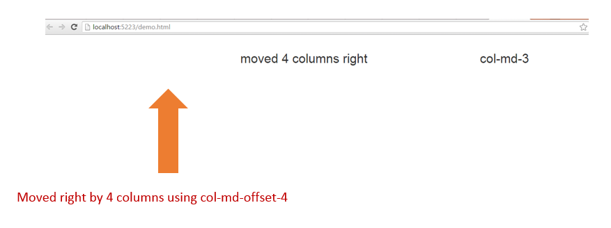
Column Offset
Bootstrap allows us to move columns to the right using the class .col-md-offset-*. So let us say we want to move a column by 4 columns to the right, then we will have to use the class col-md-offset-4. This can be done as shown in the listing below:
<divclass="row">
<divclass="col-md-5 col-md-offset-4">
<h2>moved 4 columns right</h2>
</div>
<divclass="col-md-3">
<h2>col-md-3 </h2>
</div>
</div>
Offset columns are then displayed as shown in the image below:
![]()
Column Push and Pull
Bootstrap also allows us to reorder columns, too. We can use col-md-push-* or col-md-pull-* classes to do this:
<divclass="row">
<divclass="col-md-9 col-md-push-3">col-md-9 col-md-push-3</div>
<divclass="col-md-3 col-md-pull-9">col-md-3 col-md-pull-9</div>
</div>
Here, the first column would be pushed by 3 columns to the right and second column would be pulled to 9 columns to the left as shown below:
![]()
Conclusion
As we’ve demonstrated, you can use various classes provided by Bootstrap to create responsive layouts for your web applications. In this post, we focused on row and columns classes along with offset, push, pull, and nesting the columns. I hope you find this post useful, and thanks for reading!
Create modern Web apps for any scenario with your favorite frameworks. Download Ignite UI today and experience the power of Infragistics jQuery controls.
![]()
![]()