Quantcast
Channel: Infragistics Community
Viewing all 2223 articles
Browse latest View live

Xamarin.Forms: An introduction

$
0
0

Any developer who has had to design apps for different mobile platforms will know just how time consuming writing code for different operating systems is. Any developer who’s ever mastered different languages for APIs will know just how cumbersome a task this can be, and any developer who’s wanted to test their apps on different devices or upload them to the App stores will be aware of just how frustrating this process often becomes.

While the emergence of the iTunes store and its Android and Windows rivals has produced a revolution in the app development industry it has also produced new difficulties. With over one and a quarter million apps in the major App stores and counting, consumers have an unprecedented access to tools which correspond to practically any desire.

For developers, this is both a challenge and an opportunity. On the one hand, their designs can now reach potentially millions of end-users, bringing in enormous potential for growth. On the other hand, standing out among the crowd and designing apps which will reach consumers quickly, efficiently and smoothly is harder than ever.

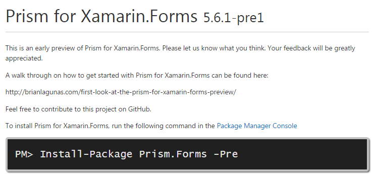
Given this context, Xamarin.Forms was designed to help professionals write apps in a faster, more agile way. It provides an API where designs are written in one popular language (C#) and which are then rendered to the characteristics of different OS’ making them feel native for end-users of different interfaces. When deciding if a tool like Xamarin is relevant for you, it’s worth considering when you’d use it, how it works and if it really corresponds with your targets.

When does Xamarin.Forms come into its own?

When writing code for iOS, Android and Windows, it’s a bugbear of the development community that they’re required to modify their designs for the different systems. Unless you want to run the risk of writing a code in one language and deploying it to the different stores only for users to report that it felt the UX was not native, building apps separately for each platform is more or less unavoidable.

The problem here, as ever, is time. We all have deadlines and the rapidly expanding and evolving App Store is a highly competitive environment. The risk of slow development is of course that another company will have the same idea as you and get it to market sooner. Otherwise, you may also face the real danger that your competitors will take your app written for iOS and quickly release an Android or Windows version and gain legitimacy with consumers before your app is even ready.

Because it writes code for all Operating Systems in C# and in one API, Xamarin.Forms helps developers write then deploy their work to the App Stores quicker. Practically, this means you can get an app written for all the stores in a considerably shorter timeframe.

What do you get in the box?

Xamarin.Forms offers a complete environment for mobile App development, from writing, to testing to deploying in the stores.

C#, the best tool for mobile App development:

  • Uses type inference, meaning developers type less and in more security
  • Language level async - keeps apps responsive
  • Stronger types produce smarter tools
  • Simple to write lambdas - something you can’t do with java for Android and which is difficult in other programs


Access to cloud testing tools:

  • Over one thousand (and growing) virtual devices on which to test your builds
  • Real-time reports
  • Scans for bugs and faults
  • Always up to date with the major operating systems


Quickly deploy Apps to stores

  • All coding written in one API
  • Directly upload from the API to App Stores, making deployment smoother


Do you actually need Xamarin.Forms?

Xamarin.Forms makes mobile application development faster, more efficient and easier. However, while it is a powerful tool, not every developer will need it - those working exclusively for one Operating System will not really feel the need to invest in its capabilities. While the option for writing in C# makes it an attractive standalone project, the adaptations required of moving to a new system may mean it’s not for you.

However, most companies aiming to expand will be keen to get their builds up and available on every App store and in this case, Xamarin.Forms really is a boon for those wanting to develop more easily, more rapidly and more securely.

A flexible and innovative tool

The advantage of a tool like Xamarin.Forms is that it lets developers do what they love best: write bold and brilliant code. Your builds will take less time to prepare, it will be possible to test them on hundreds of devices and deploy them to the App stores sooner.

Xamarin.Forms is also so powerful that it can incorporate other pre-built apps and widgets which add to and improve on an already impressive toolkit. See Xamarin's website for more information on this exciting new tool and see what it can do for you.


Developer Humor: Double Vision

$
0
0

It's Developer Humor day!!! Please enjoy our most recent release and feel free to share it with your friends!


Share With The Code Below!

<a href="http://www.infragistics.com/products/wpf"><img src="http://www.infragistics.com/community/cfs-filesystemfile.ashx/__key/CommunityServer.Blogs.Components.WeblogFiles/d-coding/6318.Tech-toon-_2D00_-2015-_2D00_-med-res-03.jpg" height="3406" width="612" /> </a><br /><br /><br />Double Vision by Infragistics <a href="http://www.infragistics.com/products/wpf">WPF Controls</a>

An Interview With A New Microsoft Regional Director: Ken Azuma

$
0
0

Ken Azuma        Last month, all of us at Infragistics received some great news! Our colleague Ken Azuma was chosen as a Microsoft Regional Director. Being chosen as a Microsoft Regional Director is an incredible accomplishment, and we are all very excited for Ken and his opportunity! It is no common feat to be selected, for according to Microsoft, to be chosen as a regional director one must “exhibit a mastery over a wide variety of technologies.” To recognize Ken’s great accomplishment, I interviewed him in order to not only get some information about him and what he does here at Infragistics but also to find out what he will be doing as a Microsoft Regional Director.

        Our interview began by me asking some questions regarding his background. I started by asking Ken how he got involved with technology in the beginning of his career. While working to obtain his masters, Ken joined several academic-industrial cooperation projects that revolved around software development. Through this experience, he decided to apply to jobs within IT and SI until one day he thought, “someday, automatic software will be more sophisticated than it is now,” which led him to eventually want to go into the more “business-side”. Ken eventually took his first job working at a temporary staffing company within the IT department. After working in the IT department, Ken switched jobs a few times, eventually leading him to become a senior RIA architect. When I asked Ken if he personally chose to go into RIA, or if it just worked out that way, he responded stating, “Actually, it was determined by my genes! During my IT department days I realized that I wanted to find a “better” way to develop software in an easy and productive way.”

        The desire to develop software efficiently caused Ken to begin working with a rapid development framework called “ColdFusion”. After working with the technology and the community, Ken eventually became the Chairman of the Tokyo ColdFusion user group and this was really the starting point of his community activity. After switching jobs and becoming a server side developer and project manager, Ken had the chance to work on a joint project with an RIA agency. While working on this project, Ken realized that this was his calling. The hidden design-oriented gene within him of which was likely passed down by his father who is a textile designer began to come out and guide Ken in a new direction. This led Ken to eventually join Infragistics in 2011 as a Senior UX Architect. I asked Ken what he does each day while he is at work and he told me, “I do a lot of consultations with customers on User Interface or User Experience.” In addition to this position, Ken is also the Managing Director of the Japan and APAC regions, in which he manages profit and loss, sales revenue, and customer satisfaction. Being in sales in a global company is “a challenge and a lot of fun” for Ken, and having the ability to work directly with customers not only has a positive effect on his sales, but also spices up his life a bit.

        In addition to his recent accomplishment, Ken has had quite a few notable achievements while here at Infragistics. As a senior UX architect, Ken has had the chance to speak at MIX, which is a gathering of developers, designers, UX experts and business professionals “creating the most innovative and profitable consumer sites on the web,” several times. Ken specifically noted two other great accomplishments since he joined Infragistics, one being the creation of his training course and book on designing user interface and structuring user experience. His other accomplishment is the partnership between Infragistics and another well known global company, which is the biggest engagement that we have company wide. Ken stated that this “has had a great impact for both companies,” and that he is “very proud that I could accomplish this great partnership with my team.” It should also be noted that in addition to being chosen as a Microsoft Regional Director, Ken has also been chosen as a Microsoft MVP for his value to the industry, customers, and community.

        After getting some background information on Ken, we directed our discussion towards being selected as a Microsoft Regional Director. Being a Regional Director, Ken is not employed by Microsoft; however, he is expected to promote their technologies. When I asked Ken what his area of expertise as a regional director is, he answered “my area of expertise is not deep technology side, but is in customer strategy and selecting client technologies.” While Ken must know the characteristics of the technologies he will be helping clients select, he also has to be able to suggest the appropriate technologies from an objective point of view. He described himself as sort of the “translator” between business and design and development. By being this “translator”, Ken will be “bridging the gap between customers and Microsoft” by working with customers who want to know the direction of Microsoft and which long term technology is right for them. I continued our discussion by asking Ken if being a regional director would allow him to travel or speak in places that he may not previously had the opportunity to. He told me that he was not sure yet, but that he would personally like to expand the area he has worked and spoken in. Ken’s ultimate desire is to again speak at Microsoft’s Tier1 Conference where he has spoken at MIX several times in the past. In addition to getting information on what Ken will be doing as a Microsoft Regional Director, I also asked Ken what his reaction was to being selected in which he humbly responded, “I was really surprised! Because so many of my friends are already Regional Directors, but they are so talented and well known in each of their categories.” He continued saying, “They are truly in a class of their own. I am so proud of this selection, but I also have to continue to polish my sense and knowledge to be on the same stage with them.” Ken’s humble words convey his deep appreciation for not only the work he enjoys doing so much, but also the respect that he has for the great minds working in the same industry as him. This is a great representation of Ken as a professional, as well as a clear display of his character.

        In addition to the more specific questions I asked Ken, I also asked him a few extra questions that I was personally interested in. Being here in New Jersey, and Ken being across the world in Japan, I was curious about the differences between the Japan/APAC region, in which he is a Managing Director for Infragistics, and the American region. Ken started by stating that there are clearly cultural differences, such as how we conduct business, our priorities, level of qualities, and so on, and he then asked, “But we’re all human right?” This led to Ken explaining how since we are anatomically the same and we essentially use interfaces the same. Because of this, Ken tries to introduce the same general user experience to his customers. However, he then went to say, “But at the same time, globalization does not mean that the U.S. way of thinking rules the world,” and that embracing diversity is so important. In order to sort of “solve” the conflict of working with other people in such a diverse world, Ken stated that he wants to continue to polish his communication skills and continue to learn about and understand others, for only then will the “gap” be filled. Through his desire to continue to grow as a professional and as a person in general, I could really tell that Ken is incredibly passionate in what he does. Because of this, I decided to ask him what his favorite part of his job is. He stated “Being a UX architect in a global software company brings endless surprise and fun for me,” and he continued starting “Infragistics embraces diversity of cultures, and I like that.” Ken’s favorite part of his job is being able to help satisfy customers and their needs, and getting that final “thank you” is what it is all about. Ken not only loves what he does, but he wholeheartedly recommends getting into UX and UX design, “because they do not depend on specific technologies, but universal skill.” Lastly, I asked Ken if there was anything he would like to share. His response was “As managing director of JP/APAC regions of Infragistics, I want to be a good advisor to our customers. Through these actions, I can also create more awareness of Microsoft technologies as well. Please feel free to reach out to me! Doumo arigatou gozaimasu (thank you very much)!”

        Ken Azuma is a hardworking, passionate professional who is dedicated to ensuring the most positive experiences and outcomes for his customers. His value and expertise is second to none, and he absolutely deserved to be selected as a Microsoft Regional Director. You can find and interact with Ken on Twitter, Facebook, and LinkedIn. Doumo arigatou gozaimasu for the interview Ken, and congratulations!

Exploring Xamarin.Forms controls in our new Global Sales Dashboard

$
0
0

This month, I take you through the creation of a Global Sales Dashboard application using Infragistics Xamarin.Forms controls with app views that adjust their content depending on screen size of targeted mobile device. You can watch video of this application and download source code.

First, Infragistics designers came up with great mockups images of what they wanted the application to look like:

Then I had productive meeting with UX and design teams to talk about how the components of this application will interact with each other. As result, we finalized the app design and user interactions, which you can review on tablet and phone prototypes in Indigo Studio.


The biggest challenges implementing this application was layout of Xamarin.Forms controls in shared app views such that they show detailed information on tablets and only summary of sales data on phone devices. In addition, the design called for normalized look and feel of BulletGraph, DataChart, and LinearGauge controls across Android, iOS, and WinPhone platforms. The final challenge was to create data structure for retrieving data based on date range, region, and division of sales.


I accomplish all challenges by some creative coding to show detailed views of sales data based on target device, normalizing styling properties on Infragistics Xamarin.Forms controls, and creating 3-dimensional data structure that I called Sales Cube to quickly retrieving information based on user’s selection of date range, region, and division of sales data.


Are you inspired to build your own dashboard mobile app? Grab your free trial of Infragistics Xamarin.Forms or simply get source code for this app so you can quickly start creating some in-depth visualizations. Happy coding!


Prism for Xamarin.Forms - A Preview

$
0
0

As was recently covered by Marissa McCorkel here at Infragistics, Microsoft's Patterns & Practices Prism Library has been open sourced... and one of my colleagues, Brian Lagunas, is helping to head up the team!

On the 24th, Brian featured some sneak peek details of Prism for Xamarin.Forms (available now on NuGet). This preview boasts features like IoC with Unity, event aggregation, commanding, MVVM support and Navigation.

Brian's actually written an incredibly in-depth article, walking you through the entire preview, with instructions and screenshots, which is available now on his blog. Also, feel free to check out the preview, read the walkthrough, check out Brian's Prism interview on .NET Rocks from earlier this week, OR you can reach out directly to Brian on Twitter and ask him about any and everything Prism related.

Writing better SharePoint code with SPCAF and Visual Studio

$
0
0

Even the best developers can make mistakes, and on a big build it’s crucial that you feel confident your coding is error-free. This is no different when developing SharePoint apps. Of course, comprehensive development guidelines are a good way to start here, but they still require manual verification and fixes. Wouldn’t life be so much simpler if this process could be automated?

Visual Studio has partially responded to this need by building tools which analyze code using code analysis tools. However, while great for general development, Visual Studio doesn’t focus on SharePoint specific development guidelines. To write better code, SPCAF (SharePoint Code Analysis Framework) from Rencore provides an excellent tool to analyze custom SharePoint apps and solutions. In this post we’ll be looking into the features of this tool when building SharePoint apps, with many also applying to farm solutions.

Analyze your code

SPCAF validates and tests your custom-made code through the application of about 600 rules. By following these rules, your solution can avoid XML errors, follow best practices, is future-proofed and so forth. In addition, custom rules can be added to adhere to a company’s standards around development. Reports are produced which not only contain the errors found, but which also provide a suggested solution. See what this looks like in practice here.

Write better apps

SPCAF can analyze both SharePoint apps and Farm solutions. To analyze apps, the team at Rencore have assembled a set of rules tailored to apps. For example, SPCAF will verify that the app meets the guidelines for submission to the store; store submission of SharePoint apps can be time consuming so SPCAF helps when you’re trying to find and solve these errors.

The quality of an app can be further enhanced through the application of a set of correctness rules. For example, only 25 Supported Locales are supported in an app; SPCAF throws up an error if more than 25 locales have been added.

Integration with third party apps

Most developers are already accustomed to using applications such as FxCop for analyzing .Net code, or CSS Lint to analyze CSS files. SPCAF handily provides integration with a lot of these third party apps, and it will nicely integrate these results into the SPCAF reports too. By integrating these external tools, one application (SPCAF) is responsible for analyzing the app and combining these results into a report. That should help make your job a lot easier!

Run from Visual Studio

Visual Studio is the most important tool for a developer. While SPCAF can be run from the command line, it provides full integration with Visual Studio. Analysis can be configured to run on every build, and the build can fail whenever SPCAF detects an error. By defining such rules in the build configuration, an app that did not pass the SPCAF rules (plus configured 3rd party apps) will never make it to other environments.

Furthermore, it even allows for automated analysis by a TFS build server on, for example, each check in. A check in will fail when an error was encountered during SPCAF analysis.

Write better code in less time

Every software developer makes mistakes and like in any type of engineering, the earlier a mistake is discovered, the better. By using automated code analysis tools, errors and problems can be discovered sooner rather than later and headaches avoided when you’re trying to find out what went wrong.

SPCAF provides a rich set of features to analyze SharePoint apps in different areas, like code correctness, best practices, and upgradeability. In this way it will decrease development time (making you more efficient) because it outlines the issues and provides guidelines on how to solve them.

How Xamarin is empowering developers to create better mobile apps

$
0
0

In the old days it was easy to develop applications. There was a machine on the developer’s desktop and it was fairly clear how that machine would behave in all circumstances. Even later, when every application began being targeted at web development it wasn't that hard because code would be on a single web server and (by and large) the code did what you expected it to do. And then there was the mobile revolution. Developers needed to create apps that would behave in a normal way at any time and on any device.

And this is something which every developer continues to struggle with. Developing for mobile devices isn't easy: there is not only the fact that there are three main platforms - each with their own SDK's - but there are also many more devices and variations in screen sizes, orientations, amount of memory, different specifications and so on. To handle all this in code is a real challenge. Due to the relatively low level programming on mobile devices, developers get a lot of freedom and flexibility but that freedom also has a price because the developer is responsible for more work to handle things like touch and swipe gestures, radio and accelerometer data, camera and video hardware, etc.

Even the management and transition between screens when data is involved is far from a simple matter. Developing a native mobile application takes a lot more time than developing the same functionality for a desktop or a web application. Nowadays a developer no longer has to modify design and custom code to different platforms or systems. Xamarin lets you write mobile apps on any platform using C#. In this post we’ll take a look at three ways in which Xamarin can help.

1. Single development language

Becoming an effective mobile application developer always involves a learning curve. There are things like process lifecycle, UI norms, the platform SDK (to name but a few things) that you must learn. If developing on a new platform also involves learning a completely new language, you’ll be faced with a particularly steep curve. Xamarin applications are written in C# however, and any experienced .NET/C# developer will be immediately at home working with Xamarin.

Xamarin provides a complete implementation of C# and the .NET class libraries. It’s not uncommon for well over 80 percent of one’s existing desktop or server .NET/C# code to be compatible with Xamarin. Even inexperienced .NET/C# developers will likely reduce the time they spend learning. Meanwhile, Android and iOS normally require the use of two separate programming environments: Java and Objective-C respectively and very few developers are highly skilled in both of these environments which means the overwhelming majority of developers will have to learn one or both of these environments before beginning a cross-platform project. Learning the Java and Objective-C environments is not limited to just the programming languages. There’s also the issue of the underlying core classes such as collections, that will require you to understand two different ways of doing the same things.

Using Xamarin, you only need to learn one language - C# - and one core set of classes to be effective on both platforms.

2. One code, making the most of different systems

Writing the application in one language for different systems does not lead to the loss of functionality. Some cross platform application development tools often hide the platform’s unique functions thus leading to applications that just don’t feel native on different devices. Xamarin, however, adds the iOS specific .NET classes and Android specific .NET classes to the existing .NET classes. This combination of code .NET and platform specific classes allows the developer to write applications that share logic between the platforms but still take advantage of the platform’s unique features. The more code that can be shared the less likely it is that bugs will appear in the code and the faster the developer can write the application. According to Xamarin you get the chance to reuse 60 to 80 percent of your code and this cuts development time in half. The time you save here is valuable and can be invested into new features for the application.

Test your code on thousands of devices in the cloud

Writing a multi-platform application is one thing. Testing it on a wide range of devices is another. It’s possible that a developer will have access to an iOS, Android and Windows Phone but what about all the different configurations like screen size, resolution, memory and so on? Xamarin offers developers a test cloud. This is an automated user-interface testing service that is designed to enable mobile developers to test their apps on hundreds of mobile devices. With the test cloud, developers are able to test their applications on real devices, not emulated ones. The tests run on these devices provides the users with detailed logs and screenshot about how the app performed on each device.

The unifier

Xamarin is gaining more attention everyday and with good reason. In a world where a variety of mobile platforms coexist, we need a development tool that allows developers to support multiple platforms with minimal duplication of work. With Xamarin.Forms you even get a complete UI design tool that can build cross platform mobile applications. Using Xamarin will lead to a shorter development cycle due to the C# and .NET implementation, the reusable code and the availability of a test cloud. This is something every developer must take a look at.

Which is Better for Analysis, Spreadsheets or Affinity Diagrams? Part 2

$
0
0

Which is a better method of analyzing user research and usability testing data, typing up your notes in a spreadsheet or creating an affinity diagram? In part 1 of this series, I discussed the advantages and disadvantages of using a spreadsheet. Here, in part two, I’ll discuss the advantages and disadvantages of affinity diagrams.

Analysis Spreadsheet

To review, in an analysis spreadsheet, each participant is listed in a column and each row can describe task performance, answers to a question, common problems experienced, or themes observed.

Spreadsheet

Affinity Diagram

With an affinity diagram, you transfer your handwritten notes to post-it notes, including one observation per note. Then you group related notes together, forming various levels of related groups and sub-groups, which results in common themes, as shown below.

A room with an affinity diagram

Affinity diagram  

Advantages and disadvantages

In part one, I discussed the pros and cons of using a spreadsheet for analysis. Now, let’s look at the advantages and disadvantages of affinity diagrams.

Affinity Diagram Advantages

Group analysis

Multiple people can combine their notes by writing them all on post-it notes and organizing them together. The act of organizing and labeling generates useful discussions.

Flexibility

Post-it notes can easily be moved and organized into various levels of groups and sub-groups.

Labeling

If you do your affinity diagram on a white board, you can easily add headings, sub-headings, draw borders, and add other indicators to show relationships.

Ability to see the big picture

You can step back and see the big picture of the diagram. When you label groups and sub-groups, you can visually see where the main issues are.

Visibility

It makes your analysis highly visible to others in the company. People are less likely to wonder why the analysis is taking so long.

Appearances

Hundreds of multicolored post-it notes on a wall looks impressive. At a glance, it looks like you gathered a tremendous amount of information.

Promotion

Affinity diagrams can generate excitement. They’re unusual and they attract attention. People ask questions and want to know what’s happening. It gets them excited to hear the results.

Deliverables

Photos of affinity diagrams look impressive in deliverables and in other documents that explain your process.

Affinity Diagram Disadvantages

Space

It requires reserving a space for several days or weeks to work on and save the affinity diagram.

Mobility

You are tied to the physical location of the affinity diagram. Once you begin working on it, it stays in the room.

Timing

Most often, you have to wait until the end of research to begin the affinity diagram.

Materials

You need post-it notes and markers.

Time and effort

Writing out each observation on post-it notes can be time consuming.

Detail

The size of post-it notes and the effort of writing forces you to be brief, which means less detail, but can also force you to think and summarize.

Backup

An affinity diagram is temporary and fragile. Someone could take it down, the post-it notes could fall off the wall (tip: use the extra sticky kind), or there could be a fire.

Archival

Eventually, you have to take the affinity diagram down. You can take photos of it from a distance to show what it looked like, but to view the details you have to take close-ups. Close-ups allow you to read the text, but it’s difficult later to see how these photos fit together. You lose the sense of organization.

Searching

You have to do a manual search by scanning the entire affinity diagram trying to find a particular note.

Counting

Summarizing issues on notes, combining notes from several people, and moving the post-it notes around the diagram make it difficult to accurately count the number of times an issue occurred.

Seeing which participant each note came from

Unless you carefully note participant numbers on each post-it note, you can lose track of which participant each note came from.

So which is better?

Both spreadsheets and affinity diagrams have their pros and cons, but are there times when one method would be better than another?

Consider a spreadsheet when

· You’re doing analysis alone.

· You want to type up your notes and begin organizing them before the end of the research sessions.

· You’re analyzing usability testing results and you want to track things such as task completion, task time, error rates, questionnaire answers, ratings, or other metrics. It’s easier to keep information together and to add up the results by reading across the rows in a spreadsheet.

Consider an affinity diagram when

· Several people are combining their notes

· You want to analyze the data as a group

· You want to attract attention to promote the research, increase its visibility, and to expose others to the idea of research

· You’re analyzing user research findings, which are often more about higher-level issues and themes, rather than focused on specific tasks, as in usability testing

Ultimately, the best method comes down to personal preference. Whichever method best helps you understand the data is the one you should use. I encourage you to try both to see how they work for you.


Implementing Master-Detail Scenarios with Infragistics UltraGrid, UltraDataChart and Entity Framework

$
0
0

Infragistics Windows Form controls offer opportunities to cover different scenarios, representing data in your desktop applications. It is one of the best, most extensible third party controls that I have ever used for UI development. Some of the scenarios are more complex and you need to consider some things during the implementation.

One of the most often seen cases is when we have master-detail scenario: master table (respectively parent entity) and detail/child table (child entity). 

WiltraGrid supports out of the box ADO.Net based data source – DataTables in DataSets, but last several years other frameworks like Entitry Framework are the best choice for rapid development, related to the line of business scenarios

This blog will demonstrate how to do master-detail scenarios with UltraGrid, Entity Framework and some other components from Infragistics Winforms like UltraDataChart. First, let’s choose some sample data to demonstrate the mentioned above scenarios.


Creating a Simple Master-Detail Model

In order to illustrate these loading techniques let's create a simple one-to-many example using our favorite database, Northwind. Using Visual Studio 2013 we can add a new item to the project and selected Entity Data Model, chose the "Generate from Database" option, and selected Categories and Products tables from Northwind.

Below you'll see the sample Entity Data Model (EDM):

UltraGrid-Master-Detail-Pic01[1]

Entity Framework supports the following three methods to load related data:

  • Eager Loading
  • Lazy Loading
  • Explicit Loading


Eager Loading Entities

In Eager Loading, all relevant data for an entity is loaded at the time of the query of the entity in the context object. Eager Loading can be done by using the "Include" method. To perform Eager Loading, Lazy Loading must be disabled. Lazy Loading is enabled by default in Entity Framework.

We can also eagerly load multiple levels of related entities. In the following example, it loads the related entity Department, Employee Master and Detail.

Often we want to have only one query to have all data – it is good if we don't have huge amounts of data. In the scenario above we always want to display the related Categories with the Products so it would be better to make a single call to the database to retrieve the Category and the Products. In that case we can use the Include method that is available on an entity and we add this to our query in our form's Load:

 1:#region members
 2:  
 3: ObservableCollection data;
 4:static NORTHWNDEntities model = new NORTHWNDEntities();
 5:publicstaticint NumberOfProducts;
 6:  
 7:#endregion members
 8:public Form1()
 9: {
 10:     InitializeComponent();
 11:     data = new ObservableCollection((model.Categories.Include("Products")).ToList());
 12:  
 13:     ultraProductGrid.DataSource = data;
 14:     ultraProductGrid.DisplayLayout.Override.SelectTypeRow = SelectType.Single;
 15:  
 16: }


We will use Eager Loading for our demo, but consider our other options:

Lazy loading implementation:

Implementing Lazy Loading works well when you only need to make a few additional calls for the related data or the data is optional (like triggered by a user action). On the other hand, if you know you will always need the related data then it is probably more efficient to load the related entities in a single call. This is called Eager Loading -- there is more data returned to you but there is less chit-chat between the client and the database.

Lazy Loading means delay loading the related entities. In Lazy Loading, a related entity or collection of entities is loaded from the database for the first time that a property is referred or the entity is accessed.

 1:using (var context = new Entities())
 2: {
 3:     context.ContextOptions.LazyLoadingEnabled = true;
 4:
 5:     Console.WriteLine("Lazy Lading Example....");
 6:     var dep = context.DepartmentMasters.Where(f => f.DepartmentId == 1).FirstOrDefault();
 7:foreach (var emp in dep.EmployeeMasters)
 8:     {
 9:         Console.WriteLine("Code: " + emp.Code + " Email Address:" + emp.EmployeeDetail.PersonalEmail);
 10:     }
 11:     Console.ReadKey();
 12: }


Explicit Loading

If Lazy Loading is disabled then it is still possible to fetch the related entities without the use of Eager Loading. It is possible with Explicit Loading. To explicitly retrieve the related entities from the database we can use the "Load" method.

To explicitly retrieve the related entities from the database, we can use the "Load" method. The following will explicitly load one-to-many related entities:

 1:staticvoid Main(string[] args)
 2: {
 3:using (var context = new Entities())
 4:     {
 5:         var dep = context.DepartmentMasters.Where(p => p.DepartmentId ==    1).FirstOrDefault();
 6:         Console.WriteLine("Department Employees are not currently loaded");
 7:if (!dep.EmployeeMasters.IsLoaded)
 8:         {
 9:             dep.EmployeeMasters.Load();
 10:             Console.WriteLine("Department Employees load complete");
 11:foreach (var emp in dep.EmployeeMasters)
 12:             {
 13:                 Console.WriteLine(emp.Code);
 14:             }
 15:          }
 16:          Console.ReadKey();
 17:     }
 18: }  


Let’s continue with the eager loading scenario.

Receive the list with child records

This is pretty easy if you need to handle child records of the selected row to use the AfterRowActivate event:

 1:privatevoid ultraProductGrid_AfterRowActivate(object sender, EventArgs e)
 2: {
 3:     Category currCategory = null;
 4:     var oRow = ultraProductGrid.ActiveRow;
 5:if (oRow != null)
 6:     {
 7:         currCategory = oRow.ListObject as Category;
 8:if (currCategory == null)
 9:         {
 10:return;
 11:         }
 12:if (currCategory == null) { return; }
 13:         var products = currCategory.Products.ToList();
 14:  
 15:     }
 16: }


Update the UltraDataChart

UltraDataChart is one of the most popular data visualization components for Windows Forms. The UltraDataChart offers powerful ways to interact with data, such as zooming, trendlines and chart synchronization. In addition to all the types supported by the XamChart, UltraDataChart supports polar and radial series types.

You need to create axes and series using data from the child records:

 1: var xAxis = new CategoryXAxis
 2: {
 3:     Label = "ProductName",
 4:     DataSource = products
 5: };
 6:  
 7: var yAxis = new NumericYAxis();
 8:  
 9: LineSeries series = new LineSeries();
 10: series.XAxis = xAxis;
 11: series.YAxis = yAxis;
 12: series.ValueMemberPath = "UnitsOnOrder";
 13: series.DataSource = products;
 14:  
 15: ultraProductsDataChart.Axes.Clear();
 16: ultraProductsDataChart.Series.Clear();
 17:  
 18:  
 19: ultraProductsDataChart.Axes.Add(xAxis);
 20: ultraProductsDataChart.Axes.Add(yAxis);
 21: ultraProductsDataChart.Series.Add(series);


Bind labels

It is possible to use different techniques to bind the label’s text to the specific value. The current sample offers the approach to create a property in Peoperties.Settings:

 1: Properties.Settings.Default.CategoryName = currCategory.CategoryName;
 2:if (currCategory == null) { return; }
 3: var products = currCategory.Products.ToList();
 4: Properties.Settings.Default.ProductsCount = products.Count().ToString();


The whole code of the method is available here:

 1:privatevoid ultraProductGrid_AfterRowActivate(object sender, EventArgs e)
 2: {
 3:     Category currCategory = null;
 4:     var oRow = ultraProductGrid.ActiveRow;
 5:if (oRow != null)
 6:     {
 7:         currCategory = oRow.ListObject as Category;
 8:if (currCategory == null)
 9:         {
 10:return;
 11:         }
 12:         Properties.Settings.Default.CategoryName = currCategory.CategoryName;
 13:if (currCategory == null) { return; }
 14:         var products = currCategory.Products.ToList();
 15:  
 16:         Properties.Settings.Default.ProductsCount = products.Count().ToString();
 17:  
 18:         var xAxis = new CategoryXAxis
 19:         {
 20:             Label = "ProductName",
 21:             DataSource = products
 22:         };
 23:  
 24:         var yAxis = new NumericYAxis();
 25:  
 26:         LineSeries series = new LineSeries();
 27:         series.XAxis = xAxis;
 28:         series.YAxis = yAxis;
 29:         series.ValueMemberPath = "UnitsOnOrder";
 30:         series.DataSource = products;
 31:  
 32:         ultraProductsDataChart.Axes.Clear();
 33:         ultraProductsDataChart.Series.Clear();
 34:  
 35:  
 36:         ultraProductsDataChart.Axes.Add(xAxis);
 37:         ultraProductsDataChart.Axes.Add(yAxis);
 38:         ultraProductsDataChart.Series.Add(series);
 39:  
 40:     }
 41: }


Implementation

Implemented functionalities are available in the sample that is available for download here. You can see screenshots from the demo below:

UltraGrid-Master-Detail-Pic03a[1]


UltraGrid supports out of the box visualization of the rows from related tables, as you can see here.

UltraGrid-Master-Detail-Pic04a[1]


This article covers just some of the basic Master Detail scenarios, realized with Infragistics WinForms grid and Entity Framework - and to make the most of this post, be sure to download the source code of this sample here.

You'll also need the Northwind sample database, which you can get in SQLServer 2008 or newer through the CodePlex website. It is also possible also to download a version that's compatible with older versions of Microsoft SQL server from the Microsoft download center.

To play around with the Infragistics Windows Forms dashboards on your own, be sure to get Infragistics Ultimate and see the chart in action in our latest sample application by clicking the banner below!

Developer News - What's IN with the Infragistics Community? (3/23-3/22)

Monitor your apps with Xamarin Insights

$
0
0

As a developer you might think that when the code is written, the work is done. This is not true; the real challenge often starts when users begin using your tool. Crash reporting and analytics are a vital component to any app's success. When building mobile applications, implementing this kind of an app insights framework can take a lot of time because of multi-platform code bases and the wide range of devices available. In this post we will take a closer look at Xamarin Insights, a recently released (preview) product from Xamarin.

When it comes to reporting and analytics it is important to know as much as possible. Xamarin know that developers have limited time and have a lot of data to interpret, so they need to know which crash issues to tackle first. Xamarin Insights uses a unique algorithm to rank issues according to user impact and reach, so these developers know how to prioritize their crash task list. It is possible to see the exact users each crash is impacting, and what sequence of actions preceded the crash.

See metrics in real time

One of the most difficult things for a developer is to understand how users are interacting with their app. Xamarin Insights offers real time reports of who's online, what kind of device they are using, what issues they've experienced, where they are from and even which activities they've used in sessions. That’s a lot of data which can help your helpdesk or developers to communicate about bug reports, application crashes, updates or fixes.

These metrics can also be used in a proactive way. Knowing this kind of information can be important to create a technical roadmap for application developers. Imagine an application where some part does not generate an error or crash but takes some time to load - this kind of information will never get to the developers without using Insights. The logged metrics will make this kind of issues clear and can help the development team to create a better app.

Comprehensive error reporting

Next to real time information, developers can also benefit from the extensive and detailed reports available. By adding only a few lines of code - shared across all three major mobile application platforms - you can add Insights into the application. The Insights engine will gather and report any uncaught native or managed exceptions that occur in the application. The delivered reports are fully detailed with at least the following information:

  • Tracking information for the active session
  • Tracking information for the past sessions
  • Device statistics like OS and screen resolution

When more detailed information is needed there is the possibility to report every caught exception. This can be done with one single line of code using the simple Insights API.

With this information, finding bugs is a lot easier because all the information the developer needs is available. Xamarin Insights can even combine event tracking with user identification to visualize some specific details that are needed to solve the issue. At the end you could even send the user an email to let them know the issue is solved.

See what’s working

In addition to crash reporting, Insights enables mobile app developers to easily track any event that occurs in the tool with a single method call. From page views to button clicks, Insights’ event tracking can handle the job. Insights’ tracking is great for seeing which features of your app are being used or neglected. This information can be useful to design the app roadmap.

Integration with different apps

Having this information is one thing, visualizing it is another. With the Insights dashboard all this data is easily browsable so developers have real-time feedback. Insights is integrated with popular services like GitHub, HipChat, Visual Studio, Campfire and others, so you’ll never miss any important notifications.

This integration is a big advantage since mobile platforms depend on many different RAD tools to create applications. Every developer is free to use their preferred environment to create mobile applications, yet can still access the vital information provided by Xamarin Insights.

It is clear that Xamarin Insights adds value to the process of mobile application development. It provides developers with a set of metrics that can be used in a proactive way while giving the support team a comprehensive set of reports where each user session is logged.

At present, Xamarin Insights is available for all active Xamarin subscribers at no additional charge over coming months as a preview. Pricing will be announced at the end of the preview, but according to Xamarin CEO Nat Friedman, a generous plan will be included for Xamarin subscribers at no additional cost.

The importance of testing your mobile apps

$
0
0

Let’s not kid ourselves, when you’ve put hours of hard work and effort into developing an app, the last thing you want is someone to come and pick a load of holes in it. From conceiving an idea, to planning it out to writing the code, your app can end up being your ‘baby’. So, to have someone come along, asking questions and poking around for bugs can be infuriating to put it lightly. Nonetheless, your app will often need a fresh pair of eyes to find mistakes you might not see and to pick holes in your build (if not your pride). So, getting your app tested - either by a professional tester or using an app testing tool is well worth doing.

The alternative - not testing your build - is hardly a sensible solution. Just because you know how the app is meant to work, not all users will approach it in the way you expect. It’s no good saying the problem is with, how shall we say, ‘less smart’ end users. If you want your app to be a success, if you want it to be a useful tool in users lives, your apps need to avoid common design mistakes. Testing is the only way you can really go about avoiding such errors, and so, annoying as it can be, it’s better to do a thorough job of it than not. 

Without proper testing, users are likely to come across many unexpected bugs and errors which devs simply didn’t think of. The danger here is that they’ll quickly lose patience with your app, and the vast majority will simply stop using it without ever letting you know why. Testing helps avoid this happening.

Testing 101

Time is a luxury in the rapid world of app development, but some of the fundamental rules you need to consider when testing an app include:


  • Always ask questions. App testing means you need to constantly think outside of the box. It’s all about asking “what would happen if?”, “why does this work in the way it does?”, “what happens when?”. Constantly asking questions of the app will throw up unexpected issues. It’s good to get a fresh pair of eyes to do this - if you’ve been working on an app for months, it’s hard to approach it from this angle as you know so intrinsically how it’s supposed to work, and thus forget that new users will have no prior knowledge.
  • Get into character. There are as many different types of users as there are apps. It’s therefore important to think about how different ‘personas’ will approach it. You need to think about people with different tech proficiency levels, different age groups, people who speak different languages. Some people who download your app will be perfectly at ease working their way around a new interface, others will struggle. It’s important to make sure it’s as simple as possible for everybody.
  • Map your app. A fundamental rule of app testing is that you think about every possible way that users will navigate through it - including when they ‘do things wrong’. What happens when they ‘pinch’ their smartphone screen when they should ‘flick’? What happens when they tap the ‘back’ button? Does going down the wrong route take them to an inexplicable error message, or does it signpost them where they should be going?
  • Get out of the office. When you build apps you’ll be doing it in the ‘perfect’ environment - that is, at your desk on a powerful computer. However, what happens when the screen is in bright sunlight? What about when the user’s phone is low on battery? Does the app work when an incoming call interrupts it? And does it keep working smoothly when the user has limited connectivity? Testing your app in the ‘real’ world is crucial for finding weak points.
  • Test it on different devices. There is a huge range of mobile devices which can run your app, so making sure it looks and feels right on all of them is fundamental. Does the UI look right when the phone is tilted for instance? Does it feel native on iOS, Android and Windows Phone? Device testing can reveal answers to these questions.


A necessary evil

Testing is far from the most enjoyable part of mobile app development. Nonetheless, there is a range of tools which make this task a lot easier, quicker and smoother. Xamarin's Test Cloud for instance, lets you upload your builds and try them out on over one thousand devices. This means you can release your app with more confidence that it will work well everywhere.

App testing may not be the reason you became a developer, but it needn’t be too painful if you put some simple steps into action. Finding and resolving bugs before an app is released will make your builds far more popular and will see wider take up in the long run.

Simplifying AngularJS in 60 minutes: Webinar recap

$
0
0

We recently held a webinar for the Indian region on March 27th, titled “Simplifying AngularJS in 60 minutes”.

[youtube] width="560" height="315" src="http://www.youtube.com/embed/9r4DQdghAX4" [/youtube]

The presentation was attended by good number of developers from the Indian region, where host Microsoft MVP and Infragistics Consultant Dhananjay Kumar covered a range of topics, including:

  1. Getting started with AngularJS in Visual Studio
  2. Setting up NodeJS, ExpressJS, Sublime Text using Bower for AngularJS development (for more information on this topic,  you can see Dhananjay’s post about it here
  3. $Scope object, $rootScope object
  4. Controller and Controller hierarchy
  5. Services , $http service, and writing custom services
  6. CRUD operations using a WCF REST Service

You can access the presentation slides here.

Many questions were asked during the webinar, and while we tried to answer all of them, we may have missed some, so here are some of the important questions, followed by our answers:

Can we use AngularJS with PHP?

AngularJS can be used with any server side technologies like PHP, ASP.NET, and ASP.NET MVC etc.

Can we work with AngularJS on notepad?  

Yes you can do AngularJS development on any text editor like Notepad, Sublime text, and Notepad++ etc.

What is $scope object in AngularJS

In AnguarJS each controller has its own $scope object. Using the $scope object controller to pass data and behavior to the view. $scope object connects controller and view in  AngularJS.

What do you mean by constructor in JavaScript?

In JavaScript a function is known as function constructor, which object gets created whenever we use it. In AngularJS the controller is a JavaScript constructor function because whenever we use a controller, its object gets created.


var AuthorApp = angular.module(''AuthorApp,[]) is both side name should be same?

No, it is not mandatory to have the same name.

How do you rend Data from the Backend Database in the AngularJS?

You can do so using the following steps:

  1. Write HTTP enabled service like WCF REST or Web API to perform CRUD operation on the database.
  2. Create a custom AngularJS service either using factory method or service method. Use the $http service to make a call to the REST service or Web API
  3. Use custom service in the controller by injecting service module in the controller module
  4. Attach returned data from the service to the controller $scope object
  5. Use the controller $scope at on the view and render the data from the database.


How can I get the value of parent controller values inside the child controller in the case both have same value

You can use $scope.$parent.propertyname in the controller and on the view {{$parent.parentpropertyname}}


What will happen if both parent and child control have same properties?

Child controller will override the parent controller property.

How two controllers can share data with each other?

In AngularJS controllers can share data using the service.

If services are singletons, can we use them to create a Cache mechanism for an application, where data from REST service calls are cached and made available to all controllers by just injecting that service?

Yes you can use service to cache data and share across the application.

Once again, thank you so much for your interest in our webinars – and we look forward to seeing you at a future webinar!

What's New in the Latest Version of SharePlus

$
0
0

The newest release of SharePlus for Android introduces the possibility to add items and documents, an important feature that greatly improves your mobile SharePoint experience. In addition, recent content is also available within the app, allowing you to easily access your recently used sites and documents.

Add Items and Documents

With our new Android version you can add both items and documents to lists and document libraries respectively.  Requested by our users, this new feature brings your team’s productivity to new heights. SharePlus now allows you to share items and documents you have created while outside the office, and enables your team to make key decisions with all information at hand wherever they are.

Add a new item by just filling in the fields you need, or select a source file to add a new document. Once ready, SharePlus will synchronize your new content with SharePoint, even while you are on the go. 

New documents are uploaded right away and if additional metadata is needed, SharePlus will ask for the required information. 

Quick Access to Recent Content

A long-standing feature in iOS is now also available in SharePlus for Android. To help you be more efficient, and work faster, the recent sites and documents you have been working on, are now automatically populated in the Recent section.

SharePlus for iOS Now Supports 64-bit Devices

The introduction of 64-bit processors is an important change happening to mobile devices. The 64-bit architecture has many benefits, and SharePlus for iOS now gives you the possibility to take full advantage of the latest Apple technology.

We hope you enjoy the latest versions of SharePlus! If you have any questions, would like to give feedback, or schedule a demo, please don't hesitate to contact us. We look forward to hearing from you!

Xamarin future focus: Apple Watch apps

$
0
0

Apple recently announced a release date for their latest innovation: The Apple Watch (you’ll be able to place orders online from 10 April) and while it’s far from the first contender in the wearable tech market, it’s already getting a lot of attention from Apple aficionados. Much more than just a timepiece, Apple claim the kit will blend into the lives of owners, letting them connect with friends and family, measure their health and fitness and keep up to date with the things which matter most to them.

With a range of customizable apps and straps it does more than measure time elapse. Variations of the Apple Watch come in three major price brands:

  • Sport. designed (you guessed it) for sport. Around $350
  • Watch: steel case ($700 - $1000)
  • Edition: 18-carat, solid gold case (up to $18,000)

Now, there’s no denying it’s an attractive piece of hardware with some pretty impressive features, but will anyone actually buy the watch? As the prices listed above indicate, the Apple Watch is hardly an entry-level product and there’s reasonable doubt as to whether wearable tech will ever hold more than a niche market share. Apple are good at designing things we never knew we needed, yet iPhones already do much more than the Apple Watch could ever do and those price tags will put a lot of consumers off.

What does the Apple Watch mean for app developers?

Apple are convinced the watch will be a success and on their developer website have provided extensiveguides to help you build third party apps. This is all very well, but there’ll be a lot of devs wondering whether it’s actually worth the effort of building new apps for a piece of kit which hasn’t yet been released and offers no guarantee of broad adoption. Will it go the way of Google Glass?

Whether it’s building a brand new app for the watch, or whether you simply want to squeeze a pre-existing mobile app into its smaller screen, deciding if this is actually worth the effort is a bit of a gamble. The Apple Watch has a different UI and apps will naturally require a lot of reconfiguration if you want them to fit well on the much smaller dimensions of the wrist-sized screen. Is it worth going through all that effort now, if the product ends up being a failure? Is it not worth waiting it out until version 2.0 when you’ll have a better idea of the likely take up of an Apple Watch app?

These are reasonable concerns and the only way of deciding is by analyzing your own market and product. While the ‘Watch’ and ‘Edition’ versions of the hardware will sell, the largest numbers of the product likely to shift will be the lower end ‘Sport’ watches. For developers with an app that tracks health then, this could be a pretty exciting option. Conversely, there’ll be many apps which will simply be illogical on the tiny watch screen.

Getting to grips with Apple’s WatchKit

If you decide that building third party apps for the Apple Watch is for you, the recommended route is to use Apple’s WatchKit solution. It’s important to understand that apps built in the WatchKit will in fact be running on a program running on a connected iPhone. The app on the Apple Watch is in fact just an external display of this app and users will need to be within range (around 30 metres) of the iPhone for the app to work. So, if you’ve developed a running app, you’ll have to bear in mind that users will have to take both the watch and the phone with them when they go jogging around the park.

Xamarin have come up with a comprehensive guide to building apps with the WatchKit and this includes everything you’ll need to know for developing your tool. Crucial things to bear in mind are:


  • It’s not super simple. The WatchKit solution has three projects - the iOS parent app; the Watch app and the Watch extension.
  • Keep bandwidth in mind. Apple are optimistic about speed, but you’d be wise to be conservative about functionality and power.
  • A very different UI. How users interact with you app is fundamentally different to how they’ll interact with their iPhones. There’s no ‘pinching’ for instance, the ‘crown’ on the side of the Watch’s casing allows you to scroll and touch controls are much more simplified.
  • You won’t have anywhere near as much control over how the interface looks and feels.


Watch this space

There’s no doubting the Apple Watch is a beautiful piece of kit, and we’re deeply impressed by what it can do. Deciding whether to take the plunge when it comes to developing apps for the Watch is a different question however, although the more entrepreneurial of you will benefit from Xamarin’s guidelines. We’re looking forward to seeing how consumers take to Apple’s Watch, and how developers will take to making apps for it.


Infragistics Benefits for Microsoft MVPs

$
0
0

Infragistics has spent a lot of time toting the prestige of the Microsoft MVP program throughout our history, and since today is quarterly renewal day we wanted to take a moment to call attention to this prestigious honor. Not only have we supported the program in the community for many years, but we have several great members of our own who are honored this year in the program. Who are they? Well…

Ken Azuma - Regional Director (Previously MVP, Client App Dev)

Daizen Ikehara - MVP, Windows Platform Development

Brian Lagunas - MVP, Windows Platform Development

Craig Shoemaker - MVP, ASP.NET/ISS

However, this isn’t really about us. This is about you and what being a Microsoft MVP means for you in the context of Infragistics. Did you know that if you’re a Microsoft MVP, Infragistics offers you benefits as well?

First and foremost, if you’re a current Microsoft MVP, you can send your MVP profile page to me at dmonasch@infragistics.com, and I’ll assist you with obtaining your complimentary 1 year Infragistics Ultimate license. You’ll have completely unrestricted access to the entire Infragistics library, including all of our .NET platforms, our new Xamarin.Forms controls, and even our prototyping tool, Indigo Studio.

On top of that, I also manage our brand new Advanced Community Program. We have tons of unique opportunities, ranging from working with us to develop a webinar to the brand new Open Source community spotlight on our Infragistics.com blogs.

If you’re interested, I’ll also be at Build with the rest of the Infragistics team, so if you’d like to stop by and chat about any ideas you’ve got, thoughts about our products, or just what you thought of the season finale of House of Cards, be sure to let me know that too!

So what are you waiting for?

Send your MVP page over to me today and take advantage of Infragistics’ great Microsoft MVP benefits!

Transform Data on the Move with ReportPlus

$
0
0

As work increasingly moves away from the static environment of the office to a more mobile and flexible place, we’ve seen a growing need for tools which make editing documents more convenient when not at the desktop. In this post we’ll be looking at a new app which aims to respond to the needs of the modern, hyper-connected worker.

The office at your fingertips

Infragistics ReportPlus is a mobile application that enables data discovery & data visualization to quickly create and visualize reports and share strategic enterprise insights on your mobile device. What this means for you, is that you can be confident that you have the latest information at hand to make real-time, informed decisions.

The application is able to connect to a wide variety of enterprise data sources including SQL Server, MySQL, Dynamics CRM, Salesforce, Reporting Services, Analysis Services OLAP cubes, Excel and SharePoint. Sharing those company insights is one of the features of the application that makes it easy to start discussions based on real time data. Sharing is possible through email or by exporting the reports. You’ll always be connected with the whole office at your fingertips.

ReportPlus can connect to a rich set of enterprise data sources. What makes ReportPlus so powerful is that there is no server software required to create or maintain data connections.

ReportPlus can connect to:

  • SharePoint
  • Google Drive
  • Dropbox
  • CRM systems like SalesForce
  • Relational databases like SQL Server and Oracle
  • Social media data like Facebook or Twitter

There is also an option to connect to web analytics to see how you public website is performing. All these data sources also offer the capacity to be combined with one another in a “Multiple Data Source” to see insights from two different sources.

ReportPlus - Your Reports on iPad

Multiple sources

The power to connect to multiple data sources is a real benefit for any manager. Imagine how difficult it is in a board meeting to visualize the sales details for example. This information is often stored in multiple sources, and for end users it is therefore far from easy to find when they are not the most experienced Excel pro. By using some prepared reports in ReportPlus the data can be shown in an attractive way to the other board members without the need for extra software tools or expertise.

Creating dashboards in ReportPlus is easy and does not need any advanced design or development skills. When a dashboard is connected to one (or many) data sources the Chart Wizard does all the work. A dashboard uses pre-defined templates or can use the custom made company template to visualize the data. This means you spend less time working out how to turn statistics into graphics and frees you up to think about how the data can best represent the important trends.

The data on these dashboards can be easily shared with other people via email or via the export feature. Exporting data to PowerPoint or any other Microsoft Office document format is simple, and avoids the hassle of re-formatting charts and graphs. The export even includes all the annotations that are made in the charts so you can track changes made to a shared document.

Enterprise ready

ReportPlus is an enterprise ready mobile application and implements data protection capabilities so data security is ensured at any time. The advanced data protection features found in ReportPlus Enterprise include options like multi-factor authentication, enterprise certificates support, passcode lock, permission based hiding, kiosk mode and many more. Additionally, the deployment of the application can be handled in-house and managed by the IT department. With the custom branding capabilities the company look and feel can be implemented in the whole application. As a result, you can rest easy in the knowledge that your corporate data is stored securely.

With enterprise data connections, powerful dashboards, sharing capabilities and data protection ReportPlus is a very powerful mobile data visualization application. The latest release of ReportPlus supports the new iOS design experience, has the option to share to Cloud based storage and exports to any Microsoft Office file format.

Next to these build-in options there is the JS Bridge API that offers developers the possibility of incorporating HTML and JavaScript visualizations created by third parties into ReportPlus dashboards.

Our ReportPlus team has done a great job in thinking about every need of companies where reporting is a vital aspect in the organization.

Finger on the pulse

In the context of an ever changing business environment and unpredictable financial markets, companies working with data need to be constantly aware of the latest changes and developments. Having access to a mobile app which can provide real time solutions is essential. A finger on the pulse is crucial for businesses who want to stay ahead of the curve and Infragistics ReportPlus can be extremely powerful in achieving this.

ReportPlus - Your Reports on iPad

Getting Started With Infragistics Xamarin.Forms

$
0
0

[youtube] width="560" height="315" src="http://www.youtube.com/embed/2bcDR32lX4w" [/youtube]

Welcome to our new video tutorial for getting started with Infragistics Xamarin.Forms components! In this tutorial, I assume that you have set up your computer for working with Xamarin.Forms (including android, iOS, and WinPhone platforms).

You have created a new blank app project in Visual Studio (using Xamarin.Forms portable template)  And your application should be targeting Xamarin.Forms v1.3.5.6335 or later.

After creating new blank project, you're going to have 4 projects: one for Android, one for iOS, one for Windows phone, and one cross platform project.

Adding References to Infragistics Xamarin.Forms Assemblies:

Note that all platform specific Infragistics assemblies have name of a platform that they are intended for and Infragistics cross-platform assemblies do not have name of a platform because they are used by all platforms.

We will need to manually add references to Infragistics cross-platform assemblies in all projects by right clicking a project, selecting Add References menu item, then clicking Browse button and navigating to a folder and selecting Infragistics cross platform assemblies. We need to repeat this step for all projects in the solution.
(REFERENCE FOR ADAM)

  • InfragisticsXF.Controls.Barcodes.dll
  • InfragisticsXF.Controls.Charts.dll
  • InfragisticsXF.Controls.Gauges.dll
  • InfragisticsXF.Controls.Grids.dll
  • InfragisticsXF.dll


Next, we need to add references to Infragistics Android assemblies In the Application .Droid project by right clicking the .Android project, selecting Add References menu item, then clicking Browse button and navigating to a folder and selecting Infragistics Android assemblies:

  • InfragisticsXF.Android.dll
  • InfragisticsXF.Controls.Barcodes.Android.dll
  • InfragisticsXF.Controls.Charts.Android.dll
  • InfragisticsXF.Controls.Gauges.Android.dll
  • InfragisticsXF.Controls.Grids.Android.dll
  • InfragisticsAndroidBindings.dll


Similarly, we need to add references to Infragistics iOS assemblies In the Application .iOS project by right clicking the .iOS project, selecting Add References menu item, then clicking Browse button and navigating to a folder and selecting the Infragistics iOS assemblies:

  • InfragisticsXF.Controls.Barcodes.iOS.dll
  • InfragisticsXF.Controls.Charts.iOS.dll
  • InfragisticsXF.Controls.Gauges.iOS.dll
  • InfragisticsXF.Controls.Grids.iOS.dll
  • InfragisticsXF.iOS.dll
  • IG.Unified.dll
  • IGChart.Unified.dll


Finally for Windows Phone project, we need to add references to Infragistics Windows Phone assemblies by right clicking the Windows Phone project, selecting Add References menu item, then clicking Browse button and navigating to a folder and selecting the Infragistics Windows Phone assemblie

  • InfragisticsXF.Controls.Barcodes.WP.dll
  • InfragisticsXF.Controls.Charts.WP.dll
  • InfragisticsXF.Controls.Gauges.WP.dll
  • InfragisticsXF.Controls.Grids.WP.dll
  • InfragisticsXF.WP.dll
  • InfragisticsWP8.Controls.Barcodes.v15.1.dll
  • InfragisticsWP8.Controls.Charts.XamDataChart.v15.1.dll
  • InfragisticsWP8.Controls.Gauges.v15.1.dll
  • InfragisticsWP8.Controls.Interactions.XamInfoBox.v15.1.dll
  • InfragisticsWP8.Controls.Interactions.XamWindow.v15.1.dll
  • InfragisticsWP8.DataVisualization.v15.1.dll
  • InfragisticsWP8.v15.1.dll
  • Infragistics.Controls.Grid.WP8.dll
  • Infragistics.Controls.Grid.WP8Core.v15.1.dll

At this point, you should have Infragistics Xamarin.Forms assemblies added and now we need to initialize Infragistics components in all application projects so that they are deployed to a device with your application.

First for Android we open main activity.cs , and right before load application, we add 4 lines of code to initialize the Infragistics components. Then we need to repeat this step for the iOS project  in the app, and you get that CS file  then For the Windows phone project we need to do the same thing. In the main page, that's our CS phone. Then save.

Next, we need to add a new Xamarin.Forms XAML Page and set it as the main page the portable project.

Therefore, we right click on the project, selecting Add – New Item… - and selecting Xamarin.Forms XAML Page template. We change name to GaugePage or other name you like use. Then we need to change the MainPage property of the Appilcation in the App.cs file to the newly created GaugePage.

On the XAML page, we need to add Infragistics namespace declarations for charts, barcodes, gauge, and grids. Note that you need to add namespace declarations only for Infragistics that you are planning to use in your application. However, I will add all namespaces so you know how it is done:

xmlns:igGauges="clr-namespace:Infragistics.XF.Controls;assembly=InfragisticsXF.Controls.Gauges"

xmlns:igCharts="clr-namespace:Infragistics.XF.Controls;assembly=InfragisticsXF.Controls.Charts"

xmlns:igCodes="clr-namespace:Infragistics.XF.Controls;assembly=InfragisticsXF.Controls.Barcodes"

xmlns:igGrids="clr-namespace:Infragistics.XF.Controls;assembly=InfragisticsXF.Controls.Grids"

Finally, we need to add Infragistics control the XAML page. I am going to add Infragistics Radial Gauge such that content of this page is Radial Gauge with a needle pointing at a value of 50.

For simplicity reasons, I am going to build and run only the .WinPhone application. Therefore, I am unloading Android and iOS projects and Windows Phone should be my startup project as indicated by bolded name of the project. At this point, we are ready to run this application against  a Windows Phone emulator so I click Run button and WinPhone emulator will load the application in a few seconds.

And here we have Infragistics Radial Gauge with a needle pointing at a value of 50.

Be sure to download the source code to this sample here to create your own Infragistics charts, grids, bar codes and other gauges, and thank you for watching this video tutorial for getting started with Infragistics Xamarin.Forms components!

Prototyping a Sales Dashboard for a Tablet

$
0
0

[youtube] width="560" height="315" src="http://www.youtube.com/embed/QgWc8O_jSk4" [/youtube]

In this video we are going to show you how we used Indigo Studio to design our global sales dashboard for a tablet.  Particularly for the layout and navigation of the dashboard. You can even download the Indigo Studio files at the end.

You will see here that we used containers to design different time ranges, for month, for quarter, or for year. When a time range is selected we like to display the breakdown of that time range in terms of geographical locations or in terms of business divisions.

For the tablet, we used repeaters to quickly construct this table. Once a row has been designed, we can quickly repeat and customize into a nice table.

At the bottom we use the chart stencil to show the trend for target, forecast, actual, and then to highlight the date range that's being selected. Now I'm going to run the prototype to get you a better idea about the interaction.

Here you see the default selection is month to date. The data shows month to date with the regions as the default selection showing different regions. I can change to the divisions, showing for different divisions. At the bottom, it shows the sales history. Because it's month to date of September 2015, the September time segment is being highlighted.

I can also select a particular region to see its trend, so for example if I select Americas, the Americas row will be highlighted and the chart will now show the sales figures for Americas. I can even change the time frame here.

Now I'm going to reset. Let's say I want to go back to previous months to see the sales figures, I can do that from the region that displays the time.

Now I’ll select June 2015, the data reflects the change and the chart also highlights the time frame that's been selected.

If I change to quarter, you will see the selection will change the data to quarter to date and the chart will highlight those three months for that quarter, similarly, for the year to date selection.

Here we were able to show our client what the app would look like and how the interactions would work for the dashboard. And there you have it.

Download the source code for this video here - and enjoy!

Should I Use a Dual-axis Chart?

$
0
0

While it's obviously essential to label charts properly, it's sometimes easier to think about chart design by stripping away some of these components. For example, what kind of information can we learn from the chart below (assume the missing vertical scale is linear and increases from bottom to top according to common convention).

Here's a few (not entirely independent) suggestions:

  • A trends upwards with time in a linear fashion;
  • B trends upwards with time in a linear fashion;
  • A is always greater than B;
  • A increases at a faster rate than B;
  • The values of A and B are never even roughly comparable;
  • Year-to-year variation is greater for A than B.

Here's another example:

From this we might conclude:

  • A trends upwards with time in a linear fashion;
  • B trends upwards with time in a linear fashion;
  • A is greater than B to begin with;
  • B increases at a faster rate than A;
  • From around 1850 to 1900 the values of A and B were roughly comparable;
  • Year-to-year variation is greater for B than A.

Clearly there are some similarities between the conclusions we can draw from Example 1 and Example 2 but also some massive differences.

The datasets are computer-generated and completely ficticious. If you think line A in Example 2 looks similar to line A in Example 1 than well-spotted - it is the same data. What's impossible to tell is that the data used for line B is also the same across the examples. Here's those examples again, this time with "proper" y axes.

Ok, so that was a sneaky trick. But was the trick the omission of axes or the use of two of them in Example 2? It's easy to think it was the former, after all, "label your charts properly" is one of the basics (quite rightly) taught at school. And dual-axis charts are everywhere. (Sometimes the units in which the two datasets are measured are the same, sometimes they are completely different.) But take a moment to think about the purpose of data visualization - why, do we not just put all the numbers in a big table? It's not just a matter of saving space. With visualizations we're not limited to a handful of values we can store in working memory. Instead we can see patterns and trends. Things go up, things go down, things change relative to each other.

It's that last bit that's the real problem here. When we place two data series in the same chart area we encourage our users to compare them. When the scales are the same that's great: we can visually compare gradients and fluctuations while line crossings have real meaning. With dual-scale axes these will generally be graphical false friends. In the example above the two datasets appear equal around the mid-to-late 19th century. They're not, they differ by an order of magnitude! To make use of the chart we must mentally tune-out certain clear and obvious patterns whilst simultaneously searching for other meaningful ones.

There's nothing particularly unique or special about the dual-axis setup above. As Stephen Few points out, with dual-axis setups you can change the axis ranges and get a different picture. In the alternative below, A and B appear to start out equal but quickly diverge; fluctuations around the general trend appear to be of similar magnitude.

We can eliminate the extra cognitive load by using two separate, but aligned, chart areas as below (color-coding of lines here is optional). Now the false crossings are completely gone. There's still a sense in which relative scales play a role in exactly what we perceive, but a direct comparison isn't being forced upon us. It's still straightforward to cross-check for potentially salient temporal patterns - do positive fluctuations in one dataset correlate with positive or negative fluctuations in the other? (In this case the answer is no.)

There's another alternative - transform the datasets so that relative gradients and crossings do have meaning. Stephen Few suggests displaying each value relative to a reference, such as the initial value for the corresponding dataset (below). Crossing points now tell us something meaningful but they're not points where the absolute value of one dataset matches another.

Aside from the loss of absolute values, there's another potential problem with this option: the visual patterns are heavily reliant on the two reference values. Was 1750 a special year? If not the, quite different, chart below is just as valid.

Dual-axis charts can be appropriate when the axes are complimentary, for example displaying temperature in both Celsius and Fahrenheit. We're not restricted to timeseries either. One (minor) benefit of using a bar chart in place of a pie chart (that I omitted from my previous analysis) is that we can use two complimentary axes - one to show percentage values and another to show absolute values. There's no requirement to have two distinct datasets.

The key point I'm trying to make is that all axes attached to a chart area should be equally applicable to all the datasets included in the chart area. Anything else risks conveying a false message to your audience. That's often worse than no message at all.

Viewing all 2223 articles
Browse latest View live