Quantcast
Channel: Infragistics Community
Viewing all 2223 articles
Browse latest View live

Prototyping the Cashflow Dashboard

$
0
0

[youtube] width="560" height="315" src="http://www.youtube.com/embed/V5aYaT6Z6tk" [/youtube]

Today we’re going to take a look at how we used Indigo Studio to create a prototype that helped explain some of the interaction designs found in our newest cashflow dashboard.

First, we proposed putting the most important corporate cash flow measures in summary on the left panel. Then, at the top of the main area, we showed two charts for displaying monthly inflow and outflow as well as ending cash value.

We suggested that the designers use a data chart of module series to not only display monthly cash flows, but also allow users to select a particular month right from the chart. There are a few interaction features that the prototype communicates here, so let’s run the prototype and see them now.

Clicking the left or right arrow on the main chart will scroll the chart to a different time range. Notice that the cash flow of data does not change while scrolling, but as expected, the data will be changed if a different month is clicked. I just clicked on the inflow and outflow columns of April 2013 and it is now the selected month for the data being presented.

The dashboard presents more detailed cash flow information in the inflow area and the outflow area. The Indigo prototype shows design intent for chart type selection. Currently, it is showing a stacked bar chart to provide a quick view of inflow from different categories; the current selected month, last month, and the same month from the prior year.

When we click the overall button, the chart changes to an area chart that displays the overall inflow along the time range. The prototype attempts to show that that chart type selection for the inflow and outflow is independent. It helps you visually determine if the design makes sense and can clearly communicate your information to viewers.

Overall, Indigo Studio helped us save time in the design and development process, by giving us the tools to mock up a dashboard design efficiently. By creating this prototype, we also ensured clear communication between the client and the designers in terms of what interactions were needed and what the dashboard was created for.

So now that you’ve seen how we built the prototype, be sure to check out the sample for yourself – and don’t forget to grab your free trial of Infragistics Ultimate to get everything you can from the code. We hope you enjoy!


7 Do's and Don'ts of DataViz

$
0
0

As sites like viz.wtf illustrate, there are many ways to create confusing and misleading data visualizations. There are also many common design-choice options that might be considered sub-optimal. This post outlines 7 common “mistakes”, with alternative solutions that avoid them. It is a personal selection and is certainly not definitive. The data used is all fictitious and the chart labels are somewhat arbitrary, acting primarily as illustrative placeholders.

Don’t use a chart when a sentence will do

Probably the most fundamental question to ask yourself when designing charts: “Is a chart even warranted?”. The great advantage of data visualization is in seeing patterns that aren’t obvious when looking at printed numbers. But how likely is it that you’ll miss a key pattern when your data consists of only a couple of values (left)? A sentence (right) is much quicker to create, takes up less space and uses less ink than a chart. There’s no requirement to think of informative titles or axis labels and no chance that the data will end up well-separated from the context in which it is discussed.


Even if you have a larger number of data points it is still not necessarily the case that a chart is your best option. If your goal is to display values precisely in an easy-lookup format then the structure a table provides is likely the optimal solution.

Don’t go overboard with the vibrant colors

It’s very easy to make a chart pop-out from the page by using large blocks of intense color. Eduard Imhof described why this is a problem for maps in “Cartographic Relief Presentation”:

“Pure, bright or very strong colors have loud, unbearable effects when they stand unrelieved over large areas adjacent to each other, but extraordinary effects can be achieved when they are used sparingly on or between dull background tones.”

The quote applies across other areas of data visualization too. One of the worst offenders is the multicolored bar chart (left) when the colors provide no additional information. We have a glaring array of reds, greens and blues, an apparent encoding of a non-existent variable and no easy way of highlighting something we want to bring particular attention to. If you use modest colors for the bulk of the data and especially the supporting structure of the chart (axes, gridlines etc) then the strongest, most vibrant color(s) can be used to emphasize something particularly important (right).


Things are somewhat different when the data encoding leads to small patches of color, for example points on a scatterplot. In such cases we are less sensitive to the color differences between the small patches. Using higher saturation colors will help to alleviate this problem.

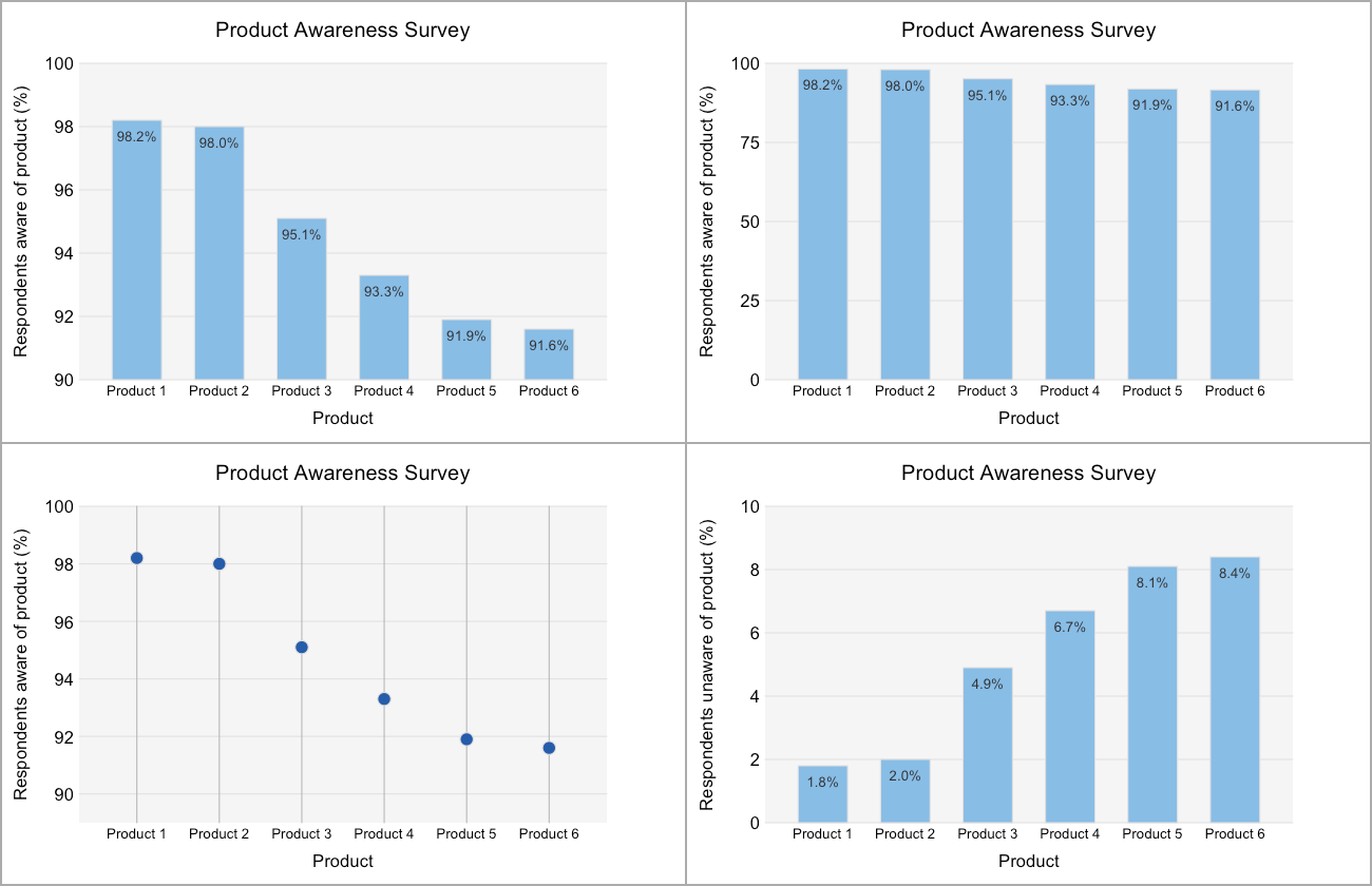
Don’t chop off the bottom of your bar charts

This is another way of saying “always start the bars in your bar charts at 0″.

The beauty of a well-designed bar chart is that, as well as making judgments based on position along a scale, we can directly compare the lengths of any two bars to judge relative magnitude. This relies on the lengths being proportional to the magnitudes of the values encoded and fails completely when they’re not (top left). It’s not just that removing this proportionality removes this feature, but also that the user of the chart is likely to expect that proportionality to exist. This leads to misjudgments of the data and that is worse than no data at all.

This distortion is often used deliberately to mislead and, as a result, even an innocent slip may lead to questions about intent and integrity. There is almost always a better alternative for the honest designer, even when the data concerned show only small variation around some comparatively large number (top right). Line charts are an obvious alternative for continuous data, while dot plots can be useful for discrete data (bottom left). A different approach is to transform the data, for example, by subtracting a “target” value from each data point or inverting the measure plotted (bottom right). (Obviously one needs to be careful that the salient message remains in tact here.)


Rules in data visualization are there to be broken. Make sure you have a very good reason for doing so here.

Don’t use two lines when one will do

This problem is more nuanced than the last and highly dependent on what it is you want to show.

Suppose you have two time-series data sets you want to compare. They have the same units and are roughly similar in magnitude. One option is to plot both lines on the same chart (left). We can see which is higher or lower at any given point in time, observe gradients and see anomalous points. There is absolutely nothing wrong with this and in many cases it is an ideal solution.

However, if what you really want to show is the magnitude (and sign) of the difference between the two time series then your best option is to plot that difference directly (right). The line then encodes the magnitude of this difference, with no requirement for the user to estimate the difference at each point in time.


Cleveland and McGill found a more fundamental difficulty with visually estimating the distance between two lines: “[t]he problem is that the brain wants to judge minimum distance between the curves in different regions, and not vertical distance”. Not only is comparing two lines a slower and more complex task, you’re more likely to get it wrong.

Don’t use a stacked area chart when you want to show individual components accurately

The difficulties we have interpreting differences from pairs of lines extends to stacked area charts. Both the bottom area and the total combined areas of stacked area charts are easy to understand because the horizontal axis provides a distinct, steady baseline. By contrast, the baseline for all the other area components must be constructed mentally, subtracting the shape of the underlying layers from the one of interest. I find this particularly difficult if the overall trend of the underlying layers is opposite to the layer of interest. For example, if the underlying layers trend strongly downwards, the shape of the layer of interest can resemble a (fat) downward sloping line (the Type III area, left). Even though the layer of interest may be getting fatter, the overall impression is of something decreasing when it is actually going up.

If you want your users to get a good sense of the data for the individual components you’re better off using distinct lines, either on a single pair of axes (right) or as small multiples. In the example below we can see magnitudes, gradients, line crossings and the relative sizes of fluctuations more clearly when the categories are plotted as separate lines.


Stacked area charts do have one very good application, namely when you’re interested in showing an ordered sum of components that changes (usually with time). One example of this would be illustrating how the total cost of a pint of milk changes due to fluctuations in farming, processing and retailing costs.

Don’t forget about your users with color vision deficiencies

Color vision deficiency (CVD) is the formal name for what is frequently described as color blindness. The most common problem associated with CVD is difficulty distinguishing reds from greens and is of genetic origin. It’s more prevalent in men (about 1 in 12 suffer) than women (about 1 in 200 suffer).

In western cultures green has come to be associated with “good” things or “go” and red with “bad” or “stop”. As a result of this it can be tempting to use these two colors to distinguish positive and negative outcomes (top left). However, because of CVD, some of your audience is likely to struggle to distinguish these two encodings.

If you only have two categories to encode then a simple solution is to swap green for blue (top right). If you have many categories (bottom left) then you’ll probably have to find a different solution. For example, if you’re plotting points you can change the shape of the points alongside the color (bottom right). This can be seen as redundant (but not harmful) encoding for the majority of your audience but likely essential for those with CVD.


It’s important to note that red-green CVD is more complex than just an inability to distinguish red from green. Color perception is altered in a broader sense, beyond that of those two specific named colors. For non-sufferers it’s thus extremely helpful that there are options for simulating the effects of CVD. Photoshop offers protanopia and deuteranopia (both forms of red-green CVD) filters, the Vischeck website also allows for red-green and blue-yellow CVD simulation of supplied images, and the Color Oracle application will momentarily simulate both red-green and blue-yellow deficiencies for the entire contents of your monitor.

Don’t obscure the data

Background gradients (left) or images can make your data visualization look more interesting and stand out from the page but are unlikely to help your reader draw any more insight from it. They are more likely to be a distraction and effects like simultaneous contrast (which gives rise to some notableopticalillusions) may lead to misperception. In general, keep to a neutral, single-color, background.

Want to learn more? Be sure to register for our upcoming webinar: How to Choose the Right Chart for Your Data, on March 11th. Click the banner below for more info!

How to Code a Multi Series Chart in Windows Forms

$
0
0

[youtube] width="560" height="315" src="http://www.youtube.com/embed/jmAxer96TKM" [/youtube]

In this video we're going to take a look at adding multiple series to a single chart. Essentially, you'll have a chart view, and there'll be overlap series on that chart. You can look at multiple data points in a single chart. This is a very common business scenario. This is a continuation of the video that we just completed, which shows you how to create a chart using the designer.

What we have here is our energy production data, which we're going to reuse. We're going to create an instance of the energy production data sample, and then we're going to use data points within the energy production type. Basically, the country and then the different types of energy that are produced by country.

First, let's go ahead and add a data chart. I'm going to go ahead and dock it full. Now in this sample, the whole thing is going to be done in code behind. We are not going to use the designer for anything, which I think will help everyone learn and understand the API of the chart.

The first thing we're going to do is clear the chart of any axes and series, which is going to be important. Let's say this dot ultradatachart1 dot  series dot clear, and the same with the axes, ultradatachart1 dot axes dot clear. The other thing we're going to do is Using Infragistics dot win dot data visualization is going to be important, because we're going to be referencing these types of the chart in our code behind.

We also want to set up some interaction properties, which will be important as the users actually use the chart. Let's go ahead and set the horizontal and vertical zoomable properties to true. This allows you to do panning and zooming with the mouse or the keyboard. We'll set that to true, and then ultra data chart one dot vertical Zoomable equals true as well, and we'll save that.

The next thing we want to do is create an instance of our data so we have data. We also want to create our numerical Y axes and our category X axes. Remember the numeric Y will be on the left-hand side of the chart, and that's going to be the numeric data that we want to display. On the horizontal category, X axes, we're going to want to show the country.

The first thing we'll do is create an instance of our data, which we'll be reusing throughout. We're going to create a new energy production data sample. Then let's go ahead and create our Y axes. The Y axes is going to be a new numeric Y axes, which we can find here. Of course, remember all of this can be done through the designer as well, but doing it through code behind does teach us a little bit about the chart's object model, and should help you build out samples much easier in the future with the chart.

So there we have our Y and our X axes, which we'll end up reusing. The first thing I want to do is set the data source of the X axes to our data. Then on the label for this I want to set it to the country field, so we'll be able to display each of the countries on the horizontal label for the chart. Let's go ahead and set the label property equal to country like so. Actually, I did not say data source here. So lets do that now..

Now let's go ahead and add the X axes and the Y axes to the chart. Remember these are collections on the chart, so we can just add to the collection. We'll say thisdot ultra data chart one dot axes dot add  and we will add our X axes like so. We'll do the same with the Y axes, so this dot ultra data chart one dot axes dot add This will be Y. It comes right up in the auto complete, so we're good there.

The next thing we want to do is add the series. Now keep in mind, the series are what is going to display, the area chart on the actual chart itself. In this case, we're going to do three series. The first one is going to be coal data, which in the video we did previously with the designer, we actually did the same thing. We did coal data, but we did it using the designer versus doing it in code.

Let's just go ahead and set up some basic properties here. Let's set up the data source equal the data so we have a new series. Now in order to tell which data to show up in the series, we have to use the value member path. Let's set the series dot value member path equal to coal in this case. If we go look at our data, you can see coal is one of the fields that we have here for the types of energy by country and by region for this particular example.

Let's give this a title so we know which one it is, and we're going to say coal. Now we're going to set the X axes and the y axes, of course. Let's go ahead and say series dot X axes here. It's going to be the X axes that we already set up. We just reuse it, and series dot Y axes is the same thing. We just reuse that.

If I ran it now nothing would show up. We need to add this to the chart. We say series dot add, and we have series like so. That's it. Let's go ahead and run this. You can see here we've got our form. I set the interaction, so I can zoom in and out with my mouse. Horizontal and vertical zoomable is true. My numeric Y axes is showing the numeric data on the left, and then my countries are on the bottom.

So let's go ahead and add a few more pieces of data. Same thing. Let's just go ahead and add oil data. Now I'm going to do this in the most manual way possible just so you get a feeling of how to interact with the chart. We're just going to add a new area series like so, and you get the idea. I call this guy series two. Essentially, if I go up here, and I copy everything and I paste it, this is as basic as it gets.

I'm saying create a new series for its title. Let's use “oil”.  What am I adding to the chart? Well I'm not adding series. I'm adding series two. Then if we do the same thing for “hydro” data, in this case I will just copy the whole thing, paste it in. Now let's change this over to series three. Series three, we're going to have to change the title, the value member path. We're going to add series three to the chart, and this guy will be “hydro”. That's it.

Let's go ahead and run it. You can see now I have multiple series on the chart all lined up with my numeric data. If I zoom in, I can glean more information. I can zoom out with my mouse or with my keyboard. It really doesn't matter.

There you have it. That's as easy as it is to create a multi-series chart all in code behind with the Infragistics Windows Forms Charting Control.

Algorithms: The Third Co-Evolutionary Force

$
0
0

      In this world the only things that create and control themselves come from nature; from the mountains to the trees to animals to human beings. A new concept of a third “co-evolutionary force” is discussed when Kevin Slavin takes a new spin on algorithms in his TEDTalk called How Algorithms Shape Our World. Slavin begins by briefly coining algorithms as “the math that computers use to decide stuff”; however, irony lives within this description for as the talk continues, we find that algorithms are much, much more than that. Slavin refers to math as “not something we extract and derive from the world, but as something that shapes us.” We can see the math, specifically algorithms, shaping our actions and decisions in the examples given from Wall Street’s use of algorithms in “Black Box Trading”, to Netflix’s use of algorithms to influence what movie we watch next, to the household robotic vacuum “Roomba” using algorithms within the realm of architecture. Whether it is something more complicated at work, or just another common moment of our lives, we see algorithms working discreetly. These examples alone make it quite clear that algorithms are not simply “the math that computers use to decide stuff”, but that they are far more complex, sophisticated, and to an extent, almost natural in that they can do things that humans cannot put their finger on, grasp, and explain.

     While yes, it is obvious that humans created, understand and can explain how Netflix knows that I would probably enjoy “The Wire” after I just tackled two seasons of “House of Cards” in a single weekend, there have been algorithms created which have done things that even their creators cannot explain. For example, Slavin refers back to Wall Street and to an incident known as the “Flash Crash of 2:45” which took place on May 6, 2010 when within five minutes, nine percent of the entire United States stock market disappeared. What exactly happened? Nobody is really sure. Where exactly did it go? Nobody is really sure. Why did it happen? Same answer. There is no clear-cut conclusion that is agreed upon by a majority which leads us to believe that at that point in time the algorithm took over, essentially did whatever it wanted and no human predicted it, or could stop it. This example supports Kelvin’s hypothesis that humans are writing codes that we can no longer completely read and that we are really losing the sense of what is actually happening. There is actually company called Nanex, whose purpose is to find these nearly illegible algorithms, “pin them to the wall like a butterfly,” and try to figure out what exactly they mean and do. It is almost as if this company is trying to figure out the anatomy and makeup of these algorithms similar to how we study nature in our college sciences courses. Some questions I have are, how far do we continue going in creating these complex things that we could quite possibly have no control over? Are we beginning to create new mathematics in which we are testing the waters and letting the prospective benefits outweigh the possible costs? Sure, we have a pretty good grasp over them now, but as these algorithms become more complex and powerful, where does the future lead? But ultimately, have we found something else that is created and then can act on its own, the same way we procreate and have children with their own genetic makeup, who grow to eventually be able to make their own decisions and shape the future?

      As Slavin said, “the landscape was always made by this sort of weird, uneasy collaboration between nature and man. But now there’s this third co-evolutionary force: algorithms... And we will have to understand those as nature, and in a way, they are.”

algorithm

View Kevin Slavin's How Algorithms Shape Our World at:

How to Build an Area chart in Windows Forms

$
0
0

[youtube] width="560" height="315" src="http://www.youtube.com/embed/MgMO5WU8VwI" [/youtube]

In this video we're going to do a quick tutorial on building an area chart with the new Infragistics Windows Forms Chart Control. Let's go ahead and start a new project. You'll notice that I'm using Visual Studio Community Edition 2013. You can use this with the free edition and everything works as it would in the ultimate edition. Let's go ahead and call this Chart Sample Windows Forms.

I'm going to do a couple of things here. First thing I'm going to do is make my screen a little bit bigger, set some properties on my screen. My form 1, I want to make sure that the startup position of the window is going to be in the center. I also have a class to add. This class is going to include data that we're going to bind to our chart. Let's go ahead and grab this class I have here in Notepad++. You can see that it's just called Energy Production Sample. I have a type of energy production in those fields--region, country and then the type of energy production--coal, oil, gas, nuclear, hydro, etc. This is what we're going to bind to the actual chart. Let me copy this, and we'll create Class Energy Production Data.

Now that I have this pasted in, everything looks good. I'm going to go ahead and save. We'll go back to our form. What I want to do is add a chart to the form. We'll go ahead and grab an UltraChart. What the UltraChart did is it added the Win.data visualization assembly, the ultra-data chart assembly, and the Win.portable.core assembly. Those are now available to me in this project. The next step  ... Let's dock this. We do a full screen to fill the chart into the form.

Now for the chart itself I could to the properties. You can see we have all the properties listed out in the property window. Or I could just right click and go to custom property pages, which is a little bit easier because we have the properties categorized, and it's a little bit easier to find stuff. The first thing I'm going to do is set a title for my chart. I'm going to call this Energy Production Data. We will do our subtitle and we'll say “by type of energy” like so. We can leave the font the same But you can see you have a lot of customization here based on how you actually want the chart to look visually.

But in order to get this chart rendered there's two things we have to set up, two collections. The first one is the axis collection. On a chart you have an x axis, a y axis, and then you have a series. The series ends up being the chart type. Let's scroll up here. You notice we have axis here, and it's a collection. I'm going to bring up its collection editor. Since I already know going into this we're going to do an area chart, we could do another chart type that has DateTime. For financial data we could do a polar series which would have x axis data, radius axis data.

What we're going to do is something fairly basic. I'm going to have a category x, and I'm going to have a numeric y. The numeric y data will show up on the left-hand side of the chart, and the x will show up on the bottom, and that's going to be the text data. The country information is going to come across the bottom, and the production numbers will come up on the left-hand side. You can also see that there's a set of properties here for the axis. Again, if we had a SQL data source or some other data source, we can easily bind it to the control.

Now we will set up our series. Let's scroll down to the series collection editor. This is very simple. I'm going to go ahead and tell it I want this area series, but you'll notice we have every other type of series that you would like here--column series, bar, line, etc., every financial series, every type of financial indicator. You name it, this chart has it. It's a very rich and robust chart. It's been in the market for years across all of our platforms be it WPF, Silverlight, JQuery, IOS , Android, and now Windows Forms. It has a lot of features, has all the basic business chart types, and then all of the more advanced chart types too as well as scientific charting.

Now that I've added my area series what I want to do is tell the x axis and the y axis on the area series what to display. I want it to display the category x I had set up in my axis collection and my numeric y. It's as simple as that. I've basically set up the properties on the chart to display my area chart series with an x axis and a y axis. Now we've got to go put some data into it. If I was using a SQL data source, I could simply go ahead and use the editor and set the properties right in my designer. But since I'm using my class, which we can look at here, our energy production data, I add my name space Infragistics models, and then I have my energy production data sample data that we're going to consume.

Let's go ahead and make sure we're using Infragistics dot models. In our constructor here we'll just go ahead and create our data source. This is going to be the new energy production data sample. Now that we've created an instance of the data that we want to bind, we want to go ahead and tell the x axis what to use and we want to tell the series what to use. In order to do that we're going to create an x axis object. It's going to be associated with the ultra data chart, which is what was on our form. Remember we had the axis collection. The axis type that we want is going to be the category x axis.

Let's go ahead and tell it to use category x axis, like so. Since, remember, this was a collection, we can just say use first or default. We have the axis that we actually want to bind data to. Now we want to tell it what label to use. This is going to use data from our collection. The label will be country. You'll notice I'm not getting all of my telasense. There's a reason for that, and we'll fix that in one second. I will say x axis.data source = data. Now we need the Infragistics.Win.data visualization name space introduced here. What that gives us is all of the types that we need to reference if we are creating objects based off of the chart.

Now we have our x axis bound to the country property and our data source of energy production data sample. Now we need to do the same thing for our series. In the same manner we're going to create a series object, and it is a part of thisultra-data chart dot series and It is “of type” of the type of series that we actually told it to use which was going to be the area series. Same thing, it's a collection. Let's go ahead and tell it which one to use. Now, In this case we have a property called the value member path. For the series what we want to do is we want to bind its value member path to the data that we want to display from the data source. In this case it's going to be “coal”. This will be coal production. We're just going to tell the series that its data source equals data. That's it. That's all we really need to do.

We've set up an instance of the data that we want to bind. We have our x axis data, which we're going to display. Remember that'll end up being on the bottom of the chart. Our y axis is going to be bound to the area series chart type, and that will display our data. If we go ahead and run this  and you'll see that we've got a beautiful area chart. We've got our title, our subtitle ... our coal production on the left-hand side, by country on the right. There you go. It's that easy to get a chart up and running in Visual Studio with the Infragistics Windows Forms Data Chart Control.

Weekly Roundup: .NET, jQuery, HTML

$
0
0

In the .NET, jQuery and HTML ecosystems, 2015 has been a year of exciting announcements. Among the various releases, teasers and previews, it’s been impossible to ignore the trend in Virtual developments (whether of the Machine or Reality kind). Some of these offerings still seem a little futuristic, and a little out of reach for the large majority of customers. Nonetheless, it’s exciting to catch a glimpse of what VR and VMs might look like in future and we can’t wait to see how these early developments will evolve over the coming months and years.

In this week’s roundup we’ll be looking in more depth at these Virtual developments, and also at Microsoft’s announcements about its new browser, Spartan. As usual, get back to us with your thought on these developments in the comments section below, we’d love to hear your take on events.

Mozilla adds VR support directly to Firefox Nightly builds

Over the last few months, the Mozilla Foundation has been working on a number of exciting projects to turn Virtual Reality on the web into an accessible reality. Until recently, VR developments lagged behind Firefox and VR fans had to wait to download a separate build when wanting to experience the medium. However, from now on WebVR will be developed in conjunction with other Firefox improvements, meaning Firefox Nightly builds will always be compatible with the latest VR technology.
Most users at present will approach WebVR with the Oculus Rift headset and this will still require an add-on and require users to open a non-e10s browser window. That said, it’s hardly a complicated process for those hoping to experience VR and Mozilla expect these minor hitches to be smoothed out in the near future.

"Beam me up Scotty": Holographics from Microsoft

This week Microsoft took the tech world by storm with the announcement of HoloLens, a headset which allows users to lay images over the world they see. Running on Windows 10, the headset promises a new way of interacting with technology and combining these with our real world experience.
For developers, this sets the next frontier of design; no longer will users interact with code and platforms through a mobile or desktop interface, but they’ll directly live the experience. This may be a real game-changer in the development world and bring unusual challenges as well as awesome opportunities.

Azure Updates: bigger, better, bolder

It’s been an exciting month for Microsoft with numerous updates and developments. It might be a little less sexy than HoloLens, but the updates they recently announced to the Azure Cloud are impressive. Now generally available, their G-series Virtual Machines offer the highest amount of SSD on any virtual machine in the public cloud, state of the art server processors and flash based storage.
What this means for the development community is faster deployment of applications, especially for resource intensive enterprise work involving big data and relational database servers.  

Famo.us joins jQuery Foundation

Famo.us got a lot of kudos for developing a 3D layout engine as well as a physics animation engine written for HTML5. With a free, Open Source platform, they allow users to build cross platform web Apps. The engine is complex and must take into account the additional physics involved in 3D.
They recently announced that they would join the jQuery Foundation - the people behind the popular jQuery JavaScript library. The main aim of the move is to make access to their engines easier and for developers to begin using the machines’ to begin building impressive, next generation jQuery widgets. Steve Newcomb, founder of Famo.us, is inspired by the challenge of building web Apps which can finally move beyond the constraints of the old-school layout engines which were just designed for simple text.
Offering Famo.us layout engines on jQuery will allow designers to build much more advanced web Apps, widgets and parts and bring web-layout into the twenty-first century.

Internet Explorer is dead, long live Spartan 

Last week, Microsoft announced that come the release of Windows 10, Internet Explorer would no longer be their default web browser. Replacing the long standing, sometimes loved, sometimes hated Internet Explorer is more than a rebranding exercise however. Spartan will be entirely built on HTML5 and offers a real break from the twenty years plus of Internet Explorer. Spartan will offer a cleaner, lighter, more modern interface, offline reading list, voice recognition and much, much more.


Many developers are skeptical of Internet Explorer, despite real improvements in its latest incarnations. Microsoft are hoping to bring back the critical mass to their browser with a fresh start however and we can’t wait to see how it will be adopted by the community.

Virtually everyone is going virtual

We all remember the science-fiction films that got us fascinated by technology in the first place - from Back to the Future to Star Trek. This week’s announcements bring back a bit of that childish amazement those films gave us. It’s early days but we’re certainly looking forward to see how things will evolve!

Infragistics Windows Forms SR Notes – February 2015: 14.1, 14.2

$
0
0

With every release comes a set of release notes that reflects the state of resolved bugs and new additions from the previous release. You’ll find these notes useful to help determine the resolution of existing issues from a past release and as a means of determining where to test your applications when upgrading from one version to the next.

Release notes are available in both PDF and Excel formats. The PDF summarizes the changes to this release along with a listing of each item. The Excel sheet includes each change item and makes it easy for you to sort, filter and otherwise manipulate the data to your liking.

In order to download release notes, use the following links:

WinForms 2014 Volume 2 Service Release (Build 14.2.20142.2092)

PDF - Infragistics WinForms 2014 Volume 2
Excel - Infragistics WinForms 2014 Volume 2

WinForms 2014 Volume 1 Service Release (Build 14.1.20141.2165)

PDF - Infragistics WinForms 2014 Volume 1
Excel - Infragistics WinForms 2014 Volume 1

Webinar Recap: Everything you need to build stunning apps


Designing a mobile app icon users will remember

$
0
0

The leading App Stores have over 1.25 million Apps available. An amazing number which will only continue to grow. With thousands of tools designed to help with anything from everyday tasks, travel, and entertainment to the truly bizarre, standing out from the crowd and getting potential clients to tap on your icon while browsing is an enormous challenge.

For many small tech startups, App icon design is often left to the developers who’ve written the code and built its features. However, unless you’ve completed a degree in graphic design, being a developer doesn’t instantly mean you have an innate understanding of icon design, yet icons require serious planning. It’s all very well having the best codes, APIs and intuitive user experiences; if your icon is busy, unclear or boring, it’s unlikely users will ever get to know what’s inside.

There’s no magic bullet for the perfect icon design - this is of course subjective. Nonetheless, there are some important rules you should take into account when designing it.

What is a symbol?

As children’s’ minds develop, they learn to understand symbols. Younger children are unable to make the mental leap between a representation of a thing, and the thing itself - we’ve all seen a toddler trying to grab at a TV screen, believing what’s displayed is actually there. However, they gradually learn to make the link between images and the things they represent.

In essence, this is the fundamental concept behind designing good icons. When companies design logos, graphic designers know that it’s essential to encourage consumers to make associations between an image and a product. So, when creating an icon for the App Stores designers need to consider two principal design stages. They first need to think of the “story” behind the icon and subsequently they need to think how this should actually be represented clearly.

Tell me a tale

The basis of good icon design (as with any marketing symbol) is to boil down the story of your App into an image which gives consumers a good idea of what it’s all about.

Say you have come up with an App which tells the consumer about their carbon emissions as they travel around their city. When boiling it down to an icon, you need to decide on what makes your App unique and how an image can tell the story. From this point you can start building an icon which will allow potential customers to guess what the App is about. For the above example, an icon which represents travel, carbon dioxide and measurement would be some of the key points and from there users will start filling the blanks.

Secondary to this is the importance of triggering an emotion in your potential customer. Again this is part of telling the story, but aiming to spark an emotion with your icon is essential - whether it be humor, fun, surprise or distraction. It’s generally advisable to aim for positive emotions; no one’s going to download a weight loss App if the icon shows a miserable overweight person!

Now design it

Having laid the foundations, there are a number of steps to consider when turning this into a fully-fledged icon. There’s a lot of good advice out there on best practices, tips and inspiration for making eye-catching icons.

One thing’s for sure here - there are no hard and fast rules when it comes to designing icons. What works for one App may make no sense at all for another and this is why it’s so important to spend time thinking about the story behind your App and the meanings you wish to convey. Nonetheless, there are some dos and don'ts which provide a pretty good starting point.


Do:

  • Think about how it will appear in different screen sizes
  • Aim for one unique shape
  • Focus on simple concepts
  • Test your icon against different wallpapers
  • Spend time on subtle details users probably won’t even notice
  • Consider how people from different cultures will react to your icon


Don’t:

  • Use too many colors - less is usually more (between two and four)
  • Include words unless unavoidable - they look messy and are hard to read on small icons
  • Use photos - they look bad in the App Stores


The rough guide

No icon is the same, and of course the rules outlined above need to be modified to your App’s needs. That said, just looking through the store will give you a good idea of what looks good and what looks bad; many of the most appealing icons are simple, eye-catching and tell a story.

As small and insignificant as icons seem, they are crucial when it comes to attracting the attention of potential customers. Using the above guidelines as a point of reference can help developers and designers focus their thoughts when drafting their icon ideas.

Developer News - What's IN with the Infragistics Community? (2/23-3/1)

Doing CRUD Operations with Infragistics UltraGrid and Entity Framework

$
0
0

The Infragistics Windows Form controls are some of the best, most extensible third party controls that I have ever used for UI development.  The set of controls is quite comprehensive and the API is exhaustive.  You can do anything with these controls, in terms of overriding their function and form.

Based on my experience often very good components are designed to be used with some frameworks in the best way, but because IT industry is very dynamic often other new technologies stays most popular and developers look for the best practices to use existing good controls with latest frameworks.

Since I use (and tweak) the UltraGrid control most often, I have decided to create a short article sharing my experience with Infragistics UltraGrid API and probably the most popular ORM for .Net applications – Microsoft Entity Framework. Samples in this post use Infragistics Windows Forms Controls (part of Infragistics Ultimate vol.14.2), EF 6.1.2 / Database First Approach (you can download this version from this link) It is also possible to use NuGet package manager. The data source is based on the popular Northwind sample database. Database engine is SQLServer 2014 Express.

Considerations:

As it was mentioned above, UltraGrid is popular well designed and tested component, released for the first time several years ago. Natively it is designed to work easily with ADO.Net framework and uses data sources like ADO.Net DataTable.

If you want to use Entity Framework there are several specific things that you need to consider first to implement the basic :CRUD (Create, read, update and delete) operations. Most notably: Entities generated from Entity Framework are not native data sources, so it is not possible to bind them directly.

Sample and most important snippets:

For this sample, let's use a simple Windows Forms solution created with Visual Studio 2013 Update 4, including UltraGrid and Entity Framework model, based on Northwind using only a Products table/entity. When we use tables with relations we need to consider integrity rules when trying to update the data source.

UltraGrid-CRUD-Pic01[1]


The structure of the Product entity is shown below:

UltraGrid-CRUD-Pic02[1]

You need to initialize our EF model:

 1:#region members
 2:  
 3: ObservableCollection data; 
 4:static NORTHWNDEntities model = new NORTHWNDEntities();
 5:  
 6:#endregion members


Read operation:

ObservableCollection or List are some of the collections that you can use as a DataSource for UltraGrid.

 1:public Form1()
 2: {
 3:     InitializeComponent();
 4:     data = new ObservableCollection(model.Products.ToList());
 5:     ultraGrid1.DataSource = data;
 6: }


Now you can see records in your Infragistics grid. Actually, you cannot apply other CRUD operations on this data source and update database out of the box – you need to add some code.

UltraGrid-CRUD-Pic03[1]


Update operation:

Update operation works with the grid and binds as a data source collection (you just need to set your Windows Forms grid in edit mode), but because we're using Entity Framework, this data source is decoupled. So you need to add code where you want to update the entities from the model and to set their EntityState to Modified. The current sample demonstrates how to update all entities. If you have many records, it is recommended to add additional logic to update only the entities which are changed.

 1:/// 
 2:/// Handles the Click event of the btnUpdateData control.
 3:/// 
 4:///The source of the event.
 5:///The  instance containing the event data.
 6:privatevoid btnUpdateData_Click(object sender, EventArgs e)
 7: {
 8:     var product = data.FirstOrDefault();
 9:     var id = product.ProductID;
 10:  
 11:foreach (Product newproduct in data)
 12:     {
 13:         var oldProduct = model.Products.Where(x => x.ProductID == newproduct.ProductID).FirstOrDefault();
 14:if (oldProduct != null)
 15:         {
 16:             oldProduct = newproduct;
 17:             model.Entry(oldProduct).State = EntityState.Modified;
 18:         }
 19:else
 20:         {
 21:             model.Products.Add(newproduct);
 22:         }
 23:     }
 24: }

Finally you need to save changes in your database using SaveChanges() method.

The screenshot below demonstrates how to update data source using this sample application.

UltraGrid-CRUD-Pic03a[1]


Create operation:

You can create a new record using the "add new record" option of the UltraGrid (it offers a button for this out of the box). Unfortunately this approach doesn't work with most data sources, so the best approach is programmatically to add a new element in the collection that you are using as a data source and to rebind it to the grid (see the snippet below):

 1:/// 
 2:/// Handles the Click event of the btnAddRow control.
 3:/// 
 4:///The source of the event.
 5:///The  instance containing the event data.
 6:privatevoid btnAddRow_Click(object sender, EventArgs e)
 7: {
 8:  
 9:     var newid = data.Select(x => x.ProductID).Max();
 10:     data.Add(new Product { ProductID = newid + 1 });
 11:     ultraGrid1.DataBind();
 12: }


The screens below demonstrate how to do that via UI of the sample application.

UltraGrid-CRUD-Pic04[1]


UltraGrid-CRUD-Pic04a[1]


Delete operation:

The Delete operation is not offered out of the box from the UI. When you need to delete the selection, you need to get the selected records using Selected.Rows, get the entity from each entity using the ListObect propery of the row, and you need to set the EnttyState.Deleted value. At the end you need to save the changes to the database.

 1:/// 
 2:/// Handles the Click event of the btnDelete control.
 3:/// 
 4:///The source of the event.
 5:///The  instance containing the event data.
 6:privatevoid btnDelete_Click(object sender, EventArgs e)
 7: {
 8:if (this.ultraGrid1.Selected.Rows.Count > 0)
 9:     {
 10:// Delete the selected rows by calling DeleteSelectedRows.
 11:         Product currProduct = null;
 12:
 13:foreach(var curr inthis.ultraGrid1.Selected.Rows){
 14:             currProduct = curr.ListObject as Product;
 15:  
 16:if (currProduct != null)
 17:             {
 18:                 var oldProduct = model.Products.Where(x => x.ProductID == currProduct.ProductID).FirstOrDefault();
 19:if (oldProduct != null)
 20:                 {
 21:                     model.Entry(oldProduct).State = EntityState.Deleted;
 22:                     model.Products.Remove(oldProduct);
 23:                 }
 24:             }
 25:         }
 26:  
 27:this.ultraGrid1.DeleteSelectedRows();
 28:         model.SaveChanges();                  
 29:     }
 30:else
 31:     {
 32:// Show a message if there are no selected rows.
 33:         MessageBox.Show("There are no rows selected. Select rows first.");
 34:     }
 35: }

You can use T-SQL expressions using ExecureSQLCommand() method, which affects the database directly. It is possible to apply it without making changes in the model and saving it. This approach is faster, but you need to be very careful here because it doesn’t keep the consistency between the database and the entity model.

 1:if (oldProduct != null)
 2: {
 3:     model.Entry(oldProduct).State = EntityState.Deleted;
 4:     model.Database.ExecuteSqlCommand("delete from dbo.Products where ProductId="+oldProduct.ProductID);
 5: }

The screenshots below demonstrates how to delete records/entities using the sample application, related to this post. 

UltraGrid-CRUD-Pic05[1] 

UltraGrid-CRUD-Pic05a[1]


This article covers the basic CRUD operations, realized with Infragistics WinForms grid and Entity Framework - and to make the most of this post, be sure to download the source code of this sample here.

You'll also need the Northwind sample database, which you can get in SQLServer 2008 or newer through the CodePlex website. It is also possible also to download a version that's compatible with older versions of Microsoft SQL server from the Microsoft download center.

To play around with the Infragistics Windows Forms dashboards on your own, be sure to get Infragistics Ultimate and see the chart in action in our latest sample application by clicking the banner below!

The HTML5 Designer from Infragistics

$
0
0

As web pages are accessed from ever more diverse devices and pages include increasingly complex elements, developers are faced with more and more complex challenges in their builds. At the same time, clients expect work to be completed sooner and to tighter deadlines. Long gone are the days of plain text pages; users expect interaction, sharp visuals and speed.

Many projects are restricted by strict deadlines, tight budgets and so developers must do more in less time. Coding entire pages from scratch is still a common task and requires intense concentration, not to mention the need for support and guidance when lost. Developers are called on to carry out more complex tasks than ever and handling these competing pressures when building for the modern web takes an enormous amount of skill and know-how.

Given these complexities, a tool like Infragistics’ HTML5 Designer offers a powerful tool for developers to facilitate the process of building for the modern web. The in-browser designer includes toolkits choc-full of modern web components and drag-n-drop page design tools to make web design a breeze. We’ll look at some of these features in more detail below.

What is the HTML5 Designer?

While it’s able to do many things, the main focus of the HTML5 Designer is to simplify the process of building modern web pages for practically any line-of-business app or page. Drawing on over twenty five years of experience in designing business oriented components, we’ve thought in depth about how to make writing modern web pages easier than ever. The HTML5 Designer incorporates responsive design elements, Bootstrap grid layout support, Bootstrap theme support, modern page layouts, drag n drop sections, a great range of components, graphs and visualizations and allows users to configure different UI Controls.

These various capabilities mean that designers can do far more when building pages and do so more quickly. With components pre-built and the flexibility for easy coding and modification, making stunning, interactive web pages with a great UX is easier than ever. Some of the HTML5 Designer’s stand out features include:

WYSIWYG design

The Ignite UI designer allows developers to drag n drop a wide variety of User Interface elements (text box, title, image box etc.) onto their pages and also allows the incorporation of Infragistics’ controls (graphs, charts, pivot tables etc.). It becomes possible to render web pages quickly and efficiently and really make the most of the power HTML5 offers. These drag n drop interfaces are of course customizable and the designer allows developers to add or change code as their builds require.

Responsive web design made easy

As consumers and colleagues access web pages from thousands of different devices and screen sizes, the need to build more responsive web pages is more important than ever. The Smartphone has revolutionized our way of interacting with the internet and added another layer of complexity to the developer’s job.

In response to this, the HTML5 designer includes a number of features which ensure your builds will fit to different screen sizes more intelligently. Included with our designer is a built-in Bootstrap row component which easily leverages Bootstrap grid frameworks to your page. Developers can also make use of the CSS breakpoint visualizer and editor to see and edit their responsive designs and make sure they look as intended.

Drag-n-drop HTML5 Components from the toolbox

At Infragistics’ we pride ourselves on the quality of our controls and components for line-of-business users. Our tools make almost any data visualization you could want possible - from financial forecasts to interactive tables and OLAP charts. End users need to simply feed in the data and our tools represent the information with inspiring and engaging visuals.

The HTML5 Designer provides developers with over fifty charts which are perfectly orientated towards business needs. So, whether your company or client want to plan for the future, see automatically updating reports on their home pages or display data to customers, the vast array of components in the toolbox make sharing information easy and efficient.Integrated code helper

Thanks to its drag n drop technique, the HTML5 designer lets developer cut out a lot of time spent writing code and spend more time making a build beautiful. Nonetheless writing code will still be necessary and the integrated code helper makes this very easy and painless. Used by services as diverse as GitHub and Wikipedia, we incorporated and customized the ACE code editor and added specialized code completion capabilities. By simply hovering your cursor over code you can find links to relevant API documents which help you ensure you’re getting things right.

Make modern web design easier than ever

Web developers face an ever increasing set of challenges when building for the modern web. Clients and customers have higher expectations and developers must make use of an enormous and diverse range of skills and knowledge to succeed. A platform like Infragistics’ HTML5 designer is powerful here and means that developers can do more, faster. Put simply, advanced web development just got a whole lot easier.

The Infragistics ASP.NET Image Viewer

$
0
0

Often we use an Image viewer for displaying multiple images in a single container. Today, these tools are widely used in online retail stores for displaying images of various products. Amazon is a good example, as it relies heavily on Sliding Image Viewers to display a range of products. Image viewers come in many styles and orientations.

Infragistics Asp.Net Image viewer, also known as WebImageViewer, has everything that a web developer needs, which will allow them to add an easy to use sliding image viewer on their web page. Depending upon your requirement, you can adjust your tool either horizontally or vertically, extract the images from either a folder directly or hook it with a data source, look for the images in a database table and display it.

Let’s find out how we can populate the “WebImageViewer” control with images, which we will extract from a folder in the server and display it. There are interesting features in this control that we will explore in this article.

Extract Images from a Folder

Storing and extracting files, particularly images, from a folder, is a simple process also considered a quicker option than doing the same with a database table. This method is popular among web developers, and we will an example using a similar method.

First, you will have to add the image viewer control on the web page. You can do this by dragging the control from the tool bar to your page.

The Markup

<%@ MasterLanguage="C#"AutoEventWireup="true"CodeFile="Site.master.cs"
Inherits
="SiteMaster" %><%@ Register assembly="Infragistics4.Web.v14.2, Version=14.2.20142.2146,
Culture=neutral, PublicKeyToken=7dd5c3163f2cd0cb"

namespace="Infragistics.Web.UI.ListControls" tagprefix="ig" %><!DOCTYPE html><html><head><title>Infragistics Image Viewer Control for Asp.Net</title><asp:ContentPlaceHolderID="HeadContent"runat="server">
</asp:ContentPlaceHolder></head><body><formrunat="server"><divclass="page"><divclass="main"><asp:ContentPlaceHolderID="MainContent"runat="server"/><asp:ScriptManagerID="ScriptManager1"runat="server">
</asp:ScriptManager><ig:WebImageViewerID="WebImageViewer1"runat="server"Height="150px"Width="500px"></ig:WebImageViewer></div></div></form></body></html>

Code Behind C#


using System;
using System.IO;
using Infragistics.Web.UI.ListControls;public partial classSiteMaster:System.Web.UI.MasterPage
{
    protected void Page_Load(object sender, EventArgs e)
    {
        PopulateImageViewer();
    }privatevoid PopulateImageViewer()
    {int iCounter =0;System.IO.DirectoryInfo dirInfo =
new
System.IO.DirectoryInfo(Server.MapPath("~/my-images/")); FileInfo[] files = dirInfo.GetFiles("*.*");if (files.Length > 0) { foreach (FileInfo file in files) {// FILE TYPE.if ((files[iCounter].Extension ==".jpg" || files[iCounter].Extension ==".jpeg" || files[iCounter].Extension ==".png" || files[iCounter].Extension ==".bmp" || files[iCounter].Extension ==".gif")) { ImageItem image =new ImageItem("~my-images/"+
 files[iCounter].Name, "", "");this.WebImageViewer1.Items.Add(image); } iCounter = iCounter +1; } } } }


Vb.Net


Imports System
Imports System.IO
Imports Infragistics.Web.UI.ListControls

Partial Class Site
    Inherits System.Web.UI.MasterPage

    Protected Sub Page_Load(sender As Object, e AsSystem.EventArgs) 
Handles Me.Load PopulateImageViewer() End Sub Private Sub PopulateImageViewer() Dim iCounter AsInteger=0 Dim dirInfo As New System.IO.DirectoryInfo(Server.MapPath("~/my-images/")) Dim files As FileInfo() =dirInfo.GetFiles("*.*") If files.Length>0 Then For Each file As FileInfo In files' FILE TYPE.
If Trim(files(iCounter).Extension) = ".jpg" Or _
Trim(files(iCounter).Extension) = ".jpeg" Or _
Trim(files(iCounter).Extension) = ".png" Or _
Trim(files(iCounter).Extension) = ".bmp" Or _
Trim(files(iCounter).Extension) = ".gif"
Then Dim image As New ImageItem("~/my-images/" & files(iCounter).Name, "", "")
Me.WebImageViewer1.Items.Add(image)
End If
iCounter = iCounter + 1
Next
End If
End Sub
End Class


In the markup section, we have added the image viewer and it has assigned the container a default Height and Width. You can always adjust the control by editing its attributes and values. In addition, it also assigned a default orientation to the control, not explicitly declared, however it is the default behavior. Its default orientation is “Horizontal”. You will see this when you run the application on the browser.

If you want to display the viewer “Vertically”, then you have to assign (or change) the orientation value this way.

<ig:WebImageViewerID="WebImageViewer1"runat="server"Orientation="Vertical"Height="500px"Width="150px">
ig:WebImageViewer>

Don’t forget to adjust the Height and Width of the Image viewer, once you have changed its orientation. Simply, reverse the values of the height and width, or whichever you feel is good.

To populate the image viewer with images, we have written a small code behind procedure. The procedure will extract the files from a folder and fill the image viewer with the images. Methods “DirectoryInfo” and “FileInfo” from “System.IO” namespace will allow us to get the images from a folder. To add the extracted images to the image viewer, we will use “ImageItem()” method in our procedure.

The “ImageItem()” method from Infragistics “ListControls” namespace takes three parameters.

  1. ImageURL – The url (with folder name) of the image that we will add to the viewer. The “file” object of class “FileInfo”, provides the name of each image in the folder. A condition in the procedure checks the type of file in the folder, before adding it to the viewer.
  2. alt – The “alt” attribute is used to specify a text for the image. This is required, if the image is not loaded properly in the viewer. It is alternative for an image, as it will help avoid any confusion among users, about the image.
  3. ToolTip – The 3rd and final parameter, will allow developers to add a “tooltip” to the images. It is equivalent to the “Title” attribute of the *img* control. You can pass either the image name or any other information with this parameter.


In-build Lazy Load feature

What I like most about this control, is its in-build lazy load feature. This feature actually delays the loading of images until every image is first loaded in the viewer and then displayed. The page loads faster. You do have to write an extra code to incorporate this feature.

In-fact this control actually makes the web developers life very easy. Preferably, a web developer would choose a DIV or Panel control to display the images. The DIV is no doubt, a lightweight option for a container for various purposes. However, imagine how much code you have to write at server and client side to make the elements and features to in work sync, and to make a good impression among your users.

Thumbnail Images

It automatically adjusts the width and height of the images. Its a perfect solution for displaying thumbnails on a web page. Simply reduce or increase the “Height” and “Width” of the Image Viewer, and it will re-size each image in the container, using the “Image Aspect Ratio” algorithm. If you are planning to design a “Responsive” web page for displaying images, I think this is the ultimate control.

In the below markup, I have reduced the height of the viewer from “150px” to “50px”, that's it.

<ig:WebImageViewerID="WebImageViewer1"runat="server"Height="50px"Width="500px">

ig:WebImageViewer>

ScrollAnimations Property

The “ScrollAnimations” property provides some cool animation to the Image Viewer. Weather displaying the images with a bounce effect or add some grace to images by smoothly displaying it. This property will take care of it easily.

<ScrollAnimationsType="NextItem"NextItem-Alignment="Center"><NextItemEquationType="Bounce" />
ScrollAnimations>

Add Header and (or) Footer

Finally, you can add a little text on the top and bottom of the viewer. All you need to do it add the elements *Header* and *Footer* to the “WebImageView” control. Add a text of your choice to the elements, and don’t forget to set the “Visible” property as “true”, and you're all set!

<HeaderText="Our Best Collections"Visible="true">Header><FooterText="High Definition WallPapers"Visible="true">Footer>

User Centered Dashboards: A Visual Design Approach

$
0
0

As a visual designer at Infragistics I am always keeping my eyes open for effective dashboard designs to lend inspiration to projects. By browsing design-rich websites like Pinterest, Behance, or Dribbble I easily find collections that stimulate me. Many of the dashboards I come across are beautiful or at the very least aesthetically pleasing, but are they effective dashboards? Well, that would really depend on who the user is and what their needs are. Aesthetics are an important element of dashboard design but to be effective a designer must first take the time to explore three key points: the purpose of the dashboard, who their audience is, and how they will use it. With this in mind I have created a list of questions a designer can ask to guide their decisions the next time they are tasked with creating a dashboard.


WHAT IS THE PURPOSE?

 The objective of a dashboard is to track the data that effects an organization’s goals. However, not only will goals vary depending on the organization and their departments so will the methods to track and achieve them. With this in mind it is important to target a dashboard’s distinct purpose. Stephen Few, an expert in data visualization, has highlighted some of these purposes in relation to visual design in his book Information Dashboard Design. I have then created some follow up questions to explore and support these different functions.

 A strategic purpose will generally serve high level decision makers and will provide a quick overview of the state of things by using static data. Questions to ask when designing to achieve a strategic goal: Which visual cues can be implemented to quickly detect and comprehend the metrics being expressed? Does each data visualization tell a different story? Is the dashboard as simple as it can be while still being effective? Can any non-data pixels be eliminated?

Strategic Dashboard design example
This dashboard will serve someone who needs a quick and simplified overview of the state of things. Each of the portions are expressing diverse yet essential figures which effect a long term goal. Large and bold type, bright colors, and an overall minimal design allow for quick detection of information.

An analytical purpose calls for a greater context of information, provides rich comparisons, and more extensive history through static data. With these objectives in mind it will be helpful to ask: Which data visualizations should be used to most effectively and thoroughly express complex metrics? Is exploration and interaction with the data being encouraged or supported? Are the patterns and links between data easily recognizable? How can visual design create acute focus?

Analytical dashboard design example
This example supports deep exploration of company cash flow. It compares an extensive history to projected and current figures. By citing sources of ‘inflow’ and ‘outflow’ these figures become explained in more detail and provide a broader context of information. Data visualizations are clear yet effective, and multiple questions are being answered within a single chart. Color is used to create relationships between metrics and there is a clear hierarchy of information. UI elements like toggle buttons and scroll bars support interaction and exploration.

An operational purpose is dynamic by nature. It will deal with continuously changing data and therefore needs to be monitored often to detect problems or opportunities that call for immediate action. Operational dashboards need to be simple yet provide crucial detail when needed. Questions to ask when designing for this purpose include: Are alerts informative and clear? Does the design support problem solving? Is the dashboard stressful to use?

Operational dashboard design example
This example is displaying live data (imagine the line charts and gauges continuously animating). While there are good reasons for light themed dashboards, this dark interface design provides opportunities for efficient usability as well. Dark interfaces fade into the background to allow the data visualizations and alerts to pop out. They also make the screen easier to look at which is essential for long periods of required monitoring, often the case for operational dashboards. Dark colors are calming too, helpful in the event of an emergency when rational decision making is important.

Although a dashboard may need to express more than a singular goal I have found this breakdown of function helpful to my own understanding of how a dashboard can serve its users and how visual design plays a role in reaching user goals.


WHO IS MY AUDIENCE?

By nature dashboards serve the executive and management levels of an organization; even so, the individuals of this user base will be diverse. To better understand who you are designing for, I suggest recognizing their experiences and abilities.

  • Consider the user’s tech savviness: How capable is the user with a particular digital platform or device? Are certain UI elements or gestural interactions common or unknown to them?
  • Understand their analytical capabilities: Are they able to recognize problems or opportunities based on the information presented?  Will they know what to do later or do they need to be guided to their next step? How can visual design enhance their capabilities?
  • Know the user’s prior familiarity with the information being presented: What do they already know? Will information need to be explained?

Find out their history with dashboard use: Does their organization have a legacy product? What did they like or not like about their past experiences with a dashboard?

Marketing campaign dashboard
The user of this dashboard is someone who not only has an extensive history with internet marketing campaigns but also holds the analytical capabilities needed to make the connections between these diverse data visualizations. The grouping of information, connections through color, and visual explanations of charts enhance the user’s ability to detect trends.

Exploring the background and characteristics of your audience will help to understand what the user group is like. Goals, values, attitudes, usage trends, and organizational responsibilities are just a few of the attributes that are important to identify. With these points in consideration more thoughtful and objective visual design ideas will begin to take shape.


HOW WILL THE DASHBOARD BE USED?

A dashboard can be used in many different ways so designing with the user’s work flow in mind will add structure to the design decision process.

  • Consider the user’s environment: Will they be using the dashboard in their own office or in the field? Will the user be in-doors, out-doors or both?
  • Know how the user will typically view the dashboard: Is it to be shown on a large presentation screen, a mobile device, or on a piece of paper?
  • Understand the amount of time the user has to review the data: Will they slowly and meticulously review each metric or do they need to quickly and deliberately scan the dashboard for key numbers?
  • Take into account collaboration: Would it serve the user to be able to share or export information from the dashboard? Does the dashboard need to format to print?
  • Connectivity of the dashboard may serve your audience as well: Will your audience require an internet connection to achieve their goals? Do they require live data sources?

Multiple workflow dashboard design
The user of this global sales reporting product has an active work flow but still requires access to this dashboard no matter where they are. This design takes into account the user’s multiple environments and solves the inherit problem of limited accessibility by creating corresponding desktop and mobile versions. While the desktop design displays the data visualization on a single screen the mobile version separates the visualizations allowing them to be still effective on smaller devices.  

By thinking about how the user intends to operate the dashboard a designer can begin to recognize which are the more constructive artistic principles/elements and how they should be implemented within the design.


The above breakdowns are not isolated from one another and therefore should be looked at side by side with no particular order or ranking of importance. In fact, I find that many of these categorized points influence one another simultaneously. On occasion you may be designing for a diverse user base and will therefore have contrasting answers to the above questions. If this may be the case I suggest prioritizing the elements deemed necessary in a way that will provide some value to all.

Since dashboards often express dense information and visualizations that are imperative to an organization’s success; good visual design implemented in a dashboard needs to be clear, practical, and elicit proper emotional responses. I am sure there are numerous methods and practices to achieve this but none of which will be truly effective without first establishing: the purpose of the dashboard, who is using it, and how they will use it.

Using Windows Forms for Web Apps

$
0
0

What is WinForms?

The .NET Platform provides you with a rich set of libraries to build GUI client applications. The concept of building rapid GUI applications has been borrowed from Visual Basic and it’s called WinForms (Windows Forms) on the .NET Platform. The WinForms API supports RAD (Rapid Application Development) and relies extensively on properties that enable you to tailor the WinForms to your needs. 

In the past, WinForms was specifically used for desktop applications on the Windows Platform, namely Console Applications and GUI/Windows Applications. Console Applications run within the MS-DOS window, while Windows Applications have their own GUI.

But what’s needed to migrate your WinForms to Web apps?

WinForms applications have always been used to develop desktop applications where you want the entire processing burden, including the drawing or graphics applications, data-entry systems, point-of-sale systems, and games to be rested on the client machine.

In this post we'll look at why it is a good idea to migrate your WinForms to Web apps and how this will make your WinForms application available on a browser user interface. Naturally, this includes applications intended to be available publicly through the World Wide Web, such as e-commerce applications.

Developers are focusing more and more on making their applications a service, rather than a product. This means that the web-based app model will become the dominant force in software. Once an OS is in place that can run software (i.e. "content"), the way a browser can display HTML (i.e. "content"), developers will jump on board and never look back.

There is, of course, still money in developing standalone apps. However, developing a web based applications with the currently available technology will only make your life easier down the line (and it'll make you look smart too!).


What’s new in WinForms for .Net Framework 3.5


  • Client Application Services– Client applications services enable the WinForms application to easily access the ASP.Net login, roles and profile services which is widely used for the Web apps application.
  • Windows Vista Support - WinForms applications work seamlessly on Windows Vista and are upgraded to work seamlessly with Windows Vista
  • Click Once Improvement - Provides the ability to deploy from multiple locations and the ability to add third-party branding. Click Once also offers alternative browser support and XCOPY publishing in some scenarios.
  • Design Time Improvements - Improvements in smart tag stability, Toolbox population and general designer responsiveness and performance. The WinForms design-time error list has been redesigned to provide targeted assistance.


The Good, the Bad & the Ugly

If you are thinking about migrating your WinForms to Web Apps, do consider the following points before deciding the approach most appropriate to you:


  • An entirely new API.
  • Entirely new update approach.
  • Entirely new look & feel - or work hard to customize the UI to look the same.
  • Lighten the amount of data transferred to the client and presented at any given time to avoid severe latency.
  • Compromise on features list due to the web limitations.
  • Handle security holes created as a result of opening services consumed by client-side AJAX and transferring business logics to the client.


With all these points taken into consideration, it can be similar to developing a new web application from scratch, yet there are ways in which you can use the existing WinForms to make new Web Apps. One of the approaches is to use our Infragistics’ WinForms product.

WinForms are not dead!

With the introduction of WPF, there’s been a lot of discussion about whether WinForms are dead. Nonetheless, there is still a huge number of existing legacy applications that are built using WinForms, many of which are hundreds of thousands of lines of code in size. The amount of time required to port them to WPF would be prohibitively large.

Many companies and developers have invested heavily into WinForms over the years. This investment includes:


  • Time invested learning the WinForms programming model
  • Time invested developing existing WinForms applications and controls
  • Money invested in buying suites of custom WinForms controls


So, WinForms persists, despite having been partially superseded by WPF. Although it does have some flaws and limitations, it’s still perfectly possible to create good quality Windows desktop applications using WinForms.

Making the most of WinForms

At Infragistics, we offer a variety of WinForms controls to help create the best User Experiences (UX) by default and integrate UX throughout the development process. We also provide the WinForms Test Automation which allow Quality Assurance teams to automate user testing with great quality releases.

Some of the sample WinForms application for showcase can be viewed here. We think there’s a future for WinForms building web apps and we’re looking forward to seeing what creations will emerge in the future.


Developer News - What's IN with the Infragistics Community? (3/2-3/8)

The Windows Presentation Foundation Roadmap: What does it mean for WinForms?

$
0
0

Developers who work within Microsoft’s universe will treat recent announcements about the Windows Presentation Foundation (WPF) with some interest. The corporation are promising important improvements in performance, interoperability and new and improved tools which will likely impact how developers use the platform.

How the roadmap will pan out in the coming years and what impact this will have on the WinForms class library could have significant consequences for developers’ projects. Microsoft’s plans reveal some exciting things about their plans for the future of WPF and it appears to offer many of the things WinForms does but better.

While no definite statements have been made about killing off WinForms, official wiki guides about moving away from WinForms to WPF hint at what Microsoft just might be thinking. This post will provide a catch up on what exactly WPF is, what it has to offer and what Microsoft are telling us about its future. How this will impact on developers who are used to WinForms is the big question here though, and we’re interested to see what WPF will mean for it.

What is WPF again?

WPF was originally launched as part of .NET Framework 3.0 and sits in the stack beneath .NET Applications and .NET development tools. It is one of the most important technologies for developing Windows desktop applications and offers a number of interlinked functions which make it appealing for developers:

  • Rich XAML language
  • Integrated binding engine
  • Custom styling possibilities
  • Hardware acceleration technique

All said, it’s a powerful package and, unlike WinForms, it’s built on DirectX. This translates into rich, fast graphics and explains why it’s become very popular with developers.

Development (not) on hold

For a couple of years there were no new updates on WPF and there was a fair bit of speculation as to whether the platform would be canned. Microsoft released no new blogs, add-ons or developments and so naturally the community begun to wonder whether it would disappear. All these questions were answered however when Microsoft let the world at large know what it had been up to.

Using feedback, interviews and surveys conducted with a large number of WPF developers, Microsoft have come up with areas for future investment in upcoming releases of WPF. This research with professionals should really have paid into what developers actually want and need and provide a solid base to these new releases.

So, what’s been improved?

Microsoft have been working hard to fix a lot of minor WPF issues to coincide with the release of .NET version 4.6. These will include:


  • Multi-image cursor file support in System.Windows.Input.Cursor
  • Support for transparent child windows.
  • Improved double tap gesture recognition by using common threshold distance from registry.
  • Improved text selection through double tapping the WPF TextBox control.
  • Improved reliability of stylus input for the WPF ComboBox control.

In addition to these improvements, Microsoft have also released a new UI Performance Analysis Tool for WPF Applications. This involves a new Timeline tool which is a replacement for the existing XAML UI Responsiveness tool that supports WPF applications in Visual Studio 2015 CTP 5. Current support is limited to WPF (.NET 4.0 and above) and Windows Store 8.1 applications running on Windows 8.1 or later. They are exploring adding support for Windows 7 in a future release of Visual Studio (more information over here).

And what’s to be expected?

Microsoft have clearly put in a lot of work bringing the WPF up to scratch. Looking forward, the roadmap promises a number of exciting improvements:

  1. Performance:  WPF is actively being used to build large-scale, high performance applications like Visual Studio and Blend and further improving the performance of the platform based on customer feedback is a priority. Some key scenarios that Microsoft are currently keen to optimize are application startup, scrolling and virtualization performance of ItemsControls.
  2. DirectX interoperability: The primary scenario of interest here is to make it seamless for WPF applications to interoperate with newer versions of DirectX.
  3. Supporting modern hardware: Technologies like touch and high density displays are ubiquitous on modern devices. To support upgrading to newer hardware, it’s important that existing WPF applications can adapt to new hardware capabilities coming to desktop machines.
  4. Tooling: Microsoft plan to keep on co-evolving the tools for WPF when appropriate, alongside new platforms like .NET/WINRT.


WPF looks likely to emerge as the choice over WinForms

WinForms superseded earlier, more complex C++ class libraries and, in its turn, look likely to be overtaken too. As technology improves and the requirements of different platforms evolve, new solutions emerge as more able to respond to requirements.

WPF is definitely a sure choice over WinForms as it is in many ways vastly superior to the latter. That’s not to say the WinForms is obsolete or useless and for some tasks it remains an important and valuable platform. Take for instance the tile control which was built from WinForms - it was well received and Microsoft is working on improving its touch capabilities.

Nonetheless, in the coming years it looks more and more likely that WPF will overtake WinForms and there’s a good chance that Microsoft may eventually stop providing support. For developers, this means keeping an eye on what’s happening. WinForms is still very much part of the mix, but knowing how to use WPF looks like an increasingly worthwhile string to your bow.

Weekly news roundup: .NET, JQuery, HTML

$
0
0

Whether you’re a professional developer, a hobbyist or a student, regularly keeping up to date with events in the development world is crucial for understanding larger trends. These recent announcements. in particular, point towards considerable changes in policy and strategy around coding for different browsers and platforms.

While not everything that’s happened over the last few weeks will directly affect all developers, the week’s news roundup does tell us about some longer term trends in .NET, jQuery and HTML which are likely to have an impact on the industry. The results of these changes might not be felt instantly, but they do represent global shifts which, sooner or later, will come to play an important role in web and app development.

What these announcements really indicate is that change is something which development professionals must adapt to constantly. Whether they come from big players in the industry or the open source community, they all contribute to pushing development forward in different ways. For those who want to be prepared, it’s good to see the bigger picture and have an idea of the changes that are coming their way.


1. HTML5: Flash gone in a flash

Only a few years ago (2010 to be more precise), Adobe Flash Player dominated the internet video market; a good 75% or more of online video were supported by the tool. However, for a generation now used to the plugin and its updates, a collective sigh of relief is bound to be exhaled since YouTube recently announced that HTML5 would replace it as the video sharing website’s primary platform for media delivery.

Flash, for all its strengths, could be a real pain to use and worked fairly poorly on devices too. Anyone who has attempted to watch videos of cute kittens on their phones would, no doubt, have encountered its painful slowness and battery drain.

Flash had its day for two reasons. First, it was a tool designed for the PC era, when people interacted with video through desktops and with mice. Downloading the plugin to watch video was fine then, but as the way people interacted with websites moved forward, Flash got left behind, unable to release anything which could keep up with the pace of change in technology.

At the same time, HTML5 has been growing rapidly to provide the framework for the modern internet, facilitating video and other media in a one-code-fits-all approach. As a result, Flash has effectively been made redundant, with new technologies offering everything it did and more (and doing it better). HTML5 looks set to dominate the Internet in the coming years and although this might be a bad day for Adobe, for users it will mean smoother streaming, less buffering and a more integrated experience.


2. .NET: Speaking of world domination…

Under Satya Nadella’s leadership, Microsoft have opened up a number of their developments to the Open Source community. While it’s been pointed out that the corporation have probably been working towards this strategy for a number of years, Nadella has really pushed the move forward. Some commentators have questioned Microsoft’s intentions here - are they really encouraging internet democracy or is this all about reaching a situation where Microsoft products are used to write, well, everything?

Whatever your take on this trend, this month saw them open source the .NET engine CoreCLR. They recently published the source code for the CoreCLR on GitHub as well as other.NET runtime components. CoreCLR is used for functional tasks such as compilation of machine code or garbaging. Not the most exciting, perhaps, but undeniably important as part of the wider goal of interoperability. This can be seen as just another step towards providing a universal coding language which will write for Windows as well as all major competitors.


3. jQuery: Open Source adoptions

While others might be finding ways to dominate the market, things seem somewhat less aggressive over at jQuery. Following three years of oversight from software craftsmanship guru Ariya Hidayat, jQuery announced they would be bringing the Esprima project, the popular JavaScript parser, into the family. The aim has been to make the project more widely available and encourage the contribution of the wider community.

Along with the adoption of Esprima, jQuery also announced they would be releasing a version 2.0 of the parser. The new release introduces many of the features which have been involved in the experimental “harmony” branch of ECMAScript 2015 (also known as ES6) including code coverage analysis, style checkers and linters.


What does all this mean for you?

Whether these changes will radically alter your job or not, being aware of these trends tells us a lot about the way things are going in the development community. Trends like the expansion of HTML5, an increasingly open-sourced model from Microsoft and the gradual expansion of jQuery all offer exciting opportunities and challenges which will, no doubt, impact on development over the coming months and years.

It's The Little Things That Matter: Axes, Tick Marks, Tick Labels, and Grid Lines

$
0
0

General principles

While the fundamentals of chart design largely concern the accurate and efficient visual representation of data, it is important not to forget the supporting structures - axes, tick marks, tick labels, and grid lines. These should be subtle (to avoid distracting from the data) but distinct from the background (otherwise what's the point?).

Perhaps the most important things to realize is that gray/grey is your friend. When we have black axes, tick marks, and grid lines (top left) the chart is dominated by the strong dark lines and the data appears almost secondary. Using gray grid lines (top right) allows the data to stand out. We can take this further by muting the axes too (bottom left). The grid lines are optional and can be removed altogether if desired without any major loss in clarity (bottom right).

The above assumes a white background for the data region. If your background is light gray then use a slightly darker or lighter gray (or white) for any grid lines. If you've gone for a black background then use dark gray for grid lines instead.

For tick labels and title text I often use black - I think it makes the finer details of letters clearer and unambiguous - but I avoid bold. Also, avoid any typeface with even a hint of Comic Sans about it.

Positioning tick marks

It's easy to just accept the default number and locations of tick marks, their labels and the corresponding grid lines (if used) that a piece of software churns out for you. Sometimes this is okay. Sometimes a bit more thought can lead to a more refined look and enhanced reading experience.

There's no set rule about the number of tick marks that should be used on an axis. Your choice should depend on the range covered. Three is likely too few (left) while sixteen is too many (middle). Something in the range of five to ten (right) is fairly standard.

Ticks should be placed at (relatively) round numbers. That could mean integers, multiples of 50 or 100 or multiples of 0.1. Obviously this depends on the magnitude of the data.

Be wary of using unlabeled minor ticks and associated grid lines as they may mark positions of non-integers on a scale. For example, assume we have a chart that uses the right-hand axis above. The positions of integers on the vertical scale that are not divisible by five can be estimated by mentally splitting the gap between each tick in to fifths. If we add one "minor" tick between each pair of "major" ticks then they mark the positions of 2.5, 7.5, 12.5 and so on (left below). There are now some integers that are two fifths and four fifths of the way between a major and a minor tick (eg the positions of 1 and 2 between 0 and 2.5) and others that are one fifth and three fifths of the way between a minor and a major tick (eg the positions of 3 and 4 between 2.5 and 5). This is unhelpful when it comes to estimating the encoded values of data points. In this example the only sensible, consistent, position for minor ticks would be at every integer that doesn't already have a major tick (middle). That would mean 31 ticks in total. Even though most of the ticks are unlabelled this may seem excessive. So in this case you probably want to avoid minor ticks (right). In Show Me the Numbers, Stephen Few argues against minor ticks altogether because they "suggest a level of quantitative precision that graphs just aren't meant to provide".

Formatting tick labels

How many 0's are there in the number 100000000? The answer is 8. The default behavior on a least one version of a popular tool for creating charts is to print all 0's on tick labels below a billion without any thousands separator (as in the example on the left below). This makes it really easy to misread the magnitude of data by a factor of 10 in one direction or the other. Adding commas will reduce this problem greatly (middle) but makes the labels even longer. Issues like these can be easily avoided if you just rescale. If the data is measured in millions then say so on the axis title and remove six zeroes from the labels (right). If the data is measured in billions then say so on the axis titles and remove nine zeroes from the labels. And so on.

Machine Learning as a Double Edged Sword

$
0
0

            It’s an interesting, difficult and controversial concept. On one side there are incredible, wonderful, life changing, life-saving possibilities, yet on the other there are awful, terrifying, life changing, life-ruining possibilities. These are only a handful of the descriptors that could be used to label machine learning. Machine learning is a method in which computers are given algorithms which are then fed data, of which they are to learn from. In his TedTalk, The Wonderful and Terrifying Implications of Computers That Can Learn, Jeremy Howard describes Arthur Samuel as “the father of machine learning.” Samuel once referred to machine learning as a “field of study that gives computers the ability to learn without being explicitly programmed,” which is relatively comparable to how humans learn. So unlike preceding years of technology in which computers read the code they were provided with, executed the task, and produced the desired results, computers are now evolving and are beginning to actually learn through seeing and reading, just like we have been doing since we were born.

            So computers are now learning, but how? They do it through an algorithm called “deep learning” which is inspired and designed by how the human brain works. Howard continues to elaborate on how deep learning functions when he states, “as a result it’s an algorithm which has no theoretical limitations on what it can do. The more data you give it and the more computation time you give it, the better it gets.” It is amazing how almost naturally this deep learning algorithm works in it truly does function almost like the human brain through receiving, processing, and understanding more and more complicated subjects as time goes on. It is clear that deep learning is nothing short of extraordinary. The fact that humans could create something of this magnitude might be even more extraordinary. However, I raise the question of have we have created something that is designed around our own genius that will in some time take over as the superior? The human brain and mind is truly remarkable and continues to evolve and become smarter and more sophisticated; however, natural evolution takes time and individuals only last so long on this earth. This algorithm, or deep learning, has evolved so rapidly and is already showing signs of actually performing better at certain tasks than humans that I can only wonder how long will it take before these artificial intelligences begin to interject themselves into our daily lives, swing our economies, and change the world as we know it? These algorithms do not die, and unless they are purposely destroyed they will only continue getting better and better. Howard expands upon these ideas when he states, “the better computers get at intellectual activities, the more they can build better computers to be better at intellectual capabilities, so this is going to be a kind of change that the world has actually never experienced before, so your previous understanding of what’s possible is different.” 

            I think what we have here is a double edged sword. We can trace this back to paralleled sets of contradictory words that were used to describe machine learning in the beginning of this piece. For example, the advances that machine learning has the potential to make in the medical field in terms of giving more accurate prognoses could be life-saving. Machine learning is already beginning to change the way we get from place to place through self-driving cars that are not only convenient, but are being called safer than human-driven cars. There is an abundance of things that this world could benefit from through the development and capabilities of machine learning; however, there are definitely some negatives that could come out of it as well. In his talk, Howard refers to the fact that over eighty percent of the world’s employment opportunities are within services. He then continues to say, “so 80 percent of what the world’s employment in the developed world is stuff that computers have just learned how to do.” If computers have the ability to do what the majority of people in the developed world do for a living, then what happens next? This is the discussion that Howard insists we begin to have right now. We must begin this discussion before we start a cycle of replacing humans with computers. We have to begin planning our next move, whether it is how are we going to create new jobs for those who are being replaced or maybe, just maybe we need to consider halting the machine learning movement all together for a bit so that we can catch back up to what we have created. While the latter is unlikely, we must respect the fact that people are going to need a source of income, and they cannot obtain that if a computer has the same capabilities as they do and there are no other jobs. Howard closed his talk on, “so now is the time to start thinking about how we’re going to adjust our social structures and economic structures to be aware of this new reality,” and I agree with him. The conversation needs to start now.

Machine Learning

Viewing all 2223 articles
Browse latest View live