Quantcast
Channel: Infragistics Community
Viewing all 2223 articles
Browse latest View live

Thinking Outside the Grid

$
0
0

For as long as I can remember, I have been fascinated by American Football. The speed, the strength, the dedication – I was engrossed by all of it, from my favorite players to the colorful team logos.To me, football was the perfect metaphor for the balance of life. When slowed down in an instant replay, the game can look like a ballet, but when played full speed it is has the force of a 5-car collision.

As I went through high school, sports played a major role in my life. I found solace on the field, where I was able to forget my everydaytroubles. On the playing field, everyone was equal, and passion and heart could break down the will of any opponent. And in class, I discovered a passion for design and technology too.

When it was time to consider what I would do for the rest of my life after graduation, I chose to follow the gift that I was graciously given and refine my raw talent in art school, while I continued to find beauty in sports. From there, it became my goal to combine my love of sports, my design skills, and my passion for technology in my professional career. And with hard work and determination, I’ve been very successful! Throughout the years, I’ve had the privilege of working closely with many legendary athletes and had countless experiences that have given me a deeper respect for the game, while honing my skills as an artist, designer, and developer.

As Chief Creative Officer at Infragistics, I am continously fascinated by the visualization of data. Just think about all the data we’re bombarded with each day: stocks, sales lists, statistics… It may sound  boring, but it doesn’t have to be. Most of us are referred to as right brained (creative) or left brained (analytical), but when we analyze data in a creative form through data visualization, it can actually be some of the most powerful information that our brains can interpret.

Data visualization & sports may not be two topics you’d think of together, but for me it was the next logical step. How could I best process all the statistics of these games? For years, I wondered if there was a better way to replay the game than as a grid filled with numbers and players names. Box scores are a great tool for fantasy sports that highlight a player’s individual stats, and by combining multiple grids in my mind I could possibly play the game over… but I could only take it so far.

So one Sunday afternoon, I decided to sketch out an idea on the top of a pizza box. How could I represent the game outside of the standard grid format?

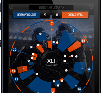
My first instinct was to create a circle, and from that, the idea of a clock: the face of a clock represents 60 minutes,  which is the regulation playing time of a game.

A game is divided into four quarters, so I separated the circle into 4 quadrants and I now had the time of the game in place. The next step was to visualize the  movement of the ball.

If a football field is made up of 100 yards, I realized I could draw 10 rings emanating from the center of the circle, each one representing 10 yards.

With these 3 simple steps, I had everything in place to show a drive, as well as time of possession. With that, the chart was created!

That Monday, I shared my idea with a few of my coworkers and it was interesting to see their individual “A-ha!” moments. As soon as they were acclimated to the chart, it all made sense! Why hadn’t anyone thought of this before? they asked. That’s when I realized – all it took was some thinking outside the grid.

So now, I encourage you to think outside of the grid and visualize your data in a whole new way.

Check out www.sbviz.com

By Tommy Rausch 
Chief Creative Officer
Infragistics Inc.


Simple Scaffolding with the Ignite UI Yeoman Generator

$
0
0

If you haven’t heard of Yeoman, I gladly recommend you check it out. It’s a nifty little CLI-based scaffolding tool for modern Web apps.


Yeoman

One of the nifty things about it is that their generator (scaffolding) architecture is extensible, so anybody can add to it, and many have, such as the popular Angular generator. And now we have a simple one ready for you to use with Ignite UI.

Because Ignite UI is not an application framework (like Angular, Ember, Backbone, etc.), it didn’t seem to make a lot of sense for us to presume to set up a whole project for you. Instead, you can use whatever your preferred project generator is (such as the basic “webapp” one) to generate your app, and then you can use the Ignite UI generator to augment it. (Or you can use it on its own inside pretty much any project.)

So What Do You Get?

Well, for this initial release, I thought I’d keep it super simple but try to be somewhat helpful, so what you get is a single HTML page that has the Ignite UI boilerplate built in for you, plus a bonus of two nifty samples that illustrate using the Ignite UI Data Chart and the Ignite UI Grid based on some simple JSON data.

The code is well-commented, so you can see which parts you can and should safely gut/modify/replace with your own. As I said, I wanted to keep it simple for this initial release, and let the generator options organically grow from there.

So check it out. The instructions for using it are on the generator-igniteui GitHub repo. Once you have it installed, you can just type yo igniteui wherever you want to add a new page that uses Ignite UI.

If you have suggestions for what you’d like to see added as generator options/sub-generators (or have other issues), please report them on the repo.

Enjoy!

How to create a heatmap with jQuery Grid and jsRender

$
0
0
 

Ignite UI igGrid - heatmapThe Ignite UI Grid control is a jQuery-based grid that presents data in tabular form. I have already written about this control and it’s column fixing feature, but now we are going to consider it in a different light. The coolest thing about the grid is that it visualize the information you are  setting in a structured way and gives the end-user the ability to play with it and manipulate it. Imagine combining that data with a heat map - the users will be able to trace it even faster. Heat maps represent data as colors and those colors change respectively to the intensity of the data. In the current blog we will see how to build such grid by using jsRender templates.

Setting the basis

To build the grid you will need the required Ignite UI JavaScript and CSS files. As I said we are going to use jsRender template to define a structure and reuse it to generate HTML dynamically, that is why you will need a jsRender library referenced as well. We are going to use a table tag to host our grid.

  1. <tableid="grid"></table>

By default, the igGrid control uses the Infragistics template engine, so in order to use jsRender you need to configure it using the templatingEngine option and setting it to a  ”jsRender” value. 

I’ve mentioned few times already jsRender so lets take a step back and see what exactly is this. JsRender is a JavaScript library, which brings a new templating library to HTML5 development that has a codeless tag syntax and high performance, has no dependency on jQuery nor on the Document Object Model (DOM), supports creating custom functions and uses pure string-based rendering. You can read more about jsRender in MSDN 'Client Insight' articles on JsRender part one and part two or check out the documentation.

Back to our implementation of the grid we should create a custom row template if we want to use jsRender. To do that we need to follow few steps. First we have to configure the igGrid to use the jsRender templating engine, as we explained earlier, then we will have to define a helper function specific to the template.

  1. $.views.helpers(
  2.  {
  3.     //define function here
  4.  });

The third step is to create the jsRender template and finally we should define the rowTemplate option to use this template.

  1. <scriptid="template"type="text/x-jsrender">
  2.     <tr>@* You can use <td> tags and place your data here. *@
  3.                      <td>{{>ID}}</td>
  4.     </tr>
  5. </script>


  1. $("#grid").igGrid({
  2.     width: "600px",
  3.     height: "600px",
  4.     dataSource: busy,
  5.     rowTemplate: $("#template").html(),
  6.     columns: [
  7.         { headerText: "Id", key: "ID" },
  8.         { headerText: "Name", key: "Name" },
  9.         { headerText: "Mon", key: "Mon" },
  10.         { headerText: "Tue", key: "Tue" },
  11.         { headerText: "Wed", key: "Wed" },
  12.         { headerText: "Thu", key: "Thu" },
  13.         { headerText: "Fri", key: "Fri" }
  14.     ],
  15.     templatingEngine: "jsrender"
  16. });

Heatmap Grid

Creating a heatmap means we need to represent the values in the grid’s row not only by their numbers and labels but with colors as well. The data we are going to use represents how busy are the employees in one organization each day of the week and their business is represented by percentage – 0% means the employee has no work to do and 100% means he is occupied the whole day. Respectively to those percentage we want to paint the row cells in colors from green to red. We are going to make that in the jsRender helper function. What we need to do is define min and max values for the entire data. In a real case scenario you may have a remote data and you may not be able to calculate the minimum and maximum values on the client side, then you should take them as prepared values from the server side. For our sample as we already know the max and min values so we are going to use them as is to keep it simple. Then on every step we will call that helper giving him the current value of the cell and using that value we will generate an appropriate color for the cell.  

  1. $.views.helpers({
  2.     colorChange: function (val) {
  3.  
  4.         var perRed;
  5.         var perGreen;
  6.         var maxValue = 100;
  7.         var minValue = 0;
  8.  
  9.         var ratio = 1 / (maxValue - minValue);
  10.         var finalValue = (val - minValue) * ratio;
  11.  
  12.         if (finalValue == 0.5) {
  13.             perRed = 1;
  14.             perGreen = 1;
  15.         }
  16.         elseif (finalValue > 0.5) {
  17.             perRed = 1;
  18.             perGreen =( 1 - finalValue)*2;
  19.         }
  20.         else {
  21.             perGreen = 1;
  22.             perRed =  finalValue*2;
  23.         }
  24.  
  25.         var red = Math.round(255 * perRed);
  26.         var green = Math.round(255 * perGreen);
  27.  
  28.         var gString = green.toString(16);
  29.         var rString = red.toString(16);
  30.  
  31.         if (gString.length == 1) {
  32.             gString = '0' + gString;
  33.         }
  34.  
  35.         if (rString.length == 1) {
  36.             rString = rString + '0';
  37.         }
  38.  
  39.         var color = '#' + rString + gString + '00';
  40.  
  41.         return color;
  42.     }
  43. });

How do we call the function and when? Well this is a jsRender helper which means that we need it in our template. In the template we create <td> tags for all of the columns in our grid and set a background style to those tags, by calling the function.

  1. <scriptid="template"type="text/x-jsrender">
  2.     <tr>
  3.         <td>{{>ID}}</td>
  4.         <td>{{>Name}}</td>
  5.         <tdstyle='background: {{:~colorChange(Mon)}};'>
  6.             <b>{{>Mon}}%</b>
  7.         </td>
  8.         <tdstyle='background: {{:~colorChange(Tue)}};'>
  9.             <b>{{>Tue}}%</b>
  10.         </td>
  11.         <tdstyle='background: {{:~colorChange(Wed)}};'>
  12.             <b>{{>Wed}}%</b>
  13.         </td>
  14.         <tdstyle='background: {{:~colorChange(Thu)}};'>
  15.             <b>{{>Thu}}%</b>
  16.         </td>
  17.         <tdstyle='background: {{:~colorChange(Fri)}};'>
  18.             <b>{{>Fri}}%</b>
  19.         </td>
  20.     </tr>
  21. </script>

The example image demonstrates the final view of the grid.

Heatmap with igGrid and jsRender templates

You can see the jsRender Integration sample for more information about  how to use it in the grid’s row template.

Conclusion

Basically a heatmap visualize a table of numbers with corresponding colors.  This is a useful way for finding highs and lows or sometimes patterns. Although usually the numbers are substituted by colors, using the igGrid you can have them both for even better user experience. JsRender templates are a powerful way of creating and loading HTML tags dynamically and thanks to it’s helper functions we can manipulate those templates as we wish.

You can see a live demo on jsFiddle or download the An ASP.Net MVC Heatmap with Grid sample.


You can follow us on Twitter @Infragistics and stay in touch on Facebook, Google+ and LinkedIn!

Infragistics Friends Group Presentation: PhoneGap vs WinJS for Windows Store Apps - Event Recap

$
0
0

Infragistics Friends group (Bulgarian BI PASS Chapter) and jQuery Sofia with the help of Infragistics Inc.  organized a presentation on the following topic: PhoneGap vs WinJS for Windows Store Apps .

The event was held on Thursday, January 30th, 2014 at Infragistics Bulgaria Office, 110B, Simeonovsko Shosse Bul., Sofia, Bulgaria. The presentation was prepared by the Evangelism team in Sofia with a major lecturer Damyan Petev (Technical Evangelist @ Infragistics) with my involvement on PhoneGap / Cordova related content.

This lecture was a comparison of these two technologies that WEB developers can use to create Windows Store Apps. . Attendees learned about the different features of both technologies when creating Windows 8.x applications.

Participants understood that WinJS vs PhoneGap is a matter of API preference and code portability and both platforms are appropriate to build Windows Store applications. Presenters demonstrated specifics of the WinJS security model and possible solutions with jQuery 2.x Demos included examples with jQuery UI and Ignite UI

Damyan Petev – minutes before the presentation.


Some of our participants


Damyan Petev in action!


Some demos….


Dinner after the presentations


You can download presentation slides here:


As always, you can follow us on Twitter @mihailmateev and @Infragistics and stay in touch onFacebook,Google+andLinkedIn!

Unicorns in UX? Just say no!

$
0
0

The “Unicorn” concept (a rare individual who can do every UX job) has been talked up lately. I last heard an impassioned talk about this at UI18 in Boston. The idea goes something like this: There are so many enterprises that need UX services but there are just not enough people to do them. So what we need to do in the UX community is to avoid specialization and become a super generalist. If we become Unicorns then there will be more professionals available for the enterprises that need our services and there will be more opportunities for everyone. I just don’t get this logic and I think the conclusion hurts UX professionals, hurts the enterprises who employee UX professionals and more importantly hurts the people who use the enterprises’ products.

For many years I was a Unicorn. I did everything -- from usability testing to coding front-ends! Was I good? Well, good enough to keep my employer happy for many years. Was it good for the projects I worked on? Were the users best served by the websites and applications I helped build? The projects were better than the other projects not using any UX methods, but my projects could have been so much better. If the organization had a better understanding of what was truly needed and budgeted more UX time, all projects would have been completed faster and I know the final product would have been better. It was always a struggle convincing stakeholders to employ good UX practices, but once they were convinced they were always happy with the results.

I do hear that there doesn’t seem to be enough UX people, but is this really true? In my case it was not that there were not enough UX people in the market, it was the organizations unwillingness to hire the people and use UX methods. When I look at the ads posted for UX positions today, I see very unrealistic job descriptions. Descriptions written by people who don’t understand the field. They take every possible keyword and put them into one long wish list -- a description only a Unicorn can fill. Someone who can conduct research, create task flows, conduct usability tests, create wireframe, prototypes and  visual designs, write CSS, HTML, JavaScript, jQuery, and code .net and PHP! When organizations think that they can get all these skills from just one person, they don’t understand what UX is.

There are clearly not enough senior UX professionals who can fill all these positions, but if the job descriptions were slightly reworded and organizations opened up more opportunities to people with different skills, both the professionals and the organizations would benefit. Organizations will get the teams of people they need to create better products and UX professionals will be able to gain skills that can only be acquired by working in teams.

By hiring just one person, they must do everything, the quality and output of that individual is severely compromised. There is just not enough time to do research, talk to users or talk to other UX professionals. Almost at the same time as you are approached about a problem you are expected to create a prototype that solves that problem! There are limitations in how you approach problems and many times you must look for shortcuts to achieve suboptimal results. Organizations suffer because they get so-so results, other UX professionals suffer because organization are less likely to hire them (they got poor results in the past, why should they try again?) and of course users suffer because they are promised a positive user experience and they get a mediocre experience.

User Experience is not just a Visual Designer/Front End developer who has had some training in User Experience theory. User Experience is a team of User Researchers (people trained in Human Factors, Anthropology, Ethnography, Psychology and more) and Design (Graphic, Visual, Industrial and UI Design). Yes, I know that sounds like a lot of people, but I am not suggesting every project needs all these highly specialized positions. What I am suggesting is that the minimum team of people needed for a successful project is a User Experience Generalist and a Visual Design Generalist. These two areas require dedication to their craft and concentrated study to create the best user experience possible. I feel that as projects scale up, dedicated specialist are needed to deal with the volume and to increase the efficiency of the process.

Now, I am not a Unicorn. I work in an environment where UX professionals collaborate together on projects. There is always a dedicated UX Architect and Visual Designer on every project. After seeing what I used to do as a Unicorn and now what I can do as a dedicated UX Architect -- I would never go back. I have more time to concentrate on what I know best and the Visual Designer can concentrate on what they know best. After seeing what Visual Designers can do, I understand how important dedicated knowledge and skills are to every project.

Unicorns, it is an interesting idea but it shortchanges UX professionals, our clients and most importantly the people who use our products. 

Building a heatmap with XAML Grids

$
0
0

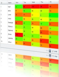
The grid is one of the most useful controls for visualizing structured data. It gives you the opportunity to display and style your data according to your needs. There are numerous features that can help you customize it and provide best possible user experience for your end-users while they are manipulating and extracting the information they need. If you display that information with a heatmap the users will be able to find patterns and track the data even faster. In this blog we will see how to build a heatmap with Infragistics WPF xamGrid and xamDataGrid.


Basics

If you have downloaded and installed the Infragistics package you will find a list of the controls from the 13.2 release of WPF in the toolbox. Drag the xamGrid or the xamDataGrid whatever you are going to use to the Designer View and you will see that the needed references will be added automatically. 

xamGrid:

xamGrid required references

xamDataGrid:

xamDataGrid required references

In the code behind we are going to create a sample data , that we are going to use for our heatmap. This data represents how busy are the employees in one organization each day of the week and their business is represented by percentage – 0% means the employee has no work to do and 100% means he is occupied the whole day. For the color calculations you will need the minimum and maximum values of your data one way or another, for this demo we'll expose them from the data collection but you can provide those any way you see fit.

  1. publicclassAppointment
  2. {
  3.     publicint ID { get; set; }
  4.     publicstring Name { get; set; }
  5.     publicint Mon { get; set; }
  6.     publicint Tue { get; set; }
  7.     publicint Wed { get; set; }
  8.     publicint Thu { get; set; }
  9.     publicint Fri { get; set; }
  10.  
  11. }
  12. publicclassDataCollection : List<Appointment>
  13. {
  14.     publicint Min { get; set; }
  15.     publicint Max { get; set; }
  16.     public DataCollection()
  17.     {
  18.         this.Add(newAppointment { ID = 1, Name = "Yoshi", Mon = 10, Tue = 96, Wed = 100, Thu = 99, Fri = 86 });
  19.         this.Add(newAppointment { ID = 2, Name = "Adria", Mon = 67, Tue = 18, Wed = 46, Thu = 39, Fri = 70 });
  20.         this.Add(newAppointment { ID = 3, Name = "Lionel", Mon = 78, Tue = 77, Wed = 51, Thu = 2, Fri = 0 });
  21.         this.Add(newAppointment { ID = 4, Name = "Indira", Mon = 1, Tue = 58, Wed = 38, Thu = 48, Fri = 30 });
  22.         this.Add(newAppointment { ID = 5, Name = "Shaeleigh", Mon = 83, Tue = 20, Wed = 74, Thu = 19, Fri = 81 });
  23.         this.Add(newAppointment { ID = 6, Name = "Octavius", Mon = 2, Tue = 25, Wed = 48, Thu = 69, Fri = 31 });
  24.         this.Add(newAppointment { ID = 7, Name = "Zephania", Mon = 46, Tue = 30, Wed = 44, Thu = 85, Fri = 73 });
  25.         this.Add(newAppointment { ID = 8, Name = "Dorian", Mon = 100, Tue = 28, Wed = 25, Thu = 60, Fri = 25 });
  26.         this.Add(newAppointment { ID = 9, Name = "Lysandra", Mon = 20, Tue = 33, Wed = 65, Thu = 91, Fri = 28 });
  27.         this.Add(newAppointment { ID = 10, Name = "Venus", Mon = 64, Tue = 81, Wed = 37, Thu = 72, Fri = 92 });
  28.         this.Add(newAppointment { ID = 11, Name = "Cairo", Mon = 82, Tue = 92, Wed = 40, Thu = 7, Fri = 46 });
  29.         this.Add(newAppointment { ID = 12, Name = "Iliana", Mon = 52, Tue = 78, Wed = 90, Thu = 16, Fri = 92 });
  30.         this.Add(newAppointment { ID = 13, Name = "Sarah", Mon = 33, Tue = 52, Wed = 27, Thu = 28, Fri = 59 });
  31.         this.Add(newAppointment { ID = 14, Name = "Valentine", Mon = 30, Tue = 26, Wed = 1, Thu = 52, Fri = 4 });
  32.         var list = this.Select(c => newList<int>() { c.Mon, c.Tue, c.Wed, c.Thu, c.Fri }).SelectMany(f => f);
  33.         Max = list.Max();
  34.         Min = list.Min();
  35.     }
  36. }

Now lets connect that information to the grid. As we dragged and dropped the xamGrid or the xamDataGrid respectively into the designer view we will see the control’s tag containing  the  grid itself. Now we can add some properties such as width, height and etc. How do we bind the data to the grid? Well it’s pretty easy.  We should add the  data collection that we have created as a resource and then in the control’s tag we need to use the data source option of the xamDataGrid and item Source option of the xamGrid and bind it to that static resource.

XAML:

  1. <Grid.Resources>
  2.     <local:DataCollection x:Key="source" />
  3. </Grid.Resources>

xamDataGrid:

  1. <igWPF:XamDataGrid Name="xamdataGrid" DataSource="{Binding Source={StaticResource source}}">

xamGrid:

  1. <ig:XamGrid Name="Grid" Width="500" Height="320" RowHover="None" ColumnWidth="*" ItemsSource="{Binding Source={StaticResource source}}" />

Defining the different columns in the xamGrid and xamDataGrid looks as follows:

xamGrid:

  1. <ig:XamGrid.Columns>
  2.     <ig:TextColumn Key="ID" />
  3.     <ig:TextColumn Key="Name" />
  4.     <ig:TextColumn Key="Mon" />
  5.     <ig:TextColumn Key="Tue" />
  6.     <ig:TextColumn Key="Wed" />
  7.     <ig:TextColumn Key="Thu" />
  8.     <ig:TextColumn Key="Fri" />
  9. </ig:XamGrid.Columns>

xamDataGrid:

  1. <igWPF:XamDataGrid.FieldLayouts>
  2.     <igWPF:FieldLayout>
  3.         <igWPF:Field Name="Name" Label="Name" />
  4.         <igWPF:Field Name="Mon" Label="Mon" />
  5.         <igWPF:Field Name="Tue" Label="Tue" />
  6.         <igWPF:Field Name="Wed" Label="Wed" />
  7.         <igWPF:Field Name="Thu" Label="Thu" />
  8.         <igWPF:Field Name="Fri" Label="Fri" />
  9.     </igWPF:FieldLayout>
  10. </igWPF:XamDataGrid.FieldLayouts>

xamGrid example image:

xamGrid with custom data

Now we have basic grids that display our data. The next step is to take the value from the numeric cells and based on that value to generate an appropriate color for every cell.

xamDataGrid with heatmap

Heatmaps visualize a table of numbers with corresponding colors. In our samples the values will be represented with both values and colors. Respectively to the data a green color meets the 0% and red meets 100%. In the xamDataGrid for every column that we want to add to the heatmap we will use the field settings and we will define a style which will take the current value of the cell and it will call a color converter function that will generate the relevant color.

Color Converter:

  1. publicobject Convert(object value, Type targetType, object parameter, System.Globalization.CultureInfo culture)
  2. {
  3.     var collection = parameter asDataCollection;
  4.     double max = collection.Max;
  5.     double min = collection.Min;
  6.  
  7.     int val = (Int32)(value);
  8.     double perRed = 0;
  9.     double perGreen = 0;
  10.     string color = "";
  11.     double ratio = 0;
  12.     
  13.     ratio = 1 / (max-min) ;
  14.     var finalValue = (val - min) * ratio;
  15.  
  16.     if (finalValue == 0.5)
  17.     {
  18.         perRed = 1;
  19.         perGreen = 1;
  20.     }
  21.     elseif (finalValue > 0.5)
  22.     {
  23.         perRed = 1;
  24.         perGreen = (1 - finalValue) * 2;
  25.     }
  26.     else
  27.     {
  28.         perGreen = 1;
  29.         perRed = finalValue * 2;
  30.     }
  31.  
  32.     var red = (int)Math.Round(255.0 * perRed);
  33.     var green = (int)Math.Round(255.0 * perGreen);
  34.     var gString = green.ToString("X");
  35.     var rString = red.ToString("X");
  36.  
  37.     if (gString.Length == 1)
  38.     {
  39.         gString = '0' + gString;
  40.     }
  41.  
  42.     if (rString.Length == 1)
  43.     {
  44.         rString = rString + '0';
  45.     }
  46.  
  47.     color = "#" + rString + gString + "00";
  48.  
  49.     return color;
  50. }

XAML:

  1. <igWPF:XamDataGrid.FieldLayouts>
  2.     <igWPF:FieldLayout>
  3.         <igWPF:Field Name="Name" Label="Name" />
  4.         <igWPF:Field Name="Mon" Label="Mon" >
  5.             <igWPF:Field.Settings>
  6.                 <igWPF:FieldSettings CellWidth="50" LabelWidth="50">
  7.                     <igWPF:FieldSettings.CellValuePresenterStyle>
  8.                         <Style TargetType="{x:Type igWPF:CellValuePresenter}">
  9.                             <Setter Property="Background" Value="{Binding Path=Cells[Mon].Value, Converter={StaticResource ColorConv}, ConverterParameter={StaticResource source}}" />
  10.                         </Style>
  11.                     </igWPF:FieldSettings.CellValuePresenterStyle>
  12.                 </igWPF:FieldSettings>
  13.             </igWPF:Field.Settings>
  14.         </igWPF:Field>
  15.         <igWPF:Field Name="Tue" Label="Tue" >
  16.             <igWPF:Field.Settings>
  17.                 <igWPF:FieldSettings CellWidth="50" LabelWidth="50">
  18.                     <igWPF:FieldSettings.CellValuePresenterStyle>
  19.                         <Style TargetType="{x:Type igWPF:CellValuePresenter}">
  20.                             <Setter Property="Background" Value="{Binding Path=Cells[Tue].Value, Converter={StaticResource ColorConv},ConverterParameter={StaticResource source}}" />
  21.                         </Style>
  22.                     </igWPF:FieldSettings.CellValuePresenterStyle>
  23.                 </igWPF:FieldSettings>
  24.             </igWPF:Field.Settings>
  25.         </igWPF:Field>
  26.         <igWPF:Field Name="Wed" Label="Wed">
  27.             <igWPF:Field.Settings>
  28.                 <igWPF:FieldSettings CellWidth="50" LabelWidth="50">
  29.                     <igWPF:FieldSettings.CellValuePresenterStyle>
  30.                         <Style TargetType="{x:Type igWPF:CellValuePresenter}">
  31.                             <Setter Property="Background" Value="{Binding Path=Cells[Wed].Value, Converter={StaticResource ColorConv},ConverterParameter={StaticResource source}}" />
  32.                         </Style>
  33.                     </igWPF:FieldSettings.CellValuePresenterStyle>
  34.                 </igWPF:FieldSettings>
  35.             </igWPF:Field.Settings>
  36.         </igWPF:Field>
  37.         <igWPF:Field Name="Thu" Label="Thu">
  38.             <igWPF:Field.Settings>
  39.                 <igWPF:FieldSettings CellWidth="50" LabelWidth="50">
  40.                     <igWPF:FieldSettings.CellValuePresenterStyle>
  41.                         <Style TargetType="{x:Type igWPF:CellValuePresenter}">
  42.                             <Setter Property="Background" Value="{Binding Path=Cells[Thu].Value, Converter={StaticResource ColorConv},ConverterParameter={StaticResource source}}" />
  43.                         </Style>
  44.                     </igWPF:FieldSettings.CellValuePresenterStyle>
  45.                 </igWPF:FieldSettings>
  46.             </igWPF:Field.Settings>
  47.         </igWPF:Field>
  48.         <igWPF:Field Name="Fri" Label="Fri">
  49.             <igWPF:Field.Settings>
  50.                 <igWPF:FieldSettings CellWidth="50" LabelWidth="50">
  51.                     <igWPF:FieldSettings.CellValuePresenterStyle>
  52.                         <Style TargetType="{x:Type igWPF:CellValuePresenter}">
  53.                             <Setter Property="Background" Value="{Binding Path=Cells[Fri].Value, Converter={StaticResource ColorConv},ConverterParameter={StaticResource source}}" />
  54.                         </Style>
  55.                     </igWPF:FieldSettings.CellValuePresenterStyle>
  56.                 </igWPF:FieldSettings>
  57.             </igWPF:Field.Settings>
  58.         </igWPF:Field>
  59.     </igWPF:FieldLayout>
  60. </igWPF:XamDataGrid.FieldLayouts>

To have the same color converter produce a color scale from blue to purple change the color variable at line 47 from the snippet and give it a maximum value for the blue(last) component:

  1. color = "#" + rString + gString + "ff";

Image:

xamDataGrid heatmap in colors from Blue to purple


xamGrid with Heatmap

We will use the same color converter as the one explained above, but we will show two ways of connecting it to that converter. One of the ways is setting a different style for every column. In this case we will send the current value of every column and receive back the relevant color. We will define the different styles in the static resources and then we will use the cellStyle property to bind the separate columns to those styles. It is good to disable the IsAlternateRowsEnabledateColumns property by assigning it a false value because otherwise it will override the coloring of the cells.

Resources:

  1. <Grid.Resources>
  2.     <local:DataCollection x:Key="source"/>
  3.     <local:ColorConverter x:Key="ColorConv"/>
  4.     <Style x:Key="MonStyle" TargetType="ig:CellControl">
  5.         <Setter Property="Background" Value="{Binding Path=Mon, Converter={StaticResource ColorConv}}"></Setter>
  6.     </Style>
  7.     <Style x:Key="TueStyle" TargetType="ig:CellControl">
  8.         <Setter Property="Background" Value="{Binding Path=Tue, Converter={StaticResource ColorConv}}"></Setter>
  9.     </Style>
  10.     <Style x:Key="WedStyle" TargetType="ig:CellControl">
  11.         <Setter Property="Background" Value="{Binding Path=Wed, Converter={StaticResource ColorConv}}"></Setter>
  12.     </Style>
  13.     <Style x:Key="ThuStyle" TargetType="ig:CellControl">
  14.         <Setter Property="Background" Value="{Binding Path=Thu, Converter={StaticResource ColorConv}}"></Setter>
  15.     </Style>
  16.     <Style x:Key="FriStyle" TargetType="ig:CellControl">
  17.         <Setter Property="Background" Value="{Binding Path=Fri, Converter={StaticResource ColorConv}}"></Setter>
  18.     </Style>
  19. </Grid.Resources>

Styling the columns:

  1. <ig:XamGrid.Columns>
  2.     <ig:TextColumn Key="ID" />
  3.     <ig:TextColumn Key="Name" />
  4.     <ig:TextColumn Key="Mon" CellStyle="{StaticResource ResourceKey=MonStyle}" />
  5.     <ig:TextColumn Key="Tue" CellStyle="{StaticResource ResourceKey=TueStyle}"/>
  6.     <ig:TextColumn Key="Wed" CellStyle="{StaticResource ResourceKey=WedStyle}"/>
  7.     <ig:TextColumn Key="Thu" CellStyle="{StaticResource ResourceKey=ThuStyle}"/>
  8.                      <ig:TextColumn Key="Fri" CellStyle="{StaticResource ResourceKey=FriStyle}"/>
  9. </ig:XamGrid.Columns>

The second way of achieving the same heatmap effect is by using the cellControlAttached event. In this case instead of of creating individual style for every column and connecting it to the color converter we will have only one style and in the event we will handle the coloring of the different cells.

XAML:

  1. <Style x:Key="Style" TargetType="ig:CellControl">
  2.     <Setter Property="Background" Value="{Binding RelativeSource={RelativeSource Self}, Converter={StaticResource ColorConv}}"></Setter>
  3. </Style>

Event:

  1. privatevoid Grid_CellControlAttached(object sender, Infragistics.Controls.Grids.CellControlAttachedEventArgs e)
  2. {
  3.     XamGrid grid = sender asXamGrid;
  4.     int columnIndex = grid.Columns.DataColumns.IndexOf(e.Cell.Column);
  5.     if (grid != null&& columnIndex > 1 )
  6.     {
  7.         e.Cell.Style = this.root.Resources["Style"] asStyle;
  8.     }            
  9. }

Image:

xamGrid heatmap - from green to red

If you follow those steps you can create your own heatmap grid in no time.

Summary

Using a heatmap is a useful way of finding patterns thought the data. It helps the end user to find faster highs and lows and track the information he needs. Although usually in heatmap the numbers are substituted by corresponding colors with the xamDataGrid and xamGrid we demonstrate how to keep them both and thus enrich the user experience.


Download the WPF xamDataGrid or the xamGrid heatmap samples.


Download free trial


You can follow us on Twitter @Infragistics and stay in touch on Facebook, Google+ and LinkedIn!

For The First Time - Azure Bootcamp Bulgaria with Infragistics

$
0
0


For the first time in Bulgaria Azure Bootcamp Bulgaria will be held on March 29, 2014 at Infragistics Bulgaria office: 110 B, Simeonovsko Shosse Bul., Office Floor II ans III , 1700 Sofia, Bulgaria.  The event is organized by the local Windows Azure society, Infragistics Friends (BI and. Net Geeks), Infragistics and Microsoft.   Infragistics and Microsoft did a lot to be done the first Windows Azure conference in this region. Azure Bootcamp Bulgaria has a great website created by Damian Petev, Technical Evangelist @ Infragistics – www.azure-camp.eu  There's also a Facebook event page you can join.


There are already 12 speakers from 4 countries (Estonia, Ukraine, Macedonia and Bulgaria), who have confirmed participation at the event.
Event organizers will try as a bonus to provide additional online streaming from Windows Azure boot camps in Poland and Japan.


This boot camp also will include a training for all attendees who have no experience or have less experience with the development of Windows Azure applications


This boot camp is also  part of the Global Azure Bootcamp .   Infragistics is a global sponso

In April of 2013 at the first Global Windows Azure Bootcamp there was more than 90 locations around the globe!

There are 113 locations registered in 45 countries and 105 cities. Of those, 86 have provided an event address and are pinned to the azure bootcamp map. You can see all the locations on the website of Global Azure Bootcamp.  Infragistics also is a global sponsor of the Azure Global Bootcamp for all locations where the event takes place.


Infragistics Bulgaria Office 


Location:

SQL Saturday 152 Bulgaria Location


What is Azure Bootcamp:

  • One day deep dive class to help thousands of people get
    up to speed on developing Cloud Computing Applications
    for Windows Azure!
  • Sessions and training should be delivered by influential and respected Windows Azure
    professionals


Our targets:

  • One-day event in Sofia, Bulgaria
  • Up to 250 attendees
  • Up to 15 sessions (lectures and training),
  • Up to 4 Tracks
  • Up to 15 speakers (local and foreign)
  • breaks, cocktail, press conference
  • At its heart this event is a local one day Windows Azure Community event.


The event is free! If you want to register you can grab the last ticketshere.


If you have any questions feel free to contact the Event Admins at mmateev@infragistics.com

Follow this event on Twitter with hashtag #WindowsazureBG, and get news on all our events with #gwab .

You can learn more about Azure Bootcamp Bulgaria if you follow us on Twitter @mihailmateev  and @Infragistics and stay in touch on Facebook, Google+, LinkedIn and Infragistics Friends User Group !

Warm Regards,
Team Azure Bootcamp Bulgaria

New How-To Video: WPF Test Automation

$
0
0

In our latest video, you'll learn how to implement a data driven testing scenario with Infragistics WPF Test Automation tools.

[youtube] width="560" height="315" src="http://www.youtube.com/embed/Q4JZ8R1FiJw" [/youtube]

Check it out and see how you can use HP's excel like Data Pane to iterate through multiple test cases while re-using the same base code.


New Video: Windows Forms Test Automation

$
0
0

In one of our newest videos, you'll learn how to implement a data driven testing scenario with Windows Forms Test Automation with HP Unified Functional Testing.

[youtube] width="560" height="315" src="http://www.youtube.com/embed/S_dqzs556vo" [/youtube]

See how easy it is when we use HP's excel like Data Pane to iterate through multiple test cases while re-using the same base code.

jQuery Bullet Graph Introduction

$
0
0

bullet graph header imageIn my previous blogs I’ve already mentioned that Infragistics’ Ignite UI package contains a lot of controls for Data Visualization. The one we are going to talk about in this blog is the bullet graph. This control is similar to the Linear Gauge but apart from the current value it also shows a target value which can serve as a point to reach or a measurement . It is usually used to compare two values one represented by a horizontal bar and another represented by a vertical line. You can display the chart separately or you can insert it in a Grid and thus create a graphical table for even better UX.


Features and Usage

The configuration of the bullet graph is easy. After adding the required Infragistics’ references as well as JavaScript and CSS files you have to create a HTML div tag to host your graph. The basic configuration of the igBulletGraph requires proving a width and a height values. If you haven’t added additional options to the configuration the control will display a scale ranging from 0 to 100 with major ticks and labels positioned  at an interval of 10. The bullet graph supports a lot of features which can help you customize it according to your needs. You can find a detailed information about the control and its features and how to configure its separate parts in the API documentation as we as the online help documentation.

To configure a custom scale you should set the minimumValue and maximumValue properties. Then you can add the performance bar which visualize the primary measure of the igBulletGraph. In order to do so set the value property. The comparative marker corresponds to the targetValue property. Those  are the four values that you should configure to have a fully functional bullet graph.

When it comes to styling the control you can customize almost every part of it starting from the labels and the tick marks and ending with the performance bar and target value. We are going to take a closer look at the ranges, cause they are a tool that can help you strengthen the feeling of comparison of values. Those comparative ranges are managed by the ranges property within which several individual ranges can be defined. Each range have its own starting and ending values as well as a brush. All of the brushes of the control support gradients. But if you want only the scale to be colored using the gradients you should use the ranges brush, if you use the backingBrush property you will color the whole control. Pay attention that if you don’t set specifically values for the brush and outline properties , the values are retrieved from the values of igBulletGraph’s rangeBrushes and rangeOutlines objects. They are defined in the default theme. You can also use CSS to style the different elements. For the ranges you can use the background-image property to set a gradient color. Another thing to watch about is : if you use the “ui-bulletgraph-range-palette-n” class you should set not only the background color but the border as well.

Each range can be configured individually by specifying its starting and ending value, the border thickness and color . The width and the position of the ranges are managed by the inner and outer start and end extent. You can add a tooltips to the ranges. By default the tooltip template of the ranges shows the start and the end values separated by hyphen.

MVC:

  1. @(Html.Infragistics().BulletGraph()
  2.     .Width("100%")
  3.     .Height("80px")  
  4.     .Ranges(range =>
  5.     {
  6.         range.Range("bad").StartValue(0).EndValue(25).Brush("#E6E6E6");
  7.         range.Range("acceptable").StartValue(25).EndValue(75).Brush("#B2B2B2");
  8.         range.Range("good").StartValue(75).EndValue(100).Brush("#808080");
  9.     })
  10.     .Value(60)
  11.     .TargetValue(40)
  12.     .ValueBrush("#000")
  13.     .TargetValueBrush("#CC0000")
  14.     .FontBrush("#660000")
  15.     .TickBrush("#660000")
  16.     .TargetValueOutline("#800000")
  17.     .MinorTickCount(0)
  18.     .ClientEvents(newDictionary<string, string>() { { "formatLabel", "function(evt, ui) { ui.label += '%' }" } })
  19.     .TransitionDuration(500)
  20.     .HtmlAttributes(newDictionary<string, object> { { "style", "margin-bottom:40px" } })
  21.     .Render())

igBulletGraph

jQuery:

  1. $("#bulletgraph").igBulletGraph({
  2.     width: '70px',
  3.     height: '400px',
  4.     minimumValue: -10,
  5.     maximumValue: 40,
  6.     targetValue: 26,
  7.     interval: 5,
  8.     value: 20,
  9.     orientation: "vertical",
  10.     labelInterval: 5,
  11.     minorTickCount: 0,
  12.     valueBrush: "#fff",
  13.     targetValueBrush: "#000",
  14.     targetValueOutline: "#000",
  15.     transitionDuration:1000,
  16.     ranges: [{
  17.         name: "temp",
  18.         startValue: -10,
  19.         endValue: 40,
  20.         brush: {
  21.             type: "linearGradient",
  22.             colorStops: [{
  23.                 color: "#33CCFF",
  24.                 offset: 1
  25.             },
  26.             {
  27.                 color: "#FFFF00",
  28.                 offset: 0.5
  29.             },
  30.             {
  31.                 color: "#FF3300",
  32.                 offset: 0
  33.             }]
  34.         }
  35.     }],
  36.     formatLabel: function (evt, ui) {
  37.         ui.label = ui.label + "C";
  38.     }
  39. });

igBulletGraph with gradient brush for the ranges

Animation Transitions

One of the main features of the bullet graph is the animated transitions. This control provides a build-in support for animations, which can be triggered by the transitionDuration property. By default this property is disabled, but you can enable it by assigning it a positive milliseconds value.   The milliseconds value determines the timeframe for sliding the control into view by smoothly visualizing all its visual elements through a slide effect. The animations appears when the control is loading as well as when the value of any of its property is changed.

In the sample below you can see how we change the value for the graph at every second and based on that value we change the background color of the control, so that it will correspond to it.

  1. transitionDuration: 1000

igBulletGraph animation

Check out the animated transitions sample to see transitions between different sets of settings in the igBulletGraph control.

For one of the samples, that you can find at the bottom of the blog we used the animation duration to show the wind speed change in mph for the different countries. You can see a live demo on jsFiddle.

igBulletGraph animation - wind speed

Graphical Table

As I said earlier the bullet graph comes in handy when we want to display comparison between two values. By building a grid and combining it with such graph you will provide to your end-users an easy to understand and use comprehensive information.  You can check out the grid integration sample to see how to use the igBulletGraph control in a grid.

To implement  such correlation between those controls, you should add a custom row template for the grid with a special div tag that will host the bullet charts.

  1. rowTemplate: "${id}${month}${sold}${produced}
    "

The next step is to add a rowsRendered event and configure the bullet graphs in it. The minimum and maximum values as well as the target value and the value itself we will take from the data that we are using for the grid.

  1. rowsRendered: function (evt, ui) {
  2.     $(".bulletgraph3").each(function (i) {
  3.         var item = data[i];
  4.         $(this).igBulletGraph({
  5.             height: "60px",
  6.             width: "450px",
  7.             backingBrush: 'transparent',
  8.             backingOutline: 'transparent',
  9.             minimumValue: item.min,
  10.             maximumValue: item.max,
  11.             targetValue: item.produced,
  12.             value: item.sold,
  13.             interval: 100,
  14.             minorTickCount: 1,
  15.             ranges: $.map(item.ranges, function (el, index) {
  16.                 return {
  17.                     name: item.month + index,
  18.                     startValue: el.start,
  19.                     endValue: el.end
  20.                 };
  21.             }),
  22.             transitionDuration: 1200,
  23.             scaleEndExtent: 0.9,
  24.            
  25.         });
  26.     });
  27. }


igBulletGraph in Grid

Summary

The bullet graph control is a handy widget when it comes to comparison of two values. With its numerous features it is easy to customize and  adapt to your personal needs. It can be used separately or you can combine it with a grid and thus create a stunning app providing the best possible  user experience.


See a live demo in jsFiddle or download the ASP.NET MVC sample.

download a free trial


You can follow us on Twitter @Infragistics and stay in touch on Facebook, Google+ and LinkedIn!

Infragistics Friends Group Presentation: Building your first Analysis Services solution - Event Recap and Follow-up

$
0
0

Infragistics Friends group, BI & .NET Geeks (Bulgarian PASS Chapter) with the help of Infragistics Inc.  organized a presentation on “Building your first Analysis Services solution” . From 14th of January 2013 our group is an official PASS Chapter in Bulgaria under the name BI &. NET Geeks and we try to provide more BI and data visualization related content.

The event was held on Tuesday, February 11 at Infragistics Bulgaria Office, 110B, Simeonovsko Shosse Bul., Sofia, Bulgaria.

This presentation was a practical session about SQL Server Analysis Services. Attendees learned how to build their first Analysis Services cube. This case is important for many BI systems and all kind of software that use multi-dimensional data. There were demonstrated the best practices how to build and use sol this cube in the easiest way.
Speaker will be Ivan Donev - SQL Server Solution Designer and DBA for Hewlett-Packard. He is also and SQL Server trainer,and holds certifications in several different SQL Server areas - development, business intelligence, database administration. He is also a certified trainer, active blogger and leader of www.mssqlinsider.com.


Let’s talk about the OLAP Cube


Ivan Donev and some of the participants in the Infragistics Bulgaria cafeteria.


Ivan  Donev is presenting   SSAS demo – how to build own cube


Pizza after the event


Some of attendees – Damyan Petev is excited by the content of the presentation


In connection with the topic of the presentation was great interest in Infragistics self service BI mobile client – ReportPlus.


The participants demonstrated great interest in the subject and we plan to have two more presentations related to SQL Server Analysis Services this year:

- Advanced  SASS (SQL Server  Analysis Services) tips & tricks

- Practical Olap Data for developers


As always, you can follow us on Twitter @mihailmateev and @Infragistics and stay in touch onFacebook,Google+andLinkedIn!


NucliOS Release Notes - November: 13.1.275, 13.2.155 Service Release

$
0
0

Introduction

With every release comes a set of release notes that reflects the state of resolved bugs and new additions from the previous release. You’ll find the notes useful to help determine the resolution of existing issues from a past release and as a means of determining where to test your applications when upgrading from one version to the next.

Release Notes: NucliOS 2013 Volume 1 Build 275 and NucliOS 2013 Volume 2 Build 155

ComponentProduct ImpactDescriptionService Release
IGChartViewBug Fix

Exception on tapping the stacked fragment after switching between stacked series.

Note: The findStackedFragmentSeriesAtPoint: method returns a proper index instead of crashing after switching between multiple stacked series.

13.2.155
IGChartViewBug Fix

Cannot add IGChartView to storyboard and Interface Builder.

Note: Added the missing handling of the initWithCoder: method.

13.1.275, 13.2.155
IGTreemapViewBug Fix

Leaf nodes don’t display multiline text.

Note: The IGTreemapView node label can now display multiple lines of text.

13.2.155
IGRangeSelectorViewBug Fix

Zooming with the IGRangeSelectorView zooms IGChartView exponentially.

Note: Fixed IGRangeSelectorView zooming, and added horizontalAutoMargin and verticalAutoMargin properties to the IGChartView.

13.2.155
IGChartViewBug Fix

Chart legend badges don't reflect the series dash array.

Note: Fixed stroke dash array in legend badges.

13.1.275, 13.2.155
IGBulletGraphView, IGGaugeView, IGLinearGaugeViewBug Fix

Setting of transitionDuration doesn’t animate transition when gradient brush is used.

Note: Fixed disappearing gradient brush during animation.

13.2.155

By Torrey Betts

XAML Bullet Graph : introduction and some tips

$
0
0

xamBulletGraph header image

The main idea behind a bullet graph is to present a progress against  a goal. It allows the end-users to visualize data in a simple concise view and thus create an attractive bar chart. The new xamBulletGraph control is a Infragistics XAML control which provides the users with the opportunity to customize every visual element of the bullet graph as well as add a title and subtitle and in that way express their data in the most appropriate way for their needs.


Introduction

The XAML bullet graph is separated in three main areas: Title area, Reserved area and Graph area. Those areas help enriching the user experience by providing more detailed information about the data, which we are presenting.

xamBulletGraph visual areas

The title area is the area in which you can display a title and a subtitle. This area is not set by default so you should define it explicitly. This area doesn’t overlap the scale. The text area for the title configures its width automatically according to the length of the title or the subtitle (whichever is longer). You can of course set the width specifically and style the titles using the titleStyle and subtitleStyle properties. In the documentation you can find a step-by-step information how to style the title and the subtitle.

  1. <ig:XamBulletGraph x:Name="xamBulletGraph1" ShowToolTip="True" Title="English level test" Subtitle="points" TitlesHorizontalRatio="0.3" />

The reserved area’s main purpose is to provide enough space for the numerous labels no matter of the orientation (horizontal or vertical).  This area spreads along the scale and automatically resizes when the orientation of the control is changed.  Actually when we say that this area should provide enough space for the numerous labels  it doesn’t mean that those labels should necessarily be position there. You can place the labels in the graph area if you like, but the spread and the location of the of the Reserved area itself – it remains where it is. This area is also important because its inner edge specifies the beginning of the graph area, and this edge serves as a a reference mark for the extent-related properties that position some visual elements.

The graph area contains the main body of the control with all of its visual elements like performance bar, target value, tick marks and ranges. This area begins from the edge of the control, if there is no title area or from the title area and ends at the edge of the control.

Configuration

As always you can find the xamBulletGraph in the toolbox under the “Infragistics 13.2 ” subcategory. Drag the control to the designer and you have the needed references added for you as well as the basic version of the control. The basic configuration consists of a scale from 0 to 100, if you want to customize it set a maximum and minimum value as well as a value and a target value. Adding comparative ranges to the graph reinforces the sense of comparing values until reaching any goal.

  1. <ig:XamBulletGraph Width="400" Height="80" Value="50" Interval="10" MinimumValue="0" MaximumValue="120" TargetValue="60" ValueBrush="White" TargetValueBrush="#FFFDFBFB" >
  2.     <ig:XamBulletGraph.Ranges>
  3.         <ig:XamLinearGraphRange StartValue="0" EndValue="45"/>
  4.         <ig:XamLinearGraphRange StartValue="45" EndValue="70"/>
  5.         <ig:XamLinearGraphRange StartValue="70" EndValue="95"/>
  6.         <ig:XamLinearGraphRange StartValue="95" EndValue="120"/>
  7.     </ig:XamBulletGraph.Ranges>
  8. </ig:XamBulletGraph>

Image:

basic xamBulletGraph with ranges

You can use gradients for the ranges’ brush to achieve a 3D effect.

To show more information about the separate ranges and what do they express you can use tooltips. The bullet graph actually supports tooltips for the performance bar, comparative marker and comparative ranges. Those tooltips can be configured individually and can be customized by manipulating their visibility, delay and value. The value can be a template, string or a UI element. In the documentation you can find how to set and change the tooltips of the different visual elements. For the purpose of the blog we created a tooltips for the ranges.

  1.       <ig:XamBulletGraph Width="400" Height="80" ShowToolTip="True" MinimumValue="0" MaximumValue="120" Value="40" TargetValue="60" ValueBrush="WhiteSmoke" TargetValueBrush="#FFFBF9F9" Interval="10">
  2.           <ig:XamBulletGraph.Ranges>
  3.                 <ig:XamLinearGraphRange StartValue="0" EndValue="45" Caption="Beginner"/>
  4.               <ig:XamLinearGraphRange StartValue="45" EndValue="70" Caption="Intermediate" />
  5.               <ig:XamLinearGraphRange StartValue="70" EndValue="95" Caption="Advanced"/>
  6.               <ig:XamLinearGraphRange StartValue="95" EndValue="120" Caption="Expert"/>
  7.           </ig:XamBulletGraph.Ranges>
  8.           <ig:XamBulletGraph.RangeToolTip>
  9.                 <Border CornerRadius="0, 20, 0, 20" Padding="10,5" Background="#BFC5C5C5" >
  10.                   <TextBlock FontWeight="Bold" FontSize="12">
  11.                       <Run Text="{Binding Path=Item.Caption}"/>
  12.                   </TextBlock>
  13.               </Border>
  14.           </ig:XamBulletGraph.RangeToolTip>
  15.       </ig:XamBulletGraph>

xamBulletGraph with tooltips for the ranges

Combining the bullet graph with a grid is a handy way to express the data in an easy to understand and work with information. In the WPF samples at our page you can see the Grid integration sample which demonstrates how to use the the xamBulletGraph control in a grid. To create such interaction you should use unbound column for the xamBulletGraph.

  1.       <ig:XamGrid Grid.Row="1"
  2.                   ItemsSource="{Binding}"
  3.                   DataContext="{Binding Mode=OneWay}"
  4.                   ColumnWidth="Auto"
  5.                   AutoGenerateColumns="False" Height="230" >
  6.           <ig:XamGrid.EditingSettings>
  7.               <ig:EditingSettings AllowEditing="Cell" />
  8.           </ig:XamGrid.EditingSettings>
  9.           <ig:XamGrid.Columns>
  10.               <ig:TextColumn Key="Month" HeaderText="{Binding Month}"/>
  11.               <ig:TextColumn Key="Sold" HeaderText="{Binding Path=Sold}"/>
  12.               <ig:TextColumn Key="Produced" HeaderText="{Binding Path=Produced}"/>
  13.               <ig:UnboundColumn Key="XamBulletGraph" HeaderText="{Binding Path=ConsumptionGraph}">
  14.                   <ig:UnboundColumn.ItemTemplate>
  15.                       <DataTemplate>
  16.                           <ig:XamBulletGraph MinHeight="50"
  17.                                              MinWidth="250"
  18.                                              Margin="0,5"
  19.                                              ValueBrush="White"
  20.                                              VerticalAlignment="Center"
  21.                                              MinimumValue="{Binding RowData.Min}"
  22.                                              MaximumValue="{Binding RowData.Max}"
  23.                                              TargetValue="{Binding RowData.Produced}"
  24.                                              Value="{Binding RowData.Sold}"
  25.                                              LabelInterval="100" >
  26.                               <ig:XamBulletGraph.Ranges>
  27.                                   <ig:XamLinearGraphRange StartValue="{Binding RowData.Min}"
  28.                                                           EndValue="{Binding RowData.Ranges[0]}" />
  29.                                   <ig:XamLinearGraphRange StartValue="{Binding RowData.Ranges[0]}"
  30.                                                           EndValue="{Binding RowData.Ranges[1]}" />
  31.                                   <ig:XamLinearGraphRange StartValue="{Binding RowData.Ranges[1]}"
  32.                                                             EndValue="{Binding RowData.Max}" />
  33.                               </ig:XamBulletGraph.Ranges>
  34.                           </ig:XamBulletGraph>
  35.                       </DataTemplate>
  36.                   </ig:UnboundColumn.ItemTemplate>
  37.               </ig:UnboundColumn>
  38.           </ig:XamGrid.Columns>
  39.       </ig:XamGrid

Image:

xamGrid integration with xamBulletGraph

Multiple target values

The bullet graph by its own supports only one performance bar and one comparative marker. If you want to have multiple target values or to create a progress bar you have to configure several bullet graph controls and position them one over the other. We make the labels and the ranges of the second graph transparent , but if you want your control to have tooltips you should define them on the upper-most bullet graph.

xamBulletGraph with multiple target values


Conclusion

The bullet graph control is a handy widget when it comes to comparison of two values. With its numerous features it is easy to customize and  adapt to your personal needs. It can be used separately or you can combine it with a grid and thus create a stunning app providing the best possible  user experience.


Download the XAML Bullet Graph sample.


You can follow us on Twitter @Infragistics and stay in touch on Facebook, Google+ and LinkedIn!

ConveyUX: A New Contender in UX Conferences

$
0
0

I recently attended a unique user experience conference, ConveyUX, from February 5th– 7th in Seattle. I was pleasantly surprised by the size, organization, and quality of content.

The idea of a privately-organized conference was new to me. So I wasn’t sure what to expect. I’ve only been to conferences organized by professional associations, such as the UXPA conference (organized by the User Experience Professional’s Association) and CHI (organized by the Association for Computing Machinery). But I found that it was very well-organized and executed, with a wide variety of excellent and thought-provoking speakers.

Networking

A big part of any conference are the networking opportunities, and ConveyUX provided several opportunities to encourage networking between the attendees. In addition to a welcome reception at a nearby brewpub, lunch sessions had tables devoted to specific discussion topics, and there was a session of speed-networking to meet a lot of people in a short time period.

At this second ConveyUX conference, attendance had grown rapidly from about 100+ people last year to about 350 attendees this year from 11 countries and 28 U.S. states. Occupations ranged across the UX spectrum with designers, researchers, content strategists, information architects, and even a few developers and project managers.

Sessions

ConveyUX had a varied program with about 35 sessions over the three days. Pacing was good with a mix of shorter 30 – 40 minute sessions, longer 60 minute sessions, and several 90 minute, interactive workshops, which provided the ability for attendees to work together in small-group exercises.

Each day kicked off with one large session for all attendees and then split into three different choices. With such good content, it was often difficult to choose between sessions. At conferences, I often seem to suffer from a “grass is greener” regret, in which halfway through a session I get the feeling that I should have attended another session instead. I only felt that a few times during this conference, as most of the sessions I attended were good.

Designing Beyond the Screen

The conference kicked off with a great keynote presentation from Don Norman about UX Design in the Real World. A low-key, but fascinating, living-legend in the UX world, Norman discussed what became a common thread throughout the conference – that user experience is more than just what happens on the screen, it’s about every interaction we have in the real world, with products, devices, appliances, services, and more. He lamented the state of current design trends that don’t label or provide affordances for controls, giving examples such as the iPhone’s iOS 7 design and a personal, humorous example of his challenge that morning to figure out how to work his hotel shower.

Samantha Starmer, in her presentation - The Future of Experience Design is Omnichannel, also stressed the need to design for all channels in which customers experience a product or service. With her personal example of her chaotic experience of flying her cats across the country and the failures of the airline, she showed the need for UX designers to move beyond simply designing for the screen and instead designing a holistic customer experience, seamless across channels and devices.

Emotion and Engagement

As UX has matured from focusing solely on usability, designing compelling experiences has become a major focus, which was reflected in several sessions on designing for emotion and engagement. In two sessions, Kelly Goto, from Gotomedia, detailed her “Why-Finding” technique to quickly get an understanding of research participants’ emotional connections to products and services. Although these connections are mostly unconscious, she demonstrated the types of questions you can use to get people to reveal these needs and desires.

With her sessions, “Designing for Engagement” and “How to Get People to Do Stuff,” Susan Weinschenk gave practical, and often humorous, advice on how to design engaging and persuasive interfaces. I felt that she was particularly good at explaining principles from behavioral psychology research on vision, perception, memory, and cognition in a way the audience could easily understand and apply directly to their work.

A few improvements

Although most sessions were very good, I did attend a few that left me bored or with the feeling that I should have attended something else. Session titles and descriptions weren’t always informative about what to expect or the level of expertise they were aimed at. Unlike other conferences, the schedule didn’t specify whether sessions were for beginners or advanced professions, so I ended up attending a few sessions that didn’t provide me with anything new.

Although the conference started with a great keynote speaker, Don Norman, it didn’t have a traditional, big-name or inspiring closing speaker. Instead, the conference asked attendees to submit their predictions for the future of user experience in five years. In the closing session, the audience voted on whether they agreed with the predictions and how bold they were. This was a fun, interactive session, but it would also have been nice to have a closing speaker to sum things up, give a new perspective, or to provide some inspiration.

Despite these few problems, it was a great conference overall - great speakers, interesting content, and extremely well run. The organizers at Blink deserve a lot of credit. I look forward to seeing how the conference continues to develop and grow in the future.

Infragistics Windows Forms - February 2014 Release Notes: 13.1, 13.2 Service Releases

$
0
0

With every release comes a set of release notes that reflects the state of resolved bugs and new additions from the previous release. You’ll find these notes useful to help determine the resolution of existing issues from a past release and as a means of determining where to test your applications when upgrading from one version to the next.

Release notes are available in both PDF and Excel formats. The PDF summarizes the changes to this release along with a listing of each item. The Excel sheet includes each change item and makes it easy for you to sort, filter and otherwise manipulate the data to your liking.

In order to download release notes, use the following links:

WinForms 2013 Volume 2 Service Release (Build 13.2.20132.2023)

PDF - Infragistics WinForms 2013 Volume 2
Excel - Infragistics WinForms 2013 Volume 2

WinForms 2013 Volume 1 Service Release (Build 13.1.20131.2105)

PDF - Infragistics WinForms 2013 Volume 1
Excel - Infragistics WinForms 2013 Volume 1


How to build a jQuery Tornado chart using the data chart control

$
0
0
 

tornado chart header imageThe Ignite UI Data Chart is a chart control that uses the Canvas tag in HTML5  to plot different kinds of chart into web applications and pages. The control has numerous series which can be combined and this way you can create even more series such as a tornado chart. The tornado chart is a special type of bar chart, which present values in a horizontal rather than vertical orientation. Those values are usually sorted from the largest bar at the top to the smallest one at the bottom. The final appearance of the chart is in a tornado shape and hence it is called. Tornado charts are useful for comparing relative variables or for sensitive analysis.  The current blog is based on Graham Murray' s ideas and help for the sample.


Step one

As always the first step to configure the widget is to add the required references as well as the JS and CSS files. If you are creating a JavaScript project you will need two div tags – one for the control and one for the legend. After you are done doing that you can start configuring the data chart.  For the purpose of our sample we are going to use movies data from Freebase.

Freebase CC-BYSource: Freebase, licensed under CC-BY. We are going to compare the number of comedy and drama movies that came out in theaters for the years: 2000 to 2010.

JS:

  1. <scriptsrc="../../Scripts/jquery-ui-1.8.20.min.js"></script>
  2. <scriptsrc="../../Scripts/infragistics.core.js"></script>
  3. <scriptsrc="../../Scripts/infragistics.dv.js"></script>


  1. <divid="chart"></div>
  2. <divid="legend"></div>

Data:

  1. var data = [
  2.     { 'Year': 2010, 'Comedy': 449, 'Drama': 780},
  3.     { 'Year': 2009, 'Comedy': 682, 'Drama': 1143 },
  4.     { 'Year': 2008, 'Comedy': 729, 'Drama': 1034 },
  5.     { 'Year': 2007, 'Comedy': 660, 'Drama': 982 },
  6.     { 'Year': 2006, 'Comedy': 765, 'Drama': 1117 },
  7.     { 'Year': 2005, 'Comedy': 686, 'Drama': 1042 },
  8.     { 'Year': 2004, 'Comedy': 639, 'Drama': 998 },
  9.     { 'Year': 2003,  'Comedy': 593,  'Drama': 864},
  10.     { 'Year': 2002,  'Comedy': 543,  'Drama': 850},
  11.     { 'Year': 2001, 'Comedy': 467, 'Drama': 732 },
  12.     { 'Year': 2000,  'Comedy': 417, 'Drama': 653, }
  13. ];

MVC:

  1. @using Infragistics.Web.Mvc
  2. @model IQueryable<TornadoChart.Models.Movies>

Model:

  1. publicclassMovies
  2. {
  3.     publicint Year { get; set; }
  4.     publicint Drama { get; set; }
  5.     publicint Comedy { get; set; }
  6. }

HomeController:

  1. publicActionResult MVC()
  2. {
  3.     var data = newList<Movies>()
  4.     {
  5.         newMovies{Year=2010,Comedy=449,Drama=780},
  6.         newMovies{Year=2009,Comedy=682,Drama=1143},
  7.         newMovies{Year=2008,Comedy=729,Drama=1034},
  8.         newMovies{Year=2007,Comedy=660,Drama=982},
  9.         newMovies{Year=2006,Comedy=765,Drama=1117},
  10.         newMovies{Year=2005,Comedy=686,Drama=1042},
  11.         newMovies{Year=2004,Comedy=639,Drama=998},
  12.         newMovies{Year=2003,Comedy=593,Drama=864},
  13.         newMovies{Year=2002,Comedy=543,Drama=850},
  14.         newMovies{Year=2001,Comedy=467,Drama=732},
  15.         newMovies{Year=2000,Comedy=417,Drama=653},
  16.  
  17.     };
  18.     return View(data.AsQueryable());
  19. }

Step two

We have everything needed to proceed with the configuration of the widget.  Let’s start with configuring the basic – we need to set height, width and dataSource which we are going to connect with the data array we defined.  Then we need to configure the chart axis options. The axis type determines if this is the category X-axis or a numeric (value) Y-axis, and the axes names are used in data series configuration to refer to which axis to map a particular data series. We will define two Y-axes and one X-axis. The X-axis main role in the case is to determine the referenceValue (the starting point for our bars).By default this value is 0. We have two Y-values: one for each bar. Although you can place as many bars as you need at one Y-axis they will be positioned one above the other. For the tornado chart we will need the opposite  bars to be displayed at the same visual line (to align the series) that is why we need two Y-values. Using the labelVisibility property we can collapse the labels of one of the Y-axes.

The crossing axis property can be used for changing where the X-Axis crosses the Y-Axis. You can set one of the Y-axis to cross the X-axis, and assign to the stroke and strokeThickness properties some values. This way when the tornado chart is ready the bars will be separated visually by a line (the Y-axis).

The last thing to do is configure the series. They are mapped to the corresponding Y-axes because the values in the two data series exist in different value ranges and we want to display them in a different way. We choose the bar type for the series because we want the bars to be displayed horizontally.  We can customize the bars by changing their brush or outline. The valueMemberPath connects the series to the data property we want it to display. If we want a legend we should assigned it with the legend option which points to the div element we created earlier.

JS:

  1. $("#chart").igDataChart({
  2.     dataSource: data,
  3.     width: "500px",
  4.     heigh: "250px",
  5.     title: "Movies",
  6.     subtitle: "Number of comedies and drama movies for the years: 2000-2010",
  7.     axes: [{
  8.         name: "yAxis",
  9.         type: "categoryY",
  10.         label: "Year",
  11.         crossingAxis: "xAxis",
  12.         stroke: "black",
  13.         strokeThickness: 2,
  14.         isInverted: true,
  15.         gap: 10,
  16.         interval: 1
  17.     }, {
  18.         name: "yAxis2",
  19.         type: "categoryY",
  20.         label: "Year",
  21.         isInverted: true,
  22.         labelVisibility: "collapsed",
  23.         gap: 10
  24.     }, {
  25.         name: "xAxis",
  26.         type: "numericX",
  27.         labelExtent: 30,
  28.         formatLabel: function (val) {
  29.             return Math.abs(val);
  30.         }
  31.     }], series: [{
  32.         name: "Comedy",
  33.         type: "bar",
  34.         xAxis: "xAxis",
  35.         yAxis: "yAxis",
  36.         valueMemberPath: "Comedy",
  37.         title: "Comedy",
  38.         brush: "#666699",
  39.         outline: "#666699"
  40.  
  41.     }, {
  42.         name: "Drama",
  43.         type: "bar",
  44.         xAxis: "xAxis",
  45.         yAxis: "yAxis2",
  46.         valueMemberPath: "Drama",
  47.         title: "Drama",
  48.         brush: "#336699",
  49.         outline: "#336699",
  50.  
  51.     }],
  52.     legend: {
  53.         element: "legend"
  54.     }
  55. });

MVC:

  1. @(Html.Infragistics().DataChart(Model)
  2.     .ID("chart")
  3.     .Height("400")
  4.     .Width("500")    
  5.     .Title("Movies")
  6.     .Subtitle("Number of comedies and drama movies for the years: 2000-2010")    
  7.     .Axes(a =>
  8.     {
  9.         a.CategoryY("yAxis")
  10.             .Label(item => item.Year)
  11.             .IsInverted(true)           
  12.             .Gap(10)
  13.             .Interval(1);
  14.         a.CategoryY("yAxis2")
  15.             .Label(item => item.Year)
  16.             .IsInverted(true)
  17.             .LabelVisibility(Visibility.Collapsed)
  18.             .Stroke("#000")
  19.             .Gap(10);
  20.         a.NumericX("xAxis")
  21.             .CrossingAxis("categodyY")
  22.             .ReferenceValue(0)
  23.             .LabelExtent(60)            
  24.             .FormatLabel("function(val){return Math.abs(val);}");
  25.     })
  26.     .Series(s => {
  27.         s.Bar("Drama")
  28.             .XAxis("xAxis")
  29.             .YAxis("yAxis2")
  30.             .ValueMemberPath("Drama")
  31.             .Title("Drama")
  32.             .ShowTooltip(true)
  33.             .TooltipTemplate("tooltipTemplateDrama")
  34.             .IsTransitionInEnabled(false);
  35.         s.Bar("Comedy")
  36.             .XAxis("xAxis")
  37.             .YAxis("yAxis")
  38.             .ValueMemberPath("Comedy")
  39.             .Title("Comedy")
  40.             .ShowTooltip(true)
  41.             .TooltipTemplate("tooltipTemplateComedy")            
  42.             .IsTransitionInEnabled(false)
  43.             .Brush("#666699")
  44.             .Outline("#666699");
  45.     
  46.     })
  47.     .Legend(legend => legend.ID("legend"))
  48.     .DataBind()
  49.     .Render())

Step Three

Building a tornado chart out of the data chart is not that hard. We want the different bars of the chart to be displayed in opposite directions and for that reason we call the convert function which transform one of the data properties’ values into negative integers.  After the call of the converting function we will have negative values in the data and for that reason the labels will have negative values as well which doesn’t fit the data we are presenting. That is why we convert the labels using the formatLabel property and we will display the numbers’ absolute value. As we said to achieve a tornado appearance for the chart we need the series to be aligned that is why we use two Y-axes.

  1. function convert() {
  2.     var i;
  3.     for (i = 0; i < data.length; i++) {
  4.         if (data[i].Drama) {
  5.             data[i].Drama = data[i].Drama * -1;
  6.         }
  7.     }
  8. }

  1. formatLabel: function (val) {
  2.     return Math.abs(val);
  3. }

This was the last step for the creation of the the tornado chart.

Tornado chart using igDataChart

If you want to add tooltips to your control you just have to add the showTooltip property and set it to true. That way you will see the default template.You can create a custom template using the tooltipTemplate property. In our case we will see the negative values that correspond to the drama bars that is why we will have to handle this with the tooltipShown event.

Tooltip templates:

  1. <scriptid="tooltipTemplateDrama"type="text/x-jquery-tmpl">
  2.   <span>${item.Drama}</span>
  3. </script>
  4. <scriptid="tooltipTemplateComedy"type="text/x-jquery-tmpl">
  5.   <span>${item.Comedy}</span>
  6. </script>

JS:

  1. series: [{
  2.             name: "Comedy",
  3.             type: "bar",
  4.             xAxis: "xAxis",
  5.             yAxis: "yAxis",
  6.             valueMemberPath: "Comedy",
  7.             title: "Comedy",
  8.             showTooltip: true,
  9.             isHighlightingEnabled: true,
  10.             tooltipTemplate: "tooltipTemplateComedy",
  11.             brush: "#666699",
  12.             outline: "#666699"
  13.  
  14.         }, {
  15.             name: "Drama",
  16.             type: "bar",
  17.             xAxis: "xAxis",
  18.             yAxis: "yAxis2",
  19.             valueMemberPath: "Drama",
  20.             showTooltip: true,
  21.             isHighlightingEnabled: true,
  22.             tooltipTemplate: "tooltipTemplateDrama",
  23.             title: "Drama",
  24.             brush: "#336699",
  25.             outline: "#336699",
  26.  
  27.         }],

Event:

  1. tooltipShown: function (evt, ui) {
  2.     if (ui.tempId == "Drama") {
  3.         ui.element.text(parseInt(ui.element.text()) * -1)
  4.     }
  5. },

Image:

jQuery Tornado Chart - tooltips

To conclude

In few simple steps you can easily create a tornado chart using the Ignite UI data chart , displaying comparative values. This chart provides an easy to understand presentation of the data and an attractive addition to any web application or site.


Check out the live demo on jsFiddle or download the MVC sample


You can follow us on Twitter @Infragistics and stay in touch on Facebook, Google+ and LinkedIn!

Ignite UI Release Notes - February 2014: 13.1, 13.2 Service Releases

$
0
0

With every release comes a set of release notes that reflects the state of resolved bugs and new additions from the previous release. You’ll find the notes useful to help determine the resolution of existing issues from a past release and as a means of determining where to test your applications when upgrading from one version to the next.

Release notes are available in both PDF and Excel formats. The PDF summarizes the changes to this release along with a listing of each item. The Excel sheet includes each change item and makes it easy for you to sort, filter and otherwise manipulate the data to your liking.

Download the Release Notes

Ignite UI 2013 Volume 1

Ignite UI 2013 Volume 2

Infragistics ASP.NET Release Notes - February: 13.1, 13.2 Service Releases

$
0
0

With every release comes a set of release notes that reflects the state of resolved bugs and new additions from the previous release. You’ll find the notes useful to help determine the resolution of existing issues from a past release and as a means of determining where to test your applications when upgrading from one version to the next.

Release notes are available in both PDF and Excel formats. The PDF summarizes the changes to this release along with a listing of each item. The Excel sheet includes each change item and makes it easy for you to sort, filter and otherwise manipulate the data to your liking.

Download the Release Notes

ASP.NET 2013 Volume 1

ASP.NET 2013 Volume 2

Creating a vCard QR Barcode generator with jQuery igQRCodeBarcode control

$
0
0

header image for QR barcode

The igQRCodeBarcode control is an HTML5, canvas control for Data Visualization. It presents different kind of information like URLs, personal contacts and etc. by rendering a Quick Response (QR) Code. The control supports several options for optimizing the size, readability and the position of the generated code. In the current blog we are going to see how to create a vCard QRBarcode for electronic business cards. vCard is a file format standard for electronic business cards. Those cars can contain various information like name, address, phone numbers and emails as well as logos, photos and URLs. In order to create a vCard you should follow some specifications which we are going to look at further in the blog.

Initial steps

The minimum requirements needed to configure the igQRCodeBarcode are setting its dimensions – width and height and set a value for the data option. The value for the data should be a string containing the information we wand to encode in the QR code. We will discuss how to create a vCard data later in the blog. The main features of the control can be grouped in three main categories: 1. Look and feel – the functions from this category can be used to customize the barcode by changing the bars; color as well as its background. The second category is the QR-code specific – using the features in this category you can set the error correction level, the size version, encoding mode and other. The third category unites functions that are responsible for configuring the control’s size, stretch and fill. Let’s take a look at some of those functions.

We want to add a lot of information in the code that is why we are going to use the barsFillMode property and it is important to set it to ensureEqualSize value to ensure that it will be easily readable by the QR readers. The default value for the property is fillSpace,  meaning that the code image will fill the whole space available for the igQRCodeBarcode.

Another property that we are going to use is the errorCorrectionLevel . The error correction is a build-in functionality which restores encoded data which has been damaged or dirty. The data recovery level is at the 15% of damaged symbols by default meaning that the errorCorrectionLevel is set to medium. We will set it to low which is equal to 7% of damages symbols that can be restored. Pay attention that the higher the correction level is, the higher the storage capacity will be required from the user’s device for scanning the QR code.

The last property I want to mention is the sizeVersion. This feature specifies the the size version of the QR code barcode matrix. The size version refers to the number of the black and white modules that make up the matrix. The control supports size versions from version 1 to version 40. The first version corresponds to 21x21 size module matrix and the version 40 corresponds to 177x177 modules. If you don’t set any version, the control automatically will use the smallest version that fits the data.

You can fine detailed information about the igQRCodeBarcode control in the documentation or the API.

  1. $("#barcode").igQRCodeBarcode({
  2.     height: "200px",
  3.     width: "200px",
  4.     barsFillMode: "ensureEqualSize",
  5.     errorCorrectionLevel: "low",
  6.     data: "BEGIN:VCARD\r\nVERSION:2.1\r\nN:Somebody\r\nFN:Somebody\r\nORG:Organization's name\r\nTITLE:Job title\r\nTEL;TYPE=cell:555555555\r\nEMAIL;PREF;INTERNET:example@example.com\r\nEND:VCARD"
  7. });

igQRCodeBarcode image with sample data

To create an electronic business card we will need a form where the users will be able to fill in their information. We are going to use the igTextEditors for that purpose. The igTextEditor control provides a lot of features for styling the input and giving it a unique view.

HTML:

  1. <formid="businessCardInfo">
  2.     <fieldsetid="field">
  3.         <legend>Personal Information</legend>
  4.         <divclass="popoverTooltip">
  5.             <label>Prefix: </label>
  6.             <br>
  7.             <inputid="textEditor"type="text"name="prefix"title="Mrs, Miss, Dr ..."><br>
  8.  
  9.             <label><spanclass="req">* </span>First Name: </label>
  10.             <br>
  11.             <inputid="textEditor1"type="text"name="firstName"title="first name"required><br>
  12.  
  13.             <label>Middle Name: </label>
  14.             <br>
  15.             <inputid="textEditor2"type="text"name="middleName"title="middle name"><br>
  16.  
  17.             <label><spanclass="req">* </span>Last Name: </label>
  18.             <br>
  19.             <inputid="textEditor3"type="text"name="secondName"title="last name"required><br>
  20.  
  21.             <label><spanclass="req">* </span>E-mail: </label>
  22.             <br>
  23.             <inputclass="output"id="textEditor4"type="text"name="email"title="example@example.com"><br>
  24.  
  25.             <label>Phone(Home): </label>
  26.             <br>
  27.             <inputclass="output"id="textEditor5"type="text"name="usrtel"title="555-555-555"><br>
  28.  
  29.             <label>Mobile: </label>
  30.             <br>
  31.             <inputclass="output"id="textEditor6"type="text"name="mobile"title="555-555-555"><br>
  32.             
  33.             <label>Twetter: </label>
  34.             <br>
  35.             <inputclass="output"id="textEditor18"type="text"name="twi"title="twitter"><br>
  36.         </div>
  37.     </fieldset>
  38.     <fieldsetid="field2">
  39.         <legend>Office Information</legend>
  40.         <divclass="popoverTooltip">
  41.             <label><spanclass="req">* </span>Organization:</label><br>
  42.             <inputclass="output"id="textEditor7"type="text"name="companyName"title="Company name"><br>
  43.  
  44.             <label><spanclass="req">* </span>Job Title :</label><br>
  45.             <inputclass="output"id="textEditor8"type="text"name="position"title="Job title like: CEO, Software Engineer,..."><br>
  46.  
  47.             <label>Business E-mail: </label>
  48.             <br>
  49.             <inputclass="output"id="textEditor9"type="text"name="email"title="example@example.com"><br>
  50.  
  51.             <label>Business Phone: </label>
  52.             <br>
  53.             <inputclass="output"id="textEditor10"type="text"name="usrtel"title="555-555-555"><br>
  54.  
  55.             <label>Fax: </label>
  56.             <br>
  57.             <inputclass="output"id="textEditor17"type="text"name="usrtel"title="555-555-555"><br>
  58.  
  59.             <label>Website: </label>
  60.             <br>
  61.                 <inputclass="output"id="textEditor11"type="text"name="homepage"title="www.example.com"><br>
  62.         </div>
  63.     </fieldset>
  64.         <fieldsetid="field3">
  65.         <legend>Office Address</legend>
  66.         <divclass="popoverTooltip">
  67.             <label>Street: </label>
  68.             <br>
  69.             <inputid="textEditor13"type="text"name="street"title="bul. Simeonovsko Shose 110B"><br>
  70.  
  71.             <label>City: </label>
  72.             <br>
  73.             <inputid="textEditor14"type="text"name="city"title="Sofia, New York, London,... "><br>
  74.             
  75.             <label>State/Province: </label>
  76.             <br>
  77.             <inputid="textEditor15"type="text"name="state"><br>
  78.             
  79.             <label>Country: </label>
  80.             <br>
  81.             <inputid="textEditor12"type="text"name="country"title="UK, USA, Bulgaria, ..."><br>
  82.  
  83.             <label>Zip/Postal Code: </label>
  84.             <br>
  85.             <inputid="textEditor16"type="text"name="zipcode">
  86.         </div>
  87.     </fieldset>
  88.     <br>
  89.       <buttonid="generateBC"value="GenerateBarcode">Generate Barcode</button>
  90. </form>

JS:

  1. $('#textEditor').igTextEditor({
  2.     width: 220
  3. });
  4.  
  5. $('#textEditor1').igTextEditor({
  6.     width: 220
  7. });
  8. $('#textEditor2').igTextEditor({
  9.     width: 220
  10. });
  11. . . .

Image:

igTextEditor inputs for the QR barcode generator

vCard Specifications

The most important thing about the igQRCodeBarcode is the data. To create a vCard we should follow some specifications. A vCard is a collection of one or more properties and a property is a uniquely named value. We should attach our values to those properties if we want our information to be encoded correctly. We are going to look at some of the properties and how to attach our data to them.  Every vCard begin with “BEGIN:VCARD” and is followed by the version “VERSION:2.1”  and ends with “END:VCARD”. Other properties can be defined in any order you like. The whole list of properties can be found in Wikipedia.

We are going to look at some of the properties just to give you a hint how to use them.The “N” value corresponds to the name property which specifies the person, place or thing associated with the vCard. The Formatted name property specifies the way the name is going to be displayed. The unique name for this property is “FN”. Those two properties has fields for the names of the person, thing or place associated with the card as well as fields for suffix and prefix if needed. We take the values from the input using the igTextEditor methods and then concatenate those values to create a valid string.

  1. var prefix = $("#textEditor").igTextEditor("text");
  2. var firstName = $("#textEditor1").igTextEditor("text");
  3. var middleName = $("#textEditor2").igTextEditor("text");
  4. var secondName = $("#textEditor3").igTextEditor("text");
  5.  
  6. if (prefix != "" || prefix != null) {
  7.     if (middleName != "" || middleName != null) {
  8.         barcodeN = "N:" + secondName + ";" + middleName + ";" + firstName + ";" + prefix + "\r\n";
  9.         barcodeFN = "FN" + prefix + firstName + " " + middleName + " " + secondName + "\r\n";
  10.     }
  11.     else {
  12.         barcodeN = "N:" + secondName + ";" + firstName + ";" + prefix + "\r\n";
  13.         barcodeFN = "FN" + prefix + firstName + " " + secondName + "\r\n";
  14.     }
  15. }
  16. else {
  17.     if (middleName != "" || middleName != null) {
  18.         barcodeN = "N:" + secondName + ";" + middleName + ";" + firstName + "\r\n";
  19.         barcodeFN = "FN" + firstName + " " + middleName + " " + secondName + "\r\n";
  20.     }
  21.     else {
  22.         barcodeN = "N:" + secondName + ";" + firstName + "\r\n";
  23.         barcodeFN = "FN" + firstName + " " + secondName + "\r\n";
  24.     }
  25. }

For the inputs which contain separate values corresponding to separate vCard properties we overwrite the value method. In those text editors we add an appropriate template. For example for the mobile phone input we will need a template of the  following kind:"TEL;CELL;VOICE:{0}\r\n" there the {0} symbol will be replaced by the input text.

  1. var originalValue = $.ui.igTextEditor.prototype.value;
  2. $.widget("ui.igTextEditor", $.extend({}, $.ui.igTextEditor.prototype, {
  3.     value: function () {
  4.         if ((val = originalValue.apply(this, arguments))) {
  5.             returnthis.options.outputTemplate.replace("{0}", val);
  6.         }
  7.         return val;
  8.     }
  9. }));


  1. $('#textEditor4').igTextEditor({
  2.         width: 220,
  3.         outputTemplate: "EMAIL;INTERNET:{0}\r\n"
  4.     });
  5.     $('#textEditor5').igTextEditor({
  6.         width: 220,
  7.         outputTemplate: "TEL;HOME;VOICE:{0}\r\n"
  8.     });
  9.     $('#textEditor6').igTextEditor({
  10.         width: 220,
  11.         outputTemplate: "TEL;CELL;VOICE:{0}\r\n"
  12.     });
  13.     $('#textEditor7').igTextEditor({
  14.         width: 220,
  15.         outputTemplate: "ORG:{0}\r\n"
  16.     });
  17.     $('#textEditor8').igTextEditor({
  18.         width: 220,
  19.         outputTemplate: "TITLE:{0}\r\n"
  20.     });
  21.     $('#textEditor9').igTextEditor({
  22.         width: 220,
  23.         outputTemplate: "EMAIL;PREF;INTERNET:{0}\r\n"
  24.     });
  25.     $('#textEditor10').igTextEditor({
  26.         width: 220,
  27.         outputTemplate: "TEL;WORK;VOICE:{0}\r\n"
  28.     });
  29.     $('#textEditor11').igTextEditor({
  30.         width: 220,
  31.         outputTemplate: "URL:{0}\r\n"
  32.     });


vCard QR barcode generator

Summary

Creating an electronic business card as a barcode is a modern and handy way to add new contacts to your phone or just receive information about somebody. The vCards contain various information starting from personal data as name, phone and email and continuing with information about business such as office address, job title, office name and business phone and emails. Adding all that information in a QR code makes its readability harder, but the igQRCodeBarcode supports several options for optimizing the size, readability and the position of the generated code.

See a live demo of the QRCodeBarcode generator on jsFiddle or download the sample.


You can follow us on Twitter @Infragistics and stay in touch on Facebook, Google+ and LinkedIn!

Infragistics WPF Release Notes – February: 13.1, 13.2 Service Releases

$
0
0

Release notes reflect the state of resolved bugs and new additions from the previous release. You will find these notes useful to help determine the resolution of existing issues from a past release and as a means of determining where to test your applications when upgrading from one version to the next.

Release notes are available in both PDF and Excel formats. The PDF summarizes the changes to this release along with a listing of each item. The Excel sheet includes each change item and makes it easy for you to sort, filter and otherwise manipulate the data to your liking.

In order to download release notes, use the following links:

Infragistics WPF 2013 Volume 1 Service Release

PDF - Infragistics WPF 2013 Volume 1 (Build 13.1.20131.2300)
Excel - Infragistics WPF 2013 Volume 1 (Build 13.1.20131.2300)

Infragistics WPF 2013 Volume 2 Service Release

PDF - Infragistics WPF 2013 Volume 2 (Build 13.2.20132.2096)
Excel - Infragistics WPF 2013 Volume 2 (Build 13.2.20132.2096)

Viewing all 2223 articles
Browse latest View live